-
Notifications
You must be signed in to change notification settings - Fork 37
HowtoBuildYourCustomStyle
The structure of all StyledComponents is based on a “collection” of predefined styles (families).
By default these options are available in the StyleFamily property and can be:
Classic, Bootstrap, Angular-Light, Angular-Dark, Basic-Colors and SVG-Colors
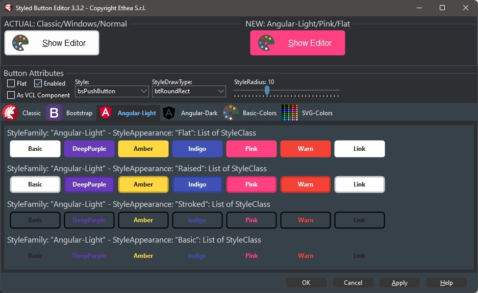
To use these styles, simply open the "Component Editor", selecting the "StyleFamily" page, within which there are the other 2 levels: StyleAppearance and StyleClass, represented by a "groupbox" and the various buttons that embed the specific class.
As you can see in this example image, the “Angular-Light” family includes four button formats (Flat, Raised, Stroked, Basic), and seven classes are available (Basic, DeepPurple, Amber, Indigo, Pink, Warn, Link).

A button has five different states: Normal, Pressed, Selected, Hot, Disabled (Selected has no effect on the "Graphics" buttons because they have no "focus").
When you select a style for a button (Family/Class/Appearance) all its attributes are assigned to five complex properties, of type “TStyledButtonAttributes” such as:
ButtonStyleNormal, ButtonStylePressed, ButtonStyleSelected, ButtonStyleHot, ButtonStyleDisabled.
Each of these properties contains all the graphic attributes used for drawing the button in the specific state, such as:
DrawType, BorderWidth, BorderDrawStyle, ButtonDrawStyle, BorderColor, FontColor, FontStyle, ButtonColor, Radius, RoundedCorners.
This structure allows maximum flexibility. For example, it is possible to decide that the Font becomes Bold when the button is pressed or selected, or that the color becomes more vivid when the button is selected, or the border becomes larger when the button is pressed... and so on.
It is even possible to change the "shape" of the button, based on the state, by operating on StyleDrawType and StyleRadius.
When you change one of these attributes the UseCustomAttributes property becomes “True”: changing it to “False” resets the attributes using those defined by Family/Class/Appearance.
To write your own StyledFamily of "Custom" styles, an example unit is available from which to start, in order to have a ready-made guideline:
{InstallDir}\source\Vcl.TemplateButtonStyles.pas
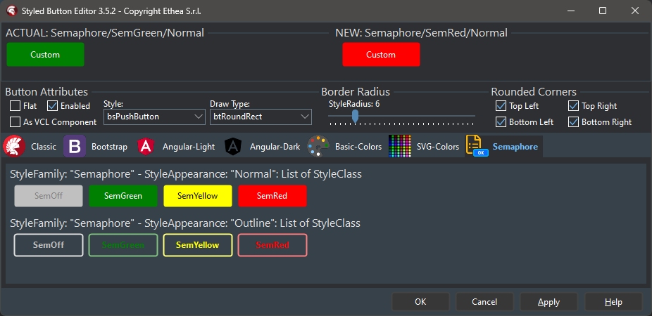
This unit contains an example of a family of Semaphoric button styles (StyleFamily=Semaphore) which can take two shapes (Normal and Outline) and four classes (SemGreen, SemYellow, SemRed, SemOff).
First you need to give your style family a name (StyleFamily) and establish how many "categories" to define (StyleAppearance) and how many classes (StyleClasses). It is useful, as in the example unit, to define constants...
  //Name of Family
  BTN_FAMILY = 'Semaphore';

  //Name of Classes
  BTN_GREEN = 'SemGreen';
  BTN_YELLOW = 'SemYellow';
  BTN_RED = 'SemRed';
  BTN_OFF = 'SemOff';

  //Name of Appearance
  BTN_NORMAL = 'Normal';
  BTN_OUTLINE = 'Outline';
...in such a way as to allow the developer to create the buttons at "Run-Time" by calling the CreateStyled constructor which requires passing the three values, for example:
LMyButton := TStyledButton.CreateStyled(Self, BTN_FAMILY, BTN_GREEN, BTN_NORMAL);These constants must then be initialized by creating global unit variables in the implementation section, generally ButtonClasses and ButtonAppearances are always used:
implementation
var
  ButtonClasses: TButtonClasses;
  ButtonAppearances: TButtonAppearances;
and initialized appropriately in the Initialization section of the unit:
initialization
  SetLength(ButtonClasses, 4);
  ButtonClasses[0] := BTN_GREEN;
  ButtonClasses[1] := BTN_YELLOW;
  ButtonClasses[2] := BTN_RED;
  ButtonClasses[3] := BTN_OFF;
  SetLength(ButtonAppearances, 2);
  ButtonAppearances[0] := BTN_NORMAL;
  ButtonAppearances[1] := BTN_OUTLINE;
  RegisterButtonFamily(TSemaphoreButtonStyles.Create);
Then it is necessary to define a class that derives from TInterfacedObject and which implements an **IStyledButtonAttributes ** interface...
  TSemaphoreButtonStyles = class(TInterfacedObject, IStyledButtonAttributes)
  private
    procedure UpdateAttributes(
      const AFamily:  TStyledButtonFamily;
      const AClass: TStyledButtonClass;
      const AAppearance: TStyledButtonAppearance;
      var ANormalStyle, APressedStyle, ASelectedStyle,
      AHotStyle, ADisabledStyle: TStyledButtonAttributes);
    function ButtonFamilyName: string;
    function GetButtonClasses: TButtonClasses;
    function GetButtonAppearances: TButtonAppearances;
    procedure GetStyleByModalResult(
      const AModalResult: System.UITypes.TModalResult;
      var AStyleClass: TStyledButtonClass;
      var AStyleAppearance: TStyledButtonAppearance);
  end;
...which includes these methods:
procedure UpdateAttributes
    function ButtonFamilyName
    function GetButtonClasses
    function GetButtonAppearances
    procedure GetStyleByModalResult
Some of these methods are very simple, because they provide the name of the family and the arrays of the ButtonAppearances and ButtonClasses, as in the example unit:
function TSemaphoreButtonStyles.ButtonFamilyName: string;
begin
  Result := BTN_FAMILY;
end;

function TSemaphoreButtonStyles.GetButtonAppearances: TButtonAppearances;
begin
  Result := ButtonAppearances;
end;

function TSemaphoreButtonStyles.GetButtonClasses: TButtonClasses;
begin
  Result := ButtonClasses;
end;
The GetStyleByModalResult method is used to define the default style of a button when the ModalResult is set to it or when your button family is used within a StyledTaskDialog.
procedure TSemaphoreButtonStyles.GetStyleByModalResult(
  const AModalResult: System.UITypes.TModalResult;
  var AStyleClass: TStyledButtonClass;
  var AStyleAppearance: TStyledButtonAppearance);
begin
  case AModalResult of
    mrNone: begin AStyleClass := BTN_OFF; AStyleAppearance := BTN_NORMAL; end;
    mrYes: begin AStyleClass := BTN_GREEN; AStyleAppearance := BTN_NORMAL; end;
    mrNo: begin AStyleClass := BTN_RED; AStyleAppearance := BTN_NORMAL; end;
    mrOk: begin AStyleClass := BTN_GREEN; AStyleAppearance := BTN_NORMAL; end;
    mrCancel: begin AStyleClass := BTN_RED; AStyleAppearance := BTN_NORMAL; end;
    mrAbort: begin AStyleClass := BTN_RED; AStyleAppearance := BTN_NORMAL; end;
    mrRetry: begin AStyleClass := BTN_YELLOW; AStyleAppearance := BTN_NORMAL; end;
    mrIgnore: begin AStyleClass := BTN_GREEN; AStyleAppearance := BTN_NORMAL; end;
    mrAll: begin AStyleClass := BTN_GREEN; AStyleAppearance := BTN_OUTLINE; end;
    mrNoToAll: begin AStyleClass := BTN_RED; AStyleAppearance := BTN_OUTLINE; end;
    mrYesToAll: begin AStyleClass := BTN_GREEN; AStyleAppearance := BTN_OUTLINE; end;
    mrClose: begin AStyleClass := BTN_OFF; AStyleAppearance := BTN_NORMAL; end;
    mrTryAgain: begin AStyleClass := BTN_GREEN; AStyleAppearance := BTN_NORMAL; end;
    mrContinue: begin AStyleClass := BTN_YELLOW; AStyleAppearance := BTN_NORMAL; end;
    mrHelp: begin AStyleClass := BTN_OFF; AStyleAppearance := BTN_NORMAL; end;
  end;
end;
Normally, a style that represents it is associated with a ModalResult, but it is also possible to establish that the same type of button must always be used for any ModalResult. In this case, as a rule, su uses the default style.
procedure TSemaphoreButtonStyles.GetStyleByModalResult(
  const AModalResult: System.UITypes.TModalResult;
  var AStyleClass: TStyledButtonClass;
  var AStyleAppearance: TStyledButtonAppearance);
begin
  AStyleClass := BTN_OFF;
  AStyleAppearance := BTN_NORMAL;
end;
The most complex implementation concerns the UpdateAttributes method which provides the usual three values as input (Family/Class/Appearance) and requires as output the graphic attributes of the 5 possible states of a button of the TStyledButtonAttributes type.
Normally we proceed by difference, that is, first we define the graphic attributes of the "normal" state by defining the ButtonColor, FontStyle and FontColor, DrawType, BorderWidth, ButtonDrawStyle and BorderDrawStyle attributes, as in this example where we see that the color of the traffic light is used for the button color for the “Normal” shape while it is used only for the border and the font for the “Outline” shape, etc…
  //Define AButtonColor and AFontColor for standard State button
  if SameText(AClass, BTN_GREEN) then
  begin
    LButtonColor := clGreen;
    LFontColor := clWhite;
  end
  else if SameText(AClass, BTN_YELLOW) then
  begin
    LButtonColor := clYellow;
    LFontColor := clBlack;
  end
  else if SameText(AClass, BTN_RED) then
  begin
    LButtonColor := clRed;
    LFontColor := clWhite;
  end
  else// BTN_OFF (default)
  begin
    LButtonColor := clSilver;
    LFontColor := clGray;
  end;
  //Define outline attribute
  LOutLine := SameText(AAppearance, BTN_OUTLINE);

  //Default Style Attributes for Semaphore Buttons
  ANormalStyle.DrawType := btRounded;
  ANormalStyle.BorderWidth := BTN_BORDER_WIDTH;

  //Style for Normal Style of Semaphore Button
  if LOutLine then
  begin
    //Outline Appearance: Border and FontColor same as Button Color and Bold Font
    ANormalStyle.ButtonDrawStyle := btnClear;
    ANormalStyle.BorderDrawStyle := brdSolid;
  ANormalStyle.FontStyle := [fsBold];
    ANormalStyle.FontColor := LButtonColor;
    ANormalStyle.BorderColor := LightenColor(LButtonColor, 50);
  end
  else
  begin
    //Normal Appearance: Border and FontColor same as Button Color and Normal Font
    ANormalStyle.ButtonDrawStyle := btnSolid;
    ANormalStyle.BorderDrawStyle := brdClear;
    ANormalStyle.FontStyle := [];
    ANormalStyle.FontColor := LFontColor;
    ANormalStyle.ButtonColor := LButtonColor;
    ANormalStyle.BorderColor := LButtonColor;
  end;
Then you must “clone” the normal style on the other styles:
  CloneButtonStyle(ANormalStyle, APressedStyle);
  CloneButtonStyle(ANormalStyle, ASelectedStyle);
  CloneButtonStyle(ANormalStyle, AHotStyle);
  CloneButtonStyle(ANormalStyle, ADisabledStyle);
Finally, you must defines the graphic elements that you want to change (like in a cascading stylesheet), based on the normal state of the button.
For example, when an "outline" button is pressed, it takes the face color of the button and becomes "solid"; the color of the border is made more light; the border becomes thicker and the font color becomes like that of the “normal” button… see the code:
  if LOutline then
  begin
    //Button Down: Face Color as Button Color and more Border
    with APressedStyle do
    begin
      ButtonDrawStyle  := btnSolid;
      ButtonColor := LButtonColor;
      BorderColor := LightenColor(LButtonColor, 50);
      BorderDrawStyle := brdSolid;
      BorderWidth := BTN_BORDER_WIDTH+2;
      FontColor   := LFontColor;
    end;
  end;
In this way it is possible to create any specific style based on the state of the button to obtain the most disparate effects, such as changing the border if a button is pressed, or coloring it darker if we hover over it, etc... There are some convenient ready-made functions for making a color lighter or darker by a percentage, such as:
function DarkenColor(Color:TColor; Percent:Integer):TColor;
function LightenColor(Color:TColor; Percent:Integer):TColor;
Or a function that transforms an html color because you want to use the "Web" style html color of the color family:
function HtmlToColor(Color: string): TColor;Or one works to transform a color into gray scale (often useful for defining the color of the button in the "Disabled" state):
function ColortoGrayscale(AColor : TColor): TColor;Finally, a function to know if a color is light, to decide whether to apply a darker or lighter transformation:
function ColorIsLight(Color: TColor): Boolean;To make your style family available to all StyledComponents already in the Delphi IDE, simply add the unit to the run-time package.
Open the run-time package file:
{InstallDir}\packages\D12\StyledComponents.dpk
add in the “contains” section:
Vcl.TemplateButtonStyles in '..\..\source\Vcl.TemplateButtonStyles.pas';and recompile the run-time package.
To make your style family available to all Styled Components, you need to change the "design-time" package.
Open the design-time package file:
{InstallDir}\packages\D12\dclStyledComponents.dpk
Then open the unit:
{InstallDir}\packages\Vcl.StyledComponentsRegister.pas
and add your unit name in the uses clause at implementation level:
implementation
uses
  Vcl.StandardButtonStyles
  , Vcl.BootstrapButtonStyles
  , Vcl.AngularButtonStyles
  , Vcl.TemplateButtonStyles
  , ...
Then re-build/install the design-time package in the IDE.
Automatically, the component editor will provide an additional page with your custom "family" and the possibility of selecting the styles provided in it:

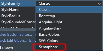
And in the same way, the new family will be available in the property editor of any StyledComponent:

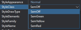
… and consequently, by opening StyleAppearance and StyleClass only the options of your customized family will appear:

The best way to learn how to customize your own style family is to look the code inside the units of the available families already implemented:
Vcl.StandardButtonStyles.pas
Vcl.BootstrapButtonStyles.pas
Vcl.TemplateButtonStyles.pas
Vcl.AngularButtonStyles.pas
Good job and enjoy with your custom Styled Components.