# Storybook Viewport Addon
Storybook Viewport Addon allows your stories to be displayed in different sizes and layouts in [Storybook](https://storybook.js.org). This helps build responsive components inside of Storybook.
[Framework Support](https://storybook.js.org/docs/react/api/frameworks-feature-support)
## Installation
Viewport is part of [essentials](https://storybook.js.org/docs/react/essentials/introduction) and so is installed in all new Storybooks by default. If you need to add it to your Storybook, you can run:
```sh
npm i -D @storybook/addon-viewport
```
Then, add following content to [`.storybook/main.js`](https://storybook.js.org/docs/react/configure/overview#configure-your-storybook-project):
```js
export default {
addons: ['@storybook/addon-viewport'],
};
```
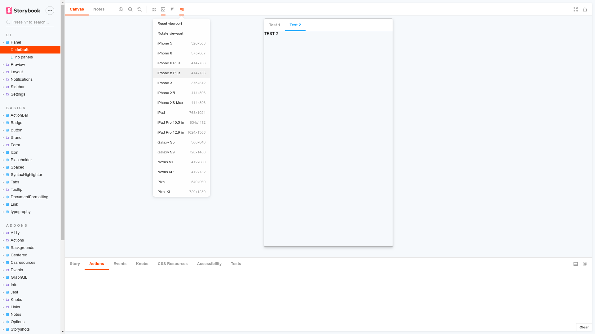
You should now be able to see the viewport addon icon in the the toolbar at the top of the screen.
## Usage
The usage is documented in the [documentation](https://storybook.js.org/docs/react/essentials/viewport).