第 63 题:如何设计实现无缝轮播 #108
Comments
简单来说,无缝轮播的核心是制造一个连续的效果。最简单的方法就是复制一个轮播的元素,当复制元素将要滚到目标位置后,把原来的元素进行归位的操作,以达到无缝的轮播效果。 贴一段轮播的核心代码: // scroll the notice
useEffect(() => {
const requestAnimationFrame =
window.requestAnimationFrame || window.webkitRequestAnimationFrame || window.mozRequestAnimationFrame
const cancelAnimationFrame =
window.cancelAnimationFrame || window.webkitCancelAnimationFrame || window.mozCancelAnimationFrame
const scrollNode = noticeContentEl.current
const distance = scrollNode.clientWidth / 2
scrollNode.style.left = scrollNode.style.left || 0
window.__offset = window.__offset || 0
let requestId = null
const scrollLeft = () => {
const speed = 0.5
window.__offset = window.__offset + speed
scrollNode.style.left = -window.__offset + 'px'
// 关键行:当距离小于偏移量时,重置偏移量
if (distance <= window.__offset) window.__offset = 0
requestId = requestAnimationFrame(scrollLeft)
}
requestId = requestAnimationFrame(scrollLeft)
if (pause) cancelAnimationFrame(requestId)
return () => cancelAnimationFrame(requestId)
}, [notice, pause]) |
|
无限轮播基本插件都可以做到,不过要使用原生代码实现无缝滚动的话我可以提点思路, |
|
克隆第一张和最后一张作为过渡,在切换时就会显得流畅一些 |
|
这里说一个不需要clone的方案: <div class="slide">
<ul>
<li>图片1</li>
<li>图片2</li>
<li>图片3</li>
</ul>
</div>1、最外层 2、 3、滚动效果通过控制 4、到了最后一个 4.1、准备继续滚动,把最后一个的 4.2、然后把ul的 4.3、然后再正常的开始一样出现第一个li的滚动效果(这步有缓动效果) 4.4、最后等无缝的第一个 5、到第一个 具体效果可以看下 汽车之家首页的轮播图效果 |
|
<!DOCTYPE html>
<html lang="en">
<head>
    <meta charset="UTF-8">
    <meta name="viewport" content="width=device-width, initial-scale=1.0">
    <meta http-equiv="X-UA-Compatible" content="ie=edge">
    <title>轮播</title>
    <style>
        *{
            padding: 0;
            margin: 0;
            list-style: none;
        }
        #continer{
            width: 300px;
            height: 200px;
            position: relative;
            margin: 20px auto;
            border: 1px solid;
            overflow: hidden;
        }
        #lunbo{
            width: 9999em;
            height: 100%;
            position: absolute;
            top: 0;
            left: 0;
        }
        li{
            float: left;
            width: 300px;
            height: 200px;
            text-align: center;
            line-height: 200px;
            color: brown;
            font-size: 30px;
        }
    </style>
</head>
<body>
    <div id="continer">
        <ul class="ul" id="lunbo">
            <li class="list">1</li>
            <li class="list">2</li>
            <li class="list">3</li>
            <li class="list">4</li>
            <li class="list">5</li>
        </ul>
    </div>
</body>
<script src="./js/jquery3.0.min.js"></script>
<script>
    let selectNum = 0
    function lunboFun (selectNum, time) {
        $('#lunbo').animate({
            'left': -1 * selectNum * 300
        }, time, () => {
            selectNum++
            setTimeout(() => {
                if (selectNum > 4) {
                    selectNum = 0
                    $('ul li:last').css({
                        'position': 'absolute'
                    }, 0)
                    $('ul li:last').animate({
                        'left': -300
                    }, 0)
                    $('#lunbo').animate({
                        'left': 300
                    }, 0)
                } else if (selectNum <3) {
                    $('ul li:last').css({
                        'position': 'relative',
                        'left': 0
                    }, 0)
                }
                lunboFun(selectNum, 1000)
            }, 2000)
        });
    }
    lunboFun(selectNum, 1000)

</script>
</html>
|
|
一上来clone一个 |
|
代码千万种,这里主要说一下两种实现思想:
自己写的react-native的轮播组件,欢迎评鉴:https://github.com/lvzhiyi/react-naitve-SeamlessScroll |
|
改变了以往写轮播的方式,尝试了一下纯操控节点增删来实现无缝连接轮播图。https://github.com/yaodongyi/javascript |
原理
本例 固定为4张图的轮播图,主要为便于阐述原理.
3 实现无缝轮播
(function () {
    let prev = document.getElementsByClassName("carousel-prev")[0];
    let next = document.getElementsByClassName("carousel-next")[0];
    let board = document.getElementsByClassName("carousel-board")[0];
    let panels = Array.from(document.getElementsByClassName('carousel-board-item'));
    board.style.left = "-400px"; //设置初始的left值
    let index = 1; //设置初始的index值
    prev.addEventListener("click", function () {
        index++
        console.log(index);
        animate(-400);
        //关键点 如果当前在 1fake 的位置
        if (index === panels.length - 1) {
            setTimeout(() => {
                //去掉动画
                board.style.transition = "0s";
                let distance = 4 * 400
                //默默的左移board至 1
                board.style.left = parseInt(board.style.left) + distance + "px"
            }, 600)
            index = 1;
        }

    })
    next.addEventListener("click", () => {
        index--
        console.log(index);
        animate(400);
        //关键点 如果当前在 4fake 的位置
        if (index === 0) {
            setTimeout(() => {
                // 去掉动画
                board.style.transition = "0s";
                let distance = -4 * 400
                //默默的右移board 至 4
                board.style.left = parseInt(board.style.left) + distance + "px"
            }, 600)
            index = 4;
        }
    })

    function animate(width = 400) {
        board.style.transition = "0.5s";
        board.style.left || (board.style.left = 0)
        board.style.left = parseInt(board.style.left) + width + "px";
    }
})() |

|
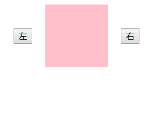
用Vue实现无缝轮播好像比较省事: <!DOCTYPE html>
<html>
<head>
<title></title>
<script src="https://cdn.bootcss.com/vue/2.6.10/vue.min.js"></script>
<style type="text/css">
#app {
display: flex;
align-items: center;
margin: auto;
width: 200px;
}
ul {
list-style-type: none;
position: relative;
width: 100px;
height: 100px;
box-sizing: border-box;
padding: 0;
margin: auto;
overflow: hidden;
}
li {
width: 100px;
height: 100px;
position: absolute;
}
#one {
background: yellow;
}
#two {
background: black;
}
#three {
background: pink;
}
#four {
background: orange;
}
.right_animation-enter, .left_animation-leave-to {
transition: all .3s ease;
transform: translateX(-100px);
}
.right_animation-leave-to, .left_animation-enter {
transition: all .3s ease;
transform: translateX(100px);
}
.right_animation-enter-to, .right_animation-leave, .left_animation-enter-to, .left_animation-leave {
transition: all .3s ease;
transform: translateX(0);
}
</style>
</head>
<body>
<div id="app">
<button @click="turn('left')">左</button>
<transition-group tag="ul" :name="direction=='left' ? 'left_animation' : 'right_animation'">
<li v-for="(img,index) in imgs"
:id="img"
:key="index"
v-show="current_index===index">
</li>
</transition-group>
<button @click="turn('right')">右</button>
</div>
</body>
<script>
new Vue({
el: '#app',
data: {
imgs: ['one', 'two', 'three'],
direction: 'left',
current_index: 0
},
methods: {
turn: function (side) {
this.direction = side
if (side == 'left') {
this.current_index -= 1
if (this.current_index < 0) {
this.current_index = this.imgs.length - 1
}
} else {
this.current_index += 1
if (this.current_index === this.imgs.length) {
this.current_index = 0
}
}
}
}})
</script>
</html> |
prev和next反了吧。 |
4.1应该是把最后一个li的left设置为所有li宽度之和的负值,4.2应该是把ul的left设置为1个li的宽度。 |
nter从 translateX(-100%) 开始,到 translateX(0) 结束,leave从translateX(0)开始,到translateX(100%)结束 这样是向右移动吧 |
|
参考了18055975947,没有用jquery |
<!DOCTYPE html>
<html lang="en">

<head>
  <meta charset="UTF-8">
  <meta name="viewport" content="width=device-width, initial-scale=1.0">
  <title>Document</title>
</head>

<body>
  <ul class="animation">
  </ul>
</body>
<script src="https://cdn.bootcdn.net/ajax/libs/jquery/3.5.1/jquery.js"></script>
<script>

  var actionStep = 1.5

  var animationData = ['1', '2']

  var domData = [...animationData, animationData[animationData.length - 1]]

  $('.animation').append($(domData.map((val, index) => {
    if (index === domData.length - 1) return `<!-- 为了撑起 animiation 元素 --><li class="animation-item animation-item-slot">${val}</li>`
    return `<li class="animation-item animation-item-move animation-item-move-${index + 1}">${val}</li>`
  }).join('')))

  var dataLength = animationData.length

  $('head').append(`<style>
    .animation-item-move {
      position: absolute;
      left: 0;
      width: 100%;
      transform: translateY(100%);
      animation: ${dataLength * actionStep}s step-start 0s infinite running slidein;
    }
    ${animationData.map((v, index) => {
    return `.animation-item-move-${index + 1} {
          animation-delay: ${index * actionStep}s;
        }
      `
  }).join('')}

    @keyframes slidein {
      0% {
        transform: translateY(100%);
        animation-timing-function: ease-in-out;
      }

      ${100 / dataLength}% {
        transform: translateY(0%);
        animation-timing-function: ease-in-out;
      }

      ${200 / dataLength}% {
        transform: translateY(-100%);
        animation-timing-function: step-start;
      }
    }

    @keyframes slideinSlot {
      0% {
        transform: translateY(0);
        animation-timing-function: ease-in-out;
      }

      100% {
        transform: translateY(-100%);
        animation-timing-function: step-start;
      }
    }

    .animation-item-slot {
      animation: ${actionStep}s slideinSlot;
      transform: translateY(-100%);
    }

    .animation {
      position: relative;
      padding-left: 0;
      text-align: center;
      background-color: aqua;
      overflow: hidden;
    }
    .animation-item {
      list-style: none;
      line-height: 50px;
      height: 50px;
    }
  </style>`)
</script>

</html> |
|
FYI. -> Demo && Code |
No description provided.
The text was updated successfully, but these errors were encountered: