-
Notifications
You must be signed in to change notification settings - Fork 18.4k
list of Coronavirus Dashboards #576
Comments
|
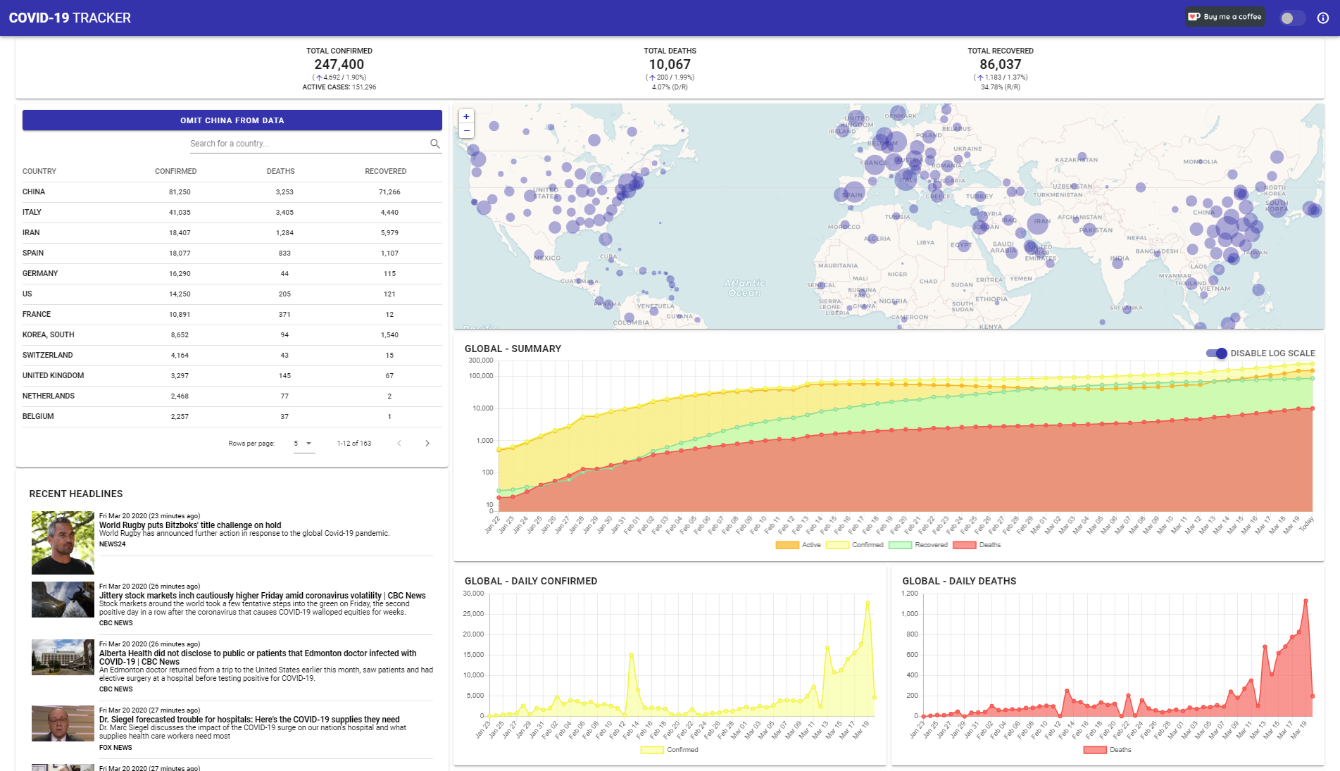
Interesting that most of these are built with Arcgis. Here's mine, built with Vue.js and some PHP. Features a fully interactive map, update: |
|
I would like to add |
|
My dashboard was built on Cognos, which uses Mapbox for the maps. There are a few maps, but I've been focusing more on graphs. I've also added population numbers, and I've counted the days since the first reported case in each country to make a cohort analysis. |
|
Thank you for the list, I thought about creating a sample-issue like that today.
Thats a media article, not an official dashboard. I crerated a seperate issue for collecting such stuffi here: |
|
@nguyandy it looks great, and like the fact it is optimized. It loads very fast. |
|
@gena I love the color-coded circle idea denoting active, survived, deaths. That's a good way to visualize the overall affect on an area. If we were fancy, taking populations and then using transparency to show % of population affected or per 100k or something would be interesting. I'm not suggesting that but just thinking out loud. @analyzewithpower @joetynan11 PowerBI. Nice. I've been playing with choropleths in QGIS - not for this. local health data. I don't know why more business intelligence companies don't offer their software to orgs or make big visualizations like this. You would think someone like Teradata would show some civic duty to lend their services and show off the competency of their products. I read of a company called TigerGraph that offered their software to China |
|
Here is open source dashboard project. https://corona-board.soaple.endpoint.ainize.ai/statistics/dashboard |
|
@jawz101 Tableau, major BI company, offers Tableau Public: https://public.tableau.com/s/ Includes both a scaled-down version of Tableau Desktop/Creator and also free hosting of published dashboards. I agree with you that more BI companies should do this. |
|
Here is my dashboard, developed by a combination of Alteryx and Tableau, and published to Tableau Public: |
|
One more here , https://www.aydan.info/ Being built while training students on javascript, open layer and node.js. Does not use any specific tool or software. More updates to follow. |
|
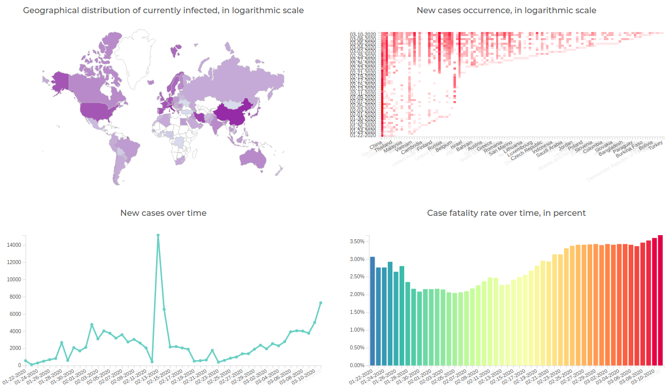
Here is my little side project over the weekend: https://virus-corona.herokuapp.com I was particularly interested in seeing the cumulative number of cases for each country over time, as well as new cases emerging by day. So I decided to develop a web-app/dashboard that gives me all this information in one place. Hover over data and/or play with dropdowns on top for all 3 pages. |
|
My contribution. Have a look at the "Currently infected" graphs - especially for China and for South Korea. |
|
This one is made with our custom business intelligence tool: https://datoris.com/gallery/report/92 |
|
Here's mine, based on this repo's data, with focus on growth patterns in specific countries: https://mackuba.eu/corona/ |
|
@ODrying is there a way to make that tiniest font a little bigger or something I can't barely read the numbers and it's pretty persistent as I can't change it with zoom or stylish. 1920x1080. Also United States isn't visible in the country list (edit: Clicking on the US works to filter). Other than that great display. |
|
@jay Yeah, United States is 'US' (as per the data from CSSE). Each object has a hover toolbox with a maximize button. Probably not doing much to the font size though - I will look into that. From a smartphone, you can actually zoom. You can't on a PC, unfortunately. Thanks. |
|
My take on this, at https://covid.sdelmont.com/ focusing on deaths per day per country, but with lots of other features. |
|
... and my contribution ... https://covid19.epi-net.info ... with time-scale, dynamic clustering, heat-map and epi-curves ... built on OpenLayers and GoogleCharts. |
|
This is an app I made for iOS & macOS. It shows a map with two levels of details & multiple charts. |
|
Let me share my own on youtube, is a live dashboard. Written in Processing, data is from worldometer.info (imported through google sheet). Still working on adding the time-series data from this repo. Designed for the public who needs a quick brief of covid-19 spread in simple numbers and intuitive color map. thanx for any feedback and support. |
|
@piccolbo NIce. How did you angle your ggplot line labels? |
I also built a dashboard based on this dataset, https://coronatimemap.com, along with a basic bar chart and transmission visualization and news source record over time. |
|
I'll plug "mine" too. Seeking contributions. Written in plain HTML/CSS/JS with plotly as the only dependency to reduce contributor build issues and lower the skill level bar for new contributions. Brand new to CSS? Open a PR. Don't know how to code at all?? See the CONTRIBUTING.md for "Non-code contributions" instructions. Feel like this code is what we escaped 10+ years ago? Fork it, rewrite in React with Kubernetes on a Raspberry Pi, I don't care. It's licensed MIT. Release your fork and get the data to the people. Uses JHU's time series dataset. Aggregates it (also MIT open source), then allows a quick interface for drilling down & comparing locations in visual and tabular formats. I wanted a local-level, simple tool anyone could use to find the latest daily metrics for the areas their loved ones live. Should load in under 3 seconds on a 10mbit/s connection, but shows the loading progress so anyone on any internet connection could understand that the data is still loading (FWIW, ~12 seconds on a 1mbit/s connection). I update the data daily at the moment, typically around 8pm EST when JHU's daily time series automated update happens. |
|
How do I reach you? |
|
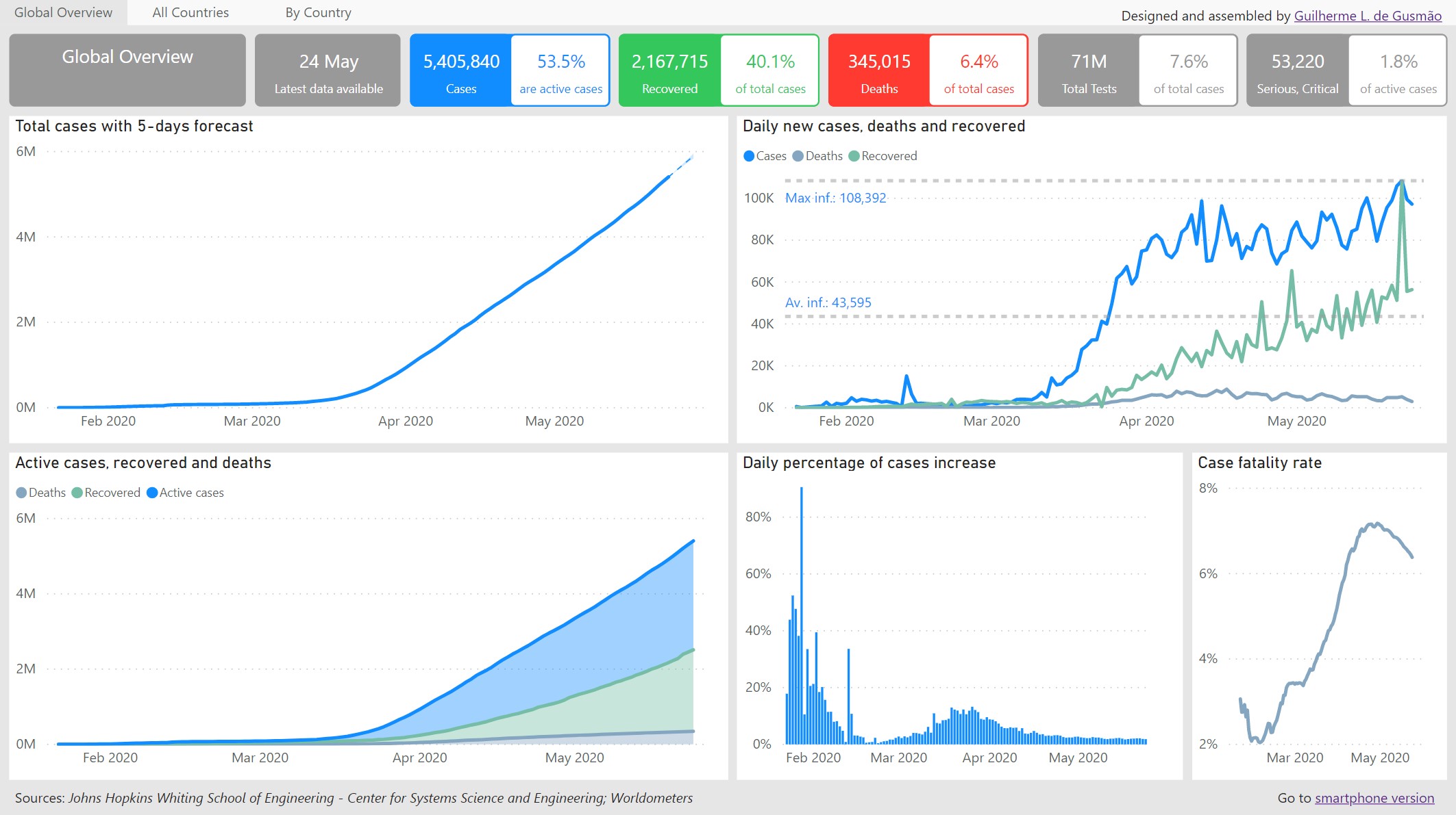
Heres mine. Using 5day and 14day moving averages with assessment score based on confirmed, deaths and recovery trends. (10 green being the highest/best). Can select each country. With light and dark theme options. |
|
My turn :) |
Hi Gerry, how to create dashboard mobile view? Your dashboard is very beautiful!Congrats |
|
Since we don't have "currently active cases" which makes no sense to me- can we assume it takes to weeks to recover? So a timeline representing present active cases would at least subtract the deaths as well as any confirmed older than 2 weeks. Recoveries are severely underreported because it's extremely impractical to continue to test people until they are definitively recovered. |
Hi Everton. Thanks! Its not the phone layout option but rather using a custom page size. (Page size) (View) Regards, |
|
Live video AI ML to understand total people count and density at key locations around the world for better #socialdistancing monitoring by @unleashlive |
|
Hi All |
|
Hi |
Very clean Guilherme, I like the interval, urban and density options. I have updated mine with a few things since I first put it here so here it is again: The first page is all interactive with the map when you click on a country/state. Otherwise dropdowns works for all 3 pages. It is done with Dash/python and deployed for free on Heroku, I have tried to optimise it better for mobile (for loading time also) but still need to work on my css skills. 😓 |
|
|
Here is my project which shows how to build interactive maps and charts of COVID-19 data inside an Angular 9 application using the D3 JavaScript framework. Click Here to view application |
|
Google made COVID-19 data available as a BigQuery public dataset. You can query the dataset using SQL and BigQuery Console or by using COVID-19 Query Tool without SQL: |
|
Here is my dashboard. Link : http://covid-19.tis.cat |
|
Adding our Covid Tracker Dashboard to this very long list. Consolidated data sources: The COVID Tracking Project, Johns Hopkins University, NYT, and CDC. Focus is on the United States by state and state-level opening up status, including economic data. https://covid19tracker.rivethammer.com/ All feedback valued and appreciated. Thanks! Bob |
|
Some other interesting visuals: A scenario calculator by the University of Basel in Switzerland https://covid19-scenarios.org/ Genomic epidemiology of novel coronavirus by Nextstrain https://nextstrain.org/ncov/global (shows the spread of the various recognized strains of covid-19 as it's mutated around the world. And another infection map by the University of Washington |
|
https://covid19dashboard.lcisp.it/ |
|
The official german RKI dashboard is super slow, which is why I introduced https://covid-karte.de which shows the same data as the rki dashboard but in a much more performant way. |
|
See also OSCOVIDA |
|
Covid-19 status can be obtained at: |
|
This site: |
|
Our lab and Microsoft AI for Health recently published a collaborative work on COVID-19 Data for United States Congressional Districts. |
|
I might be late to the party, but here is my contribution: It was important for me, to have somewhat comparable data, so the map shows the current incidence (cases / 100000 inhabitants) on country level worldwide. But you can also visualize the history or the development over time. Any date since starting of the pandemic can be shown (hopefully responsive) by using the time slider. |
|
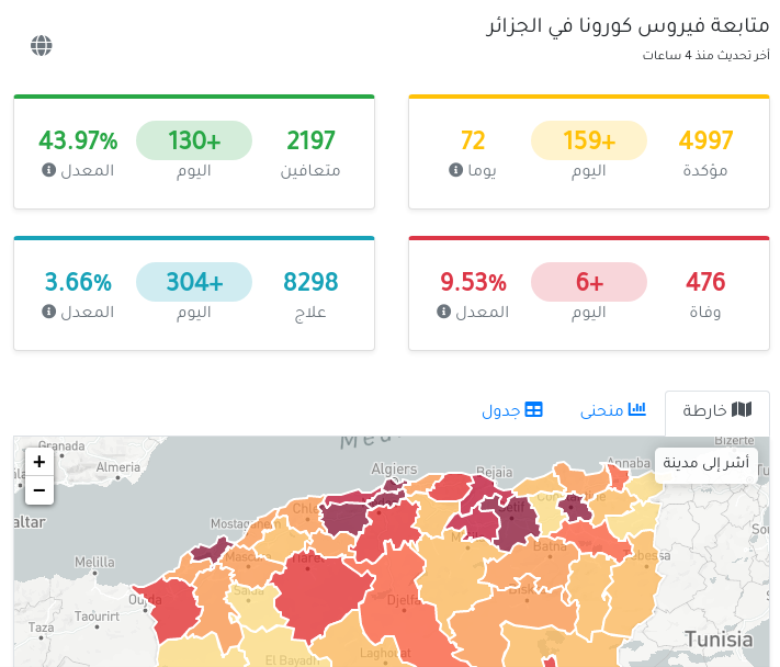
A new dashboard has been created since there is a surge in covid cases, especially in Europe. The site is http://www.eurovoyages.net/coviddashboard. It also provides status in other languages like French, German, Spanish, Italian and Hindi. |


Just found this post on the interweb. I started listing them but there really are a bunch
https://storymaps.arcgis.com/stories/a1746ada9bff48c09ef76e5a788b5910
United Nations aviation agency built the 3DFX Dispersion map https://icao.maps.arcgis.com/apps/webappviewer3d/index.html?id=d9d3f8fa9a23425c8f0889baab626186
University of Virginia http://nssac.bii.virginia.edu/covid-19/dashboard/
WHO https://experience.arcgis.com/experience/685d0ace521648f8a5beeeee1b9125cd
https://who.maps.arcgis.com/apps/opsdashboard/index.html#/c88e37cfc43b4ed3baf977d77e4a0667
Too many to list here https://coronavirus-disasterresponse.hub.arcgis.com/
earlyAlert (Oklahoma Early Alert Dashboard includes airport suspensions, travel health notices with options to sort by country)
https://www.arcgis.com/apps/opsdashboard/index.html#/20bfbf89c8e74c0494c90b1ae0fa7b78
unknown (maybe in Lithuanian) https://www.arcgis.com/apps/opsdashboard/index.html#/3a68dac5ebb94b6a8db221c954bcc90e
Germany https://experience.arcgis.com/experience/478220a4c454480e823b17327b2bf1d4
Indonesia (Geoportal Kebencanaan) http://gis.bnpb.go.id/arcgis/apps/webappviewer/index.html?id=9b8d73c9874a4fda983ddf4f4b2dbac4
Italy: https://www.arcgis.com/apps/opsdashboard/index.html#/4f74fc222b7041cd9cc3c52e62af1b8c
Japan (JAG Japan Corp) https://www.arcgis.com/apps/opsdashboard/index.html#/641eba7fef234a47880e1e1dc4de85ce
Johns Hopkins World map https://gisanddata.maps.arcgis.com/apps/opsdashboard/index.html#/bda7594740fd40299423467b48e9ecf6
Korea ESRI https://esrikrmkt.maps.arcgis.com/apps/MapSeries/index.html?appid=b379f788425349168d02669285758af0
Philippines Department of Health https://ncovtracker.doh.gov.ph/
Shenzen http://129.204.11.162:8080/sys_yq_shenzhen/ (viewable in China?)
Singapore Ministry of Health: https://experience.arcgis.com/experience/7e30edc490a5441a874f9efe67bd8b89
Taiwan: https://viator.maps.arcgis.com/apps/opsdashboard/index.html#/bbd3dfeeec9c494daf178457c7b74c3e
Thailand Ministry of Public Health https://mophgis.maps.arcgis.com/apps/opsdashboard/index.html#/210413ebb5ff49bb8914808af6473322
Israel https://systematics.maps.arcgis.com/apps/opsdashboard/index.html#/e1a670aa9493446889760fb22c882066?locale=he
Turkey http://esriturkiye.maps.arcgis.com/apps/opsdashboard/index.html#/cfe8603d7f104fd6b133bc1fed0e90bd
Hong Kong
English https://chp-dashboard.geodata.gov.hk/nia/en.html
English https://chp-dashboard.geodata.gov.hk/covid-19/en.html includes "predictive ai"?
Chinese https://chp-dashboard.geodata.gov.hk/nia/zh.html
http://www.netcraft.com.mo/dashboards.html
http://2019ncov.chinacdc.cn/2019-nCoV/
https://ncov.dxy.cn/ncovh5/view/pneumonia
The text was updated successfully, but these errors were encountered: