-
Notifications
You must be signed in to change notification settings - Fork 22
Implementing designs in the DAO DAO UI
In our designs colors have names, you can find them when viewing the css Figma suggests. For example, the color in the css below corresponds to the tailwind color background-interactive-hover.
/* Background/Interactive/Hover */
background: rgba(243, 246, 248, 0.1);
We opt not to use theme customization in tailwind, so to actually set a div's background color, you'd need to do <div className="bg-background-interactive-hover"></div>. This is a little long winded, but matches the reality of designs better where often things like background colors will get used for outlines and borders.
All of our colors are stored in css variables in the packages/ui/styles/index.css file. They are then imported into tailwind in packages/ui/tailwind.config.js. If you find yourself in need of a color that does not exist please consider using this system if it isn't a one-off color.
In our designs fonts also have names. For example a font may be named Text Primary. These fonts correspond to font classes we have written in packages/ui/styles/index.css, in this case primary-text. We use the primary-text class instead of text-primary to avoid conflicting with tailwind class names.
Generally speaking, the vast majority of sizes and spacings used in the DAO DAO UI are multiples of four pixels. This works well with tailwind's system where something like w-4 corresponds to width: 16px. Where there are exceptions to this, feel empowered to just hardcode a pixel value. You can do this in tailwind in the format w-[<CSS VALUE>]. For example, to set a width to 240 pixels, you'd do w-[240px].
We have storybook set up in packages/ui for developing components. To start storybook, move to the ui package directory and run yarn storybook.
To add a new component, create a new file in components with a component inside. Write your component so it returns something non-null, for example <div></div> (this is needed so that the generator script can see that the component returns a ReactNode and, thus, is a component), then run yarn storybook:generate to have a new story file generated in packages/ui/stories. The generator may leave some TODO comments for you if some of the defaults need to be specified to be valid.
Say we want to make the "Not a Member" text in this component:

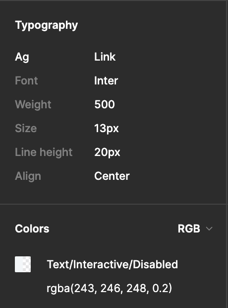
Clicking on the text yields the following information in the typography section:

From the Ag field, we see this is link text, so to get the text sizing correct we apply the link-text class. From the colors field we see that this is Text/Interactive/Disabled so we'll set the text color in tailwind with text-text-interactive-disabled. This makes the complete class name for the text link-text text-text-interactive-disabled.