-
-
Notifications
You must be signed in to change notification settings - Fork 1k
New issue
Have a question about this project? Sign up for a free GitHub account to open an issue and contact its maintainers and the community.
By clicking “Sign up for GitHub”, you agree to our terms of service and privacy statement. We’ll occasionally send you account related emails.
Already on GitHub? Sign in to your account
Toolbar vertical real-estate enhancement #387
Comments
|
Goodness yes. More vertical real estate, please! Narrower tracks would be useful as well. |
|
+1 ((btw: loving to see the amazing team work of all you guys in the past months!!! you're doing a great job!!! Big Ups!!! Thousand thanks, love and hugs to all of you <3 <3 <3)) |
|
This is very similar to a mock-up I made earlier... I think if this is done, the whole scope thing gets pretty useless so it can probably be removed entirely and instead be implemented as a separate window. Maybe add a scope mode in spectrum analyzer. |
|
And maybe someone is willing to update the scope to stereo scope 🌻 |
|
FYI: the current scope is stereo already :-) |
|
how will this look in 4:3? |
|
On 02/28/2014 06:11 PM, musikBear wrote:
This won't go to 1.0.0. |
|
I mean SURROUND scope ✋ |
This depends on the pixel width of the 4:3 screen, but assuming the proposal is used, the items would overflow into a second line (in the case of the buttons, I would advise overflowing half (6 buttons), but that is highly dependent on the flow layout used) as described here:
-Tres |
|
I spent some time looking into the overflow capabilities in QT in terms of the toolbar and they look quite involved compared to some other layout managers I've used since QT seems to lack a layout manager that does automatic overflow. What I did discover was a QT sample FlowLayout that allows this automatic "overflowing": Not sure if it's the right approach, but i wanted to offer it for reference from the qt docs: I would assume this layout manager could help in quite a few areas that have naturally forced minimum-width constraints due to child elements (i.e. toolbars); particularly helping with the increasing minimum width of the Piano Roll. Sample Screenshot: FlowLayout Example: FlowLayout Source Code:
Files for reference: -Tres |
|
On 03/04/2014 11:21 PM, Tres Finocchiaro wrote:
Yeah that's probably the way to go, but that's for after 1.0.0. Now |
|
is this still in the works, it's been tagged so many times but hasnt been updated in nine years |
|
Its just a feature request, so anyone with basic programming experience can try to tackle it, but as far as I know it was never actually started. |

A proposal for the toolbar to reclaim some unused screen real-estate.
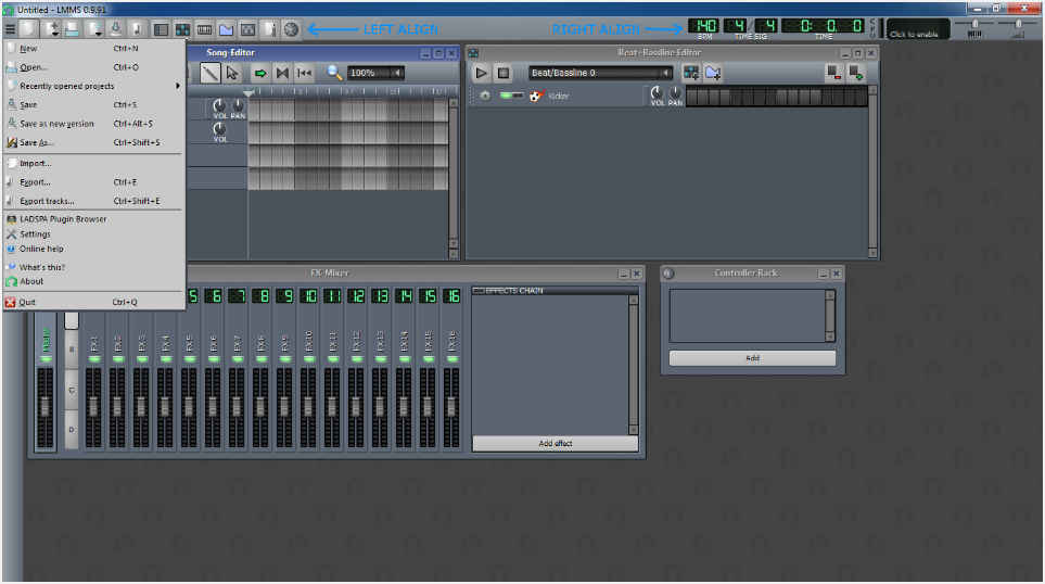
Left aligned tool menu items:

Make the file and project toolbar buttons a single row that is capable of overflowing into a second row if needed.
Right aligned tool menu items:
Make the remaining components a single row that is capable of overflowing into a second row if needed.
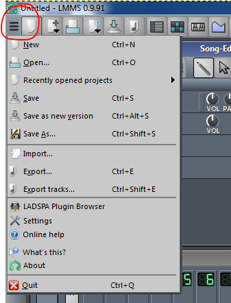
File menu hidden

All menu items consolidated into a single quick-access menu. This is no less clicks than the current menu and finds a better place for single-item menus such as LADSPA or Settings. Most items already have dedicated toolbar buttons, encourages their usage. Chrome menu button used only as example.
The big picture:

All changes combined into a single mock-up. Notice the master volume is frozen to the top right, for quick accessibility.
Additional Notes
I would personally recommend removing the CPU and visualization from the default view and instead offer these as FX visualization plugins. Alternately, a basic CPU/MEM indicator might be a good alternative.
-Tres
The text was updated successfully, but these errors were encountered: