-
Notifications
You must be signed in to change notification settings - Fork 0
/
R_ladies_colorFlash.Rmd
209 lines (128 loc) · 6.28 KB
/
R_ladies_colorFlash.Rmd
1
2
3
4
5
6
7
8
9
10
11
12
13
14
15
16
17
18
19
20
21
22
23
24
25
26
27
28
29
30
31
32
33
34
35
36
37
38
39
40
41
42
43
44
45
46
47
48
49
50
51
52
53
54
55
56
57
58
59
60
61
62
63
64
65
66
67
68
69
70
71
72
73
74
75
76
77
78
79
80
81
82
83
84
85
86
87
88
89
90
91
92
93
94
95
96
97
98
99
100
101
102
103
104
105
106
107
108
109
110
111
112
113
114
115
116
117
118
119
120
121
122
123
124
125
126
127
128
129
130
131
132
133
134
135
136
137
138
139
140
141
142
143
144
145
146
147
148
149
150
151
152
153
154
155
156
157
158
159
160
161
162
163
164
165
166
167
168
169
170
171
172
173
174
175
176
177
178
179
180
181
182
183
184
185
186
187
188
189
190
191
192
193
194
195
196
197
198
199
200
201
202
203
204
205
206
207
208
209
---
title: "On Colorblind Friendly Plotting"
author: "Laurel Brehm"
output:
slidy_presentation: default
---
```{r include=FALSE}
library(ggplot2)
library(viridisLite)
library(cowplot)
library(dichromat)
knitr::opts_chunk$set(fig.width=6, fig.height=2.5)
```
---
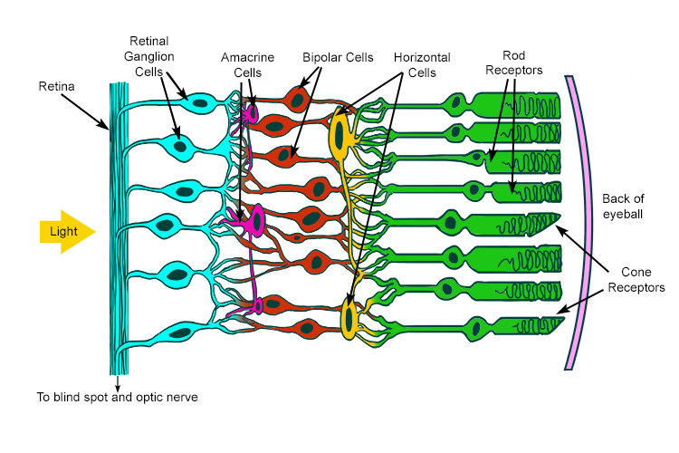
The visual system works via a set of sensors in your eye called _rods_ and _cones_
Rods are super sensitive to low levels of light -- they're known as your 'light / dark' detectors.
Cones are sensitive to different frequencies of light -- they're what gives you color vision.
{width=70%}
---
You may have heard that there are 3 types of cones known as _red_, _green_, and _blue_
---
You may have heard that there are 3 types of cones known as _red_, _green_, and _blue_
This is true on one level, but it doesn't work the way you think.
---
You may have heard that there are 3 types of cones known as _red_, _green_, and _blue_
This is true on one level, but it doesn't work the way you think.
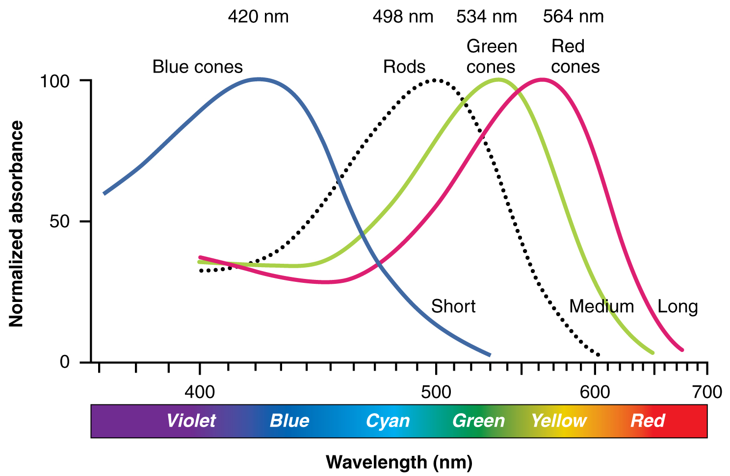
In fact, *each* cone sees *all* types of light-- they're just different in sensitvity to the various frequencies that make up colors.
---
Light is a spectrum of wavelengths.
Different wavelengths are percieved as different hues.
{width=90%}
---
The three cones are sensitive to different wavelengths in this spectrum:
\
\
\
\
{width=60%}
---
Color perception happens due to wavelengths of light activating each cone differentially.
- Red = lots of activation on long cone, less activation on medium cone, no activation on short cone
- Blue = lots of activation on short cone, less (and equal) activation on medium and long cones.
{width=60%}
---
This has 2 important implications for data visualisation:
1. *Everybody* percieves hue differences between green/yellow better than blue/violet
2. When either the green or red cone malfunctions, different wavelengths of light are percieved to be the same hue.
{width=60%}
# Practical tip 1: Avoid rainbows, use viridis
Here's the same plot using traditional rainbow and the viridis palette (from viridisLite() ), which has been designed to be an equal luminance gradient (=good for representing real contrasts)
```{r message=FALSE, warning=FALSE}
p <- ggplot(iris,aes(x=Sepal.Length,y=Sepal.Width,color=Petal.Width))+
geom_point()+theme_bw()
plot_grid(
p + scale_color_gradientn(colors=rainbow(5)),
p + scale_color_gradientn(colors=viridis(5))
)
```
# Practical tip 1: Avoid rainbows, use viridis
Even for people with 100% normal color vision, rainbows produce perceptual differences that aren't really there, and minimize differences that are.
```{r message=FALSE, warning=FALSE}
p <- ggplot(iris,aes(x=Sepal.Length,y=Sepal.Width,color=Petal.Width))+
geom_point()+theme_bw()
plot_grid(
p + scale_color_gradientn(colors=rainbow(5)),
p + scale_color_gradientn(colors=viridis(5))
)
```
# Practical tip 2: Avoid contrasting red and green
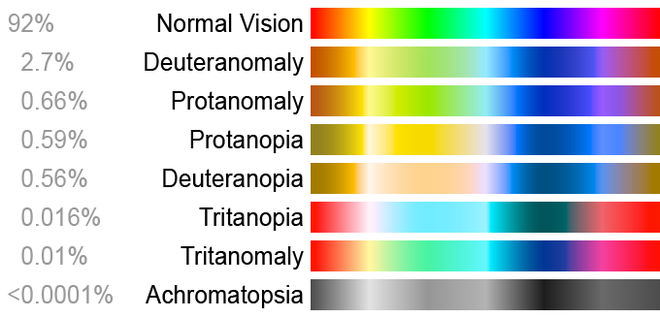
8% of people are colorblind! (Higher for men than women)
# Practical tip 2: Avoid contrasting red and green
Here's the traditional default ggplot color scheme with simulated deficiency in the deutan cone (most common form of colorblindness) using package dichromat(). *IT IS VERY BAD*
```{r message=FALSE, warning=FALSE}
p2 <- ggplot(iris,aes(x=Sepal.Length,y=Sepal.Width,color=Species, shape=Species))+
geom_point()+theme_bw()
plot_grid(
p2 + scale_color_manual(values=c("#F8766D","#00BA38","#619CFF")),
p2 + scale_color_manual(values=dichromat(c("#F8766D","#00BA38","#619CFF"),type="deutan"))
)
```
# Practical tip 2: Avoid contrasting red and green
Here's a better option, gotten from http://www.cookbook-r.com/Graphs/Colors_(ggplot2)/
\
```{r message=FALSE, warning=FALSE}
plot_grid(
p2 + scale_color_manual(values=c("#999999", "#E69F00", "#56B4E9")),
p2 + scale_color_manual(values=dichromat(c("#999999", "#E69F00", "#56B4E9"),type="deutan"))
)
```
# Practical tip 3: Seriously, avoid rainbows
Here's the rainbow plot with simulated deficiency in the deutan cone (most common form of colorblindness) using package dichromat(). *IT IS ALSO PRETTY BAD*
```{r message=FALSE, warning=FALSE}
p <- ggplot(iris,aes(x=Sepal.Length,y=Sepal.Width,color=Petal.Width))+
geom_point()+theme_bw()
plot_grid(
p + scale_color_gradientn(colors=rainbow(5)),
p + scale_color_gradientn(colors=dichromat(rainbow(5),type="deutan"))
)
```
# Practical tip 3: Seriously, avoid rainbows
Here's the viridis plot with simulated deficiency in the deutan cone (most common form of colorblindness) using package dichromat(). *It looks much less bad!*
```{r message=FALSE, warning=FALSE}
p <- ggplot(iris,aes(x=Sepal.Length,y=Sepal.Width,color=Petal.Width))+
geom_point()+theme_bw()
plot_grid(
p + scale_color_gradientn(colors=viridis(5)),
p + scale_color_gradientn(colors=dichromat(viridis(5),type="deutan"))
)
```
# Practical tip 3: Seriously, avoid rainbows
Here's the default continuous color palette with simulated deficiency in the deutan cone (most common form of colorblindness) using package dichromat(). *It is actually pretty good!*
```{r message=FALSE, warning=FALSE}
p <- ggplot(iris,aes(x=Sepal.Length,y=Sepal.Width,color=Petal.Width))+
geom_point()+theme_bw()
plot_grid(
p + scale_fill_gradient(),
p + scale_color_gradient(high=dichromat("#52A9ED",type="deutan"),low=dichromat("#142E47",type="deutan"))
)
```
# Plotting Recommendations
1. Avoid default ggplot categorical colors or any palette that contrasts green to red.
--> Contrasting blue/purple to yellow/orange/red is good (or even MPI green/orange)
--> Light / dark contrasts are your friend!
2. Use viridis or monochromatic spectrum for continuous colors.
--> The key is 'equal luminance'
3. If you have to have a complex palette, use other aesthetics to your advantage.
--> Map variable to color *and* shape *and* use extra labels.