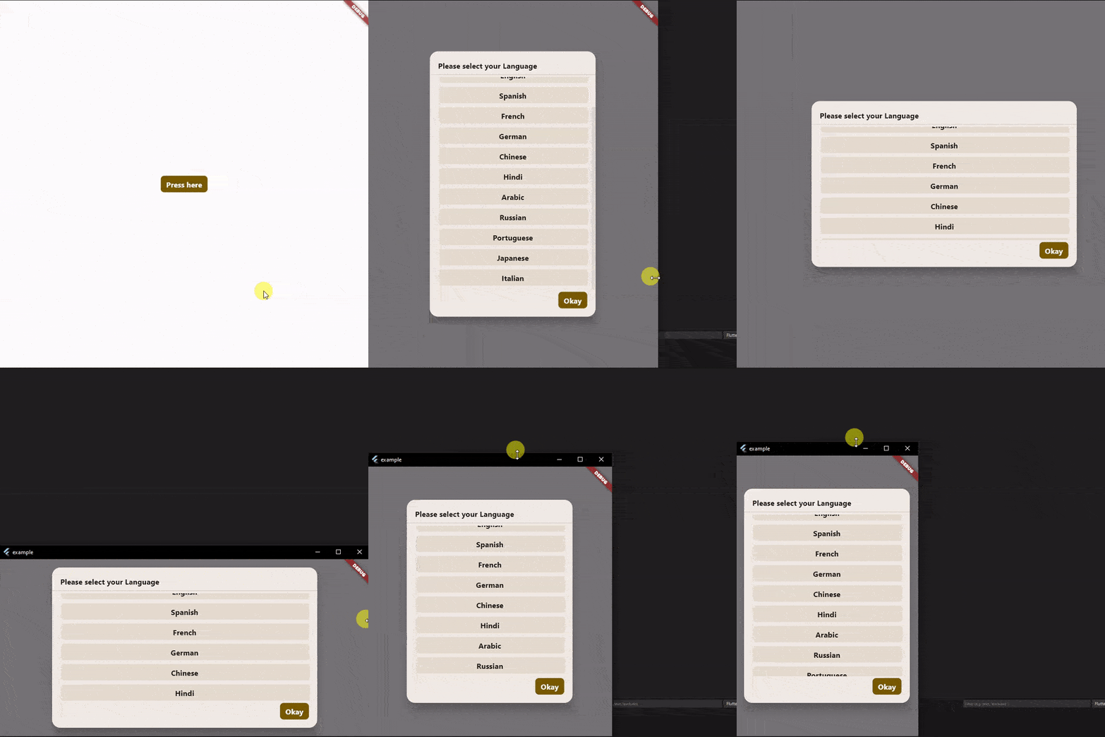
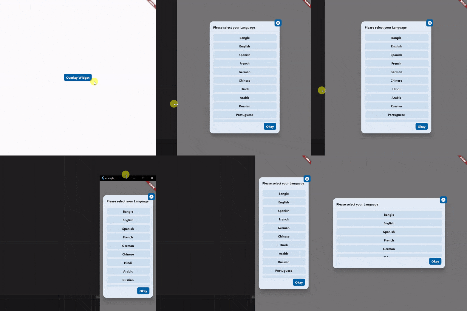
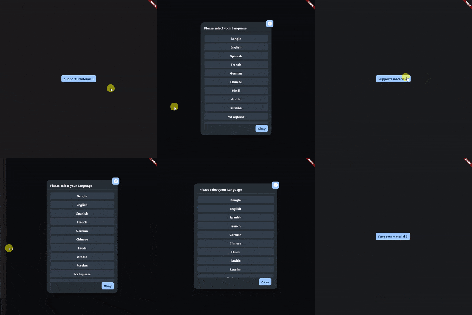
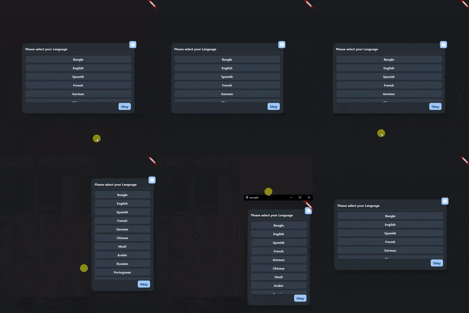
An awesome popup widget that fulfills all your demands in dialog.
- Material 3 supported
- Responsive
- Easy to use, No extra support is needed
To use the on_popup_window_widget widget in your project, follow these steps:
-
Install the widget according to the instructions on the install page
-
Just use this code to add
showDialog(
  context: context,
  builder: (context) => OnPopupWindowWidget(
    title: const Text("This is the title"),
    footer: const Text("This is the footer"),
    child: const Text("This is the child"),
  ),
),- Want to add a close button at the top-right corner of the window? Just use
overlapChildrenproperty. You can add as many widgets as you want. It also supports positional widget, so you can place widget anywhere you want.
showDialog(
  context: context,
  builder: (context) => OnPopupWindowWidget(
    title: const Text("This is the title"),
    footer: const Text("This is the footer"),
    child: const Text("This is the child"),
    overlapChildren: const [
      Positioned(
        right: -10,
        top: -10,
        child: Container(
          width: 50,
          height: 50,
          color: Colors.blue,
          child: Icon(Icons.cancel, color: Colors.white),
        ),
      ),
    ]
  ),
),- Want to use as a widget, so you can use your Dialog box as your requirment? Just use
OnPopupWindowWidget.widgetMode.
OnPopupWindowWidget.widgetMode(
    title: const Text("This is the title"),
    footer: const Text("This is the footer"),
    child: const Text("This is the child"),
),


