Skip to content
New issue

Have a question about this project? Sign up for a free GitHub account to open an issue and contact its maintainers and the community.

By clicking “Sign up for GitHub”, you agree to our terms of service and privacy statement. We’ll occasionally send you account related emails.

Already on GitHub? Sign in to your account

[Feature Request] Update our UI to match the current YT app #1740

Closed
jerryn70 opened this issue Sep 21, 2018 · 5 comments · Fixed by #2907
Closed

[Feature Request] Update our UI to match the current YT app #1740

jerryn70 opened this issue Sep 21, 2018 · 5 comments · Fixed by #2907
Labels
feature request Issue is related to a feature in the app GUI Issue is related to the graphical user interface

Comments

@jerryn70
Copy link

Currently we are on the old UI style of yt app. The UI of YT app has changed a lot . We need to change our "Trending page" style and whats new "Whats New" page style to match the current YT app.
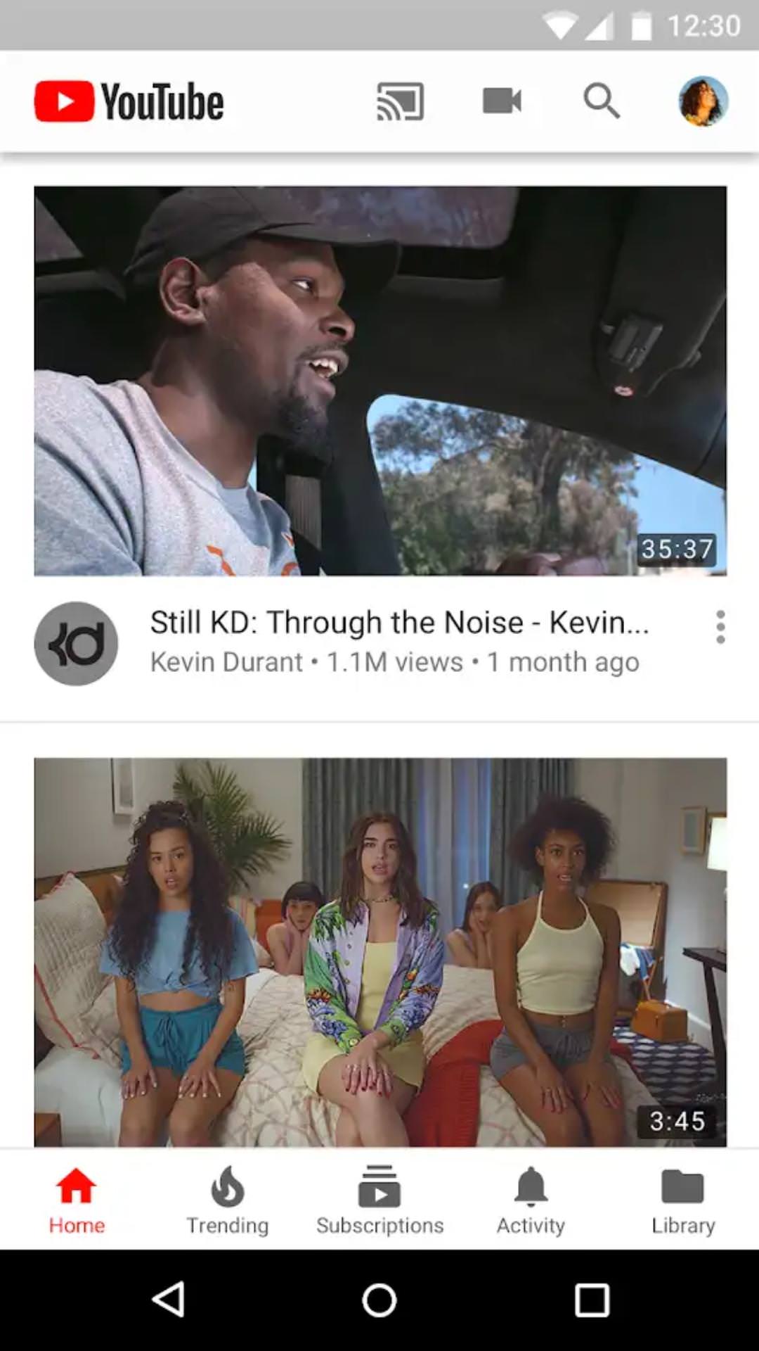
In Newpipe app videos in the trending page and What's New page is displayed in small size (small preview) we need to change it big size like this the screenshot.

@MaX-Lo
Copy link
Contributor

MaX-Lo commented Sep 23, 2018

For me personal, I like the current layout in NP. You get a lot of information while the elements are still neatly arranged.

@trymeouteh
Copy link

I think the light theme could be better by making the black text ontop the red elements be white instead but it is a minor issue. And I do prefer NP UI over YouTube since it is simple.

@ghost
Copy link

ghost commented Dec 21, 2018

I like original YT UI because some people play videos by only see thumbnails.

@Serkan-devel
Copy link

But I think YouTube uses twice as much band with as newpipe with all the autoplaying thumbnails which gets really annoying

@Stypox Stypox added feature request Issue is related to a feature in the app GUI Issue is related to the graphical user interface labels Aug 28, 2019
@seniorm0ment
Copy link

seniorm0ment commented Nov 13, 2019

But I think YouTube uses twice as much band with as newpipe with all the autoplaying thumbnails which gets really annoying

I personally +1 for video previews, but I think it should be a toggle on or off feature for people who don't want it.
As far as GUI layout, I do kinda prefer Newpipes more.

@B0pol B0pol linked a pull request May 10, 2020 that will close this issue
Sign up for free to join this conversation on GitHub. Already have an account? Sign in to comment
Labels
feature request Issue is related to a feature in the app GUI Issue is related to the graphical user interface
Projects
None yet
Development

Successfully merging a pull request may close this issue.

6 participants