-
Notifications
You must be signed in to change notification settings - Fork 4.3k
New issue
Have a question about this project? Sign up for a free GitHub account to open an issue and contact its maintainers and the community.
By clicking “Sign up for GitHub”, you agree to our terms of service and privacy statement. We’ll occasionally send you account related emails.
Already on GitHub? Sign in to your account
Navigation block overview #17544
Comments
|
As a way to keep the initial design and scope simple, I've come to this problem with a few initial assumptions up front:
With those things in mind—and knowing that these assumptions will need to change as we progress—I've worked up the following design for a very simplistic (but also very useful) Site Navigation block. |
|
Thanks for putting that together @shaunandrews, it's a really big help being able to see the whole process. One thing that seems different from most of the discussion I've seen recently is the Previously it's been discussed that this would be a normal block appender, and there's some work underway on #16708 to make the button insert the menu item directly without showing the inserter menu. It'd be good to get a steer on which approach we want to take. (cc: @mtias) |
|
@shaunandrews this is awesome. Thank you! Could we explore submenus / item nesting as well? From the above it is unclear how that will work. Also @mtias as Dan said above, that appender / inserter is its own thing, very different from the default provided by InnerBlocks, we need to reconcile somehow these differences between the niceties we could do in the block and implementing it with generic system components. |
I did work some time ago in Gutenberg that allows you to create a fully bespoke appender. It's not set in stone any more. You can pass any component you like. |
|
Good eye @talldan. I omitted discussing it in depth because I thought the flow could be easily accommodated with a small tweak: clicking the plus would always insert the menu item first, and the search interface would be invoked from the newly created item (automatically), not the + itself. Does that make sense? The only way I'd keep the + opening an inserter is if we used the actual inserter to choose among "page", "post", "link", "category" entities. As a general guideline, the (+) should insert an item immediately or open the block inserter. We should avoid appending custom interfaces to it. |
|
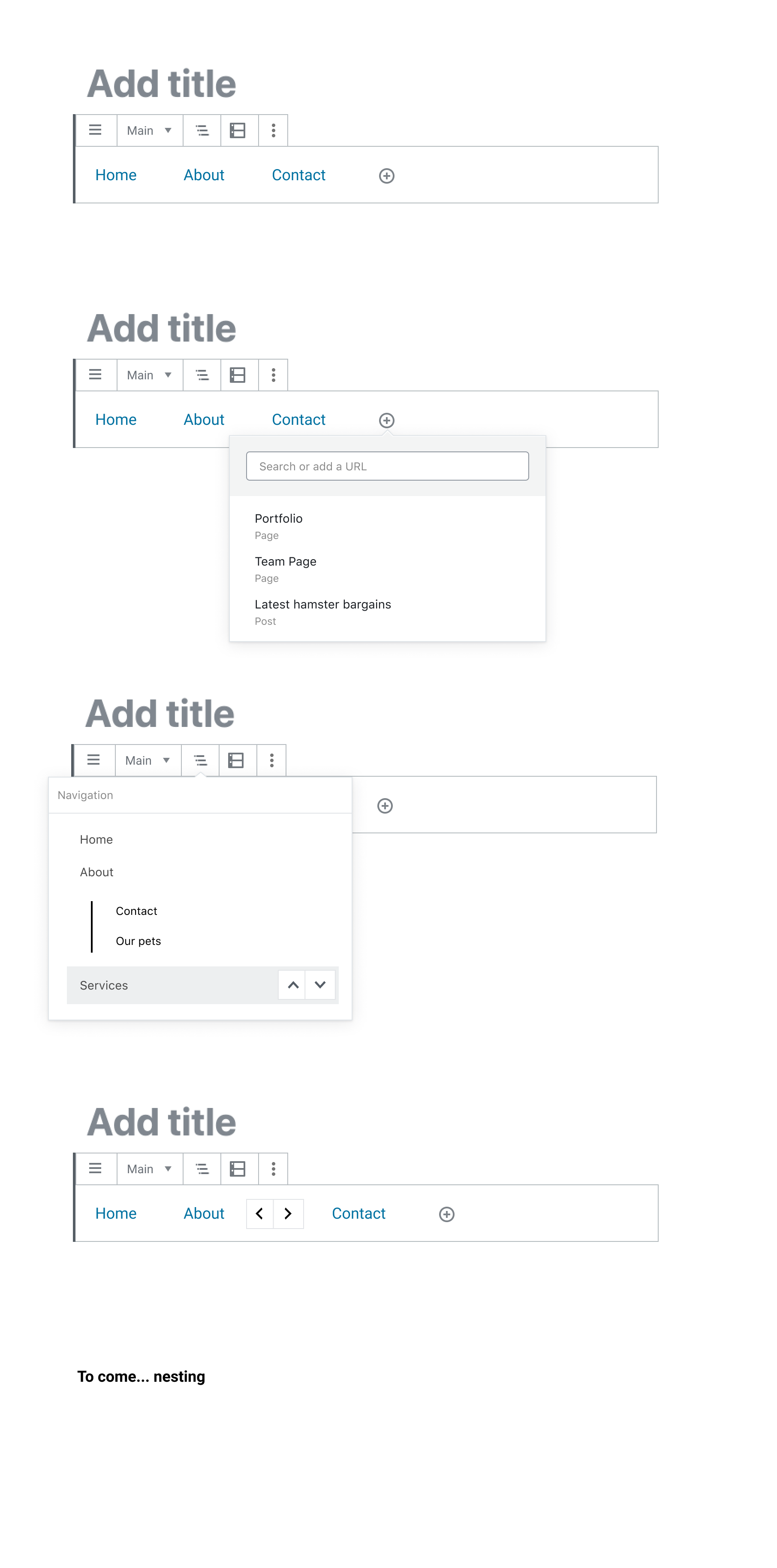
I spent some time collating the current state of navigation into a single Figma file (I will try and keep this up to date). https://www.figma.com/file/cUho7Ont8qqJN06hr8z9Wp/Navigation-Story-So-Far?node-id=3%3A3 It's super rough and involves a lot of Frankenmocks, but it's a good check. First, the separate parts: Note, right now we don't have a decent mock for nesting so that needs to come. Here are the current mocks being iterated on: I also did a rough collection of every state of the block (not including customization). Note the design is to be iterated but think of it as showing sketch structure for now. A final collection is the current state of the simplified block being explored by @shaunandrews: |
I can update the design to match this, but I'm curious why? Adding the menu item immediately means that users then have to delete it (which can be confusing) if they choose to not add a new menu item. To me, this discourages the behavior of exploring how the block works, and mixes up the defined pattern for the + button elsewhere. |
|
I sort of fall in the camp of the '+' icon inserting menu item first. That said, there is some exploration with the link interface will tie back to this. For me the current flow makes sense to simplify into this:
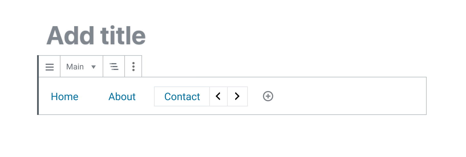
I am not convinced we even out of box need 'more' or other things in toolbar. I know discussion has been around having toggles/formatting there. I think if we can get a simple prototype that will come. For example (I left more just incase): If we all agree on that we can then move into exploring a few things we need to:
On those things, I am also going to look at making summaries like this because I feel checking in on the states will help us move forward. |
|
Closing this out as the MVP described in the issue has shipped in Gutenberg 7.0. Follow-up issues can be found using the [Block] Navigation label or the Navigation block project board. A huge thank you to everyone here for all the hard work! |


This is an overview of the work required to complete a first iteration of the Navigation block. The block is currently in a functional state but needs lots of polish at both the block and framework level.
There's been lots of previous discussion about the Navigation block: #13690, #16821 and #16974 contain the bulk of it. As we turn our attention towards shipping a v1, let's consolidate high level discussion into this issue and more specific technical discussion into the issues linked below.
Overview
The Navigation block defines the menu area and contains all of the menu items. In its toolbar is a Navigator button for accessing the Block Navigator. Menu items are added using the mechanism for adding child blocks (+).
Each menu item is a child block. In its toolbar is a Link button for changing where the menu item links to via the existing
URLInputcomponent. Menu items can be nested within each other forming submenus. When a menu item is selected, its child menu items are displayed.Menu items can be re-ordered using the existing block mover controls which will be restyled to look visually similar to the movers in the Gallery block.
URLInputThe
URLInputcomponent will be updated to allow the easy selection of a top-level page.Block Navigator
The Block Navigator will be updated to allow blocks to be re-ordered via up/down buttons.
Tasks
URLInputin toolbarFuture tasks
The text was updated successfully, but these errors were encountered: