-
Notifications
You must be signed in to change notification settings - Fork 4.3k
New issue
Have a question about this project? Sign up for a free GitHub account to open an issue and contact its maintainers and the community.
By clicking “Sign up for GitHub”, you agree to our terms of service and privacy statement. We’ll occasionally send you account related emails.
Already on GitHub? Sign in to your account
Edit Site: Spinning up a variation on any given template #19259
Comments
|
This is a tough one because I believe there will be more opportunities for this flow as we build out more features around templates (like a mosaic view and template part library, etc). Proposal i1My first proposal uses the block toolbar to duplicate a Template. There are some caveats as I have made some assumptions by moving both the template selector and the page selector part of the template block toolbar (instead of the top toolbar). However, I believe the core of this flow could be the same regardless of where those selectors end up. ScreenshotsBenefits:
|
|
This is a good approach so far! One thing that stands out to me in general is the issue of template hierarchy, and that it's not something average users should need to understand in order to use full-site-editing effectively and easily. With that in mind, I wonder if the "Save Template As" option could be a set of possible options (based on the custom post types that are currently registered). For example, instead of allowing people to call the templates anything they want, maybe a list like this should be available to them:
Ideally I think this should be some kind of engaging UI that clearly indicates which templates fall under which Custom Post Types. I don't think a simple dropdown menu will be enough. |
@johnstonphilip I see what you're saying. We may need the user to specify what type of page it is. That's interesting. I wonder if that is necessary or if any template could be used for any page. @mtias, could you please shed some light on this? |
|
After some back and forth iteration on this with @shaunandrews, here's where I landed at the end of today. Proposal i2This is primarily an iteration on the Template menu. It shows the current template and useful actions one could take with that template including "Duplicate," "Rename," and "Browse templates." It does not include template parts. There is already two methods for selecting template parts via the Navigator and by directly selecting them. It's still possible to include them, but to me, feels unnecessary and distracts from the focus of the menu. I also tried a variant with the added ability to change what page the user is on. I'm not entirely sold on it and it comes with its own set of issues for another... issue. |
|
Thanks for keeping with the high fidelity mockups! I've said it before but it deserves repeating, it makes for SUCH better conversation when you have something clear to look at. In this case I think the duplicate/rename actions are really interesting, and would be nice to explore keeping in a section of that dropdown. But I do find myself missing some of the pieces of #20470, including the template parts. Specifically, when the dropdown says "Home", to me it suggests that not only should "Home" also appear in the dropdown, but it should appear next to other menu items of the same DNA, i.e. other template parts. The idea being when you pick another template part, that's what becomes the label in the dropdown — after a reload of course. The additional actions can still be there if necessary, but they need to be cordoned off. By the way the bold indicator for active item is a step up from what I have, but is there any way we can make it even more clear that it's active, without showing a checkmark like in the preview dropdown? Specifically, here's what I have currently, and it's bad :soblol: |
|
I have to note a concern I am starting to have of multiple dropdowns revealing information on the screen. I understand why we are doing this, but it's important to think about what is crucial information and what is ok to hide. We might be ok right now still, but it's a slope I'd caution against going too far down. I understand why we are including duplication but repeating 'home' to me seems not needed. If it is needed to indication what is active then the treatment where it shows should reflect that. For example "Template: Home". I do prefer having this over having the template actions under 'save' which I just saw in another issue. Along with this, I would like to add a +1 to iterating on the active state. |
|
@MichaelArestad, I think the UI has changed a bit since the last round of mockups, can you provide something more recent for review? |
|
@mapk Sure! Here's a minor update showing what we could do now: In the future, with some enhancements to the sidebar, we could potentially move template switching and some of the actions out of this menu. |
|
Thanks, @MichaelArestad! I think we'll need to re-label "TOOLS" though. We use that word to describe too many other actions in the UI. Maybe we use "ACTIONS"? |
|
@mapk Yeah. Maybe Actions would be better. I'm also adding "New Template": Updated mock: |
|
@MichaelArestad are we changing direction here to work these into the sidebar menu from #23939 ? |
|
@mapk eventually, yes. I'd like to see these actions exist there. Particularly the duplicate action. |
|
Michael, your latest mock highlights the need for better systematization of where icons are located in the menu item component. When you have a moment, I'd love your thoughts on #23552, which puts them on the right. |
|
@jasmussen I agree. I wasn't proposing an icon location as much as iterating on what exists in that menu. That did get me thinking about systemization so I'm mocking up a few things and posting on #23552 . |
|
@MichaelArestad Do you think these settings would be more in line with the center-of-the-toolbar document settings explored in #20877? |
|
@noahtallen I wouldn't say "more in line." Equally in line, yes. These settings are somewhat flexible as to where they end up as they are menu items. I would very much prefer we go with the centered single document settings menu being explored in #20877. |
|
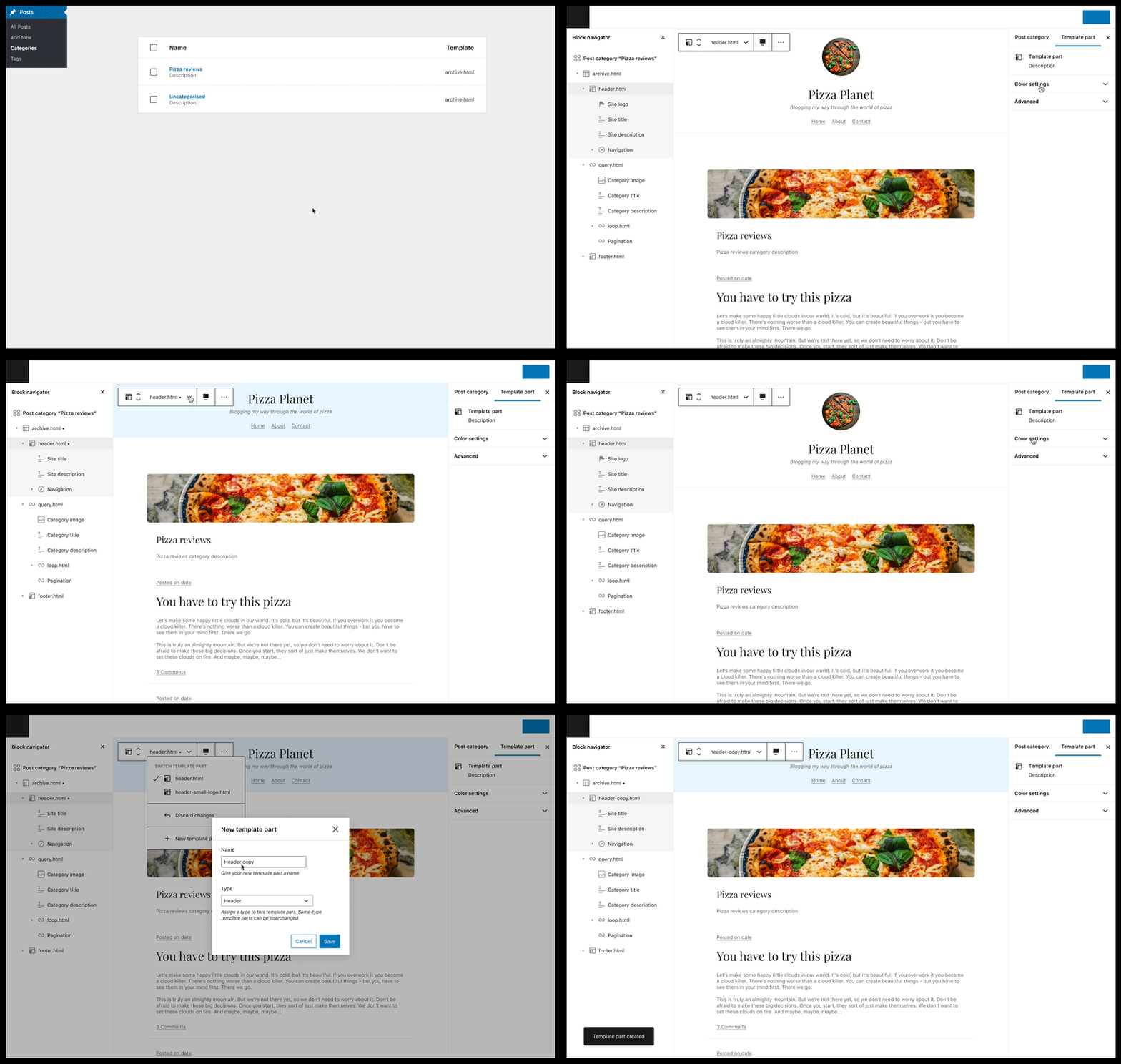
I've recently been exploring how we might bring the post category edit experience to the block editor, and this issue obviously features heavily in that experience. The interesting thing about that flow in particular is that it becomes possible to edit content and templates at the same time. So with that context I'd like to share another option that is - I think - more inline with @MichaelArestad's i1. Considering that this functionality is not unique to the top-level template, and will likely need to be applied to template parts as well, I think it makes sense for the following operations (and perhaps more) to be local to the selected template or template part:
Here's how editing the header template part - while editing a post category - might look: Note: The edit sequences (changing the background color and removing the site logo) were shortened. Clearly, it is possible for an author to miss these actions - change a template or template part, and save their document without understanding the global reach of their changes. So I believe this interface (or something very similar) should also be surfaced during the save process. Most likely this would align with the multi-entity saving efforts (#20474). I think this flow could also work as a part of #20477 as well - assuming it will be possible to edit templates from mosaic view. |
|
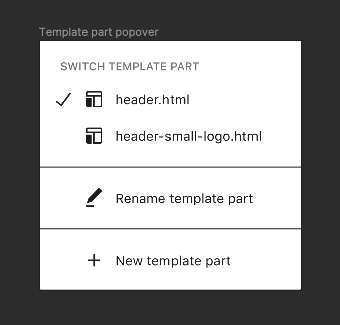
@jameskoster Nice! What led you to add template part switching functionality there? It could definitely work. It makes renaming the template a little less seamless, but maybe the trade-off is worth it? I'm not sure how common template part switching would be as the context of template parts can vary. It would almost be like replacing a paragraph with an image. |
It seems to me that in many cases where template parts are rendered and clickable in the editor - particularly when editing templates themselves - there should be an affordance to rotate between available template part variations. E.g. I'm creating a template for a specific post category that is initially based on the standard archive template - with this pattern it is easy to switch the base header template part with something else, or even create an entirely new header template part if I need to. I'm not sure how seamless template part renaming needs to be? It doesn't strike me as a regular activity. It could perhaps live alongside the other actions in the popover? |
I agree that ‘Actions’ as a label seems to reflect more what’s in there. However, I suggest renaming ‘new template’ to ‘create new’ to align the actions with the same grammar style. |
I don't think this would have to affect renaming; You could still click the name label itself to edit, and the arrow to open the menu. That said, I wonder if it would make sense to use the existing transform UI to list out compatible template parts? |
what would it mean for an existing template part to be compatible?? |
I considered the transform tool, but felt it was perhaps inappropriate for this behaviour because it does a fundamentally different job - transforming one block type into another. It's a technicality of course - and perhaps something that is lost on the end user - but after switching a template part... it is still a template part, just a different type of template part 😆. This particular action (template part switching) felt one level removed from changing the block type as it is local to the active block. Conceptually it feels more akin to the style tool, but that isn't right either. That's what led me to a different pattern. I didn't want to undermine the transform tool or obfuscate its purpose. It's very possible that I overthought this though, and the transform tool would in fact be fine. No strong feelings from me on that.
That is a very good question. I believe we can observe the semantic meaning generally applied to template parts in traditional theme / plugin building, and potentially use that to establish template part types, and consequently compatibility. Examples being things like headers, footers, content, and sidebars. Naturally we'd need to design a UI for this as well. Of course not all template parts will fit into these groups, and therefore not have any compatibility. I think that is fine though. |
|
Re:
#24990 adds a button on the toolbar to open the already existing Template Part search/preview that is already used in the Template Part placeholder. This could be a good starting point to iterate on in the future. As template parts expand with types this search/preview component could be updated to support that, and in the case of its use for an existing template part could initialize its search state based on the current template part's type. |
|
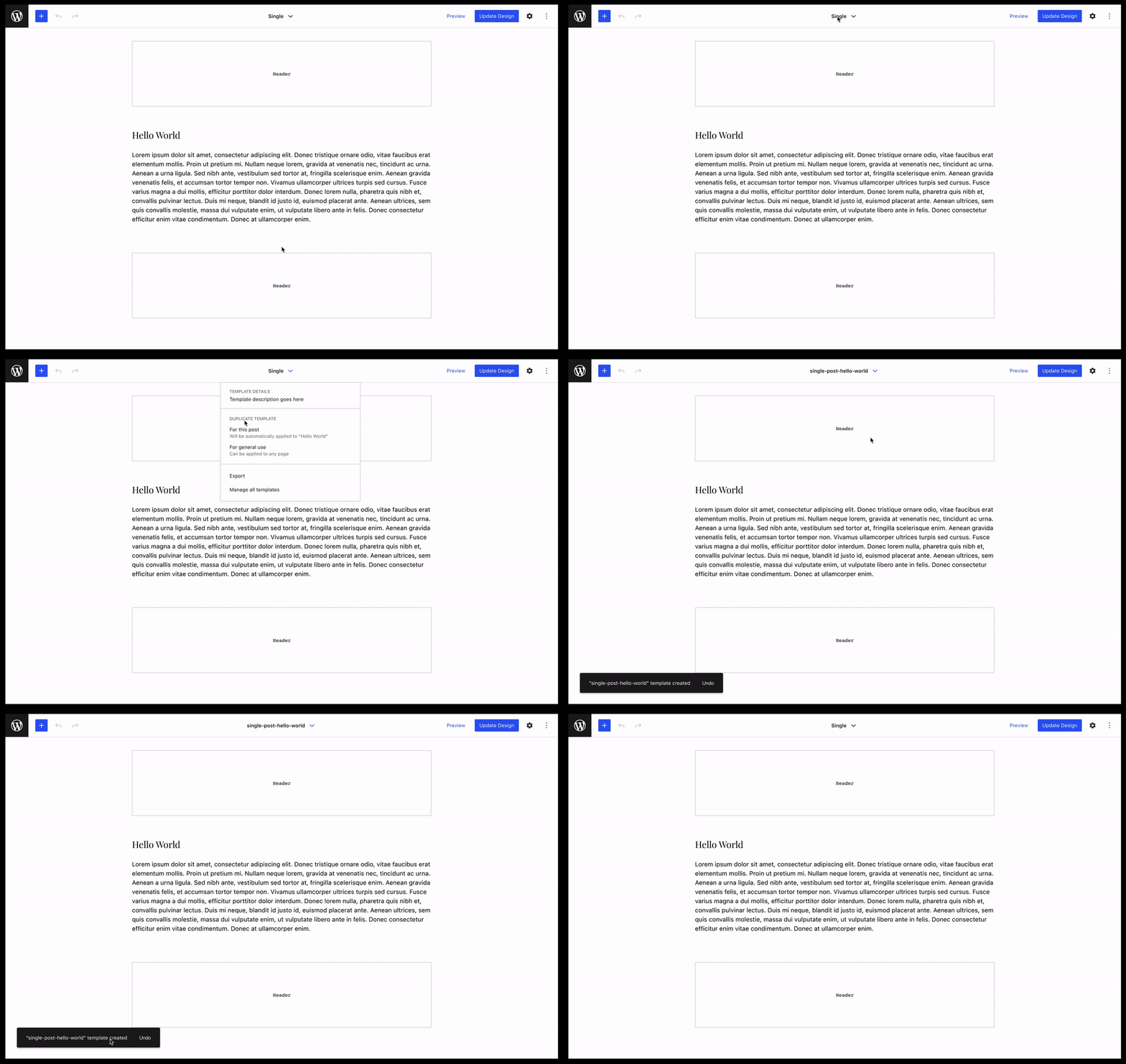
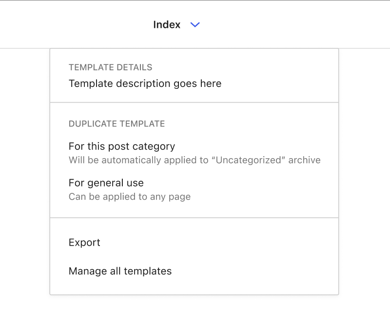
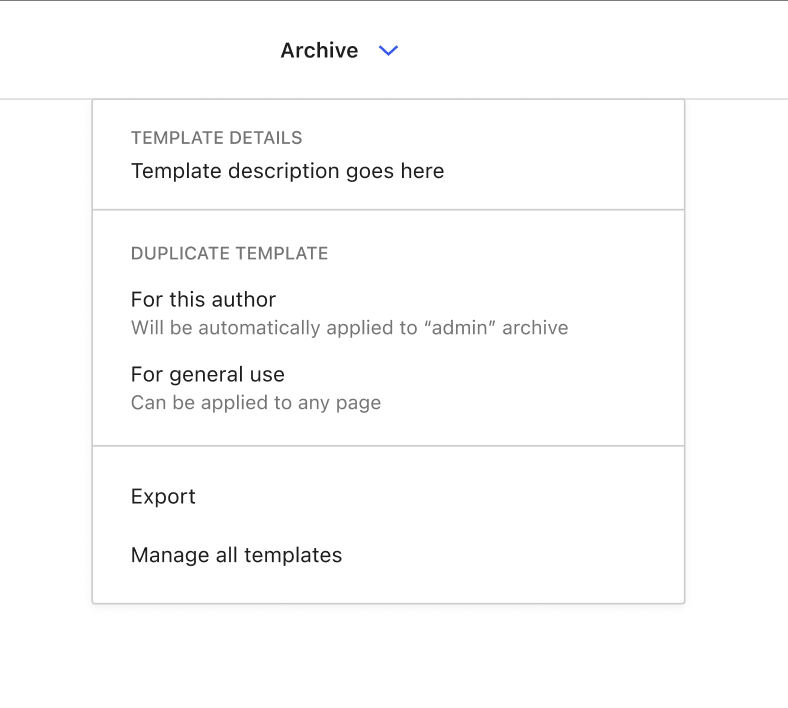
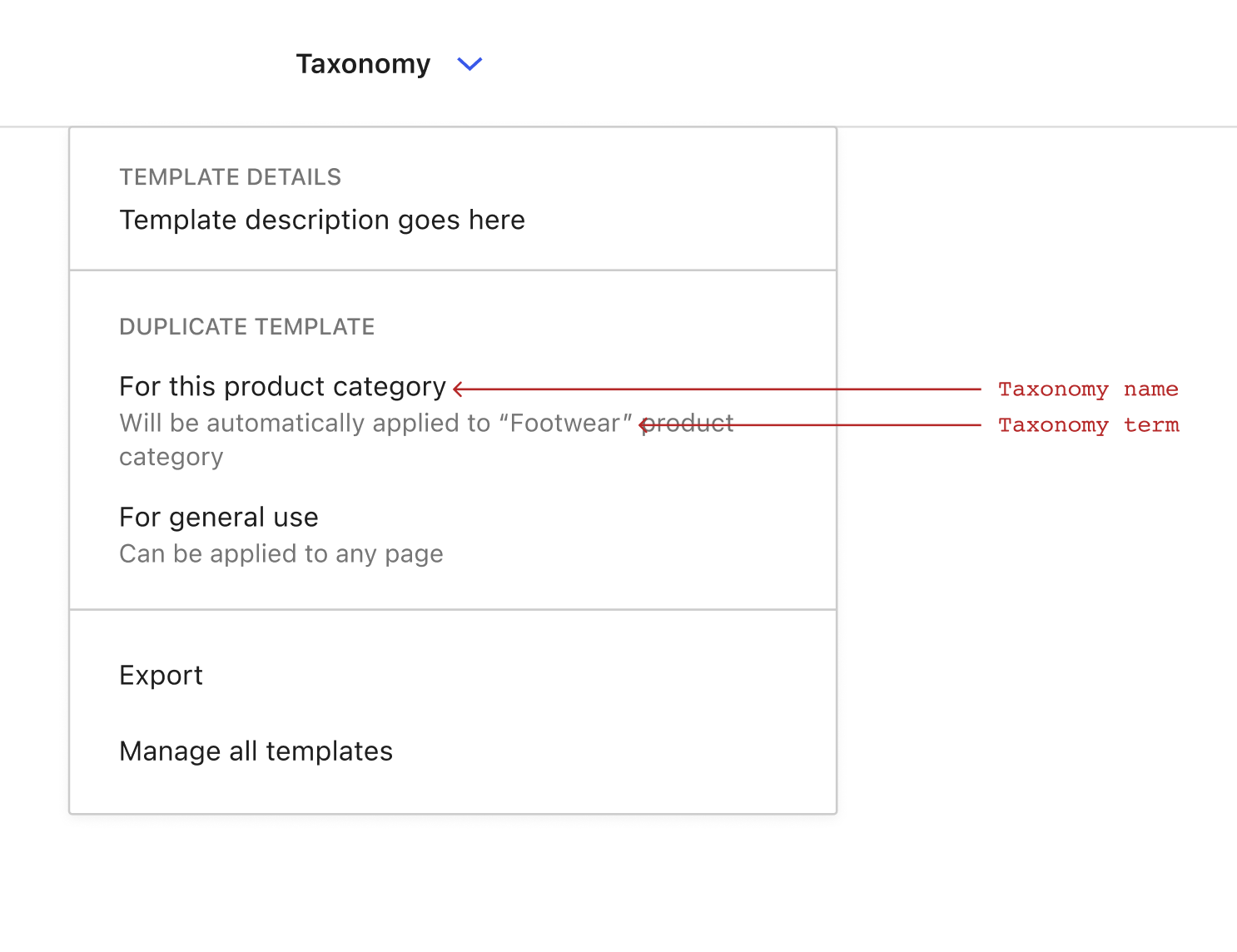
I think it's quite important that (at least for now) we only present the option to create template variations for specific contexts when we have a clear indication of the user intent for that content. This will help avoid complex UIs for selecting context when this is not apparent. The most reliable way to do this now would be to only offer an option to create a specific template when a user has loaded a data scope in to the template being edited. Example: I'm editing the Single template and have loaded the "Hello World" blog post as context. In this scenario I am able to quickly and easily spawn a new template specifically for my "Hello World" post. Here's how that might work: It should be noted that we can probably generate nicer template names than "single-post-$slug" :D This mechanism would allow folks to spin up template variations in a variety of different situations, albeit with slightly different labels on the menu item. Here's some more examples: Editing the Index template and loaded the "Uncategorized" post categoryEditing the Archive template and loaded the "admin" authorEditing the Taxonomy template and loaded the "Footwear" product categoryLike the template names themselves, I'm sure we can optimise the labelling on these menu items. Another use case to consider here is the idea of duplicating a template to create a new generic ($custom) template that can be applied to any singular content: Whether we implement the functionality to create both generic and specific templates initially is probably worth discussing. I imagine that either (or both) would form a solid foundation to build out more complex template variation creation in the future. Thoughts? |
|
Nice exploration! I think the "duplicate template for $entity" might be weird depending on how you switch the context. if you only switch the entity context via the preview button, it would be odd to mention the entity here (imo) The "duplicate template for general use" is interesting, because it would basically require the template to not have a slug so that it wouldn't be used anywhere. I think that is an interesting use case, but I do wonder what the "apply template to page" part of the interaction would look like, and where that ought to go. Would you be marking the template as a general template (e.g. telling it to act as the "singular" template), or overriding the template on a page? |
|
Yeah I'm beginning to think that entity switching should occur in the template menu. The general-use templates are an equivalent to the existing
You'd be creating a new custom template, and assigning that template to the content in question. The assignment is optional because you might want to create the template now, but not use it immediately. |
|
Re-iterating the design proposal and marking this as ready for dev :) When content has been loaded whilst editing a template, a "Create new template" section should appear in the template menu. For now, let's focus on adding a menu item there to create a template for the loaded context. IE if you loaded your "Hello World!" post in to the singular template you'd see this: In the future we'll likely add an option to create a new |





Once you are in a specific context within
edit-site(or a context has been loaded) there should be a way to create a variation for that specific context (if it'ssingular, asingular-{post-id}), if it's a monthly view ofarchiveadatetemplate and so on. This flow is decidedly more advanced, so it should be handled carefully and be easy to disable, but it should be possible.These templates would be saved in the CPT for the site's
wp_templatesdirectly.The text was updated successfully, but these errors were encountered: