Skip to content
New issue

Have a question about this project? Sign up for a free GitHub account to open an issue and contact its maintainers and the community.

By clicking “Sign up for GitHub”, you agree to our terms of service and privacy statement. We’ll occasionally send you account related emails.

Already on GitHub? Sign in to your account

Graded Assignment-1 (Jan Term 2023) :- Visualization Critique #1

Open
Jimmi-Kr opened this issue Jan 23, 2023 · 36 comments
Open

Graded Assignment-1 (Jan Term 2023) :- Visualization Critique #1

Jimmi-Kr opened this issue Jan 23, 2023 · 36 comments

Comments

@Jimmi-Kr
Copy link
Collaborator

For the graded assignment 1, find a simple, stand-alone, static visualization and write a short critique on: How effective is it at what it aims to do? What works well and what doesn't? What could be better? (See Week 1, Part 7 lecture video for a briefing of the assignment)

Make your submission as a comment. It should contain:

  • Title of the example with one image (add URL reference if it is online)
  • Short critique (could be in paragraphs or bullet points)
  • You can edit or update your comment up until the submission deadline but do not make multiple comments. If your GitHub username is not your actual name, include it in the comment/comment title.

Here are samples (sample 1, Sample 2) of how this is to be submitted. Use examples that are not used in the samples.

@Chaitanya-Kumaria
Copy link

Title

Visualizing Cricket Data with Tableau

Student: Chaitanya Kumaria, B.S, 21f1000479

Article URL :https://www.edupristine.com/blog/cricket-data-visualization-with-tableau
Image URL :https://i2.wp.com/content.edupristine.com/images/blogs/cricket-data-visualization-with-tableau_3.jpg?ssl=1
image

POSTIVES

  • Comparison between players can be easily done by mere inspection of image, thus making making data accessible and helping in interpreting information
  • Boxes being in proportion to the runs scored makes it better
  • Economize the explanation

NEGATIVES

  • No Legends in the image, thus a newbie to cricket would find the numbers hard to interpret
  • Colour contrast on the heatmap should have been more prominent (like using green-red, then yellow-red)
  • Changes in box area are more prominent than the changes in the colour thus, can lead to conclusions based on runs scores, despite the preceding heading highlighting the comparison is on the batsman's strike rate
  • Text colour remains constant and size of the text also hardly changes making it hard for readers to read it

@aryab-sudo
Copy link

aryab-sudo commented Jan 28, 2023

The Biggest Companies in Brazil

Student Name & Roll No: Arya Bhattacharyya, 21f2000436

URL: https://www.visualcapitalist.com/the-top-10-biggest-companies-in-brazil/
image

Critique:

Pros:

  1. In my opinion an effective usage of space to convey additional useful information. For instance, when the pie sector is small (for companies like Santander), extra information is written outside the sector. However, when the pie sector is large, the information sticks inside the sector (like in the case of Petrobras).
  2. Pie Chart gives extra information in terms of the industry sectors that these companies serve in addition to the regular information about the market capitalization. This information is colour coded alongwith small symbols and hence makes it slightly easier to differentiate between different industry sectors. However, there are some cons in the colour scheme which we will come to in the cons section.
  3. There is a clear legend of the different symbols used in the pie which helps us with the differentiation of the industry sectors as mentioned in point 2. Without the legend, while the symbols are intuitive, the load on the reader would have increased.
  4. Companies are mentioned with their logos which also reduces the load on the reader. From personal experience, I have seen people being able to identify companies much more easily with their logos and relate them better in comparison to just their name in plain text.
  5. Since the sectors of the different companies are mentioned, the pie also indirectly aids the user to understand the share of each sector in the pie and get more out of the visualisation by getting some answers to questions like : "What is the most popular sector (amongst the top 10 companies) in terms of the market capitalization?", "What is the most common industry sector (amongst the top 10 companies) in terms of the number of companies present/operating in the same?", etc.
  6. While it was a good practice to pull the different sectors of the pie apart so that when companies operating in the same industry sector are side by side (for example Santander and BTG Pactual), their individual market capitalizations can be visualized in an easier way; there are still some cons which will be covered in the cons section.

Cons:

  1. The colour scheme could be better. It seems that the visualization team chose the colour green because Brazil is supposed to be having high amounts of green cover. However, with three different shades of green used, a wrong message could be conveyed to an inattentive reader (or one who is short on time and just quickly moves on), for instance: "Perhaps all the greens are related to each other in some way or the other. Or perhaps they manifest a certain idea/concept at different levels, with the darker shades signifying a more intense manifestation.". In reality, however, we see that the green sectors are very much different from each other and don't seem to have any relation to the previously mentioned "wrong messages".
  2. Given that the industry sectors are colour coded, it would have been better to have all the companies of the particular industry sector side by side so that an idea of the share of the particular sector could be obtained visually. Currently, the same has to be done mathematically by taking the numerical values.
  3. When we use pie charts, we tend to break down a whole into its parts. In this visualization, it is not very clear why a pie chart has been used. That is because it doesn't seem to work very well with the title of the visualization in place. The intention of this visualization can be said to be outlining the top biggest companies in Brazil. For the same, a bar chart of their market capitalizations could have been better in my opinion. That is because there is no "whole" here which needs to be broken down into "parts" because the title of the visualization is not something like "Market Capitalization shares of the top 10 companies in Brazil".
  4. As in point 3, we have already discussed in the lectures as well that understanding 2D data visualization is more difficult that 1D data visualization, especially when the data itself is 1D in nature. Here, the market capitalization is the major data of interest and can therefore said to be 1D in nature. Hence the use of area (as in the pie chart) instead of the length (as could be in a bar chart) is detrimental to conveying the information lucidly. Traditionally, in pie charts, the angle covered by the pie sector is taken to be an indicator of the contribution of the "part" to the "whole". However, here, the angle covered by the pie sectors is the same throughout. The change is in the length of the protruding part of the sector, further supporting the claim that the data is 1D and the pie is not the right element of choice.
  5. Adding to point 4, visualizations in my opinion must be in sync with numerical values. From the pie, can we say that the pie sector containing "Vale" (Market Capitalization of $73.03B) could fit in three pie sectors of "Rede D'or Sao Luiz" (Market Capitalization of $23.79B) ? This is not very clear. Again, a bar chart would be a simple and effective way to do away with this problem.

@Chirag-Goel-17
Copy link

Chirag-Goel-17 commented Jan 28, 2023

Mens football worldcup revenue and cost

Student: Chirag Goel , 21f2000540

Article URL : https://www.economist.com/graphic-detail/2022/11/18/is-the-world-cup-a-giant-waste-of-money

image

CONS:

  • The x-axis step value of 2 may not provide a clear enough picture of the data, as it does not show the data points as frequently as a step value of 1 would. To give a more accurate picture, the step value can be reduced to 1.
  • The chart may not be useful for years with small revenue and cost differences as the chart may not show the data clearly.
  • The chart doesn't show the impact of ticket sales, merchandise sales, and other ancillary revenue on the overall revenue and cost.
  • The chart may not provide a detailed breakdown of revenue and cost by source, making it difficult to identify which areas of the tournament are most profitable or costly.

PROS:

  • The chart provides a clear picture of the data, especially when the difference in revenue and cost is not large.
  • The net amount is clearly displayed on the right side of the chart, making it easy to understand the overall financial performance of the tournament.
  • Using different colors for revenue and cost helps to clearly distinguish between the two.
  • The chart can be used to track progress over time, making it easy to identify year-over-year trends in revenue and cost.

@deekshaChutani
Copy link

Comparison of various dog breeds

Student Name: Deeksha Chutani; Roll Number: 21F1002583

Visualization URL: https://informationisbeautiful.net/visualizations/best-in-show-whats-the-top-data-dog/

image

PROS:

  • The visualization is fresh and appealing.
  • A large number of dog breeds have been included making it easy for viewers to compare and also learn about various breeds.
  • The 'quadrant system' used is eye catching.
  • The data is color encoded based on the nature of the dog breed. Further, the direction in which each dog is facing is dictated by the breed's perceived intelligence. There is variation in size as well. These work well for differentiating between the dogs and make it simple on the eyes.
  • The parameters used to calculate the data score(as mentioned in the visualization) are appropriate.

CONS:

  • Due to a large number of breeds, many breeds are overlapping each other making the visualization cluttered.
  • Although the parameters for data score calculation are mentioned(i.e. intelligence, longevity, costs etc.), the exact scoring methodology has neither been explained nor has any relevant link been provided so as to understand the same.
  • The x-axis has not been explained in detail.

@Devjyoti-Chakrabarti
Copy link

Name: Devjyoti Chakrabarti
Roll Number: 21f1006240

URL: https://www.economist.com/graphic-detail
URL: https://www.instagram.com/theeconomist/?hl=en

Instead of a particular visualization, I want to consider the entire class of charts that are published in the newspaper, The Economist. I do so because there is a distinct consistency in how these charts are plotted and structured which makes these visualizations rather appealing and easy to understand. Despite covering a plethora of topics, these charts are lucid, and to the point, conveying all necessary information in a straightforward manner. Consider the below visualization as an example;

URL: https://www.instagram.com/p/ClgrWOKOSjh/
Title: Over 1.3m people are under medical observation in China
image

The chart has a basic title, “Over 1.3m people are under medical observation in China” and the short descriptive title, “Covid-19 close contacts under medical observation*,2022,m”. This is immediately reflected in the line chart which rises to 1.3 million people, on the Y-scale which is on the right-hand side instead of the conventional left side. So it becomes clear that the number rose to that specific value. The font is easy to read and the colour scheme is simply black, grey and red. The months are labelled with the starting letter of the month's name, making the chart concise and directing attention straight away to what the chart is trying to convey and the overall message of the chart.

The beauty of this design is how a similar pattern with a notable preference for line and bar charts (which are the easiest to read and understand quickly), and simple colours are consistently followed throughout all their visualisations as can be seen from the 2 URLs given at the top of the comment. Another observation about why these charts are appealing is that the chart titles match the message of the chart and guide the viewer naturally to that message. For instance, in the below line chart, the title highlights the growing dissatisfaction with family doctors and correspondingly in the chart, the line for GPs is in red while for the other types of doctors the lines are in the faded shades of grey. Thus through this subtle choice of colours, the message is highlighted for the viewer.

URL: https://www.economist.com/britain/2023/01/09/general-practitioners-are-a-big-part-of-britains-health-care-crisis
Title: Britain’s dissatisfaction with family doctors is growing fast

image

This is not to say that all of the Economist visualizations are perfect. Charts such as the one shown below are inherently complex and it takes time to completely understand and absorb the data that is being shown. But by being consistent in design principles, colour scheming and chart structure, the Economist becomes an exemplar for understanding the nuances of good data visualisation techniques.

URL: https://www.economist.com/graphic-detail/2023/01/03/americas-117th-congress-accomplished-a-lot-so-did-its-recent-predecessors
Title: Major laws passed by Congress

image

@jaidevd
Copy link

jaidevd commented Feb 3, 2023

Name:    Jaidev Deshpande
Roll No: 21F1003751

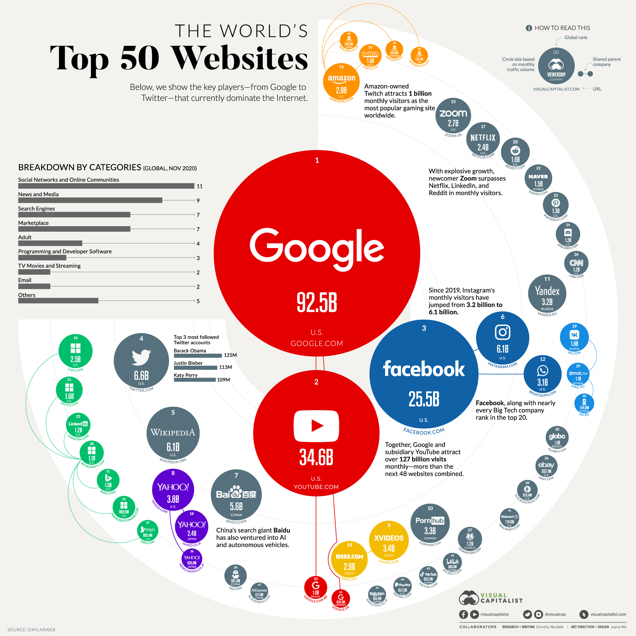
The World's Top 50 Websites

(Click the image for a higher resolution version)

Source: https://www.visualcapitalist.com/the-50-most-visited-websites-in-the-world/


Making a good first impression

At first glance, this infographic, published in 2021 by Visual Capitalist, looks attractive and interesting. The designer does a good job of balancing different colours - the ones chosen are pretty, while not being excessive. The title, too, is fairly prominent - I quickly get a clear idea of what this is about. The designer aptly chose to annotate each bubble with the iconography associated with each website (as against simply using the name of the website). Doing so seems economical. Notice the second and the fourth largest websites - one does not need to read the names “YouTube” and “Twitter” in order to understand that these, respectively, are the second and the fourth largest websites in the world. Their logos are iconic enough.

Each bubble contains the number of views / visits - which provides a scale by which to compare two websites. Speaking of comparisons, however, the graphic does make the classic mistake of implicitly asking users to compare sizes of circles. If I was narrating this visual to someone over a phone call, I would have said “Google is not only the largest website in the world, it is the largest website by far. It is nearly three times as large as the runner-up, YouTube.” Now, this statement, and especially the 3X factor between YouTube and Google, can only be inferred by reading how many billion clicks these websites have. The sizes of the circles don’t help a lot when comparing sizes, as we know well. As I continue to read the graphic, when I reach the fifth most popular website (Wikipedia), I realize that the bubbles have become too small for their sizes to still be meaningful. At this point, the size becomes a distraction, and I’m left simply reading the contents of each bubble. Perhaps a different visual scale (or even a numerical one - e.g. comparing the logarithms of the number of visits) would have been more suitable.

Diminishing utility to the point of becoming annoying

It’s not only the bubbles that hamper the readability of the chart. Following the largest sites in sequence - Google, YouTube, Facebook, and then Twitter and Wikipedia - is easy. But once I reach smaller and smaller sites, I find it increasingly difficult to locate the next biggest website. Suppose I am currently looking at the sixth largest website - Instagram - which is located approximately to the horizontal right and vertical center, right next to it’s parent company, Facebook. From here, I need to find the seventh largest website. I know by now that looking for the next largest circle is pointless. So my only option is to look around the graphic randomly, hoping to catch the 7th ranking website somewhere by chance (the 7th largest website is Baidu, located in the bottom left quadrant - there is no reason why it should be there and not closer to Instagram). At this point, I’ve given up reading the chart from the perspective of ranking websites, and I start looking for other visual cues that may provide more information.

In the background are three quarters of a circle - like a doughnut with its top left quadrant cut off. The moment I see this “ring”, my first instinct is to run my eyes around it in a clockwise fashion - from the 12 o’clock position to the 9 o’clock position. This reaction comes naturally to me - as naturally as I would read a vertical bar chart from bottom to top, or a horizontal one from left to right. This reaction is not rewarded with any new information. The 3/4th doughnut also has lightly coloured concentric rings within it - so I try to see if their radii mean anything, but this too is misleading. Ultimately, as a design element, the “ring” is wasted.

Summary

The only other aspect of this infographic that I find useful is the bar chart in the top left quadrant, which shows the the grouping of websites across categories. It’s a straightforward, no-nonsense bar chart that gets the job done. Unfortunately it doesn’t make the remainder of the infographic more palatable. For example, I see from the bar chart that “Programming and Developer Software” is a popular category of websites (fourth from the bottom of the bar chart) - but I have no way of figuring out which specific websites fall within this category.

In summary, it seems to me that the designers took a lot of effort to convey smaller, less relevant details of websites (e.g. websites belonging to the same organization are clustered and even colour coded), instead of simply focusing on doing what the title promises - ranking the top 50 websites.

@cheriangeorge
Copy link

Name : Cherian K George
Roll Number : 21F1002142

Visualizing the Scale of Global Fossil Fuel Production ¹

global-fossil-fuel-production-infographic_scaled

  • The juxtaposition of the the large cubes representing fossil fuel volumes and one of the world's tallest buildings serves to shock and awe the general population, abstracting away the calculations to make an effortless visual comparison.
  • Comparing the height of the Burj Khalifa with the height of a cube representing a given volume of fossil fuel is extremely misleading as the scale of reference is totally different. Hence a fallacy of inconsistency has been committed in the infographic - False equivalence - Colloquially "comparing apples and oranges." This fallacy might have been mitigated by having bigger Burj Khalifas instead of the cubes - This would have preserved the volume-height relationship in the comparison.
  • The original data was aggregated in terms of weight (eg: 8 billion tonnes of coal in 2021). In order to translate weight into something visually perceptible, the authors multiplied average densities for coal and oil and the compressed volume of liquefied natural gas. This volume was used create the cubes in the infographic. However the volume of the Burj Khalifa has not been considered in this comparison.
  • Now, it would be grossly inaccurate and misleading to visually compare the weight of coal, oil or natural gas and the weight of the Burj Khalifa (The weight of the empty building is 500,000 tonnes.) So trying to quantify and compare these three natural resources using an alternate frame of reference might help a viewer visualise and perceive the vastness of these quantities², since it is quite hard to comprehend and grasp large quantities in general.
  • The presentation of the graphic in 2-point perspective also creates a mild Ponzo illusion - the human mind judges an object's size based on its background.
  • While the quantities of crude oil, liquefied natural gas and coal have been aggregated geographically and chronologically to represent the total quantities in the whole world during the whole of 2021, the quantity represented by the Burj Khalifa in the infographic is not derived from a similar aggregation. So this would be like comparing the total volume of wood of all the trees in the world grown during the whole of 2021, with the volume of the Burj Khalifa.

Citations

  1. Govind Bhutada, Clayton Wadsworth, Christina Kostandi. 2023. "Visualizing the Scale of Global Fossil Fuel Production" Visual Capitalist, January 31, 2023.
  2. Bourgeois, Mark. 2019. "Your Brain’s “Law of Large Numbers”" Oratium, June 14, 2019.

@ayushpatidar14
Copy link

Name: Ayush Patidar
Roll No: 21f1004981

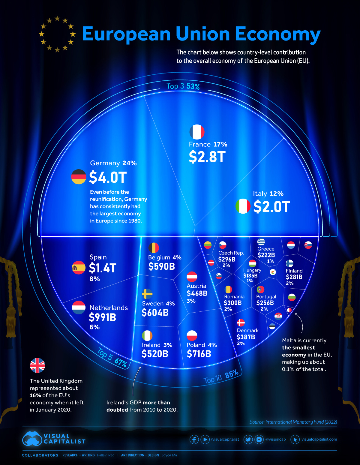
The $16 Trillion European Union Economy

European Union Economy Visualization Image

Source: https://www.visualcapitalist.com/16-trillion-european-union-economy/


This chart was published by visual capitalist in January, 2023. It shows the contribution of all member countries to the $16 trillion economy of European Union (EU). All together, 27 member countries make up one internal market allowing free movement of goods, services, capital and people.

Pros:

  • Top contributors to the EU economy can be easily identified at a glance.
  • Total contributions of top3, top5 and top10 countries is highlighted by forming clusters.
  • Use of country's flags along with the names makes it easy to locate certain countries.

Cons:

  • Chart does a very poor job of showcasing share of individual country in the overall EU economy. A simple pie chart would have conveyed the information in a much better way.
  • Areas occupied by countries are not to scale. It gives a wrong impression of how big an economy is?
  • It is really tough to follow economies in order from biggest contributor to the smallest.
  • Labelling of the chart is also poor. For small economies, chart conveys neither country's name nor it's contribution. Thus, skipping the main information that it should convey.

@nithish050497
Copy link

nithish050497 commented Feb 5, 2023

Name: Nithish Arram
Roll No: 21f1003498

An Internet Minute In 2021

Article Url: https://www.visualcapitalist.com/from-amazon-to-zoom-what-happens-in-an-internet-minute-in-2021/

Capture

Source : https://www.visualcapitalist.com/wp-content/uploads/2021/11/data-never-sleeps-9-1.0-1200px-1.png

This is published on Visual Capitalist describing the data generated in a minute on Internet in 2021, As the world hit by pandemic and everything went online, this shows the usage of different applications online in 2021

  • The visualization used above creates Interest in users as a clock format is used which is inline with the topic
  • It is nice that they have mentioned the units/ metrics used along with the numbers for each application7
  • The symbols or icons used are explanatory of the service provided which helps users who is not aware of that brand
  • The trend of Internet population across years is shown below to mention the increase of usage of Internet

Suggestions

  • The visualization is color coded, but it doesn't convey any specific use of it, Instead a common color could be used for applications in same category
  • The trend line shown below is also color code but doesn't imply any measure, so a common colour can be used for the trendline
  • Similar colours are used in both the trendline and the image above which can create a confusion
  • A common measure across companies could help to compare
  • Instead of Companies, comparing categories could help in comparing user usage across them.

@SURAJARS
Copy link

SURAJARS commented Feb 5, 2023

Name : Suraj ARS
Roll No : 21f1005229

Five cats looking around a field. URL:https://public.tableau.com/app/profile/fennsk/viz/MLSSalaries/MLSPUDashboard

The graph doesn't convey lot of information as stacked bar chart is used for this problem.We can see in each team the player's salary for MLS(Major League Soccer) tournament this is conducted in United States.This chart is hosted at Tableau, which is one of the modern visualization software suites. It appears to be a user submission. Alas, more power did not bring more responsibility.Sorting the bars by total salary would be a start.The colors and subsections of the bars were intended to unpack the composition of the total salaries, namely, which positions took how much of the money. These pictures doesn't make any information for the given data.We see that multi colours used for each small rectangle.The x-axis is represented as salary given to players.And two stacked bar charts are present in one image.The main problem is the important information are in small font size.In some teams the two players are present top and below in one barchart.

Suggestions

  • We can plot the graphs separately.
  • We can plot the bar chart for each team.So,that it can convey the information well.
  • We can use piechart also for representing player's salary.

``

@NinoLeenus
Copy link

Name : Nino Leenus
Roll Number : 21f1001786

Visualizing Layoffs at Prominent Startups Triggered by COVID-19
Article URL: https://www.visualcapitalist.com/layoffs-prominent-startups-covid-19/

image

PROS:

• Easy to visually understand as the aera of circle depicts how many employees are laid off from each company due covid-19 in from March-11 to May 26.
• Clear labelling about company name, % of lay off, number of employees fired provides a faster understanding.
• Color scheme is simple, does not distract viewer.
• The diameter of circle gives a relative idea on number of people laid off from each company.
• The objective of the topic is clearly represented. There is additional information at the bottom for the colours used and details in circle despite not needing one, the visuals are pretty self-explanatory. The additional information about the companies, Industries are useful.
• There is no overlaying of data as each position is uniquely occupied making the data free of confusion
• Scale on each axis is the same and all scales are aligned.
• Source of the data is mentioned.

CONS:

• The positioning of circles is in no specific order. A better labelling about month or week in each segments will give a clarity on trend on layoff.
• Colouring of circles can be better. Uber has laid of 25% employees while deliv has fired 100% of its work force. The diameter of the circle shows the number of people affected which masks the severity of percentage of layoff in a company. Probably usage of red colour for higher percentage firing would be helpful to alarm about the company.
• Past data of wework presented in the corner is irrelevant.
• Brief about a few companies were mentioned with in the diagram which shows lack of consistency.
• This graph is an excellent representation for a limited data representation. However, for an year’s data with more companies included the similar visualizations may look clumsy.

@HarshithaSrikanth
Copy link

Name: Harshitha Srikanth
Roll Number:21f1004861

PERCENTAGE OF CHOCOLATE ICE CREAM LOVERS ACCORDING TO AGE GROUP

image

Link:https://www.slideteam.net/blog/tweak-it-to-work-it-10-golden-rules-for-data-visualization

What has been captured well(The pros):

  • The aesthetics and visual appeal of this representation deserves a 100/100 for the "drooling, ice-cream length proportional" representation of the inference.
  • The results have an inherent ordering to them(descending order) making it easier to interpret and comprehend.
  • The representation is not cluttered with too much data or too many results and hence does not distract the viewer from the important information to be conveyed.
  • Visual representations carry with them the power of better retention: People are more likely to remember information when it is presented visually, compared to when it is presented in text and numbers.
  • This representation is the perfect example of how data can be presented to a lay-man such that it does the job and communicates the important information by simplifying some complex ideas.

What could have been captured better(The cons):

  • The length variations between the various representations is extremely mild making it hard to differentiate the percentages.
  • Pictographs can be engaging, but they can also easily mislead the audience when they are not drawn to scale and this is a classic example of the same.
  • None of the data points have their unit of measurements alongside them which is a major flaw in the representation.
  • Too many images or large images such as in this case can slow down the load time of a visualization, making it difficult for users to access and understand the information.
  • No information on the sample or on how the data has been collected has been mentioned which makes us question the reliability of the inferences.
  • Various other spurious variables such as liking towards other flavours of ice cream or health conditions that dont permit people of age category 60-80 could have been elicited.

@yatinchug01
Copy link

Name: Yatin Chug
Roll No: 21f1007066

ChatGPT search interest worldwide

image

LINK: https://genuineimpact.substack.com/p/2-new-charts-search-and-chatgpt

ChatGPT seemingly knows enough about most things to write academic essays, debug code, and explain quantum mechanics in a way that my physics teacher never could. Now more than ever the question of when, not if, AI will replace jobs is at the forefront of people’s minds.

  • Trends shows the top 5 countries with the largest search interest in ChatGPT are China, Nepal, Singapore, Israel & Lebanon. USA comes in at 29, and UK all the way at 34!
  • Trends also shows us the first major uptick in popularity came at the end of November, and it only took 1 month to reach peak popularity by January.
  • It is very clear from the Map the top countries using ChatGPT and testing withe various questions.
  • The visualization used above creates Interest in users how this AI platform grows very fast.

Suggestions:
It can be make more attractive if the numbers of searches were mentioned in the bar graph along with top countries.By that we can compare the difference in serches of consecutive countries.
Due to large number of countries have almost same color, we can't differentiate from this.

@mukeshonlinesiitm
Copy link

mukeshonlinesiitm commented Feb 8, 2023

Name: Mukesh Kumar Singh
Roll No: 21f1000350

Topic: The Top 100 Most Valuable Brands in 2022
URL:"https://www.visualcapitalist.com/top-100-most-valuable-brands-in-2022/"

image

This is published on Visual Capitalist describing The Top 100 Most Valuable Brands in 2022.
By just seeing chat it is easy to identify that Apple is top spot on the ranking as the world’s most valuable brand, with a total brand value of $335.1 billion.

What I liked:

  1. It is nicely presented that it covers top 100 brand in a single visualization with good clarity.
  2. The circle are designed to graphs from larger Valuable Brand to smaller Valuable brand.
  3. Colour are well defined inside circle to distinguish by Sector wise.
  4. Circle are well define by Name, Logo and country of Brand and Legends are given which help any layman to read very easily.
  5. In below the chart some descriptive statistic are provided which gives some useful insight like “Over past year Tiktok has triple its brand value”.

Suggestion for improvement:

  1. Circle are designed with order number but order are not maintained in sequence so that it make difficult to find 5-15 valuable brand as user need to search where is 5 or 6 or so on.
  2. During segregation by Sector it is not well cover within the sector percentage for example Automobile and Media & Telecom cross the segregation by Sector.
  3. Country are defined in side circle but is hard which country have most of brand of this chart. If some mixed colour are defined to distinguish country it will be very attractive.
  4. Area of circle are not well draw which can lead which has more brand value than other. Also sometime it feel that size of circle are chaning for the given sector.
  5. Colour combination with text can be improved for better readability.
  6. Brand Value can be inside the circle for better readability. Currently brand value $350.3B looks the value of Apple until user will not looked the rank of Apple.

@SamandeepSinghTomar
Copy link

Name: Samandeep Singh Tomar
Roll Number: 21f1001112

Cyber Threats Infographic: Evolution and Prevention

image

Source: CIV April Grant – U.S. Navy Information Technology Magazine
URL: https://www.euriun.com/infographics/cyber-threats-infographic-evolution-and-prevention/

What works well:

  • The use of colorful illustrations and clear labeling effectively categorizes and highlights the different types of cyber threats. This makes it easy for the reader to understand and remember the information presented.
  • The use of statistics and data helps to drive home the message about the severity of these threats and reinforces the importance of taking cybersecurity seriously.
  • The infographic is visually appealing and engaging, making it more likely that people will take the time to look at it and understand the information presented.

What doesn't work well:

  • The text in the infographic can appear small and difficult to read, especially for those with visual impairments. The font size could be increased to make it more accessible.
  • The So appearing pie chart is not labelled with the actual percentages, making it difficult to determine the exact proportions of each type of threat. Including the actual percentages would make the information more precise and meaningful.
  • The infographic does not provide any concrete advice or action steps for people to take in order to protect themselves from these threats. This information would be valuable for readers and could be included in a future iteration of the infographic.

What could be better:

  • Increased font size and improved layout would make the infographic more accessible and easier to understand.
  • The inclusion of actionable advice or steps that people can take to protect themselves from cyber threats would be a valuable addition.
  • Including the actual percentages would make the information more precise and meaningful.
  • Including additional information on each type of threat, such as a brief description or example, would provide more context and help readers to better understand the information presented.
  • The inclusion of additional statistics and data on the impact of these threats could further reinforce the importance of the issue and drive home the message.

Summary:

In conclusion, the infographic is effective in presenting information on cyber threats in a visually appealing manner, but some aspects of its design and presentation could be improved to make it more accessible and informative.

@puvvadasaikiran
Copy link

puvvadasaikiran commented Feb 9, 2023

Name: Saikiran Puvvada
Roll Number: 21f1005095

America’s 20 Biggest Tech Layoffs Since 2020

by Avery Koop at Visual Capitalist

image

Above Graphic illustrates the Biggest layoffs done by American Companies within their workforce due to Forecasted Economic Slow down as well as earlier layoffs related to pandemic

What's Great:

  • Effort put into make the graphic
  • Motivation to show how many people are affected by layoffs

What's not Great:

  • Isometric visuals are hard for humans to choose as a reference to compare
  • even recognizing firms logo within the graphic makes bit of an issue
  • Inclusion on percentage of workforce affected might provide a better picture

Conclusion:

  • Complicated effort to present a basic info
  • can be made with simple bar chart for better interpretability

@cautiousgodzilla
Copy link

Name: Arvind Sankar
Roll No.: 21f1002061

A 'Shot Graph' of Kei Nishikori

Tennis players often like to know where they hit their shots from and the trajectory of the ball once the shot is hit. On the basis of this information, players may adjust their game plan and consider redesigning their training regiment to improve their game. For instance, if the player is uncomfortable hitting backhand crosscourt (i.e. diagonally across the court) shots from a certain position, the player may include drills to improve that stroke. Correspondingly, by looking at the opponent's data, the player may be able to anticipate the direction in which the opponent may hit the ball if said opponent is in a certain position of the court, and accordingly change their game plans for the match.
The following 'Shot graph' was prepared using data from matches between Kei Nishikori and other top players like Federer, Djokovic, Murray and Wawrinka.
image
Source: Damien Saunder, Tennis Mash, 'Kei Nishikori's critical Shot Charts, 18th February 2016.
URL:https://tennismash.com/2016/01/18/kei-nishikori-shot-charts/

The 'Shot Graph' provides:

  1. The shot position is indicated by the blue dots located at the left end of the court.
  2. The ball bounce position is indicated by the blue dots located at the right end of the court.
  3. The length of each red line represents the average length of each shot.
  4. The position of the end of each red line represents the average bounce position of each shot.
  5. The thickness of the red lines indicates the frequency (number of shots) from a particular part of the court, with thicker lines indicating a higher frequency of shots.
  6. The percentage of shots played into each part of the court is also represented.
  7. The total number of shots played from a particular part of the court is also indicated.
  8. The percentage of forehands and backhands played from a particular part of the court is also shown.

Critique

How effective it is:

  • The shot graph effectively coveys Kei Nishikori's preferred shot position during a match. The graph also shows correlation between the shot position and the trajectory of the ball hit by Kei from that shot position.
  • The graph shows insights on Kei's favourite/successfully executed shots for a given shot position, thereby allowing him to assess risk while making shots on the court.

What works well:

  • The ball landing distribution very clearly indicates the direction in which Kei is likely to hit the ball from each shot position.
  • The thickness of the line, the number of shots hit, and the percentage of shots being forehand or backhand, very helpfully provides information on how likely Kei is to successfully execute a shot in a certain direction given the shot position.
  • The end of each line also present the average ball landing position, instead of making viewers estimate the same based on ball landing distribution.
  • The text and the legend on the left allow the reader to quickly understand the data and accordingly form conclusions from the same.
  • The graph uses a typography and design that is visually pleasant to see and analyze.

What doesn't work:

  • The line does not provide an indication of the type of stroke used. For instance, it is likely that the strokes hit from grid boxes at the end of the court were slices, i.e. ball carrying an underspin. It is also likely that most strokes on the forehand side are topspin strokes while a mix of topspin and underpin strokes on the backhand side.
  • The graph does not account for different types of opponents. For instance, Federer and Wawrinka are aggressive players while Djokovic and Murray and relatively defensive players. It is possible that there were shorter rallies when playing with aggressive players and longer rallies with defensive players, thereby causing the data to be skewed. Further, it is also possible the shot positions were more scattered when playing against aggressive players and more concentrated near the baseline against defensive players.
  • The graph does not take into account approach shots and volleys hit near the net, and limits itself to shots hit between 10-15 feet from the baseline.

What could be better:

  • The lines could be coloured to indicate the type of stroke used, i.e. topspin, underspin or flat strokes.
  • Grid lines can be provided at the returning end as well to provide an indication as to where the ball landed on the court.
  • Separate graphs can be provided based on the type of players, i.e. whether they are offensive or defensive.
  • More grid lines/boxes can be provided to also show approached shots and volleys.
  • The thickness of each shot line can be modified to allow viewers to see the distribution of ball landings clearly.
  • The graph can also show shots that resulted in unforced errors so that any correlations between shot position and unforced errors can be found, if any.

@codeswapnadeep
Copy link

codeswapnadeep commented Feb 11, 2023

Name: Swapnadeep Pradhan
Roll: 21f1002240

Chances of NDA Coming into Power in 2019

Ahead of the 2019 elections in India, India Today published an article to discuss the chances of Prime Minister Narendra Modi's NDA winning a second term. While NDA did win its second term, understanding its chances via the visual data is puzzling.

NDA
Source: Political Stock Exchange: Find out Narendra Modi's chances of second term (Apr 9, 2019)
URL: https://www.indiatoday.in/elections/lok-sabha-2019/story/political-stock-exchange-find-out-narendra-modi-chances-of-second-term-lok-sabha-elections-2019-1497239-2019-04-08

Overview:

The pie chart (devised as a speedometer) is divided into 3 – NDA staying below the 220 mark, NDA crossing the 250 mark, and NDA getting a majority. The probability is 9%, 72%, and 50% respectively.

Critique:

  • It’s ideal to use a speedometer chart in data visualization like this one (or a pie chart in general) when you have collectively exhaustive and mutually exclusive quantities. In this chart by India Today, none of the two is the case.
  • Commonly, a speedometer chart has just one pointer. However, the graphic designer here decided to feature two pointers – one point in-between the 9% and 72% probability, while the other points between the 72% and 50% probability. This clutters the chart and there is no way to be sure what the pointers are for.
  • It is very hard to make sense of the graph at first because it seems as if it is not to scale. The 50% probability of NDA winning a majority in the chart takes 50% of the space in the pie chart, but the 9% probability of the NDA staying below 220 seats, takes way more space than 9% in the pie chart.
  • When we look at the bottom corners of the speedometer chart it seems that this chart is a representation of the seats in the Indian Lok Sabha NDA is likely to win, and the prominently written probabilities are not what is described in the pie chart.
  • As we try to scrutinize this graph in more and more detail, it quickly becomes clear that this chart does not describe anything at all. If this chart represented seats in the Lok Sabha, then the majority mark i.e. 272 seats, would cover half of the pie chart. But in this chart NDA crossing just 250 seats covers more than half or exactly half of the chart, depending on the direction from which we start.

Conclusion:

  • Wrong type of chart chosen for the data it is trying to represent.
  • This chart describes nothing useful and may even confuse people, who would otherwise have the correct information from the article.

Disclaimer:

These are the views of a student just starting out on Data Visualization.

@ShagunDwivedi
Copy link

Asia's pollution problem is not just confined to China

Shagun Dwivedi
21F1001731

scatter-pop-density-pm25_-large--76af3dc859fb664f2efc5a191781e2e9
Here's the Source!

The visualization intends to show that more than 4.2bn people in Asia are breathing air that is many times dirtier than what's considered within the World Health Organisation's safe limit. It only takes into account areas that are populated to avoid skewing the numbers for countries such as China and Russia that have vast unpopulated regions.

What Works:

  • Color-Coded Bubbles: The bubbles are color coded by continent which helps in the particular context of differentiating Asia and the other continents.
  • Omission of High Density Countries: Omitting highly dense yet small countries like the Vatican, Macau and Singapore helps free up space they otherwise might have dominated.
  • Footnote with Abbreviations, Sources and Disclosures: Expanding the abbreviations and defining the condition for populated areas provides more clarity to the audience. Stating the sources and naming the countries omitted makes the visualization seem more trustworthy.
  • Well-Labeled and Ticked Axes: Evenly scaled, labeled and ticked axes, as well as gridlines, help in efficiently reading visualizations.
  • WHO Safety Limit Line: The safe limit line helps put into context how poor the air conditions are, which might not be that obvious otherwise.

What Doesn't Work:

  • Unlabelled Bubbles: Not even a single African country is labelled. Though all the bubbles can not be labeled, the majority of the bubbles here just seem like random circles.
  • Determining Population Size: Despite the reference scale for the population size, it's hard to determine what the population of a country might be.
  • Reference Circle for Population Size: Another issue with the population size reference circle is it goes from round numbers 50 and 300 to 1,397 (which might be a reference to the size of the Indian population but) it would be simpler to round it to 1,400 or 1,500.
  • Overlapping Bubbles: An issue inherent to any bubble chart, overlapping bubbles are hard to distinguish, but since Bangladesh is a huge outlier, other countries get even more clustered.
  • Bubbles on the Safety Limit Line: Is Egypt within the WHO safe limit or outside? It's unclear which point on/in the circle is in line with the corresponding parameter.
  • Color Contrast: The color scheme for Oceania, Africa and Europe are too similar, especially for smaller bubbles. The pollution in Asia seems worse, which might be attributed to the dominant color used, as compared to other continents with pastel colors.

Suggestions for Improvement:

  • Label a few major countries from each continent.
  • Reference circle for population size should reflect round numbers.
  • Explicitly state if the PM2.5 count for the country is at the centre of the bubble.
  • Use a color-scheme with better contrast.
  • Leave out outliers to make more space for the cluster of countries near the origin.

@kun101
Copy link

kun101 commented Feb 11, 2023

Kunal Chaturvedi
21f1003353

Infrastructural Vulnerability of Earthquake Prone Countries

29258
Source: https://www.statista.com/chart/29258/vulnerability-to-natural-disaster/

The visualization tries to present a comparison between different earthquake prone countries based on their infrastructural preparedness in view of the recent earthquakes in Turkey

Positives:

  1. The graph tries summarizes a lot of information concisely, into a short grid of information.
  2. The chart uses colour well to communicate a parameter with a negative value as a darker colour and a parameter with a positive value as a lighter colour
  3. There is a clear demarcation based on the listing of countries in determining the hierarchy of those listed.
  4. The different columns clearly mention the parameters on the basis of which the ranking has been done.

Negatives:

  1. The graph is shown as seperate blocks of parameters having different colours which doesn't specify a lot of information visually at a first glance.
  2. It is difficult to determine the exact meaning of "Lack of Progress" being "Very Low" due to the usage of double negation, whereas mentioning the progress as Good/Moderate/Poor would communicate the message more clearly.
  3. Lack of progress has an asterix mark over it which is referenced below, making the meaning of the headline unclear whereas it can be accomodated in the same title to show lack of progress in education/research/disaster prevention as mentioned.
  4. There is a lack of contrast, specifically between the high/medium colours and they seem to similar to be distinguished.
  5. There is a lot of cluttered text in the heading which doesn't allow the chart to be read very well at a first glance.

Suggestions:

  1. The coloured blocks of paramters (low/high/medium etc.) can be replaced by a spider chart or bubble chart to indicate countries with more risk having a larger area and the countries with less risk, ex Japan, as having lesser area.
  2. The columns instead of using double negation to display information should switch the graphic into green, yellow, orange and red colours to indicate progress or lack of progress.

@Pramoth-SK
Copy link

VC-Mobile-Data_V3
Name: S.K.Pramoth
Roll Number:21f1005796
Source: https://www.visualcapitalist.com/cost-of-mobile-data-worldwide/

THE COST OF 1GB OF MOBILE DATA IN EVERY COUNTRY

The visualization shows us about the cost of 1GB of mobile data in 155 countries.

What worked:

  • countries represented as flags instead of just names helps us to identify a particular country easily.

  • source of information and reason for the high/low prices in some countries are given in the visualization for better understanding.

  • representation of the prices as area of the circle makes it easier to compare with other countries.

  • top 5 most and least expensive countries are given in separate list for easy lookup(and it is positioned appropriately )

what didn't work and could have been better:

  • the x axis is underutilized, This visualization could have used the x axis to represent other data (like Total data usage per user).

  • below the 5 dollar mark the chart is cluttered with overlapping countries, which makes harder to read. grouping the countries into categories and representing it as a list on the side will solve this issue

  • This visualization doesn't make any relation with the population of the country, the minimum wage in the country or the speed at which the data is received. So it doesn't paint the whole picture and might be misleading in the terms of quality of the data provided.

@rajanways
Copy link

Name - Rajan Kumar
Roll No - 21f1006139

2023 Inflation Forecasts by Country

Source- https://www.visualcapitalist.com/mapped-2023-inflation-forecasts-by-country/
The Visualisation is about inflation Forecast by Country
2023-Inflation-Forecasts
What works:

  1. Putting all countries on a single map is a good idea.
  2. In few country Inflation is incredibly high.Visualisation creates a sense of urgency for those countries having rectangular box with maroon colour highlight.
    3.The data is quantitative. Easy to compare,so good to grasp in quick glance.

What doesn’t work/could be improved:

  1. Colour coding is little confusing and not very clear about those country which has extremely high inflation. All chosen colour is of same shade, so it makes difficult to highlight with critical country.
  2. No information about inflation drivers.
  3. All country name is not mentioned.
  4. Adding a big circle around the countries is unnecessary and drawing attention there again and again.
  5. Some country data is not given or missing.
  6. The data visualisation is static and not for dynamic data.

@midhuncrajan
Copy link

Name - Midhun Rajan
Roll No - 21f1006973

Visualizing the World’s Largest Oil Producers
Source-https://elements.visualcapitalist.com/largest-oil-producers/

image

This Visualization is about world's largest oil producers.

Pros:
The chart is in the shape of a barrel representing the oil producers
Quantity is flagged
The white border is quite strong and contrasting, which makes it easy to distinguish between different regions.
Use of supportive text within the map to indicate the highly recognizable location names. Elimination of the unnecessary geographical elements.
On first look, one can tell what this map is about.

Cons:
The grey border between countries are not so strong, so its little bit difficult to differentiate between countries
All the countries inside the same continent are not placed together.
OPEC countries are not grouped together
Shape of the region covered by a language is irregular and non-geometric

@jemma-mg
Copy link

jemma-mg commented Feb 12, 2023

Name: Jemma Mariya George
Roll no: 21F1001937

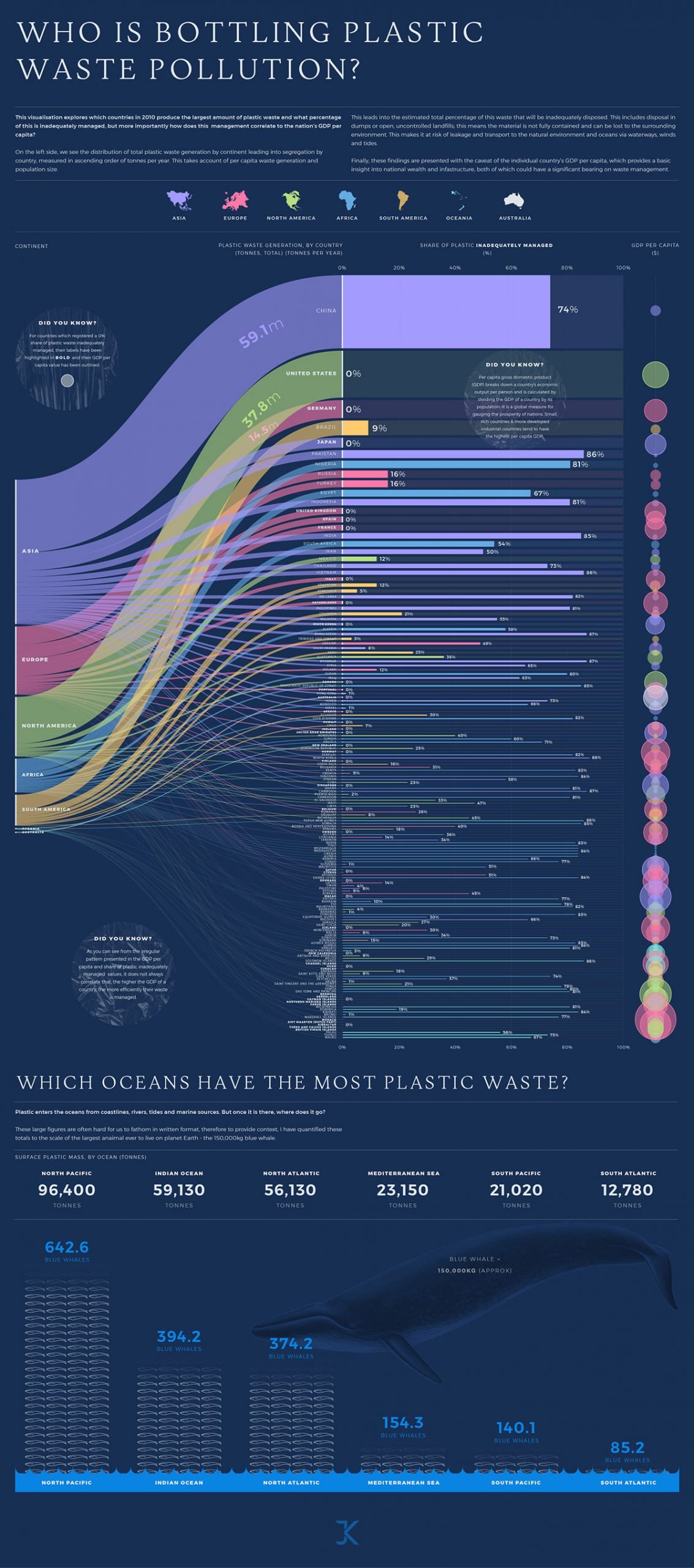
Plastic Waste Pollution

Plastic pollution in oceans

Source: https://www.behance.net/gallery/106936329/Plastic-Waste-Pollution-data-visualisation

This visualization estimates the percentage of plastic waste that was inadequately disposed of based on the continent-wise distribution of total plastic waste generation.


PROS

  • Share of plastic inadequately managed per country is represented using a horizontal bar chart.
  • names of the countries that report 100% of all their plastic waste handled properly are highlighted in bold.
  • compares per capita GDP to the area of a circle.
  • uses plastic textured bubbles to depict facts and conclusions
  • creatively depicts the plastic waste in the ocean by quantifying the weight of plastic with a whale in a bar chart.

CONS

  • The colors used in the diagram are not contrasting.
  • font size is less and hard to read.
  • confusing visual, the countries are arranged in decreasing order of plastic waste generation as well as grouped continent-wise.
  • hard to compare the GDP per capita due to overlapping visuals.

SUGGESTIONS

  • Combine countries with relatively less contribution to an 'others' category.
  • Avoid overlapping of graphics unless necessary.
  • Use readable font sizes and better contrast of colors.

@imaadansari1
Copy link

imaadansari1 commented Feb 12, 2023

Name - Imaad Naeem Ansari
Roll No - 21f1004808

The Future Value of Disruptive Materials

URL: https://www.visualcapitalist.com/the-future-value-of-disruptive-materials/
assignment

PROS:

  • The colours use in the diagram are following a harmony while still maintaining contrast between each other.
  • The different components in the diagram are well organized in a neat and cohesive manner.
  • The fonts used in the diagram are easy to read without straining the eyes.
  • The logos representing the use case of different materials are very smartly placed in the circle were there is enough space and out of the circle if the space is not enough.

CONS:

  • The market value of the minerals are in the shape of irregular polygons, which makes it difficult for the observer to compare the different mineral’s market values.
  • The diagram would have been better it was made using a basic Pie Chart.
  • In the bottom section of the graph, the annual growth rates are represented using solid semi-circles, which again makes them difficult to compare, a standard barchart would have done the job efficiently making it easy for the observer to compare the growth rates of different minerals.

@royjohn15
Copy link

royjohn15 commented Feb 12, 2023

World's Biggest Exporters

Roy John
21f1007054
URL:The World's Biggest Exporters
exporters

Pros:

  • The visualization provides a good overview of the export value of different countries of the world.
  • The use of color is visually appealing and is useful in identifying countries with high export value.
  • The transition from a dark to a light shade shows a decrease in the export value.
  • Countries are appropriately sized which makes it easy to identify the country with the highest (or lowest) export value.
  • The actual maps of countries are used in this visualization which is more aesthetically pleasing than a simple bar chart.
  • Each country is clearly labelled with its name and the export value.

Cons:

  • The visualization feels a bit cluttered with the maps of all the countries.
  • It is hard to find the countries with smaller export value as they are small in the visualization.
  • We have to look around a bit to find out further information from the visualization, like finding out the smallest exporter or finding out countries with more export value than India etc.

@21f1003953
Copy link

Title: Mapped: GDP Growth Forecasts by Country, in 2023

URL: https://www.visualcapitalist.com/mapped-gdp-growth-forecasts-by-country-in-2023/

image

CRITIQUE:

Pros:

  • The article provides a helpful visualization of the 2023 GDP growth forecasts by country, based on projections from the International Monetary Fund (IMF).
  • The article highlights some of the economic headwinds facing different countries, such as rising energy costs and inflation, and provides context for why these factors are impacting GDP growth.
  • The article includes some interesting insights on specific countries, such as China's predicted 5.2% growth and the economic vulnerabilities of European manufacturing sectors.

Cons:

  • The article is fairly brief and doesn't delve too deeply into the factors behind the GDP growth forecasts or the potential implications of these forecasts for different countries.
  • The article could benefit from additional context on some of the economic headwinds mentioned, such as why rising energy costs are impacting GDP growth and what factors are driving inflation.
  • The article could provide more guidance or recommendations for investors or advisors based on the GDP growth forecasts, rather than simply presenting the forecasts themselves.

@Laha-Dibyendu
Copy link

% Renewable Electricity Country wise

Dibyendu Laha

21F1006498

URL -Click here

Screenshot 2023-02-12 214733

Pros -

  • It conveys a lot of information in a single image, which is easy to understand and interpret.
  • The numerical values provide an additional layer of information and make it easy to compare countries quantitatively.

Cons -

  • The data points in the European region is too much cluttered which can lead to wrong interpretation.

  • The visualization does not provide any information on how the data was collected.

  • It also haven't mentioned what sources of renewable energy are included.

  • And it hasn't mentioned whether the data is up-to-date.

Overall, the static visualization is effective in presenting the data it aims to show, but could benefit from more information and interactivity to provide additional insights and facilitate more in-depth analysis.

@Saha-Sumistha
Copy link

The Largest Oil and Gas Companies in the World

Name - Sumistha Saha
Roll No - 21F1000276

URL - https://elements.visualcapitalist.com/the-largest-oil-and-gas-companies-in-the-world/

Largest-Oil-and-Gas-companies

The above static visualization displays the largest oil and gas companies in the world in terms of revenue, highlighting the top 20 companies using a pie chart.

What Works:

  • This static visualization is effective to describe the relative size of the top 20 companies in the world by showing their revenue using a pie chart.

  • Anyone can easily read and understand this chart for its clear labeling and a color scheme that distinguishes each company.

  • The accompanying text and company logos provide additional context and help to identify the specific companies.

What Doesn't Work:

However, the visualization has some limitations.

  • First of all it is not following the characteristics of a pie chart. The format of this chart is not helpful for readers to understand the distribution of the data quickly.

  • It does not provide any information on the impact of these companies on the environment or society.

  • Additionally, the visualization does not provide any interactivity or the ability to filter or sort the data.

Suggestions for Improvement:

  • To improve the visualization, it could include interactive features like revenue or country name that allow users to filter and sort the data easily.

  • Use a color-scheme with better contrast.

  • It could also provide more information on the specific sources of revenue for each company and their impact on the environment and society.

@shaifalivashistha
Copy link

Shaifali Vashistha
21f1003257
Title: The Daily Routines of Famous Creative People
Data_visualization_img

Reference URL: https://www.visualcapitalist.com/visualizing-the-daily-routines-of-famous-creative-people/

Aim of the visualization:

The visualization aims to provide insights into the habits and routines of successful and creative individuals. By presenting this information in a visual format, it makes it easier to understand and compare the patterns and similarities among different individuals and can provide inspiration and guidance for others looking to improve their own daily routines.

What Works Well?

  • Clear and concise information: The visualization is presenting information in an easily digestible format as a timeline, that is easy to understand and interpret.
  • Use of color and graphics: The visualization is well-designed as it uses color and graphics effectively to highlight key information and make the data more visually appealing.
  • Sufficient detail: The visualization is providing enough detail about each celebrities' routine so that readers can gain a deep understanding of their habits and strategies.

What doesn't work well?

  • Overcrowding: Too much information is making the visualization cluttered and difficult to interpret for the reader.
  • Lack of context: Without proper context, it is challenging to understand the significance of the information being presented.
  • Inaccurate or outdated data: The information presented in the visualization might be accurate and outdated as the provided information is not updated recently.

What could be better?

The betterment of the visualization is possible by:

  • reducing the overcrowding or using a better format of visualization such as a table.
  • providing a proper context to the readers for which the data visualization is done.
  • making time-to-time updates of the data and removing outdated data from the visualization to prevent misinterpretation.

@AliPhaeez
Copy link

Faiz Ali 21f1006793

EDA on netflix data

taken from https://public.tableau.com/views/netflixdata_16485916854140/Dashboard1?:language=en-US&:display_count=n&:origin=viz_share_link
dataviz

Pros
1 Netflix data to compare the % of total count of Netflix shows seen by specific age group
2 Diff Color shows diff country
3 Sizing of the boxes is relative to the proportion which makes it easier to grasp and understand quickly

Cons
1 So much data in a very small graph makes it difficult to interpret about the small countries where the proportion is less
2 Some of the colors are almost similar which makes it difficult to differentiate between the countries

@Ajay-Kumar-1998
Copy link

The Air We Breath

Student name- Ajay kumar, 21f1000200

Although a high-definition image of the above data visualization was not available, a lot of inferences can be made from the above plot.

The-Air-We-Breathe-IronViz-Final

PROS-

Although the moto of the above data visualization is to show the correlation between GDP per capita and air pollution, due to the design style, there can be seen a clear split between east and west. This clearly shows that the western world breathes cleaner air than the eastern world.

CONS-

The main moto of the image was to show the collection between GDP per capita and air pollution, But the GDP per capita was not shown in any form in the picture.

What the density of dots represent has not been mentioned and the picture also does not clearly depict any such thing.

@kevin-IITM
Copy link

What becomes of the homeless population when they are given plane or bus tickets out of town?

Name: Kevin Varghese
Roll: 21f1004582

Article Link: https://www.theguardian.com/us-news/ng-interactive/2017/dec/20/bussed-out-america-moves-homeless-people-country-study?CMP=twt_gu

image

This visual by The Guardian explored where the homeless population, when they are given plane or bus tickets out of town, end up going. It demonstrates how the homeless are often relocated to areas with lower median incomes.

PROS

  • The graph is a very creative and aesthetic take on normal visualizations.
  • The color scheme used is pleasing with gradients to show emphasis of depth.
  • The labelling has been properly undertaken to provide accurate information of each part of the figure.
  • The text labelling is aided with numerical values to make quicker inferences from a casual glance.

CONS

  • The hair like graphic does not make it obvious to the reader as to the significance of the width of the different hairs.
  • While the gradient can be understood as overlapping hairs, the significance of the darker colors is not easily understood as the number of people are measured on the X axis.
  • No information as to the data of this data collection is included to ensure users are not referring outdated information.

@21f1003692
Copy link

21f1003692 commented Feb 12, 2023

World's Biggest Data Breaches and Hacks

Name - Rudraraj Dasgupta
Roll Number - 21f1003692
Email - 21f1003692@student.onlinedegree.iitm.ac.in

data+breach+bubbles.jpg

Pros

  • Data visualised is simple and easy to understand. Anyone without any technical background can understand.
  • The size of the bubbles give us an idea of the breaches relative to one another. This would not have been fulfilled with just numbers.

Cons

  • Visualization might be overwhelming as the bubbles are cluttered. Companies with low data breaches might get overlooked.
  • Timeline axis text should be larger, given the about of data displayed.
  • Information produced is not enough to understand the type of data breaches or the compromised data. In a way it's too simplistic to derive certain conclusions.
  • Legend is not provided, as a result it might create some confusion between bubbles.
  • The Visualization shows us that data breaches have grown over the years, however it may mislead us as users in the internet have grown as well. We don't know have ratios e.g. breaches/user which could help us draw conclusions.

Sources

@Supe-Tushar
Copy link

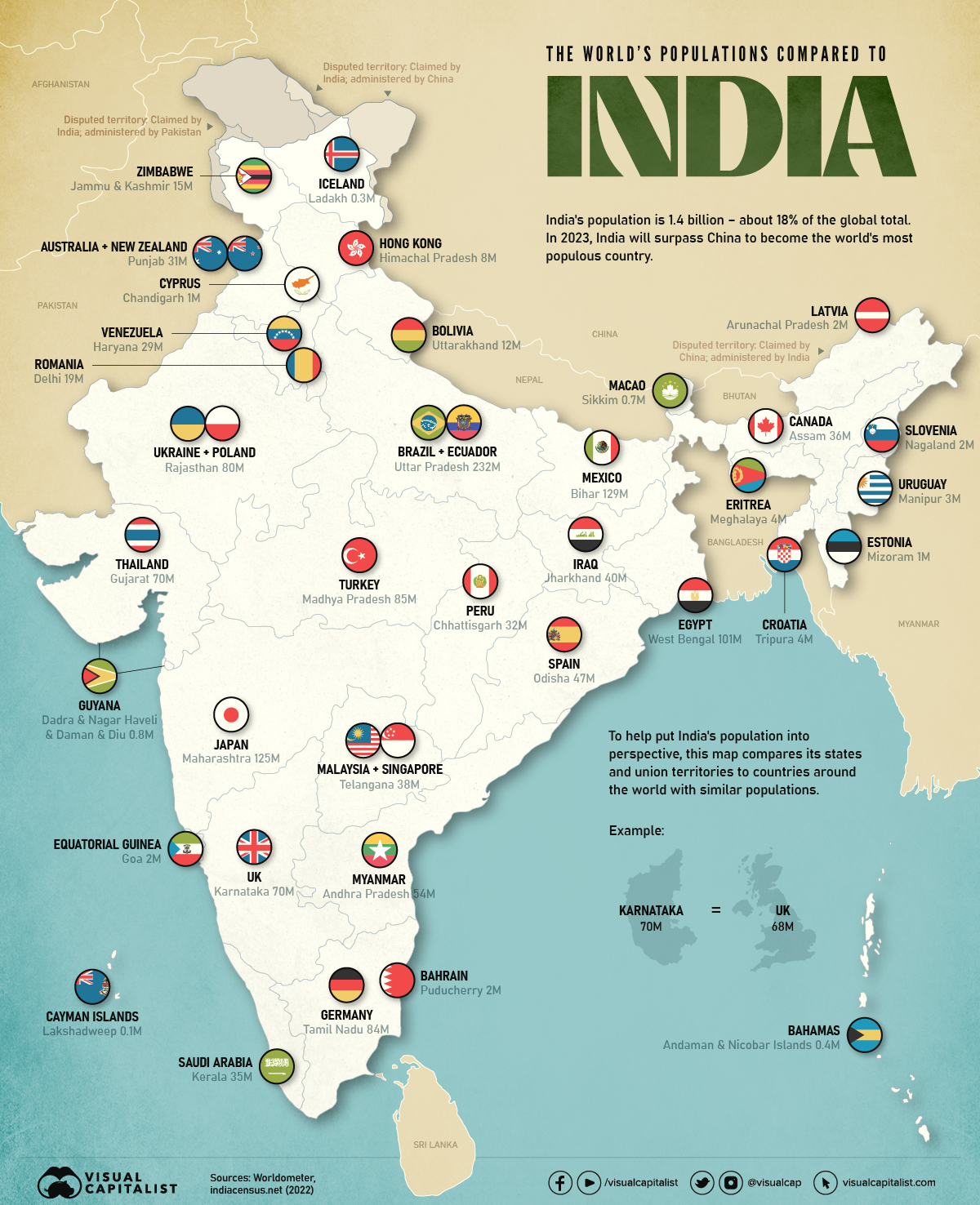
Title: The Population of India’s States Compared with Countries
Article Link: https://www.visualcapitalist.com/population-of-india-compared-with-countries/
Visualization
GitHub username: Supe Tushar
Name: Tushar Shrikrishna Supe
Roll no: 21F1003637

The visualizations show map of India and in each state, flag of a country which is having almost equal population as the state.

Pros:

  • The visualizations are very colourful.
  • It includes flags of the countries as well as their names.
  • It includes population number.
  • Also, the state name is also included.
  • It shows all the data required and fulfills the title of the article.
  • The data collected as of 2023 is also included in visualizations. So its not trying to fool users.

Cons:

  • The comparison of countries population/area compared to Indian states population/area is missing.
  • Country names as well as flag is present. Its too much redundant data in small area.
  • Its too colourful if we think about minimalist design and visualizations (minimum ink on paper method)
  • The data is not overlapping because it goes outside of the map. So there are no fixed boundaries for the annotations.
  • Country names are bold and state names are not. Its not consistent.

@kumar-cmd
Copy link

kumar-cmd commented Feb 12, 2023

Among the Oscar Contenders, a Host of Connections

Name : Kumar Chandan
Roll : 21f1004845

Screen Shot 2023-02-12 at 12 06 12 PM

Image Link : https://archive.nytimes.com/www.nytimes.com/interactive/2013/02/20/movies/among-the-oscar-contenders-a-host-of-connections.html

Description of Graph

Pros

  • This visualisation efficiently captures the connections between Oscar nominees as a beautifully designed graph.
  • It indicates the type of nominee (Actor/producer/director/multiple roles) using a color encoding technique
  • The connections in the graph are around movies that have been nominated for best picture. These form local clusters and islands too.
  • The visualisation attempts to explain unconnected islands in the graph with a short margin note.
  • The use of muted pastel colors makes the visualisation easy to understand and make further interpretations.

Cons

  • The structure is arranged manually. This is good for small representations. However, when the number of nominees increase this structure would be too crowded.
  • The this is a highly customised design and might not work well for a different dataset (The nominees from a different year for example)
  • The winner is indicated by a small grey dot. When the dot is on a common edge it is quite hard to determine who the winner is without zooming in to see which color surrounds the grey dot.
  • The legend is not totally explanatory and it takes a good level of inspection to figure out what is going on in the visualisation.

Improvements

  • This visualisation could become more general and scalable if a layer representation was used. For example the movies, actors, directors could be on different layers
  • Also we can arrange in circular arrangement.

Sign up for free to join this conversation on GitHub. Already have an account? Sign in to comment
Projects
None yet
Development

No branches or pull requests