Skip to content
New issue

Have a question about this project? Sign up for a free GitHub account to open an issue and contact its maintainers and the community.

By clicking “Sign up for GitHub”, you agree to our terms of service and privacy statement. We’ll occasionally send you account related emails.

Already on GitHub? Sign in to your account

Create "Accessibility" article #17

Closed
eheasley opened this issue Mar 28, 2017 · 3 comments · Fixed by #191
Closed

Create "Accessibility" article #17

eheasley opened this issue Mar 28, 2017 · 3 comments · Fixed by #191

Comments

@eheasley
Copy link
Contributor

No description provided.

@morrinene
Copy link

@smhigley

Provide the following so an article can be drafted that provides more detailed background information about key features of Accessibility and key concepts and patterns for being effective in working with it in Dojo 2:

  • Summary of key points that a user should know about the topic
  • Code examples (or links to relevant existing examples)
  • Links to relevant reference material

@smhigley
Copy link
Contributor

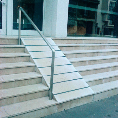
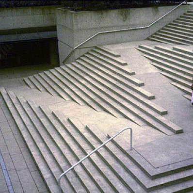
Sorry this is late, I'm still a little ambivalent about it. Any feedback is very welcome:

Philosophy & Approach

Dojo 2 is grounded in the belief that accessibility is as important online as it is in our built environments, and architects of both share a similar responsibility to provide access to all. Accessibility failures abound in each setting, and they can be very obvious once one starts looking:

Bad wheelchair ramp example Good ramp example
Afterthought Accessibility Designed Accessibility

Web developers have an additional hurdle to jump over, since accessibility failures online are often invisible and silent. Without proper testing, it is all too easy to add a title attribute to a link or a <label> without a for and think requirements have been met.

The advances in spec and support for ARIA attributes are fantastic, but they can feed into the false impression that accessibility is achieved by slapping an aria-labelledby or role onto a finished widget and calling it a day. The only approach that has the potential to deliver truly equal access is to begin thinking about a11y in design and continue through to development and testing. For that reason, Dojo 2 has no separate a11y mixin; all our widgets have been designed to be accessible by default, and any tools needed to meet WCAG standards have been integrated into widget-core and widgets.

Using Dojo 2 Widgets

All widgets provided through @dojo/widgets have been created with a range of assistive tech and perceptual differences in mind. However, as with all code, they are not foolproof. There are a number of instances where additional information is required of the widget user before peak accessibility can be achieved. A framework can only go so far before it becomes the user’s responsibility to provide label text or correctly set various attributes. Each widget’s example page models best practices, and scanning through available properties is a good way to check for any missing a11y enhancements.

Form Controls

All simple form controls (TextInput, Textarea, Radio, Checkbox, Slider, and Select) use either a styled native control or provide a native fallback, which allows them to take advantage of built-in accessibility wherever possible. Since widgets cannot accept arbitrary node attributes, properties are provided in the widget interface to control relevant ARIA attributes like aria-invalid, aria-describedby, and aria-readonly.

For example, a TextInput widget with the following properties:

w(TextInput, {
	describedBy: ‘foo’,
	disabled: true,
	invalid: true,
	type: ‘email’
});

Would create the following attributes on the input node:
<input type=“email” aria-describedby=“foo” aria-invalid=“true” disabled>

Label

All form widgets apart from Button contain a label property that allows users to easily associate a text label with the control, along with options to position it or keep it visually hidden. Label is also available as a separate widget for use with custom form controls.

The label property on both form widgets and Label accepts either a string or an options object that allows customization of where the label is placed (before or after the input), and whether it is visually hidden. The latter makes use of screen reader-accessible CSS styles to hide text content, and is recommended for use with form controls that have no visible label.

A <label> element with hidden text was chosen over the aria-label attribute for invisible labels due to still-inconsistent screen reader support for the latter. Should this change, we will be able to update our implementation without changing the public-facing properties.

Styling

The base Dojo 2 theme meets WCAG AA color contrast guidelines, but it is up to the user to double check the final styles as changes to font size or background could affect readability. Widget css packaged with Dojo2 also includes :focus styles for all focusable nodes.

There is a set of base styles provided by @dojo/widgets separate from themes, containing basic utility classes like the screen reader-accessible visually hidden style. To use it, import baseCss separately like so:

import * as css from ‘path/to/your/css’;
import * as baseCss from @dojo/widgets/common/styles/base.m.css’;

@theme(css)
class MyWidget extends WidgetBase {
	render() {
		return v(‘div’, {
			classes: this.classes().fixed(baseCss.visuallyHidden)
		}, [ ‘Screen reader instructions’ ]);
	}
}

Focus Management

Dojo 2 will provide a focus manager for situations where focus needs to be directly managed, since directly touching the DOM within widgets is discouraged. This feature is currently in development.

Writing Custom Widgets

All DOM attributes can be set with VirtualDomProperties so, apart from managing focus, no extra tools should be required to create strongly accessible widgets. For example, the following code would create an accessible popup button:

v('button', {
	key: 'buttonKey',
	'aria-controls': 'popupId',
	'aria-expanded': String(this.properties.expanded),
	'aria-haspopup': 'true',
	id: 'buttonId',
	onclick: this._togglePopup
}, [ 'Click to open popup' ])

Since this example uses a <button> element, it requires neither an explicit tabindex nor an onkeydown event to work properly with a keyboard. Wherever possible, Dojo 2 takes advantage of built-in accessibility by using native elements; if it looks like a button and acts like a button, it should be a <button>. However, while native functionality is the easiest and most straightforward path to good accessibility, there are times when it’s just not possible or no such element exists.

For those times, this handy checklist is a good starting point for planning a soon-to-be accessible widget:

  • Ensure nodes that support any sort of user interaction are both focusable and have accessible descriptive text.
  • Leave native focus styles intact, or provide a sufficiently visible alternative.
  • Check the WAI-ARIA Authoring Practices 1.1 for information on node attributes and keyboard interaction for many common widget patterns. Even for more complex widgets, these serve as good building blocks.
  • Make a quick POC and try inspecting its accessibility attributes in the browser and running through one of the many excellent a11y checklists.
  • Try operating the widget with only a keyboard and, if possible, a screen reader.
  • If applicable, try turning off your sound.
  • Look at your widget with high contrast mode enabled

@morrinene morrinene assigned vansimke and unassigned smhigley May 30, 2017
@eheasley eheasley added beta3 and removed beta2 labels Jun 6, 2017
@eheasley eheasley modified the milestones: 2017.05, 2017.06 Jun 6, 2017
@dylans dylans modified the milestones: 2017.06, 2017.07 Jul 4, 2017
@dylans dylans modified the milestones: 2017.07, 2017.08 Jul 29, 2017
@kitsonk kitsonk modified the milestones: 2017.08, 2017.09 Sep 4, 2017
@smhigley
Copy link
Contributor

V2:

Philosophy & Approach

Dojo 2 is grounded in the belief that accessibility is as important online as it is in our built environments, and architects of both share a similar responsibility to provide access to all. Accessibility failures abound in each setting, and they can be very obvious once one starts looking:

Bad wheelchair ramp example Good ramp example
Afterthought Accessibility Designed Accessibility

Web developers have an additional hurdle to jump over, since accessibility failures online are often invisible and silent. Without proper testing, it is all too easy to add a title attribute to a link or a <label> without a for and think requirements have been met.

The advances in spec and support for ARIA attributes are fantastic, but they can feed into the false impression that accessibility is achieved by slapping an aria-labelledby or role onto a finished widget and calling it a day. The only approach that has the potential to deliver truly equal access is to begin thinking about a11y in design and continue through to development and testing. For that reason, Dojo 2 has no separate a11y mixin; all our widgets have been designed to be accessible by default, and any tools needed to meet WCAG standards have been integrated into widget-core and widgets.

Using Dojo 2 Widgets

All widgets provided through @dojo/widgets have been created with a range of assistive tech and perceptual differences in mind. However, as with all code, they are not foolproof. There are a number of instances where additional information is required of the widget user before peak accessibility can be achieved. A framework can only go so far before it becomes the user’s responsibility to provide label text or correctly set various attributes. Each widget’s example page models best practices, and scanning through available properties is a good way to check for any missing a11y enhancements.

Below is a list of widgets in @dojo/widgets, along with a description of the keyboard interaction (if applicable) and any properties included primarily for accessibility:

Label

All form widgets apart from Button contain a label property that allows users to easily associate a text label with the control. Label is also available as a separate widget for use with custom form controls. The Label widget included with dojo form widgets is associated with the form input by wrapping it as a child element. When used separately, it is also possible to explicitly set the forId property to the id of an input.

The label property on both form widgets and Label accepts either a string or an options object that allows customization of where the label is placed (before or after the input), and whether it is visually hidden. The latter makes use of screen reader-accessible CSS styles to hide text content, and is recommended for use with form controls that have no visible label.

A <label> element with hidden text was chosen over the aria-label attribute for invisible labels due to still-inconsistent screen reader support for the latter. Should this change, we will update our hidden label implementation to aria-label without changing the public-facing properties.


TextInput and Textarea

As with all basic form controls included in @dojo/widgets, TextInput and Textarea use native <input>/<textarea> elements, which allows them to take advantage of built-in accessibility.

A11y properties
  • controls: Text inputs can sometimes control the visibility of other elements, for example in the case of a combobox or autocomplete dropdown. In this case, controls can be used to set aria-controls to the ID of the controlled element.
  • describedBy: Sets the aria-describedby property to point to the ID of an element containing additional descriptive text. Screen readers usually read this text after the label text, followed by a short pause.
  • label: Controls the wrapping <label> element, and takes a string or options object
  • type: Specifying text input type to email, search, etc. when applicable provides more information to screen reader users in addition to other benefits like showing the most helpful mobile keyboard.

Button

This widget returns a simple <button> element.

A11y properties
  • describedBy: Sets the aria-describedby property to point to the ID of an element containing additional descriptive text. Screen readers usually read this text after the label text, followed by a short pause.
  • popup: This can either be set to true to simply set the aria-haspopup property, or it can be passed an object with expanded: true/false and id: string properties to control aria-expanded and aria-controls. This is recommended for any button that opens a dialog, dropdown, or menu.
  • pressed: For use with buttons that toggle on/off. Sets the aria-pressed property.

Checkbox

The Checkbox widget wraps a native <input type="checkbox">, which provides native accessibility and keyboard interaction.

Checkbox can also be used as a toggle switch with optional onLabel and offLabel properties. When no text is provided to the on- and off-labels, the change is purely cosmetic. Otherwise, the text provided to onLabel will be read at the end of the label text when the checkbox is checked, and offLabel will be read when the checkbox is not checked.

A11y properties
  • describedBy: Sets the aria-describedby property to point to the ID of an element containing additional descriptive text. Screen readers usually read this text after the label text, followed by a short pause.
  • label: Controls the wrapping <label> element, and takes a string or options object

Radio

Radio creates a single wrapped <input type="radio"> input. It is best practice to wrap a group of radio buttons in a <fieldset> element that contains a <legend> with descriptive text.

A11y properties
  • describedBy: Sets the aria-describedby property to point to the ID of an element containing additional descriptive text. Screen readers usually read this text after the label text, followed by a short pause.
  • label: Controls the wrapping <label> element, and takes a string or options object

Slider

A native range slider offers limited visual customization, so the Dojo Slider widget creates an invisible native <input type="range"> input that controls a custom track, thumb, and fill. This allows the widget to take advantage of native accessibility and keyboard interaction without sacrificing styling.

The current value is wrapped in an <output> element that points to the ID of the native input.

A11y properties
  • describedBy: Sets the aria-describedby property to point to the ID of an element containing additional descriptive text. Screen readers usually read this text after the label text, followed by a short pause.
  • label: Controls the wrapping <label> element, and takes a string or options object

Select

Select is the only Dojo form widget that makes use of a fully custom solution. Since it is impossible to fully customize <option> elements, we chose to re-create select functionality within our component. The end result is a popup button that controls a dropdown listbox of options.

ARIA attributes are used to associate the button with the listbox and focused option. They are also used to provide semantics for read-only and disabled options, as well as setting the entire select field to be read-only, invalid, or required.

It is also possible to use Select to create a widget using the native <select> element by passing useNativeElement: true to the properties object.

Keyboard Interaction
  • Down arrow: Focuses the next option, wrapping from last to first, or opens the menu if closed
  • Up arrow: Focuses the previous option, wrapping from first to last
  • Home: Focuses the first option
  • End: Focuses the last option
  • Enter & Space: Selects the focused option and closes the listbox, unless the option is disabled
  • Escape: Closes the listbox without selecting an option

Disabled options are focusable but not selectable within the listbox, per WAI-ARIA recommendations.

A11y properties
  • describedBy: Sets the aria-describedby property to point to the ID of an element containing additional descriptive text. Screen readers usually read this text after the label text, followed by a short pause.
  • label: Controls the wrapping <label> element, and takes a string or options object
  • useNativeElement: Switches to using the native <select> element, with some trade-offs to customizability.

ComboBox

ComboBox is similar to select, but provides a text input that filters available options in addition to a button that opens the option menu. The markup is similar in that the menu comprises of a listbox of options with role="option" controlled by both a text input and button.

Since both the button that opens the options menu and the button that clears the textbox value rely on icons, hidden screen reader-accessible text is also provided. Focus is programatically returned to the text input when the clear text button is pressed or when the dropdown is opened.

Keyboard Interaction
  • Down arrow: Focuses the next option, wrapping from last to first, or opens the menu if closed
  • Up arrow: Focuses the previous option, wrapping from first to last
  • Enter: Selects the focused option and closes the listbox, unless the option is disabled
  • Escape: Closes the listbox without selecting an option
A11y properties
  • inputProperties: Can be used to set any properties, including describedBy, directly on the inner TextInput widget
  • label: Controls the wrapping <label> element, and takes a string or options object

TimePicker

TimePicker wraps the ComboBox widget, so all keyboard interactions and a11y properties are the same across both widgets. The only difference is TimePicker also provides a native <input type="time"> option controlled through useNativeElement.


Calendar

The Calendar widget renders a date grid with dropdown month and year pickers. Both the month and year dropdowns use a popup button, and control focus between the button and popup when opened and closed. Focusable items in hidden popups are removed from the focus order.

The date grid itself uses a <table> element with weekdays as the column headers. Hidden accessible text is provided for the previous/next pagination arrows that only visibly display an icon. The date table is labelled by a hidden <label> element showing the current month and year. It has aria-live="polite" so screen readers will be notified when the displayed month changes, e.g. when a user navigates to the next month via arrow keys.

Keyboard Interaction

Items in the focus order for this widget in its initial state are the buttons for the month and year pickers, the currently focused date, and the previous and next month buttons. The following keyboard interactions are available when focus is within the date grid:

  • Left arrow: Moves focused date to the previous date
  • Right arrow: Moves focused date to the next date
  • Down arrow: Moves focused date to the same day of the next week
  • Up arrow: Moves focused date to the same day of the previous week
  • Enter & Space: Selects the focused date
  • Page Up: Moves focused date to the first day of the month
  • Page Down: Moves focused date to the last day of the month

When the focused date moves to a day in the next or previous month, the date grid will refresh.

A11y properties
  • labels: The Calendar widget has a number of internal descriptive labels, and this property allows their text to be customized

Dialog

The Dialog widget creates a controlled dialog element. Controlled focus is not yet implemented, but will be added along with the focus manager.

A11y properties
  • closeText: Provides hidden, accessible text for the icon close button. Defaults to "close dialog."
  • role: The default role for the dialog container is dialog, but it can be changed to alertdialog through this property.

SlidePane

SlidePane is similar to dialog in that it creates a modal that overlays page content. It will need similar programmatic focus control, pending completion of the focus manager.

A11y properties
  • closeText: Provides hidden, accessible text for the icon close button. Defaults to "close pane."

TabController

TabController creates a set of tabs that control the content of a container. The tabs use role="tab" and are associated with the content through aria-controls and aria-labelledby. Only one tab is in the tab order, and arrow keys are used to switch between tabs.

Keyboard Interaction
  • Left arrow: Moves to previous tab, wrapping from first to last
  • Right arrow: Moves to next tab, wrapping from last to first
  • Down arrow: Moves to next tab on vertically oriented tabs
  • Up arrow: Moves to previous tab on vertically oriented tabs
  • Page Up: Moves to first tab
  • Page Down: Moves to last tab
  • Escape: Closes focused tab if it is closeable

TitlePane

TitlePane creates an accordion widget, functionally a button that expands a content container. Collapsed content is obscured with aria-hidden, and the button and content container are associated with aria-controls and aria-labelledby.

A11y properties
  • headingLevel: Optionally customize the heading level of the button controlling the accordion.

This overview only touched on properties that primarily exist for accessibility-related reasons, but any design decision or property change will end up affecting accessibility in some way. For some of those, such as invalid, disabled, and readOnly, we handle setting ARIA attributes in the background in addition to toggling classes without any extra attention needed from the user. In other cases, such as getResultLabel in ComboBox or renderMonthLabel in Calendar, it is entirely up to the widget user to ensure the returned result includes clear, screen-reader-accessible text content.

Styling

The base Dojo 2 theme meets WCAG AA color contrast guidelines, but it is up to the user to double check the final styles as changes to font size or background could affect readability. Widget css packaged with Dojo2 also includes :focus styles for all focusable nodes.

There is a set of base styles provided by @dojo/widgets separate from themes, containing basic utility classes like the screen reader-accessible visually hidden style. To use it, import baseCss separately like so:

import * as css from ‘path/to/your/css’;
import * as baseCss from @dojo/widgets/common/styles/base.m.css’;

@theme(css)
class MyWidget extends WidgetBase {
	render() {
		return v(‘div’, {
			classes: this.classes().fixed(baseCss.visuallyHidden)
		}, [ ‘Screen reader instructions’ ]);
	}
}

Focus Management

Dojo 2 will provide a focus manager for situations where focus needs to be directly managed, since directly touching the DOM within widgets is discouraged. This feature is currently in development.

Writing Custom Widgets

All DOM attributes can be set with VirtualDomProperties so, apart from managing focus, no extra tools should be required to create strongly accessible widgets. For example, the following code would create an accessible popup button:

v('button', {
	key: 'buttonKey',
	'aria-controls': 'popupId',
	'aria-expanded': String(this.properties.expanded),
	'aria-haspopup': 'true',
	id: 'buttonId',
	onclick: this._togglePopup
}, [ 'Click to open popup' ])

Since this example uses a <button> element, it requires neither an explicit tabindex nor an onkeydown event to work properly with a keyboard. Wherever possible, Dojo 2 takes advantage of built-in accessibility by using native elements; if it looks like a button and acts like a button, it should be a <button>. However, while native functionality is the easiest and most straightforward path to good accessibility, there are times when it’s just not possible or no such element exists.

For those times, this handy checklist is a good starting point for planning a soon-to-be accessible widget:

  • Ensure nodes that support any sort of user interaction are both focusable and have accessible descriptive text.
  • Leave native focus styles intact, or provide a sufficiently visible alternative.
  • Check the WAI-ARIA Authoring Practices 1.1 for information on node attributes and keyboard interaction for many common widget patterns. Even for more complex widgets, these serve as good building blocks.
  • Make a quick POC and try inspecting its accessibility attributes in the browser and running through one of the many excellent a11y checklists.
  • Try operating the widget with only a keyboard and, if possible, a screen reader.
  • If applicable, try turning off your sound.
  • Look at your widget with high contrast mode enabled

Sign up for free to join this conversation on GitHub. Already have an account? Sign in to comment
Projects
None yet
Development

Successfully merging a pull request may close this issue.

6 participants