By now you already obtained read counts from your metagenomic experiment. The thing is what do we do with them. Most of the time, obtaining read counts is only the beggining to exploring the metagenomic content of your samples. The first step in analyzing read count data is to put it in a contingency table format.
We need to create a table where rows are genomes and columns are samples. In the previous demo we analyzed a downsampled version of sample ES_211. The original dataset consisted of 16 cases (patients with schisophrenia) and 16 healthy controls.
I've already analyzed these data and I'm providing all tsv files (rather the top 50 hits from each file). If you want to give it a try, you can always download the original data which was deposited in NCBI under BioProject [PRJNA255439] (http://www.ncbi.nlm.nih.gov/sra/?term=PRJNA255439).
The following code is from an R script that I use but that it's not as tidy and neat as I'd like to.
Let's load the required libraries and set our working directory
library(xlsx)
library(gtools)

directory<-"~/PS_demo/tsv"
setwd(directory)
If you don't have those libraries installed, simple issue the following commands
install.packages(c("xlsx","gtools"))
We need to create a list of files, a list of "patient names", and finally read in relevant columns in the tsv's so that we can combine everything into a contingency table
# make a list of the files to loop through

list_of_files <- list.files(path=directory, pattern = ".tsv")

# make a list of just the patient names

patient_names<-NULL
for( i in 1:length(list_of_files)){
  patient_names[i]<-substring(list_of_files[i], 1, 6)
}

# read in each table

read_counts <- lapply(list_of_files, read.table, sep="\t", header = FALSE, skip =2)
read_counts <- lapply(read_counts, function(x) x[, c(1,4)])
read_counts <- lapply(read_counts, function(x) x[complete.cases(x),])
Now we have a list of tables (or data frames) that we need to combine, in a non-redundant fashion, to create our contingency table
# for each table make the first col name OTU and the second the patient name

for( i in 1:length(list_of_files)){
  colnames(read_counts[[i]])<- c("OTU", patient_names[i])
}

# list of lists called otu which stores the first column otu names for each dataframe

otu<-NULL
for( i in 1:length(list_of_files)){
  otu[i]<- list(as.character(read_counts[[i]][, 1]))
}

# for each dataframe in read_counts transpose and then

read_counts <- lapply(read_counts, function(x) t(x[,2]))

# add the otus back as the column name

for( i in 1:length(list_of_files)){
  read_counts[[i]]<-data.frame(read_counts[[i]])
  colnames(read_counts[[i]])<-otu[[i]]
  read_counts[[i]]<-data.frame(patient = patient_names[i], read_counts[[i]])
}

# combine the different dataframes together

otu_table <- read_counts[[1]]
for( i in 2:length(list_of_files)){
  otu_table <- smartbind(otu_table, read_counts[[i]], fill = 0)
}

# transpose the table back so that the microbes are the rows and the patients are the col

otu_table<-t(data.matrix(otu_table))
colnames(otu_table)<-patient_names
otu_table<-otu_table[2:nrow(otu_table), ]

# remove zeroes
otu_table_noZeroes<-otu_table[apply(otu_table[,-1], 1, function(x) !all(x==0)),]

write.csv(otu_table_noZeroes,"otu_table.csv")
Since we are in a limited time setting, we are going to load three data frames, i.e., read counts from above, a taxonomy table, and metadata associated with the patients).
Let's load some libraries and create a phyloseq object:
source("http://bioconductor.org/biocLite.R")
biocLite("phyloseq")
library(phyloseq)

# we need to create a phyloseq object manually. See tutorial
# http://joey711.github.io/phyloseq/import-data#manual

# read in data
setwd("~/PS_demo/data")
read.csv("otu_table.csv", header=TRUE, row.names=1) ->otu_table
read.csv("taxmat.csv", header=TRUE, row.names=1) ->taxmat
read.table('metadata.txt', header=TRUE, sep='\t', row.names=1) -> metadata

as.matrix(otu_table)->otumat
as.matrix(taxmat)->taxmat

rownames(otumat) <- paste0("OTU", 1:nrow(otumat))
rownames(taxmat) <- rownames(otumat)
OTU = otu_table(otumat, taxa_are_rows = TRUE)
TAX = tax_table(taxmat)

# create a phyloseq object with the three dataframes

physeq = phyloseq(OTU, TAX)
sampledata = sample_data(metadata)
physeq = merge_phyloseq(physeq, sampledata)
Now that we have a phyloseq object, we can easily create plots using the functions provided in the PhyloSeq Bioconductor package (here and here).
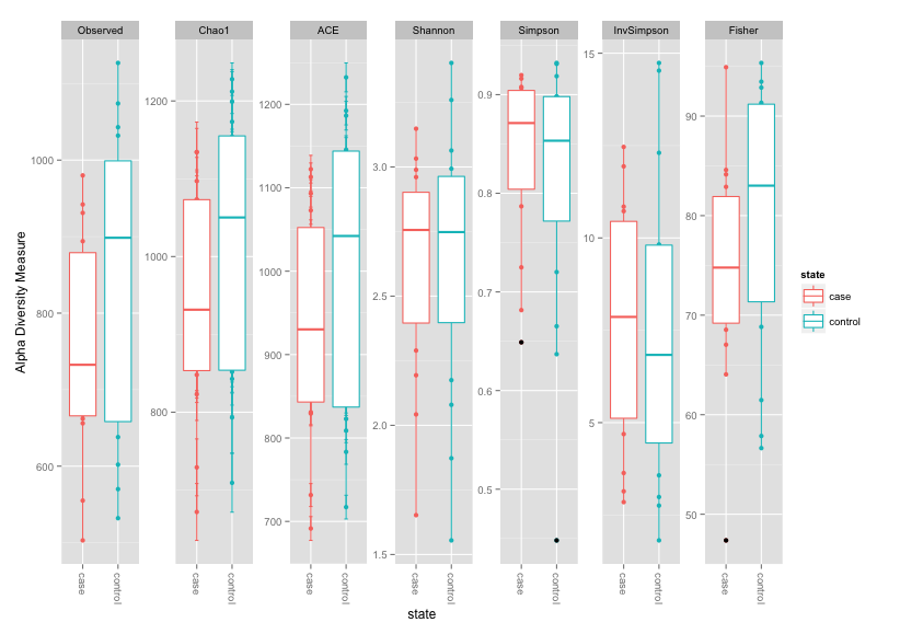
Let's start with some alpha diversity measures
library("ggplot2")
plot_bar(physeq, fill = "Superkingdom")
plot_heatmap(physeq, taxa.label = "Superkingdom")
plot_richness(physeq, x = "state", color = "state",measures=c("Observed","Chao1", "Fisher","ACE", "Shannon", "Simpson", "InvSimpson")) + geom_boxplot()
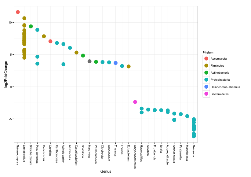
We can also test for whether microbial composition in cases and controls is significantly different.
# Load required libraries

library("DESeq2")

# relevel data so that results are expressed in comparison to "control" samples

sample_data(physeq)$state <- relevel(sample_data(physeq)$state, "control")

# convert phyloseq object to deseq object, accounting for cigarrette smoking...

diagdds = phyloseq_to_deseq2(physeq, ~ cigsmoker + state)

# ...and perform a test to find out if cases and controls are different

diagdds = DESeq(diagdds,test="Wald", fitType = "local")

# now subset results to show only significant results

res = results(diagdds, cooksCutoff = FALSE)
res = res[order(res$padj, na.last = NA), ]
alpha = 0.001
sigtab = res[(res$padj < alpha), ]
sigtab = cbind(as(sigtab, "data.frame"), as(tax_table(physeq)[rownames(sigtab), ], "matrix"))

# and here we look only at taxa that has a positive fold change in comparison to controls

posigtab = sigtab[sigtab[, "log2FoldChange"] > 0, ]
posigtab = posigtab[, c("baseMean", "log2FoldChange", "lfcSE", "padj", "Phylum", "Class", "Family", "Genus","Species")]

# we can always create a plot to visualize the results

theme_set(theme_bw())
scale_fill_discrete <- function(palname = "Set1", ...) {
  scale_fill_brewer(palette = palname, ...)
}
sigtabgen = subset(sigtab, !is.na(Genus))
# Phylum order
x = tapply(sigtabgen$log2FoldChange, sigtabgen$Phylum, function(x) max(x))
x = sort(x, TRUE)
sigtabgen$Phylum = factor(as.character(sigtabgen$Phylum), levels = names(x))
# Genus order
x = tapply(sigtabgen$log2FoldChange, sigtabgen$Genus, function(x) max(x))
x = sort(x, TRUE)
sigtabgen$Genus = factor(as.character(sigtabgen$Genus), levels = names(x))
ggplot(sigtabgen, aes(x = Genus, y = log2FoldChange, color = Phylum)) + geom_point(size = 6) +
  theme(axis.text.x = element_text(angle = -90, hjust = 0, vjust = 0.5))
PhyloSeq and DESeq packages allow for all sorts of statistical comparisons and visualization options. I encourage people interested in metagenomic analysis to check out Bioconductor pages for these packages for further information.
That concludes our demo/tutorial. If you have further questions don't hesitate to contact me at castronallar@gmail.com or in GitHub or [Google Groups] (https://groups.google.com/forum/#!forum/pathoscope). Thanks!