[Lens] Improve unclear UI for bucket aggregation grouping order #77015
Assignees

Labels
enhancement
New value added to drive a business result
Feature:Lens
Team:Visualizations
Visualization editors, elastic-charts and infrastructure
Comments
|
Pinging @elastic/kibana-app (Team:KibanaApp) |
1 task
|
I am closing this issue for now, we can reopen once we'll find time to implement better solution. |
Sign up for free
to join this conversation on GitHub.
Already have an account?
Sign in to comment
This issue is focused on finding a solution for the short term ("Lens by default" time frame). For a long-term solution covering more possible cases, see #79268
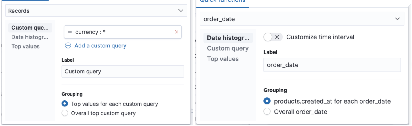
Right now, we have 3 different bucket aggregations (soon to be 4). It gives us 6 different combinations for 2 nested aggregations. Out of these six, the ones below influence the response that comes from ES meaningfully (not only order, but the data is different):
The other three only change the order, which is important for pie or datatable vis:
For the first three, it's easy to come up with a nice understandable copy we already have for BucketNestingEditor:

However, for the other three the copy doesn't seem helpful or correct (below):
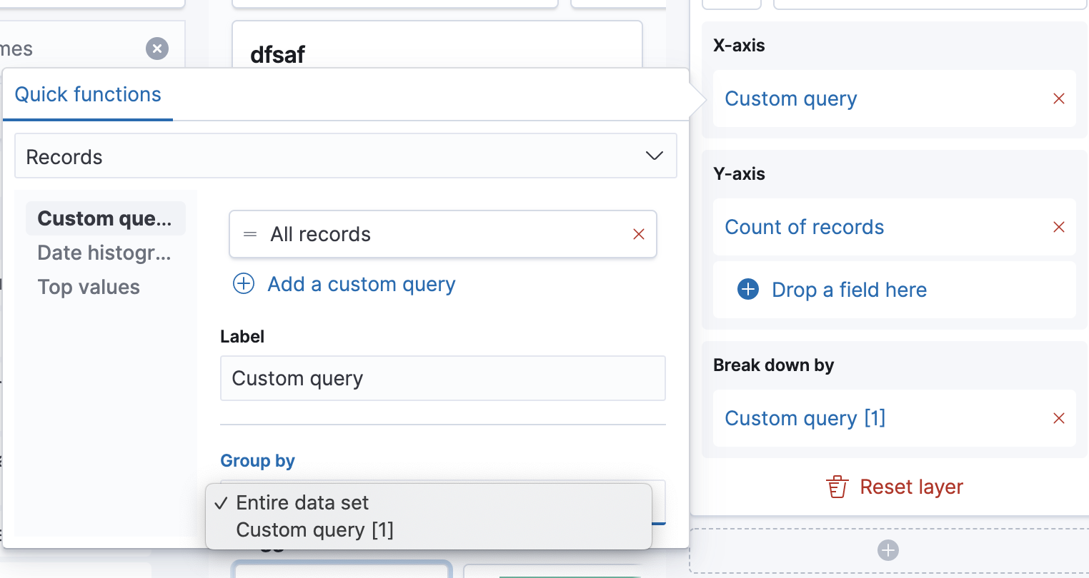
We could add more information, like the label of the column to make it more understandable. However, this change only affects the order, so how about displaying the other design that we have implemented for BucketNestingEditor for more than 2 nested aggregations (not radios, but select list). I think it's actually more readable:

First step was implementing this PR: #77331, but we might want to revisit this issue.
The text was updated successfully, but these errors were encountered: