Improving Data only view of query page #3087
Comments
Bringing meta data to the top more in place:
|


Hide left sidebar entirely
|


Card layoutThis design approaches the data only query page as a mini dashboard where the data is presented in similar card like layouts we use on the dashboards.
|

|
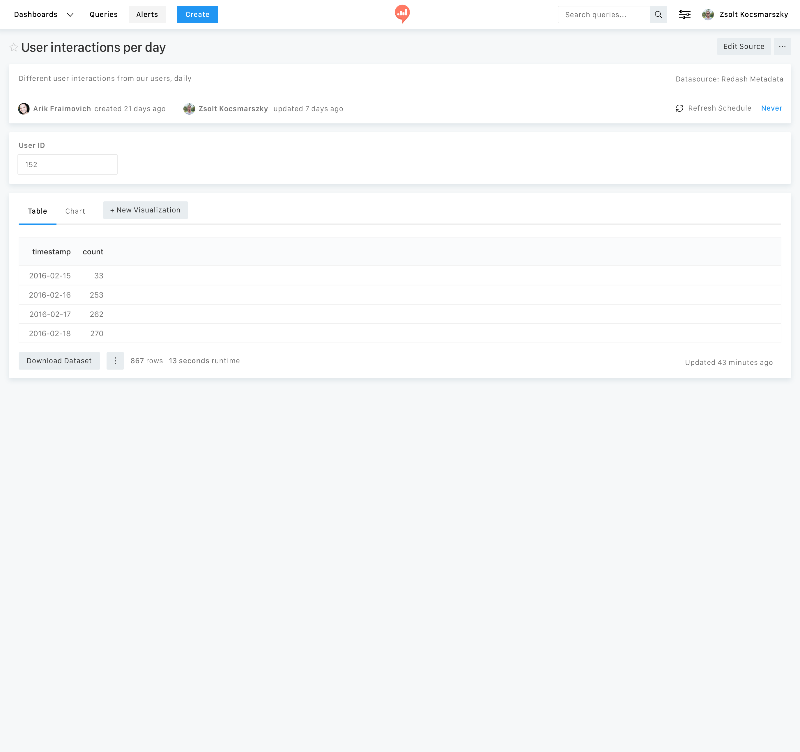
Screenshot 3 is the one that makes the most sense:
But I also like the look of the cards version. I don't think we should show all visualizations in a single view, but I do like the rest. Maybe we can try merging screenshot 3 with the cards version:
|
|
Here's the merged version: I'm not 100% sure this is the right direction, the mixed fixed and fluid elements feels a bit strange to me. I'm also not 100% convinced that a so much different view/edit pages is the right direction. |

|
How about all sections will be full width? |
|
Yes, full width works much better.
|
|
Yes, I agree this is better. Some notes:
|
|
I've refined this as requested:
I explored how it would look like if we go with the sticky bottom section; I think this might even work better.
|


|
We're hoping to address this as part of the React migration (#3071) of the Query Results and Editor pages. For this end, we're going to do some preliminary work with a UI/UX designer to define the new views. As a first step before finding such person, I created a short description of the project: https://docs.google.com/document/d/1zX2NJz22ExBTKzpRnP10u8qwMaWhKIE2jEoEr8tkRNo/edit?usp=sharing Y'all welcome to comment and add your thoughts in the doc. |
|
Updated designs from @mohitpanjwani for the results only view. (@gabrieldutra, @kravets-levko, @susodapop FYI) Everyone are welcome to share thoughts and comments. |
I've played a bit with the query data only view to further improve this view.
Just throwing in a couple of ideas, including iterative improvements and new concepts as well.
The text was updated successfully, but these errors were encountered: