The first step a developer usually takes is turning the style guide from the given designs into CSS. With the introduction of the theme.json file, this process is made a little easier.
theme.json is a file in your block theme that allows you to enable specific theme functionality and create theme specific settings, and then apply that functionality and settings to the theme or elements of the theme.
Tip: The Block Editor Handbook has a live theme.json specification document, which is recommended reading for block theme developers.
To create your first setting, let's apply the system-wide theme font. Take a look at the Twenty Twenty-Three style guide in the Figma file you copied earlier.
The base font is either the default system font of the operating system, or the fallback is San Serif.
To implement this in the theme.json file, you first create a system wide Typography setting in the settings of your theme.json, which will generate a CSS variable when the theme is rendered.
Do Create the
typographysection in the theme.json "settings" and populate it with the relevant values.
{
  ...
  "settings": {
    "typography": {
      "fontFamilies": [
        {
          "fontFamily": "-apple-system,BlinkMacSystemFont,\"Segoe UI\",Roboto,Oxygen-Sans,Ubuntu,Cantarell,\"Helvetica Neue\",sans-serif",
          "name": "System Font",
          "slug": "system-font"
        }
      ]
    },
  ...
}
Note
- The
fontFamilyvalue is the CSS value of the font- The
namevalue is the name of the font as it will appear in the Site Editor- The
slugvalue is used to create the CSS variable, using the following format--wp--preset--font-family--{slug}
This creates a CSS preset variable called --wp--preset--font-family--system-font that can be used in the theme's Global Styles.
To apply this font setting to your theme, you can select this preset in the Global Styles interface in the Site Editor.
Switch back to the Site Editor, open the Global Styles interface, and apply the new font in the Typography section.
Do
- Open the Global Styles interface.
- Click Typography.
- Click Text.
- Select System Font from the Font dropdown.

Instantly you'll notice that the font in the template in the editor has been updated to the new font.
Make sure to save your Custom Styles, to ensure they are applied to the theme.
If you prefer to manually add the setting to the theme.json file, you can do so by adding the following to the styles section.
Do Update the
stylessection in the theme.json and apply the --wp--preset--font-family--system-font CSS variable to all typography.
{
  ...
  "styles": {
    "typography": {
      "fontFamily": "var(--wp--preset--font-family--system-font)"
    }
  }
  ...
}
Once you've made these changes, your updated theme.json file looks like this:
{
	"version": 2,
	"$schema": "https://schemas.wp.org/trunk/theme.json",
	"settings": {
		"typography": {
			"fontFamilies": [
				{
					"fontFamily": "-apple-system,BlinkMacSystemFont,\"Segoe UI\",Roboto,Oxygen-Sans,Ubuntu,Cantarell,\"Helvetica Neue\",sans-serif",
					"name": "System Font",
					"slug": "system-font"
				}
			]
		}
	},
	"styles": {
		"typography": {
			"fontFamily": "var(--wp--preset--font-family--system-font)"
		}
	}
}
Now switch back to your Site Editor, and take a look at any of the templates. You should see that the font has been updated to the system font.
At this point you might be wondering if it's possible to view the code for the styles applied in the Global Styles interface, in the same way you can view the code for the templates and template parts.
Due to the nature of JSON vs HTML/block code, it's not currently possible. What you can do however is use the Overwrite option of the Create Block Theme plugin, which will update your theme.json file with anny changes applied in the Global Styles interface.
If you do follow this process, note that the Create Block Theme plugin will write your theme.json top level elements in alphabetical order, which may not be the order you want. This won't break the functionality of the theme, but it may be a little confusing if, for example, you're used to seeing the schema and version items at the top of the file.
The process outline above is the same for any setting or style you want to apply to your theme.
- Add the relevant setting to the
settingssection intheme.json - Apply the setting via the Global Styles interface OR add it to the relevant style in the
stylessection of the theme.json file.
Styles can be applied globally, as we did for the typography, or to specific blocks.
Note To speed up this process, it's also possible to copy exiting settings and styles from existing themes, and update the values to match your theme.
For the purposes of this lesson, we've gone ahead and done some groundwork for you. Go ahead and copy the settings and styles sections below and replace your current theme.json settings and styles.
Note These settings and styles are a sub-set of the Twenty Twenty-Three Figma styles.
Settings:
{
  ...
  "settings": {
    "appearanceTools": true,
    "color": {
      "palette": [
        {
          "color": "#FFF5E1",
          "name": "Base",
          "slug": "base"
        },
        {
          "color": "#781C68",
          "name": "Contrast",
          "slug": "contrast"
        }
      ]
    },
    "layout": {
      "contentSize": "650px",
      "wideSize": "1000px"
    },
    "spacing": {
      "spacingScale": {
        "operator": "+",
        "increment": 0.5,
        "steps": 9,
        "mediumStep": 1.5,
        "unit": "rem"
      },
      "units": [
        "%",
        "px",
        "em",
        "rem",
        "vh",
        "vw"
      ]
    },
    "typography": {
      "dropCap": false,
      "fluid": true,
      "fontFamilies": [
        {
          "fontFamily": "-apple-system,BlinkMacSystemFont,\"Segoe UI\",Roboto,Oxygen-Sans,Ubuntu,Cantarell,\"Helvetica Neue\",sans-serif",
          "name": "System Font",
          "slug": "system-font"
        }
      ],
      "fontSizes": [
        {
          "size": "1rem",
          "slug": "small"
        },
        {
          "size": "1.125rem",
          "slug": "medium"
        },
        {
          "size": "1.75rem",
          "slug": "large"
        },
        {
          "size": "2.25rem",
          "slug": "x-large"
        },
        {
          "size": "2.75rem",
          "slug": "xx-large"
        }
      ]
    }
  },
  ...
Styles:
  ...
  "styles": {
    "color": {
      "background": "var(--wp--preset--color--base)",
      "text": "var(--wp--preset--color--contrast)"
    },
    "elements": {
      "button": {
        "border": {
          "radius": "0"
        },
        "color": {
          "text": "var(--wp--preset--color--contrast)"
        },
        "typography": {
          "fontSize": "var(--wp--preset--font-size--medium)"
        },
        ":hover": {
          "color": {
            "background": "var(--wp--preset--color--contrast)",
            "text": "var(--wp--preset--color--base)"
          }
        },
        ":focus": {
          "color": {
            "background": "var(--wp--preset--color--contrast)",
            "text": "var(--wp--preset--color--base)"
          }
        },
        ":active": {
          "color": {
            "text": "var(--wp--preset--color--base)"
          }
        }
      },
      "h1": {
        "typography": {
          "fontSize": "3.625rem",
          "lineHeight": "1.2"
        }
      },
      "h2": {
        "typography": {
          "fontSize": "clamp(2.625rem, calc(2.625rem + ((1vw - 0.48rem) * 8.4135)), 3.25rem)",
          "lineHeight": "1.2"
        }
      },
      "h3": {
        "typography": {
          "fontSize": "2.25rem"
        }
      },
      "h4": {
        "typography": {
          "fontSize": "clamp(1.75rem, calc(1.75rem + ((1vw - 0.48rem) * 8.4135)), 1.875rem)"
        }
      },
      "h5": {
        "typography": {
          "fontSize": "var(--wp--preset--font-size--medium)",
          "fontWeight": "700",
          "textTransform": "uppercase"
        }
      },
      "h6": {
        "typography": {
          "fontSize": "var(--wp--preset--font-size--medium)",
          "fontWeight": "400",
          "textTransform": "uppercase"
        }
      },
      "heading": {
        "typography": {
          "fontWeight": "300",
          "letterSpacing": "-0.02rem",
          "lineHeight": "1.4",
          "textTransform": "capitalize"
        }
      },
      "link": {
        "color": {
          "text": "var(--wp--preset--color--contrast)"
        },
        ":hover": {
          "typography": {
            "textDecoration": "underline dashed"
          }
        },
        ":active": {
          "typography": {
            "textDecoration": "none"
          }
        }
      }
    },
    "spacing": {
      "blockGap": "1.5rem",
      "padding": {
        "top": "0px",
        "right": "var(--wp--preset--spacing--30)",
        "bottom": "0px",
        "left": "var(--wp--preset--spacing--30)"
      }
    },
    "typography": {
      "fontFamily": "var(--wp--preset--font-family--system-font)",
      "fontSize": "var(--wp--preset--font-size--medium)",
      "lineHeight": "1.6"
    }
  }
  ...
Once you've updated your theme.json file, refresh the Site Editor, and you'll see the settings and styles applied to your theme.

Typically, when developing a theme, you would define the theme settings and styles first, based on the designs, and then start building the templates and template parts.
However, in the previous module we created various templates and template parts first, without applying any styles.
So now might be a good time to review the header and footer template parts, and make any necessary changes based on the designs.
If you take a look at any of the template designs, you'll notice the following commonalities:
- The largest element on any page is 1000 pixels wide (e.g. featured images, titles, latest posts etc.)
- Any text content is contained within a 650 pixel wide area
Note: The actual text content size is 655 pixels wide in the designs, but it's a good idea to stick to round numbers in web design, so we'll go with 650.
These two layout values are set in the theme.json layout setting, as follows:
    ...
    "layout": {
      "contentSize": "650px",
      "wideSize": "1000px"
    },
    ...
Based on this, you can update your header and footer template parts to use the new layout wideSize setting:
Do:
- Navigate to the Template Parts, and select the Header template part
- Select the Row block that contains the Site Title and Navigation
- Change the Alignment from None to Wide width
- Save the template
This will force the header content to always display at a width of 1000 pixels across the site. Do the same for the footer template
Do:
- Navigate to the Template Parts, and select the Footer template part
- Select the Row block that contains the Site Title and "powered by WordPress" text
- Change the Alignment from None to Wide width
- Save the template
Then take a look at the page template you created earlier, and you will see how the header and footer are now aligned to the 1000 pixel wide layout.

At the same time, take a look at the Figma design for the page layout. You'll notice that the Post Featured Image and the Title blocks should also be set to 1000 pixels wide, and the text should be 650 pixels wide.
Do:
- Navigate to the Pages template
- Select the Group block that contains the Post Featured Image and Title blocks, and set it's alignment to Wide width
- Select the Post Featured Image block, and set it's alignment to Wide width
- Select the Title block, and set it's alignment to Wide width
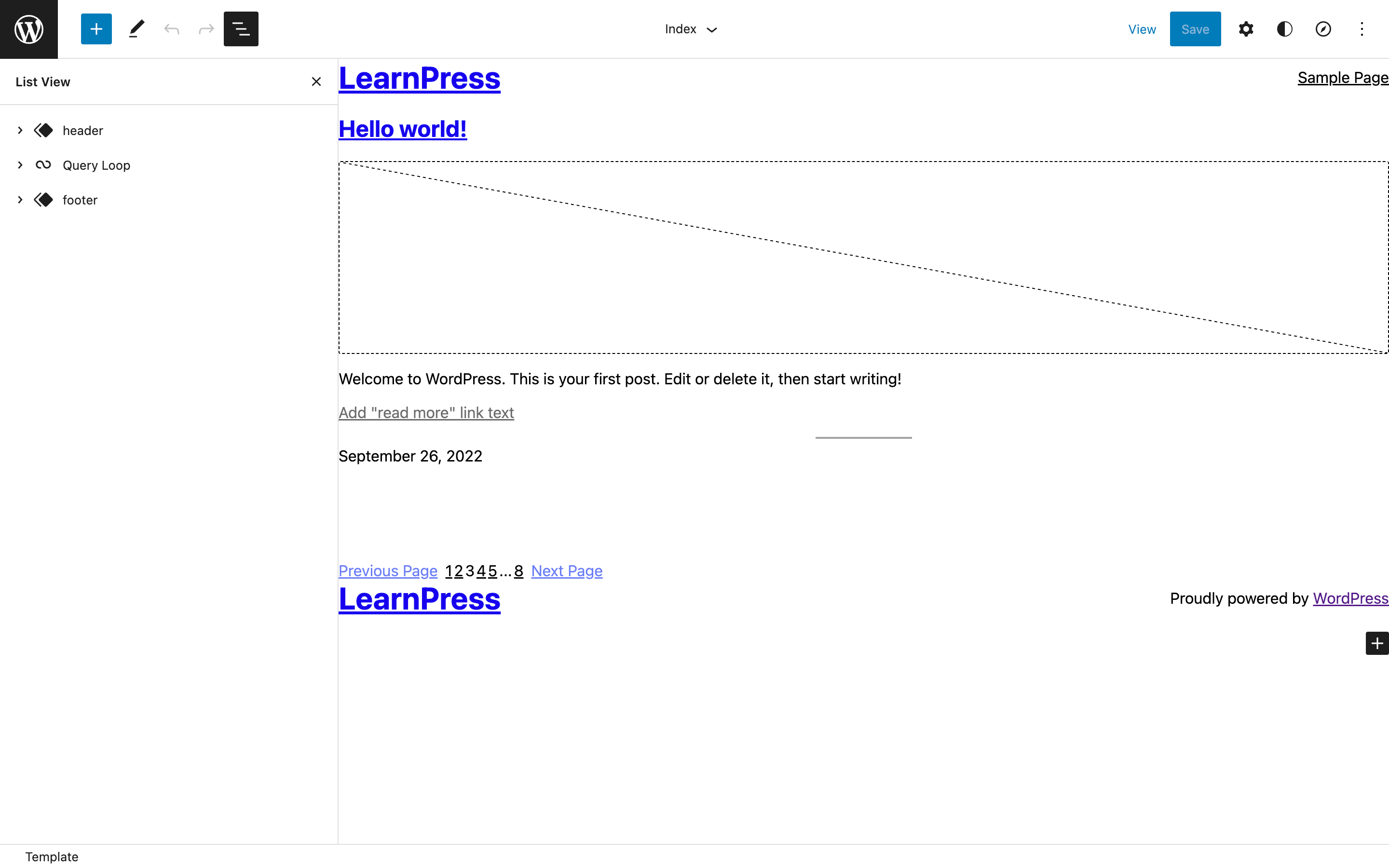
There is no design for the Index template, mostly because this template will only be used as a fallback if the archive template is not defined. However, you can also set the Query Loop block to constrain itself to the widths specified in the theme.json, by toggling the Inner blocks use content width setting.
Replace above screenshot with "updated-index-template.png"
Tip: Using Group, Row and Column blocks for defining layout is very useful, so it's a good idea to learn about all the different core blocks and what functionality they provide.