Let's get right down to business of showing what Ephemeral Components brings to the table.
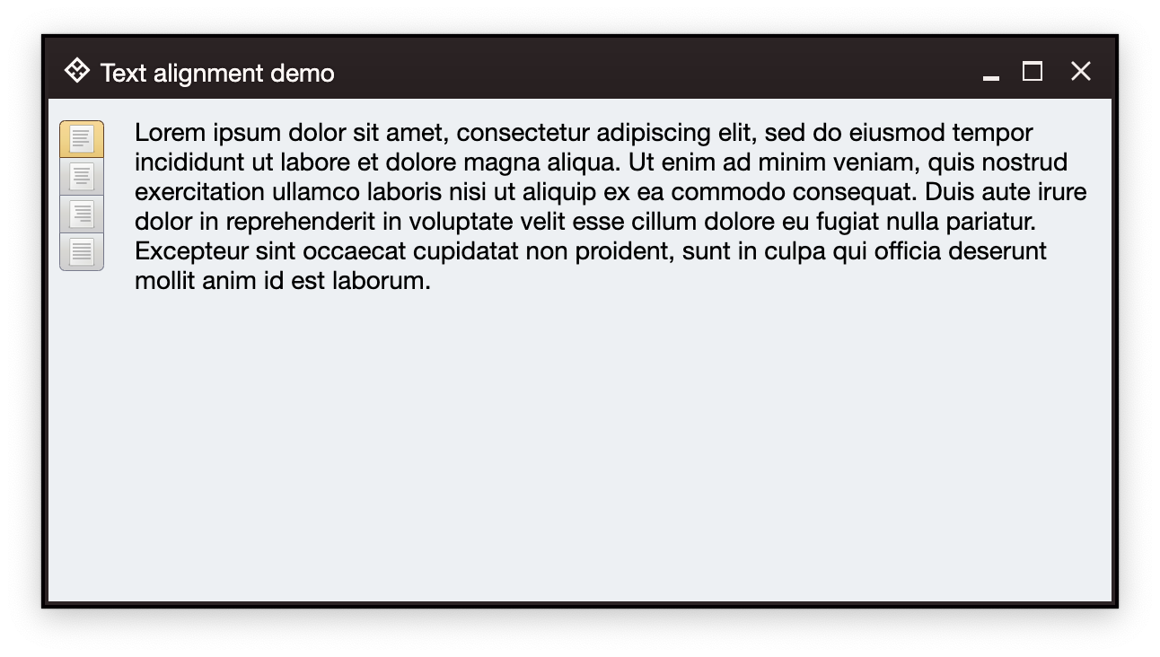
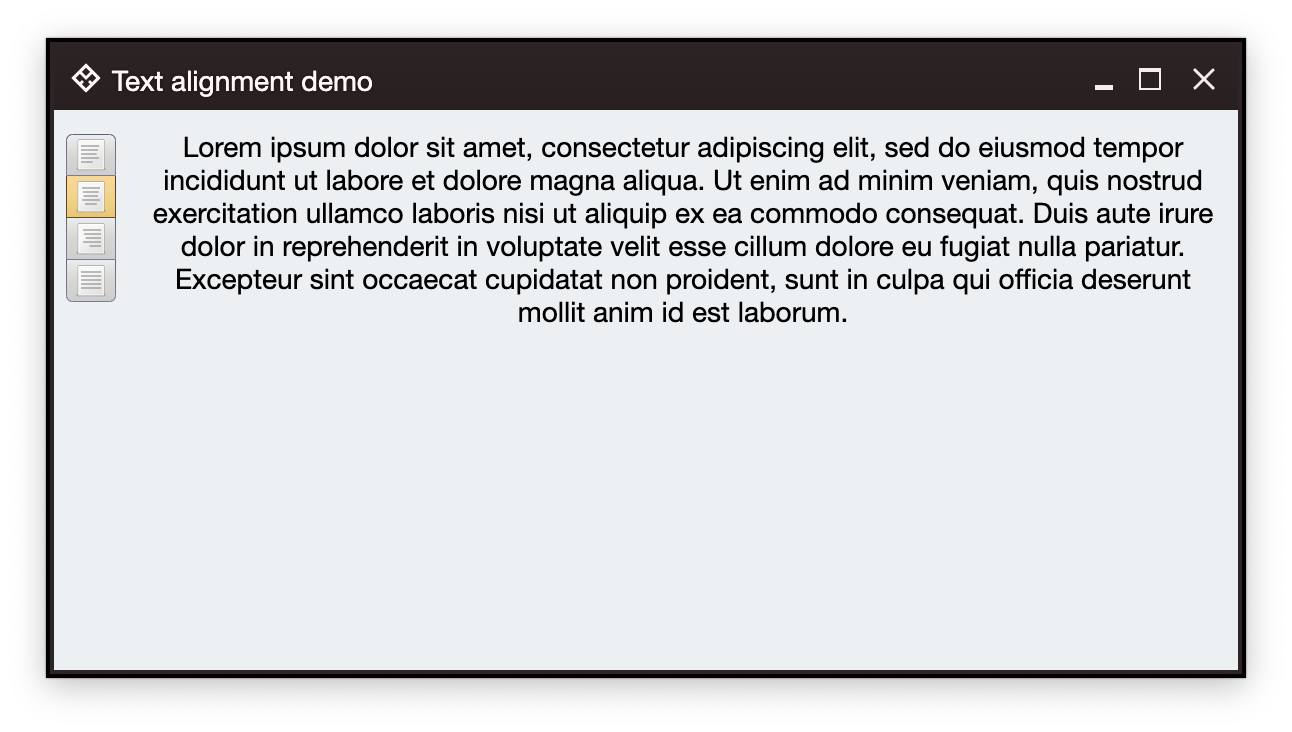
In the screenshot below we have a multiline text area and a vertical strip of buttons on the left. Clicking one of the buttons should change the text alignment of the content. The current alignment should be represented by the visual indication on the matching button.
We start with the overall definition of our application and window content:
fun main() = auroraApplication {
  val state = rememberWindowState(
      placement = WindowPlacement.Floating,
      position = WindowPosition.Aligned(Alignment.Center),
      size = DpSize(600.dp, 320.dp)
  )

  AuroraWindow(
      skin = marinerSkin(),
      title = "Text alignment demo",
      icon = radiance_menu(),
      iconFilterStrategy = IconFilterStrategy.ThemedFollowText,
      state = state,
      undecorated = true,
      onCloseRequest = ::exitApplication,
  ) {
      // Here we'll have our data models

      Row(
          modifier = Modifier.fillMaxSize().padding(6.dp),
          horizontalArrangement = Arrangement.spacedBy(12.dp)
      ) {
        // Here we'll have the box for the buttons
        // And here we'll have the TextFieldValueProjection
      }
  }
}
For the data models, we start with setting up our TextFieldValue:
val text = "Lorem ipsum dolor sit amet, consectetur adipiscing elit, sed do eiusmod " +
        "tempor incididunt ut labore et dolore magna aliqua. Ut enim ad minim" +
        " veniam, quis nostrud exercitation ullamco laboris nisi ut aliquip " +
        "ex ea commodo consequat. Duis aute irure dolor in reprehenderit in " +
        "voluptate velit esse cillum dolore eu fugiat nulla pariatur. " +
        "Excepteur sint occaecat cupidatat non proident, sunt in culpa qui " +
        "officia deserunt mollit anim id est laborum."
var textAlign by remember { mutableStateOf(TextAlign.Left) }
val paragraphStyle by derivedStateOf { ParagraphStyle(textAlign = textAlign) }
val textFieldValue by derivedStateOf {
    TextFieldValue(
        annotatedString = AnnotatedString(
            text = text,
            paragraphStyle = paragraphStyle
        )
    )
}
Here, we have a block of text (note that in this example the text area is not going to be editable, so we do not use mutableStateOf for the text itself). In this demo we are going to be changing the text alignment, so we set up a mutable variable for that, and use derivedStateOf to wrap our TextFieldValue. Whenever the textAlign changes, that change will cause recomposition and update of textFieldValue.
In order to add our read-only text area, we use Aurora's text field projection:
TextFieldValueProjection(
    contentModel = TextFieldValueContentModel(
        value = textFieldValue,
        readOnly = true,
        onValueChange = {}
    ),
    presentationModel = TextFieldPresentationModel(showBorder = false)
).project(modifier = Modifier.weight(1.0f, true))
And now let's take a look at configuring and displaying the command buttons that will change the text alignment.
The most basic building block of Ephemeral components is a command. Instead of thinking in terms of buttons - where each button, when clicked, changes the content alignment on text pane - Ephemeral separates the content aspects of such a unit of functionality from the presentation aspects of it.
Let's take a look at the four commands for changing the text area content alignment:
// Align left command
val commandAlignLeft = Command(
    text = "Left",
    icon = format_justify_left(),
    isActionToggle = true,
    isActionToggleSelected = (textAlign == TextAlign.Left),
    onTriggerActionToggleSelectedChange = {
        if (it) textAlign = TextAlign.Left
    }
)

// Align center command
val commandAlignCenter = Command(
    text = "Center",
    icon = format_justify_center(),
    isActionToggle = true,
    isActionToggleSelected = (textAlign == TextAlign.Center),
    onTriggerActionToggleSelectedChange = {
        if (it) textAlign = TextAlign.Center
    }
)

// Align right command
val commandAlignRight = Command(
    text = "Right",
    icon = format_justify_right(),
    isActionToggle = true,
    isActionToggleSelected = (textAlign == TextAlign.Right),
    onTriggerActionToggleSelectedChange = {
        if (it) textAlign = TextAlign.Right
    }
)

// Align fill command
val commandAlignFill = Command(
    text = "Fill",
    icon = format_justify_fill(),
    isActionToggle = true,
    isActionToggleSelected = (textAlign == TextAlign.Justify),
    onTriggerActionToggleSelectedChange = {
        if (it) textAlign = TextAlign.Justify
    }
)
Each command in this example is configured with the following attributes:
- An icon for the command's representation (or projection, in Ephemeral's terms) on the screen.
- Marking the command's action as toggle (on and off)
- Depending on the current value of
textAlign, mark the toggle selected state to betrueorfalse - Action to be taken when the command's representation on the screen is activated. Here, each command's action is mapped to update our
textAlign.
Let's take another look at how the visual representation of these four commands looks like:
Each command is represented by a single button. When a button is clicked, the corresponding command action is activated and our textAlign is updated. As the result of the recomposition that follows that update, the overall button strip is updated to reflect the currently "selected" command (the one whose visual representation was just clicked):
How do we "convert" these four commands to be shown as a vertical strip of four buttons on the screen? Here's the code:
CommandButtonStripProjection(
    contentModel = CommandGroup(
        commands = listOf(
            commandAlignLeft,
            commandAlignCenter,
            commandAlignRight,
            commandAlignFill
        )
    ),
    presentationModel = CommandStripPresentationModel(
        orientation = StripOrientation.Vertical,
        commandPresentationState = CommandButtonPresentationState.Small,
        horizontalGapScaleFactor = 0.75f
    )
  ).project()
Let's unpack what is going on here.
A CommandButtonStripProjection is created from two objects - a command group and a command strip presentation. The first one represents a logical group of our four Command objects to be treated as the content model of that vertical strip of buttons you see in the screenshot.
The second one is the presentation model for the button strip. It says that we want the strip to layout the buttons vertically, the overall visual aspects of each one of the buttons.
What is a projection? A projection takes a content model (a group of four commands in our case) and creates a component that represents that content model on the screen. For that, in addition to the content model it also needs a matching presentation model. Note how, in this particular case, the vertical orientation of the layout belongs in the presentation model. And the logic of what happens when the button that represents a command belongs in the content model.
After our projection object is constructed, we call a project() on it. This gives us a composable that is emitted as part of our window hierarchy.
Continue to another sample walkthrough.

