Angular directive for quickly creating a two-level menu system with Bootstrap tabs as the top level and a Bootstrap navbar as the second level. That is, each tab has its own navbar acting as its submenu.
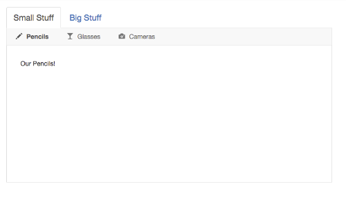
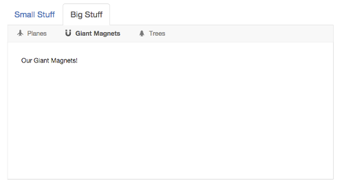
Here's what it looks like:
And Here's a plunk showing it in action. (Be sure to make the plunk's preview area at least 768px wide so the Bootstrap navbars lay out horizontally rather than stacking vertically.)
- Download it or install it using bower:
bower install angular-bootstrap-tabs-with-navbars - Include
tabs-with-navbars.csson your page after Bootstrap's CSS - Include
tabs-with-navbars.json your page - Add
mj.tabsWithNavbarsas a module dependency to your app:angular.module('myapp', ['mj.tabsWithNavbars']);
The directive can be an element or an attribute, so you can add it to your markup like this:
<tabs-with-navbars
  tabs="ctrl.tabs"
  navbar-items-array-name="navbarItems">
</tabs-with-navbars>
or like this:
<div tabs-with-navbars
     tabs="ctrl.tabs"
     navbar-items-array-name="navbarItems">
</div>
You need to include the following attributes on the element:
| Attribute | Type | Description |
|---|---|---|
tabs |
Array | A reference to your tabs data array (see below) |
navbar-items-array-name |
String | The name of the property on your tab objects that contains that tab's navbar items array |
The directive assumes you have a tabs data array that looks something like this:
tabs = [
  { // Tab 1: Small Stuff
    title: 'Small Stuff',
    active: true,
    navbarItems: [ // Tab 1 Navbar Items
      {
        title: 'Pencils',
        active: true,
        iconCssClass: 'glyphicon glyphicon-pencil',
        targetPaneContent: '<div>Our Pencils!</div>'
      },
      {
        title: 'Glasses',
        active: false,
        iconCssClass: 'glyphicon glyphicon-glass',
        targetPaneContent: '<div>Our Glasses!</div>'
      }
    ]
  },
  { // Tab 2: Big Stuff
    title: 'Big Stuff',
    active: false,
    navbarItems: [ // Tab 2 Navbar Items
      {
        title: 'Planes',
        active: true,
        iconCssClass: 'glyphicon glyphicon-plane',
        targetPaneContent: '<div>Our Planes!</div>'
      },
      {
        title: 'Giant Magnets',
        active: false,
        iconCssClass: 'glyphicon glyphicon-magnet',
        targetPaneContent: '<div>Our Giant Magnets!</div>'
      }
    ]
  }
];
where each tab object has the following properties:
| Name | Type | Description |
|---|---|---|
title (Required) |
HTML | The tab title/label; it can be HTML or plain text |
active (Required) |
Boolean | Flag indicating whether the tab is active or not |
navbarItems (Required) |
Array | Array of navbar items for that tab; the property can be named anything you want because you pass the name into the directive on the navbar-items-array-name attribute |
And each navbar item object has the following properties:
| Name | Type | Description |
|---|---|---|
title (Required) |
HTML | The item title/label; it can be HTML or plain text |
active (Required) |
Boolean | Flag indicating whether the item is active or not |
iconCssClass (Optional) |
String | CSS class for the item's icon (e.g., a glyphicon class) |
targetPaneContent (Required) |
HTML | The HTML content of the item's content pane |
MIT License.