Buttons, cards, and text field styling updates to match new material-release #14667
Comments
|
@jakeleventhal Just to be clear, we are implementing Material Design, not Google's product line. Google Products are taking liberties with the specifications. I think that we can close the issue for #14521, we miss a By the way, if you want to create a theme for Google Docs, we would be happy to integrate it in the documentation! |
|
Is there a way to apply styles that override the default styles in a theme file? |
|
@jakeleventhal Yes, I'm glad you asked. You can use the |
|
You can start from here: https://codesandbox.io/s/7z9lqqwqq0.
import React from "react";
import { MuiThemeProvider, createMuiTheme } from "@material-ui/core/styles";
import Button from "@material-ui/core/Button";

const theme = createMuiTheme({
  typography: { useNextVariants: true },
  palette: {
    primary: {
      main: "#496590"
    }
  },
  props: {
    MuiButtonBase: {
      disableRipple: true
    }
  }
});

theme.overrides = {
  // Name of the component ⚛️ / style sheet
  MuiButton: {
    // Name of the rule
    outlined: {
      "&:active": {
        boxShadow: theme.shadows[2]
      }
    },
    sizeSmall: {
      paddingTop: 0,
      paddingBottom: 0
    },
    label: {
      textTransform: "none"
    }
  }
};

function OverridesCss() {
  return (
    <MuiThemeProvider theme={theme}>
      <Button size="small" color="primary" variant="outlined">
        Cancel
      </Button>
    </MuiThemeProvider>
  );
}

export default OverridesCss; |

|
@oliviertassinari is there a way to apply this sort of global prop settings with size breakpoints? i.e. const theme = createMuiTheme({
typography: { useNextVariants: true },
palette: {
primary: {
main: "#496590"
}
},
props: {
MuiGrid: {
[theme.breakpoints.up('lg')]: {
spacing: 16
},
[theme.breakpoints.only('md')]: {
spacing: 8
},
[theme.breakpoints.down('sm')]: {
spacing: 2
}
}
}
}); |
|
@jakeleventhal You can't change JavaScript values with CSS. No, not like this. import React from "react";
import { MuiThemeProvider, createMuiTheme } from "@material-ui/core/styles";
import Grid from "@material-ui/core/Grid";
const theme = createMuiTheme({
typography: { useNextVariants: true },
palette: {
primary: {
main: "#496590"
}
}
});
theme.overrides = {
MuiGrid: {
container: {
[theme.breakpoints.up("lg")]: {
margin: -16 / 2,
width: "calc(100% + 16px)"
},
[theme.breakpoints.only("md")]: {
margin: -8 / 2,
width: "calc(100% + 8px)"
},
[theme.breakpoints.down("sm")]: {
margin: -2 / 2,
width: "calc(100% + 2px)"
},
"& > $item": {
[theme.breakpoints.up("lg")]: {
padding: 8 / 2
},
[theme.breakpoints.only("md")]: {
padding: 16 / 2
},
[theme.breakpoints.down("sm")]: {
padding: 2 / 2
}
}
}
}
};
function OverridesCss() {
return (
<MuiThemeProvider theme={theme}>
<Grid container>
<Grid item>1</Grid>
<Grid item>2</Grid>
</Grid>
</MuiThemeProvider>
);
}
export default OverridesCss; |
Expected Behavior 🤔
The newer updates to Google Docs, and other Google products have updated designs that aren't reflected in the current iteration of material-ui
Current Behavior 😯
Current material-ui components use older styling
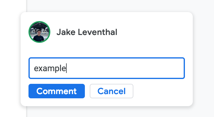
Examples 🌈
Here is a screenshot of what the new design looks like: a comment card on the redesigned Google Docs
In this comparable sandbox that I made, there are many noticeable differences in default styling behavior. The styling differences are apparent everywhere throughout most all of Google's software tools as of the January 15, 2019 updates to material.
I am aware that a lot of these changes can be achieved through styling but these changes seem to be the DEFAULT behavior in material design
The text was updated successfully, but these errors were encountered: