Releases: nhn/tui.chart
v4.3.1
Bug Fixes
- Fix the bullet chart scale was not calculated properly(#602, #648)
- Fix bullet chart with negative values were not drawn correctly(#648)
- Fix that not reflected when downloading from the export menu after data manipulation(#649)
- Fix lineScatter chart scale was not calculated properly(#651)
- Fix the title of the heatmap y-axis was not displayed properly(#644)
v4.3.0
New Features
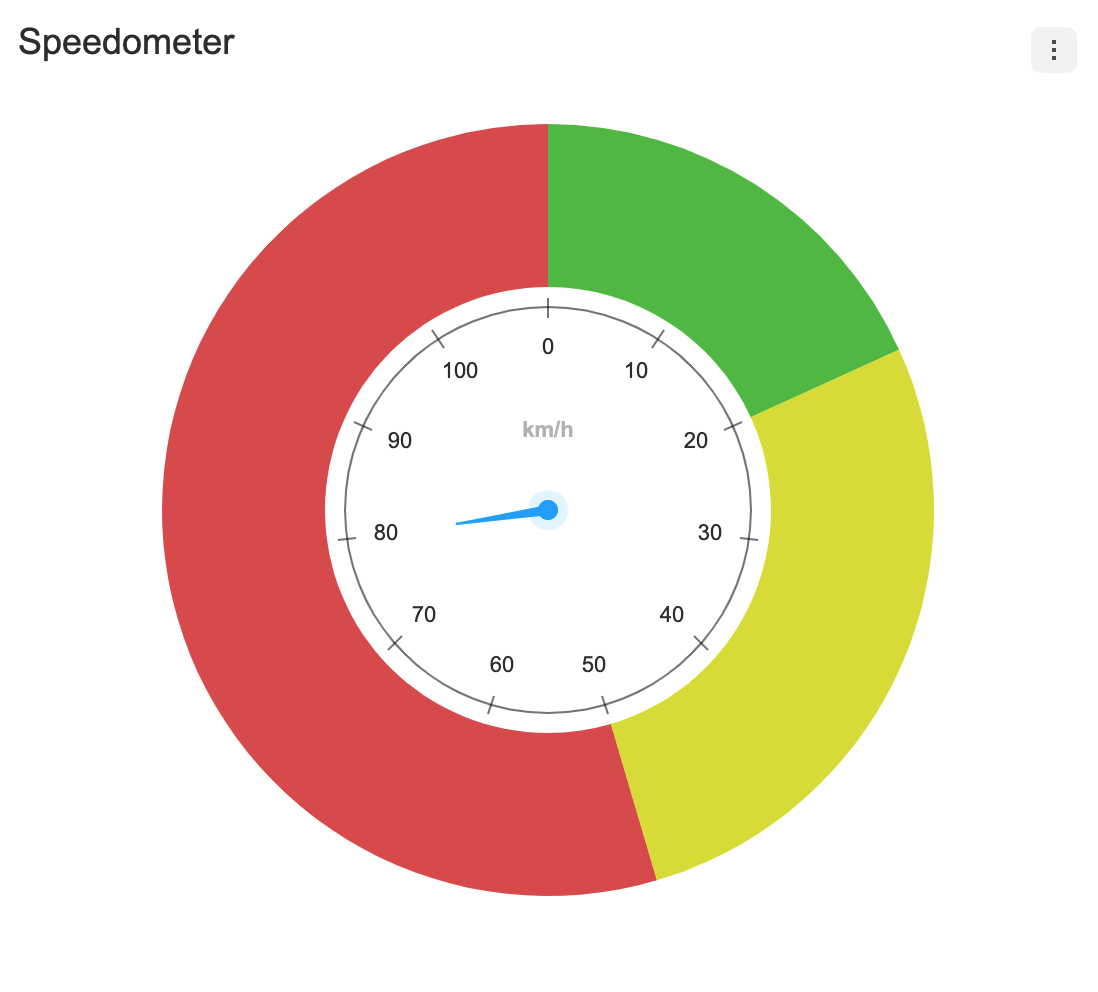
A new chart type, the Gauge chart announced 🎉
It supports series options such as clockwise, angleRange, solid, etc. Use these options to display your own charts. This new chart has circularAxis ans plot options. This chart does not support legends..
plot
You can set the range using the plot option.
const options = {
  ...
  plot: {
    bands: [
      { range: [0, 20], color: '#55bf3b' },
      { range: [20, 50], color: '#dddf0d' },
      { range: [50, 110], color: '#df5353' },
    ],
  },
  // using category data
  plot: {
    bands: [
      { range: ['Apple', 'Watermelon'], color: '#df5353' },
      { range: ['Watermelon', 'Grape'], color: '#8700ff' },
      { range: ['Grape', 'Apple'], color: '#ff9800' },
    ],
  },
};| basic | using category data |
|---|---|
 |
 |
series.clockwise options
Determines the direction in which the series is painted.
const chart = new GaugeChart({el, data, {
  ...
  clockwise: false,          // default: true
}});| clockwise | counter clockwise |
|---|---|
 |
 |
series.angleRange options
The angleRange uses start and end options to determine the range of the arc.
const chart = new GaugeChart({el, data, {
  ...
  angleRange: {
    start: 45,
    end: 315
  }
}});| apply angleRange | with theme |
|---|---|
 |
 |
series.solid options
The solid option is available when there is only one series. If set to solid: true, the a clockhand are not displayed by default. If you want to display the clockhand, set solid.clockHand: true.
const chart = new GaugeChart({el, data, {
  ...
  solid: true
  // or
  solid: {
    clockHand: true // defat: false
  }
}});| with clockHand | with dataLabels |
|---|---|
 |
 |
Guide
v4.2.1
Bug Fixes
- Fix the coordinate chart was not rendered properly.(#641, #628, #634)
- Fix range plot bands not rendering properly. (#635)
- Fix chart not rendering properly in webpack5. (#619)
- Fix the theme was not applied when calling the selectSeries API. (#639)
- Fix the chart was not drawn properly when setData in the no data state(#629)
v4.2.0
New Features
Legend Item Ellipsis(#614)
Controls the width and overflow options of the legend item. If a value is given to item.width and the overflow setting is not specified, overflow:'ellipsis' is applied.
const options = {
  legend: {
    item: {
      width: 40,
      overflow: 'ellipsis'
    }
  }
};
No Data Layer(#607)
No Data Text is options for displaying a message like "No data to display".
Default

lang Options
The default text value is "No data to display". Use options.lang.noData when you want to process i18n or change the text.
const options = {
  lang: {
    noData: '😭No Data!!😭',
  },
}
theme
The following is a list of themes that can be modified in the No Data Text.
const options = {
  theme: {
    noData: {
      fontSize: 30,
      fontFamily: 'Verdana',
      fontWeight: 'bold',
      color: '#3ee',
    }
  }
}

interface NoDataTheme {
  fontSize?: number;
  fontFamily?: string;
  fontWeight?: string | number;
  color?: string;
}
Bug Fixes
- Fix Cross-Site Scripting Vulnerability (#604, #618) (📣 @arjunshibu Thanks for CONTRIBUTING!)
- Fix the spectrum legend layout was not properly exposed (#626)
v4.1.4
v4.1.3
v4.1.2
v4.1.1
v4.1.0
New Features
A new chart type, the RadialBar chart announced 🎉
It supports options such as clockwise, angleRange, radiusRange, etc. Use these options to display your own charts. This new chart has circularAxis, verticalAxis. In addition, Radar Chart has improved the concept of the previously ambiguous axis, and uses CircularAxis and verticalAxis.
selectable and eventDetectType options
The selectable option makes the series selectable and defines how to detect the series through the mouse with eventDetectType.
const chart = new RadialBarChart({el, data, {
  series: {
    selectable: true,          // default: false
    eventDetectType: 'grouped' // default: 'point',
  }
}});| point | grouped |
|---|---|
 |
 |
clockwise options
Determines the direction in which the series is painted.
const chart = new RadialBarChart({el, data, {
  series: {
    clockwise: false,          // default: true
  }
}});| clockwise | counter clockwise |
|---|---|
 |
 |
angleRange options
The angleRange uses start and end options to determine the range of the arc.
const chart = new RadialBarChart({el, data, {
  ...
  series: {
    angleRange: {
      start: 45,
      end: 315
    }
  }
}});| angleRange | with theme |
|---|---|
 |
 |
|
radiusRange options
The radiusRange uses inner and outer options to define the radii of inner and outer circles.
const chart = new RadialBarChart({el, data, {
  series: {
    radiusRange: {
      inner: 50,
      outer: '90%'
    }
  }
}});| radiusRange | with theme |
|---|---|
 |
 |
Guide
addOutlier API (#557)
Using addOutlier(), you can add new outlier data to the BoxPlot chart.
public addOutlier(seriesIndex: number, outliers: number[][])

/* example */
const boxPlotChart = new BoxPlotChart({ el, data, options });

boxPlotChart.addOutlier(1, [[1, 50], [3, 30]]);
Data visible options
- Compatible with:
Line,Area,LineArea,Bar,Column,ColumnLine,Bullet,BoxPlot,Scatter,LineScatter,Bubble,Pie,NestedPie,Radar
RadialBar chart will be supported in 4.1.1
Each series can have visible option. The visible option determines whether the series is displayed when the chart is first drawn. The default is true. Both basic chart and range chart use the same way.
const data = {
  categories: ['Jan', 'Feb', 'Mar', 'Apr', 'May', 'Jun'],
  series: [
    {
      name: 'Seoul',
      data: [20, 40, 25, 50, 15, 45],
      visible: false,
    },
  ],
}
Bug Fixes
- Fix bug where colors are not properly exposed when there are more than 27 series(#555)
- Automatically change the legend layout when the number of series is large.(#562)
- Fix bug where the container's width and height were not specified and when 'auto' was used(#568)
- Remove alias used when importing types(#561)
- Fix bug that the position was not properly exposed when scrolling the export menu.(#578)
- Fix bug where the data of the selected series was not provide
selectSeries()(#582)