refactor(popover): add example with no header, refactor css a little, add some a11y attributes #837
Conversation
… add some a11y attributes
 mcoker
requested review from
jameslau,
jgiardino,
matthewcarleton and
srambach
mcoker
requested review from
jameslau,
jgiardino,
matthewcarleton and
srambach
|
Deploy preview for pf-next ready! Built with commit a4ddb23 |
 jameslau
left a comment
jameslau
left a comment
jameslau
left a comment
There was a problem hiding this comment.
The popover looks good. Code is clean with the CSS. I'll let @jgiardino confirm on the ARIA attributes before this is merged.
|
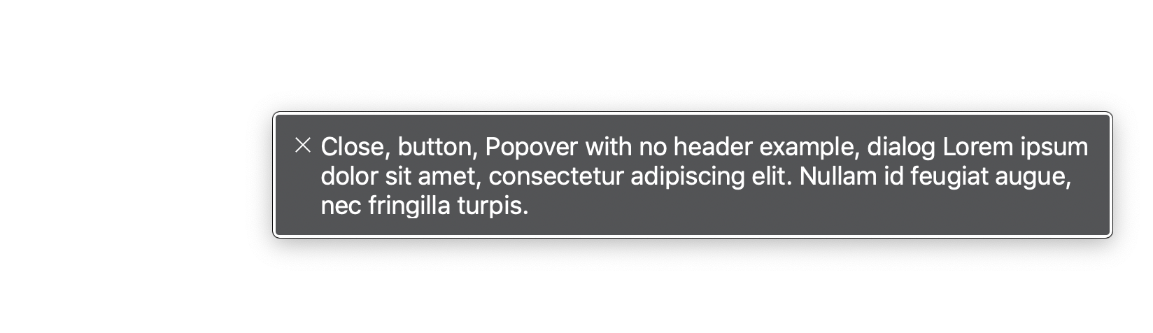
looks good! I ran this through voiceover and noticed that the examples with header announce the entirety of the popover header/content but the example with no header just announces the |
|
Thanks @matthewcarleton! I'm a little confused as to when to use |
|
@michael-coker ya good point. I'd expect the same experience with/without the header but I'm not sure in our case if the description would be the same as the body or not. It depends if the expectation from a screen reader is to then continue to read the content after they've had the description announced. I'd assume they'd only want the content announced and not a description of it, but I think we'd have to do a bit more research to really know for sure. |
|
@matthewcarleton I compared the popover to the modal, and I believe their accessibility attributes should be the same. Each of the modal examples have |
|
Also I'm noticing that ones with titles announce everything twice b/c they have 'aria-labelledby' and 'aria-describedby'. It seems |
|
These updates match what I'd expect, which is based on the documentation provided here: https://www.w3.org/TR/wai-aria-practices-1.1/examples/dialog-modal/dialog.html I also consider popovers and modals to be similar enough to have the same keyboard and screen reader experience. I'm also a little confused by When reviewing our popovers and modals in VO, I found that I'm not able to access anything except the title and close button, which I thought was odd. I found this modal example which talks about adding I didn't notice the behavior that @matthewcarleton described. |
Yep. That's what I would expect. Do you expect to hear something different?
I hadn't noticed that, but I can confirm it's happening on my side, too. I just tested our modals, and it's happening there as well since they use the same aria properties. @jgiardino after VO reads the label and body in either a popover or a dialog with a title (when the dialog reads |
|
Merging this with the effort of a11y moving to a new issue because this also affects modal. |
* 'master' of https://github.com/patternfly/patternfly-next:
  fix(brand): remove min-height in example (#929)
  Breadcrumbs 832 (#912)
  chore(colors): update palette and support some new charting colors (#923)
  refactor(popover): add example with no header, refactor css a little, add some a11y attributes (#837)
  fix(page): fix padding var order, update dark attr selector (#908)
  fix(grid): add min-width/height 0 to override min-content (#921)
  chore(hbs): add contains helper to handlebars (#904)
  remove sequence folder (#903)
  fix(nav): update spacing for nav system (#890)
  chore(workspace): add ability to expand/collapse code areas (#896)
  feat(width): Introduce width utility (#820)
  enhancement(switch): Update the Switch to reflect the latest design (#877)
  chore(card): add oxford comma
  chore(card): Expand card implementation (#842)
  chore(node version): add nvm support, at Node >= v8.0.0 (#855)
  fix(naming): rename template styles.scss into componentName.scss (#861)
  fix(nav): Update expandable nav toggle's a11y attributes (#746) (#876)
  fix(page-layout): move nav styles to component (#884)
  fix(page-layout):revises condensed masthead  mobile view (#879)
  fix(workspace): Change bg of preview body to allow component bg to show (#874)
5 participants
fixes #834