| title | author | date | site | documentclass | bibliography | url | description | link-citations | github-repo | ||
|---|---|---|---|---|---|---|---|---|---|---|---|
Introduction to Data Analysis in R |
Caitlin C. Mothes, PhD and Katie Willi |
2023-10-05 |
bookdown::bookdown_site |
book |
|
This site hosts the course content for WR 696 at Colorado State University.
|
true |
rossyndicate/WR696_R_Intro |
This site hosts the course curriculum for Colorado State University's WR 696 course: Introduction to Data Analysis in R
As your first step, please follow the instructions on the [R Setup][Setup Instructions] page to make sure you have all the necessary software installed on your computer before the class starts.
The table of contents on the left allows you to navigate to the lesson for each week of the course. Each lesson will walk you through the topic(s), analysis, etc. for that week. There are exercises at the end of the lesson that will be that week's homework assignment.
Homework will be submitted through Canvas and exercise questions (including any code, figures, etc.) must be submitted as a rendered R Markdown document in Word or HTML format. The Intro to R and R Markdown lesson will walk through how to create these R Markdown documents; you will use these R Markdowns as the basis for writing your code/answers to the exercises and then render them to either a Word or HTML report which is what you will submit through Canvas.
The broad goal of this course is to introduce you to the skills necessary for a career that involves data science - namely manipulating data sets and performing statistical tests in R. The more specific goals of this course are to teach students to:
- Navigate the RStudio interface and create R Markdown documents for reproducible reporting;
- Utilize R packages and functions to manipulate and analyze data effectively and apply data wrangling techniques using the {tidyverse} framework;
- Differentiate between various data types and structures within R; and
- Explore comparative analyses, linear regression, and trend analysis techniques to reveal patterns in data.
This class is flipped, meaning all materials for the week ahead must be reviewed before class. To encourage this we will have weekly quizzes on pre-class content each Monday before we dive into the assignment.
So without lectures in class what do we do together? We code! This class has almost four hours of contact time per week, and we design lessons so that you should be able to finish your assignments in class. The flipped class allows for deeper discussion about the common pitfalls of coding and allows for collaborative work time with your fellow classmates.
Generally we will do a quick live-code review of concepts from the assignment and the pre-class materials, but more than 1.5 hours per day will be dedicated to you coding and working on the assignment in class.
As such, coming to class is a vital part of how you can be successful and we fully expect you to be there every day.
We also will actively encourage a collaborative coding environment where students help each other and discuss the best approach to solving various coding problems. We also hope that outside of class, you will use our Teams channel to discuss code issues!
We will always send announcements with assignments, web links, and other updates through Canvas. The course syllabus will also be posted on Canvas.
+------+---------------+----------------------------------------------------------------------------------------------------------------------------------------------------------------------------------------------------------------------------------------------------------------------+ | Week | Date (Monday) | Content | +------+---------------+----------------------------------------------------------------------------------------------------------------------------------------------------------------------------------------------------------------------------------------------------------------------+ | 1 | 8/22 | Before class: Primers Basics and R Markdown; download R and RStudio | | | | | | | | Introduction to R, RStudio, RMarkdown | +------+---------------+----------------------------------------------------------------------------------------------------------------------------------------------------------------------------------------------------------------------------------------------------------------------+ | 2 | 8/28 | Before class: Work with Data | | | | | | | | Exploratory data analysis | +------+---------------+----------------------------------------------------------------------------------------------------------------------------------------------------------------------------------------------------------------------------------------------------------------------+ | 3 | 9/4 | No Class Monday 9/4! Before class Wednesday: Visualize Data | | | | | | | | Data visualization | +------+---------------+----------------------------------------------------------------------------------------------------------------------------------------------------------------------------------------------------------------------------------------------------------------------+ | 4 | 9/11 | Before class: Tidy Your Data | | | | | | | | T-tests, ANOVA | +------+---------------+----------------------------------------------------------------------------------------------------------------------------------------------------------------------------------------------------------------------------------------------------------------------+ | 5 | 9/18 | Before class: Iterate | | | | | | | | Linear modelling pt. 1 | +------+---------------+----------------------------------------------------------------------------------------------------------------------------------------------------------------------------------------------------------------------------------------------------------------------+ | 6 | 9/25 | Before class: Write Functions | | | | | | | | Linear modelling pt. 2 | +------+---------------+----------------------------------------------------------------------------------------------------------------------------------------------------------------------------------------------------------------------------------------------------------------------+ | 7 | 10/2 | Modelling assumptions, power | +------+---------------+----------------------------------------------------------------------------------------------------------------------------------------------------------------------------------------------------------------------------------------------------------------------+ | 8 | 10/9 | PCA | +------+---------------+----------------------------------------------------------------------------------------------------------------------------------------------------------------------------------------------------------------------------------------------------------------------+
If you are looking to learn even more outside of what this class offers, below are some great introductory R resources:
-
Stat 158 - Vectors, data frames, installing R, etc...
-
RStudio Materials - A series of videos, books, and more to get you started in R.
-
R for Data Science - Covers all of the basic intro material, from a tidyverse perspective. As discussed, this is one way to find solutions in R, it happens to be my preferred way, but there are lots of Base R ways that work just fine!
-
Stat 159 - A CSU specific course for an intro to the tidyverse
-
R Markdown - The primary book for learning more about R Markdown and all of its quirks.
-
Cheatsheets - Short, clear documents that cover so much material from dplyr to shiny apps. Great for quick references. We find the
rmarkdownandggplot2ones particularly useful!
This tutorial walks you through all the required setup steps for using R and RStudio in this course. Please use our class's Teams Channel to post any questions/problems that you encounter.
R is an open source language and software environment for statistical analysis and graphics (plus so much more!). You must first download the R software (for free) here: https://www.r-project.org/.
- Click the download link based on your operating system (OS). Then, for Mac users, install the latest release based on your macOS. For Windows users, click the 'install R for the first time' link.
Note: If you already have R installed, you must have at least version 4.0.0. or greater, but it is best to have the most recent version installed (4.3.1)
RStudio is a (also free) R Integrated Development Environment (IDE) that provides a built-in editor and other advantages such as version control and project management. Once you have the R software installed on your computer, you can install RStudio Desktop here: https://posit.co/download/rstudio-desktop/.
- Under Step 2 click the download RStudio Desktop button.
While the R software comes with many pre-loaded functions (referred to as 'base R' functions) to perform various operations in R, there are thousands of R packages that provide additional reusable R functions. In order to use these functions you need to first install the package to your local machine using the install.packages() function. Once a package is installed on your computer you don't need to install it again (but you may have to update it). Anytime you want to use the package in a new R session you can load it with the library() function.
We will be working in RStudio for this entire course, so after you have installed both R and RStudio, open a new session of RStudio.
You will learn more about the ins and outs of RStudio in class, but for set up purposes you will just be running code in the Console. Normally you want to save the code you write, but since package installation is only needed once (unless you are working on a new machine or need to update any packages) you can execute this directly in the console.
Run the following three lines of code (one at a time) in the console. You can click the copy button in the upper right corner when you hover over the code chunk, then paste that after the > in the Console. Spelling and capitalization is important!
Install the {tidyverse} package. The Tidyverse is actually a collection of multiple R packages designed for data manipulation, exploration, and visualization that you are likely to use in every day data analysis. When you install the Tidyverse, it installs all of these packages, and you can later load all of them in your R session with library(tidyverse). Since you are installing multiple packages here this may take a little while.
install.packages("tidyverse")Install the {palmerpenguins} package. This is a data package that installs a couple of spreadsheets you can load and work with in R.
install.packages("palmerpenguins")Install the {rmarkdown} package. Later on in the course you will be working in and rendering R Markdown files and reports. R Markdown is a notebook style interface integrating text and code, allowing you to create fully reproducible documents and render them to various elegantly formatted static or dynamic outputs.
You can learn more about R Markdown at their website, which has really informative lessons on their Getting Started page, and see the range of outputs you can create at their Gallery page.
install.packages("rmarkdown")To see if you successfully installed all three packages, use the library() function to load the packages into your session. You should either see nothing printed to the console after running library(), or in the case of the tidyverse you may see some messages printed. As long as there are no error messages, you should be all set! Please use our class's Teams Channel for assistance if you get any error messages.
library(tidyverse)
library(palmerpenguins)
library(rmarkdown)In this lesson we will get a general introduction to coding in RStudio, using R Markdown, some R fundamentals such as data types and indexing, and touch on a range of coding topics that we will dive into deeper throughout the course.
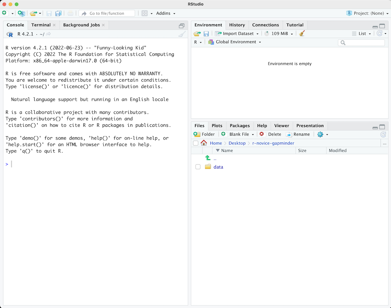
When you first open RStudio, it is split into 3 panels:
- The Console (left), where you can directly type and run code (by hitting Enter)
- The Environment/History pane (upper-right), where you can view the objects you currently have stored in your environment and a history of the code you've run
- The Files/Plots/Packages/Help pane (lower-right), where you can search for files, view and save your plots, view and manage what packages are loaded in your library and session, and get R help.
To write and save code you use .R scripts (or RMarkdown, which we will learn shortly). You can open a new script with File -> New File or by clicking the icon with the green plus sign in the upper left corner. When you open a script, RStudio then opens a fourth 'Source' panel in the upper-left to write and save your code. You can also send code from a script directly to the console to execute it by highlighting the entire code line/chunk (or place your cursor at the end of the code chunk) and hit CTRL+ENTER on a PC or CMD+ENTER on a Mac.
It is good practice to add comments/notes throughout your scripts to document what the code is doing. To do this start a line with a #. R knows to ignore everything after a #, so you can write whatever you want there. Note that R reads line by line, so if you want your comments to carry over multiple lines you need a # at every line.
As a first step whenever you start a new project, workflow, analysis, etc., it is good practice to set up an R project. R Projects are RStudio's way of bundling together all your files for a specific project, such as data, scripts, results, figures. Your project directory also becomes your working directory, so everything is self-contained and easily portable.
We recommend using a single R Project (i.e., contained in a single folder) for this course, so lets create one now.
You can start an R project in an existing directory or in a new one. To create a project go to File -> New Project:

Let's choose 'New Directory' then 'New Project'. Now choose a directory name, this will be both the folder name and the project name, so use proper spelling conventions (no spaces!). We recommend naming it something course specific, like 'WR-696-2023', or even more generic 'Intro-R-Fall23'. Choose where on your local file system you want to save this new folder/project (somewhere you can find it easily), then click 'Create Project'.
Now you can see your RStudio session is working in the R project you just created. You can see the working directory printed at the top of your console is now the project directory, and in the 'Files' tab in RStudio you can see there is an .Rproj file with the same name as the R project, which will open up this R project in RStudio whenever you come back to it.
Test out how this .Rproj file works. Close out of your R session, navigate to the project folder on your computer, and double-click the .Rproj file.
::: {.alert .alert-info} What is a working directory? A working directory is the default file path to a specific file location on your computer to read files from or save files to. Since everyone's computer is unique, everyone's full file paths will be different. This is an advantage of working in R Projects, you can use relative file paths, since the working directory defaults to wherever the .RProj file is saved on your computer you don't need to specify the full unique path to read and write files within the project directory. :::
Let's start coding!
The first thing you do in a fresh R session is set up your environment, which mostly includes installing and loading necessary libraries and reading in required data sets. Let's open a fresh R script and save it in our root (project) directory. Call this script 'setup.R'.
Before creating a set up script, it might be helpful to understand the use of functions in R if you are new to this programming language. R has many built-in functions to perform various tasks. To run these functions you type the function name followed by parentheses. Within the parentheses you put in your specific arguments needed to run the function.
# mathematical functions with numbers
log(10)
## [1] 2.302585
# average a range of numbers
mean(1:5)
## [1] 3
# nested functions for a string of numbers, using the concatenate function 'c'
mean(c(1,2,3,4,5))
## [1] 3
# functions with characters
print("Hello World")
## [1] "Hello World"
paste("Hello", "World", sep = "-")## [1] "Hello-World"
R Packages include reusable functions that are not built-in with R. To use these functions, you must install the package to your local system with the install.packages() function. Once a package is installed on your computer you don't need to install it again (you will likely need to update it at some point though). Anytime you want to use the package in a new R session you load it with the library() function.
When do I use :: ?
If you have a package installed, you don't necessarily have to load it in with library() to use it in your R session. Instead, you can type the package name followed by :: and use any functions in that package. This may be useful for some one-off functions using a specific package, however if you will be using packages a lot throughout your workflow you will want to load it in to your session. You should also use :: in cases where you have multiple packages loaded that may have conflicting functions (e.g., plot() in Base R vs. plot() in the {terra} package).
You may hear us use the terms 'Base R' and 'Tidyverse' a lot throughout this course. Base R includes functions that are installed with the R software and do not require the installation of additional packages to use them. The Tidyverse is a collection of R packages designed for data manipulation, exploration, and visualization that you are likely to use in every day data analysis, and all use the same design philosophy, grammar, and data structures. When you install the Tidyverse, it installs all of these packages, and you can then load all of them in your R session with library(tidyverse). Base R and the Tidyverse have many similar functions, but many prefer the style, efficiency and functionality of the Tidyverse packages, and we will mostly be sticking to Tidyverse functions for this course.
To make code reproducible (meaning anyone can run your code from their local machines) we can write a function that checks whether or not necessary packages are installed, if not install them and load them, or if they are already installed it will only load them and not re-install. This function looks like:
packageLoad <-
  function(x) {
    for (i in 1:length(x)) {
      if (!x[i] %in% installed.packages()) {
        install.packages(x[i])
      }
      library(x[i], character.only = TRUE)
    }
  }
For each package name given ('x') it checks if it is already installed, if not installs it, and then loads that package into the session. In future lessons we will learn more about writing custom functions, and iterating with for loops, but for now you can copy/paste this function and put it at the top of your set up script. When you execute this chunk of code, you won't see anything printed in the console, however you should now see packageLoad() in your Environment under 'Functions'. You can now use this function as many times as you want. Test is out, and use it to install the Tidyverse package(s).
packageLoad('tidyverse')You can also give this function a string of package names. Lets install all the packages we will need for the first week, or if you already followed the set up instructions, this will just load the packages into your session since you already installed them.
# create a string of package names
packages <- c('tidyverse',
              'palmerpenguins',
              'rmarkdown')
# use the packageLoad function we created on those packages
packageLoad(packages)
Since this is code you will be re-using throughout your workflows, we will save it as its own script and run it at the beginning of other scripts/documents using the source() function as a part of our reproducible workflows.
Throughout this course you will be working mostly in R Markdown documents. R Markdown is a notebook style interface integrating text and code, allowing you to create fully reproducible documents and render them to various elegantly formatted static or dynamic outputs (which is how you will be submitting your assignments).
You can learn more at the R Markdown website, which has really informative lessons on the Getting Started page and you can see the range of outputs you can create at the Gallery page.
Some of you may have heard of Quarto, which is essentially an extension of R Markdown but it lives as its own software to allow its use in other languages such as Python, Julia and Observable. You can install the Quarto CLI on its own and RStudio will detect it so you can create documents within the IDE, or alternatively with newer versions of RStudio a version of Quarto is built-in and you can enable Quarto through the R Markdown tab in Global Options. R Markdown isn't going anywhere, however many in the data science realm are switching to Quarto. Quarto documents are very similar to R Markdown, in fact Quarto can even render R Markdown documents, so after learning R Markdown in this course you should have some of the fundamental skills to easily switch to Quarto if you want to. You can read more about Quarto here.
Let's create a new document by going to File -> New File -> R Markdown. You will be prompted to add information like title and author, fill those in (let's call it "Intro to R and R Markdown") and keep the output as HTML for now. Click OK to create the document.
This creates an outline of an R Markdown document, and you see the title, author and date you gave the prompt at the top of the document which is called the YAML header.
Notice that the file contains three types of content:
-
An (optional) YAML header surrounded by
---s -
R code chunks surrounded by
```s -
text mixed with simple text formatting
Since this is a notebook style document, you run the code chunks by clicking the green play button in the top right corner of each code chunk, and then the output is returned directly below the chunk.
::: {.alert .alert-info} If you'd rather have the code chunk output go to the console instead of directly below the chunk in your R Markdown document, go to Tools -> Global Options -> R Markdown and uncheck "Show output inline for all R Markdown documents" :::
When you want to create a report from your notebook, you render it by hitting the 'knit' button at the top of the Source pane (with the ball of yarn next to it), and it will render to the format you have specified in the YAML header. In order to do so though, you need to have the {rmarkdown} package installed.
You can delete the rest of the code/text below the YAML header, and insert a new code chunk at the top. You can insert code chunks by clicking the green C with the '+' sign at the top of the source editor, or with the keyboard short cut (Ctrl+Alt+I for Windows, Option+Command+I for Macs). For the rest of the lesson (and course) you will be writing and executing code through code chunks, and you can type any notes in the main body of the document.
The first chunk is almost always your set up code, where you read in libraries and any necessary data sets. Here we will execute our set up script to install and load all the libraries we need:
source("setup.R")Normally when working with a new data set, the first thing we do is explore the data to better understand what we're working with. To do so, you also need to understand the fundamental data types and structures you can work with in R.
For this intro lesson, we are going to use the Palmer Penguins data set (which is loaded with the {palmerpenguins} package you installed in your set up script). This data was collected and made available by Dr. Kristen Gorman and the Palmer Station, Antarctica LTER, a member of the Long Term Ecological Research Network.
Load the penguins data set.
data("penguins")You now see it in the Environment pane. Print it to the console to see a snapshot of the data:
penguins## # A tibble: 344 × 8
## species island bill_length_mm bill_depth_mm flipper_length_mm body_mass_g
## <fct> <fct> <dbl> <dbl> <int> <int>
## 1 Adelie Torgersen 39.1 18.7 181 3750
## 2 Adelie Torgersen 39.5 17.4 186 3800
## 3 Adelie Torgersen 40.3 18 195 3250
## 4 Adelie Torgersen NA NA NA NA
## 5 Adelie Torgersen 36.7 19.3 193 3450
## 6 Adelie Torgersen 39.3 20.6 190 3650
## 7 Adelie Torgersen 38.9 17.8 181 3625
## 8 Adelie Torgersen 39.2 19.6 195 4675
## 9 Adelie Torgersen 34.1 18.1 193 3475
## 10 Adelie Torgersen 42 20.2 190 4250
## # ℹ 334 more rows
## # ℹ 2 more variables: sex <fct>, year <int>
This data is structured as a data frame, probably the most common data type and one you are most familiar with. These are like Excel spreadsheets: tabular data organized by rows and columns. However we see at the top this is called a tibble which is just a fancy kind of data frame specific to the Tidyverse.
At the top we can see the data type of each column. There are five main data types:
-
character:
"a","swc" -
numeric:
2,15.5 -
integer:
2L(theLtells R to store this as an integer) -
logical:
TRUE,FALSE -
complex:
1+4i(complex numbers with real and imaginary parts)
Data types are combined to form data structures. R's basic data structures include:
-
atomic vector
-
list
-
matrix
-
data frame
-
factors
You can see the data type or structure of an object using the class() function, and get more specific details using the str() function. (Note that 'tbl' stands for tibble).
class(penguins)## [1] "tbl_df" "tbl" "data.frame"
str(penguins)## tibble [344 × 8] (S3: tbl_df/tbl/data.frame)
## $ species : Factor w/ 3 levels "Adelie","Chinstrap",..: 1 1 1 1 1 1 1 1 1 1 ...
## $ island : Factor w/ 3 levels "Biscoe","Dream",..: 3 3 3 3 3 3 3 3 3 3 ...
## $ bill_length_mm : num [1:344] 39.1 39.5 40.3 NA 36.7 39.3 38.9 39.2 34.1 42 ...
## $ bill_depth_mm : num [1:344] 18.7 17.4 18 NA 19.3 20.6 17.8 19.6 18.1 20.2 ...
## $ flipper_length_mm: int [1:344] 181 186 195 NA 193 190 181 195 193 190 ...
## $ body_mass_g : int [1:344] 3750 3800 3250 NA 3450 3650 3625 4675 3475 4250 ...
## $ sex : Factor w/ 2 levels "female","male": 2 1 1 NA 1 2 1 2 NA NA ...
## $ year : int [1:344] 2007 2007 2007 2007 2007 2007 2007 2007 2007 2007 ...
class(penguins$species)## [1] "factor"
str(penguins$species)## Factor w/ 3 levels "Adelie","Chinstrap",..: 1 1 1 1 1 1 1 1 1 1 ...
When we pull one column from a data frame like we just did above using the $ operator, that returns a vector. Vectors are 1-dimensional, and must contain data of a single data type (i.e., you cannot have a vector of both numbers and characters).
If you want a 1-dimensional object that holds mixed data types and structures, that would be a list. You can put together pretty much anything in a list.
myList <- list("apple", 1993, FALSE, penguins)
str(myList)## List of 4
## $ : chr "apple"
## $ : num 1993
## $ : logi FALSE
## $ : tibble [344 × 8] (S3: tbl_df/tbl/data.frame)
## ..$ species : Factor w/ 3 levels "Adelie","Chinstrap",..: 1 1 1 1 1 1 1 1 1 1 ...
## ..$ island : Factor w/ 3 levels "Biscoe","Dream",..: 3 3 3 3 3 3 3 3 3 3 ...
## ..$ bill_length_mm : num [1:344] 39.1 39.5 40.3 NA 36.7 39.3 38.9 39.2 34.1 42 ...
## ..$ bill_depth_mm : num [1:344] 18.7 17.4 18 NA 19.3 20.6 17.8 19.6 18.1 20.2 ...
## ..$ flipper_length_mm: int [1:344] 181 186 195 NA 193 190 181 195 193 190 ...
## ..$ body_mass_g : int [1:344] 3750 3800 3250 NA 3450 3650 3625 4675 3475 4250 ...
## ..$ sex : Factor w/ 2 levels "female","male": 2 1 1 NA 1 2 1 2 NA NA ...
## ..$ year : int [1:344] 2007 2007 2007 2007 2007 2007 2007 2007 2007 2007 ...
You can even nest lists within lists:
list(myList, list("more stuff here", list("and more")))## [[1]]
## [[1]][[1]]
## [1] "apple"
##
## [[1]][[2]]
## [1] 1993
##
## [[1]][[3]]
## [1] FALSE
##
## [[1]][[4]]
## # A tibble: 344 × 8
##    species island    bill_length_mm bill_depth_mm flipper_length_mm body_mass_g
##    <fct>   <fct>              <dbl>         <dbl>             <int>       <int>
##  1 Adelie  Torgersen           39.1          18.7               181        3750
##  2 Adelie  Torgersen           39.5          17.4               186        3800
##  3 Adelie  Torgersen           40.3          18                 195        3250
##  4 Adelie  Torgersen           NA            NA                  NA          NA
##  5 Adelie  Torgersen           36.7          19.3               193        3450
##  6 Adelie  Torgersen           39.3          20.6               190        3650
##  7 Adelie  Torgersen           38.9          17.8               181        3625
##  8 Adelie  Torgersen           39.2          19.6               195        4675
##  9 Adelie  Torgersen           34.1          18.1               193        3475
## 10 Adelie  Torgersen           42            20.2               190        4250
## # ℹ 334 more rows
## # ℹ 2 more variables: sex <fct>, year <int>
##
##
## [[2]]
## [[2]][[1]]
## [1] "more stuff here"
##
## [[2]][[2]]
## [[2]][[2]][[1]]
## [1] "and more"
You can use the names() function to retrieve or assign names to list and vector elements:
names(myList) <- c("fruit", "year", "logic", "data")
names(myList)
## [1] "fruit" "year" "logic" "data"
Indexing is an extremely important aspect to data exploration and manipulation. In fact you already started indexing when we looked at the data type of individual columns with penguins$species. How you index is dependent on the data structure.
Index lists:
# for lists we use double brackes [[]]
myList[[1]] # select the first stored object in the list
## [1] "apple"
myList[["data"]] # select the object in the list named "data" (a data frame)## # A tibble: 344 × 8
## species island bill_length_mm bill_depth_mm flipper_length_mm body_mass_g
## <fct> <fct> <dbl> <dbl> <int> <int>
## 1 Adelie Torgersen 39.1 18.7 181 3750
## 2 Adelie Torgersen 39.5 17.4 186 3800
## 3 Adelie Torgersen 40.3 18 195 3250
## 4 Adelie Torgersen NA NA NA NA
## 5 Adelie Torgersen 36.7 19.3 193 3450
## 6 Adelie Torgersen 39.3 20.6 190 3650
## 7 Adelie Torgersen 38.9 17.8 181 3625
## 8 Adelie Torgersen 39.2 19.6 195 4675
## 9 Adelie Torgersen 34.1 18.1 193 3475
## 10 Adelie Torgersen 42 20.2 190 4250
## # ℹ 334 more rows
## # ℹ 2 more variables: sex <fct>, year <int>
Index vectors:
# for vectors we use single brackets []
myVector <- c("apple", "banana", "pear")
myVector[2]
## [1] "banana"
Index data frames:
# dataframe[row(s), columns()]
penguins[1:5, 2]

penguins[1:5, "island"]

penguins[1, 1:5]

penguins[1:5, c("species","sex")]

penguins[penguins$sex=='female',]

# $ for a single column
penguins$species
::: {.alert .alert-info}
To index elements of a list you must use double brackets [[ ]], and to index vectors and data frames you use single brackets [ ]
:::
(not required, but work through them if you want!)
-
Why don't the following lines of code work? Tweak each one so the code runs
myList["Fruit"]
penguins$flipper_lenght_mm
penguins[island=='Dream',]
-
How many species are in the
penguinsdata set? What islands were the data collected for? (Note: theunique()function might help) -
Use indexing to create a new data frame that has only 3 columns: species, island and flipper length columns, and subset all rows for just the 'Dream' island.
-
Use indexing and the
mean()function to find the average flipper length for the Adelie species on Dream island. (Note: explore themean()function and how to deal with NA values).
So far the code you've been writing has consisted of Base R functionality. Now lets dive into the Tidyverse with the {dplyr} package.
{dplyr} is a Tidyverse package to handle most of your data exploration and manipulation tasks. Now that you have learned indexing, you may notice the first two {dplyr} functions you are going to learn. filter() and select() act as indexing functions by subsetting rows and columns based on specified names and/or conditions.
Subset rows with filter()
You can filter data in many ways using logical operators (>, >=, <, <=, != (not equal), and == (equal)), AND (&), OR (|), and NOT (!) operators, and other operations such as %in%, which returns everything that matches at least one of the values in a given vector, and is.na() and !is.na() to return all missing or all non-missing data.
filter(penguins, species == "Adelie")

filter(penguins, species != "Adelie")

filter(penguins, island %in% c("Dream", "Torgersen") & !is.na(bill_length_mm))
Note: Tidyverse package functions take in column names without quotations.
::: {.alert .alert-info} Using {dplyr} functions will not manipulate the original data, so if you want to save the returned object you need to assign it to a new variable. :::
Select columns with select(){style="font-size: 13pt;"}
select() has many helper functions you can use with it, such as starts_with(), ends_with(), contains() and many more that are very useful when dealing with large data sets. See ?select for more details.
::: {.alert .alert-info}
Writing out ? ahead of any function from a package will open a description of that function in the "Help" pane.
:::
# Select two specific variables
select(penguins, species, sex)

# Select a range of variables
select(penguins, species:flipper_length_mm)

# Rename columns within select
select(penguins, genus = species, island)

# Select column variables that are recorded in mm
select(penguins, contains("mm"))
Create new variables with mutate(){style="font-size: 13pt;"}
# New variable that calculates bill length in cm
mutate(penguins, bill_length_cm = bill_length_mm/10)

# mutate based on conditional statements
mutate(penguins, species_sex = if_else(sex == 'male', paste0(species,"_m"), paste0(species, "_f")))
Notice the use of paste0() here, and when we briefly used a similar function paste() in the 'Functions' section above. Explore the difference between these two. They are both very useful functions for pasting strings together.
These can all be used in conjunction with group_by() which changes the scope of each function from operating on the entire data set to operating on it group-by-group. group_by() becomes even more powerful when used along with summarise() to calculate some specified summary statistic for each group. However before we start using multiple operations in conjunction with one another, we need to talk about the pipe operator %>%.
The pipe, %>%, comes from the magrittr package by Stefan Milton Bache. Packages in the Tidyverse load %>% for you automatically, so you don't usually load {magrittr} explicitly. Pipes are a powerful tool for clearly expressing a sequence of multiple operations.
For example, the pipe operator can take this sequence of operations:
df1 <- filter(penguins, island == "Dream")
df2 <- mutate(df1, flipper_length_cm = flipper_length_mm/10)
df3 <- select(df2, species, year, flipper_length_cm)

print(df3)
And turn it into this, removing the need to create intermediate variables
penguins %>%
  filter(island == "Dream") %>%
  mutate(flipper_length_cm = flipper_length_mm/10) %>%
  select(species, year, flipper_length_cm)
You can read it as a series of imperative statements: filter, then mutate, then select. A good way to pronounce %>% when reading code is "and then". It takes the output of the operation to the left of %>% and feeds it into the next function as the input.
Say you want to summarize data by some specified group, for example you want to find the average body mass for each species, this is where the group_by() function comes into play.
penguins %>%
  group_by(species) %>%
  summarise(body_mass_avg = mean(body_mass_g, na.rm = TRUE))
Or get a count of how many individuals were observed for each species each year
penguins %>%
  group_by(species, year) %>%
  summarise(n_observations = n())
You can even shorten the above operation by using count() instead of summarise.
(not required, but useful if you want to work through them!)
-
Reorder the variables in
penguinsso thatyearis the first column followed by the rest (Hint: look into the use ofeverything()). -
Create a new column called 'size_group' where individuals with body mass greater than the overall average are called 'large' and those smaller are called 'small'.
-
Find out which year for each species had the largest average body mass.
-
You want to filter data for years that are not in a vector of given years, but this code doesn't work. Tweak it so that it does. (Yes, you could just filter year to equal 2007 in this case but there is a trouble-shooting lessons here).
    penguins %>%
filter(year !%in% c(2008, 2009))We used an R data package today to read in our data frame, but that probably isn't how you will normally read in your data.
There are many ways to read and write data in R. To read in .csv files, you can use read_csv() which is included in the Tidyverse with the {readr} package, and to save csv files use write_csv(). The {readxl} package is great for reading in excel files, however it is not included in the Tidyverse and will need to be loaded separately.
For this lesson you will be working with the same penguins data from last week. You will be submitting this as your first assignment, so start a new R Markdown document to record your code and answers to the assignment questions, which you will submit as a rendered HTML or Word document on Canvas.
You can set up your session by executing your set up script we created in [Lesson 1][Introduction to R, RStudio and R Markdown]
source("setup.R")OR if you haven't created your set up script, you can load the two libraries below we will need for today:
library(tidyverse)
library(palmerpenguins)
::: {.alert .alert-info}
Note: To avoid warnings and other messages showing up in your rendered R Markdown document, you can set messae = FALSE and warning = FALSE in your code chunk arguments.
:::
For this lesson, we are going to use the Palmer Penguins data set (which is loaded with the {palmerpenguins} package). This data was collected and made available by Dr. Kristen Gorman and the Palmer Station, Antarctica LTER, a member of the Long Term Ecological Research Network.
Since this is a data set from the data package {palmerpenguins}, we can use the data() function to load it into our session:
data("penguins")You should now see it in the Environment pane. Print it to the console to see a snapshot of the data:
penguins## # A tibble: 344 × 8
## species island bill_length_mm bill_depth_mm flipper_length_mm body_mass_g
## <fct> <fct> <dbl> <dbl> <int> <int>
## 1 Adelie Torgersen 39.1 18.7 181 3750
## 2 Adelie Torgersen 39.5 17.4 186 3800
## 3 Adelie Torgersen 40.3 18 195 3250
## 4 Adelie Torgersen NA NA NA NA
## 5 Adelie Torgersen 36.7 19.3 193 3450
## 6 Adelie Torgersen 39.3 20.6 190 3650
## 7 Adelie Torgersen 38.9 17.8 181 3625
## 8 Adelie Torgersen 39.2 19.6 195 4675
## 9 Adelie Torgersen 34.1 18.1 193 3475
## 10 Adelie Torgersen 42 20.2 190 4250
## # ℹ 334 more rows
## # ℹ 2 more variables: sex <fct>, year <int>
When working with a new data set, often the first thing you do is perform some initial investigations on the data using various summary statistics and graphical representations. This is exploratory data analysis! Or for short, EDA. EDA is used to catch any potential errors, assess statistical assumptions, observe patterns and help form initial hypotheses of your data that you can then test with statistics.
For our penguins data, we want to start by exploring things like sample size, variation and distribution of our variables, and make initial comparisons among species, islands, and sex.
A new Base R function we have yet to use is summary(). This functions gives us a very quick snapshot of each variable in our dataset, where we can see things like sample size and summary statistics.
summary(penguins)## species island bill_length_mm bill_depth_mm
## Adelie :152 Biscoe :168 Min. :32.10 Min. :13.10
## Chinstrap: 68 Dream :124 1st Qu.:39.23 1st Qu.:15.60
## Gentoo :124 Torgersen: 52 Median :44.45 Median :17.30
## Mean :43.92 Mean :17.15
## 3rd Qu.:48.50 3rd Qu.:18.70
## Max. :59.60 Max. :21.50
## NA's :2 NA's :2
## flipper_length_mm body_mass_g sex year
## Min. :172.0 Min. :2700 female:165 Min. :2007
## 1st Qu.:190.0 1st Qu.:3550 male :168 1st Qu.:2007
## Median :197.0 Median :4050 NA's : 11 Median :2008
## Mean :200.9 Mean :4202 Mean :2008
## 3rd Qu.:213.0 3rd Qu.:4750 3rd Qu.:2009
## Max. :231.0 Max. :6300 Max. :2009
## NA's :2 NA's :2
For some more in depth EDA, the tidyverse packages provide many useful functions to summarize and visualize data. Today we are going to simultaneously learn more about various functions of tidyverse packages while investigating and formulating hypotheses about our penguins data set.
dplyr is a Tidyverse package to handle most of your data exploration and manipulation tasks. Now that you have learned indexing in the [Intro to R lesson][Introduction to R and RStudio], you may notice the first two dplyr functions we are going to learn, filter() and select() act as indexing functions, subsetting rows and columns based on specified names and/or conditions.
Subset rows with filter()
You can filter data in many ways using logical operators (>, >=, <, <=, != (not equal), and == (equal)), AND (&), OR (|), and NOT (!) operators, and other operations such as %in%, which returns everything that matches at least one of the values in a given vector, and is.na() and !is.na() to return all missing or all non-missing data.
# filter rows for just the Adelie species
filter(penguins, species == "Adelie")

# filter rows for all species EXCEPT Adelie
filter(penguins, species != "Adelie")

# filter islands Dream and Torgersen AND rows that DO NOT have  missing values for bill length
filter(penguins, island %in% c("Dream", "Torgersen") & !is.na(bill_length_mm))
::: {.alert .alert-info} Note: Tidyverse package functions take in column names without quotations. :::
Using dplyr functions will not manipulate the original data, so if you want to save the returned object you need to assign it to a new variable.
body_mass_filtered <- filter(penguins, body_mass_g > 4750 | body_mass_g < 3550)Subset columns with select(){style="font-size: 13pt;"}
select() has many helper functions you can use with it, such as starts_with(), ends_with(), contains() and many more that are very useful when dealing with large data sets. See ?select for more details
# Select two specific variables
select(penguins, species, sex)

# Select a range of variables
select(penguins, species:flipper_length_mm)

# Rename columns within select
select(penguins, genus = species, island)

# Select column variables that have 'mm' in their name
select(penguins, contains("mm"))
Create new variables with mutate(){style="font-size: 13pt;"}
mutate() allows you to edit existing columns or create new columns in an existing data frame, and you can perform calculations on existing columns to return outputs in the new column. The syntax is the name of the new column you want to make (or the current column you want to edit) on the left of =, and then to the right is what you want to put in the new column. Note that mutate() works row wise on the data frame.
# New variable that calculates bill length in cm
mutate(penguins, bill_length_cm = bill_length_mm/10)

# mutate based on conditional statements with if_else()
mutate(penguins, species_sex = if_else(sex == 'male', paste0(species,"_m"), paste0(species, "_f")))
if_else() reads as: IF the given argument (sex == 'male') is TRUE, put this: paste0(species,"_m") otherwise if FALSE put this: paste0(species, "_f")
::: {.alert .alert-info}
Notice the use of paste0() here, and when we briefly used a similar function paste() in the 'Functions' section of the Intro to R lesson. Explore the difference between these two. They are both very useful functions for creating new character strings.
:::
The pipe, %>%, comes from the magrittr package by Stefan Milton Bache. Packages in the tidyverse load %>% for you automatically, so you don't usually load magrittr explicitly. Pipes are a powerful tool for clearly expressing a sequence of multiple operations.
For example, the pipe operator can take this sequence of operations:
df1 <- filter(penguins, island == "Dream")
df2 <- mutate(df1, flipper_length_cm = flipper_length_mm/10)
df3 <- select(df2, -flipper_length_mm) # keep everything BUT the flipper_length_mm column

print(df3)
And turn it into this, removing the need to create intermediate variables
penguins %>%
  filter(island == "Dream") %>%
  mutate(flipper_length_cm = flipper_length_mm/10) %>%
  select(-flipper_length_cm)
You can read it as a series of imperative statements: filter, then mutate, then select. A good way to pronounce %>% when reading code is "then". It takes the output of the operation to the left of %>% and feeds it into the next function as the input.
All the above functions can all be used in conjunction with group_by(), which changes the scope of each function from operating on the entire data set to instead operate by specified groups. group_by() becomes even more powerful when used along with summarise() to calculate some specified summary statistic for each group.
Say you want to summarize data by some specified group, for example you want to find the average body mass for each species, this is how you could do that:
penguins %>%
  group_by(species) %>%
  summarise(body_mass_avg = mean(body_mass_g, na.rm = TRUE))
## # A tibble: 3 × 2
## species body_mass_avg
## <fct> <dbl>
## 1 Adelie 3701.
## 2 Chinstrap 3733.
## 3 Gentoo 5076.
::: {.alert .alert-info}
Notice the additional argument na.rm = TRUE within the mean() function. This is required for any mathamatical or statistical functions if you have ANY missing (NA) values in your dataset. What this does is remove those values from the calculation, otherwise mean() would just return NA without the na.rm = TRUE argument.
:::
The output now only has 3 rows, one for each unique group (i.e., species), and a new column with the calculated average body mass for each species.
You can also group by multiple variables. Say you want to calculate the sample size (i.e., count, which can be calculated with the n() function) for each species for each year of the study:
penguins %>%
  group_by(species, year) %>%
  summarise(n_observations = n())
## # A tibble: 9 × 3
## # Groups: species [3]
## species year n_observations
## <fct> <int> <int>
## 1 Adelie 2007 50
## 2 Adelie 2008 50
## 3 Adelie 2009 52
## 4 Chinstrap 2007 26
## 5 Chinstrap 2008 18
## 6 Chinstrap 2009 24
## 7 Gentoo 2007 34
## 8 Gentoo 2008 46
## 9 Gentoo 2009 44
You can even shorten the above operation by using a new function, count(), instead of summarise():
penguins %>%
  group_by(species, year) %>%
count()You must include the line(s) of code used to answer each question
-
Why don't the following lines of code work? Tweak each one so the code runs (3 pts.)
penguins[1:5, ("species", "island")]
penguins$flipper_lenght_mm
penguins[island=='Dream',]
-
Find the average flipper length for each species. Which species has the largest flippers? (2 pts.)
-
Which is the only species that was sampled across all three islands in this study? You must use {dplyr} functions to answer this question (e.g.,
group_by()...) (2 pts.) -
Reorder the variables in
penguinsso thatyearis the first column followed by the rest (Hint: look into the use ofeverything()). (2 pts.) -
Create a new column called 'size_group' where individuals with body mass greater than the overall average are called 'large' and those smaller are called 'small'. (Note: this answer requires the additional use of both the
if_else()andmean()functions. Remember how to deal withNAvalues inmean()). (4 pts.) -
You want to filter data for years that are not in a vector of given years, but this code doesn't work. Tweak it so that it does. (Yes, you could just filter year to equal 2007 in this case but there is a trouble-shooting lessons here). (2 pts.)
penguins %>%
    filter(year !%in% c(2008, 2009))
An important part of data exploration includes visualizing the data to reveal patterns you can't necessarily see from viewing a data frame of numbers. Here we are going to walk through a very quick introduction to ggplot2, using some code examples from the palmerpenguins R package tutorial: https://allisonhorst.github.io/palmerpenguins/articles/intro.html.
ggplot2 is perhaps the most popular data visualization package in the R language, and is also a part of the Tidyverse. One big difference about ggplot though is that it does not use the pipe %>% operator like we just learned, but instead threads together arguments with + signs (but you can pipe a data frame into the first ggplot() argument).
The general structure for ggplots follows the template below. Note that you can also specify the aes() parameters within ggplot() instead of your geom function, which you may see a lot of people do. The mappings include arguments such as the x and y variables from your data you want to use for the plot. The geom function is the type of plot you want to make, such as geom_point(), geom_bar(), etc, there are a lot to choose from.
# general structure of ggplot functions
ggplot(data = <DATA>) +
  <GEOM_FUNCTION>(mapping = aes(<MAPPINGS>))
Visualize variable distributions with geom_historgram()
If you plan on doing any statistical analysis on your data , one of the first things you are likely to do is explore the distribution of your variables. You can plot histograms with geom_histogram()
ggplot(penguins) +
  geom_histogram(mapping = aes(x = flipper_length_mm))
This tells us there may be a lot of variation in flipper size among species. We can use the 'fill =' argument to color the bars by species, and scale_fill_manual() to specify the colors.
# Histogram example: flipper length by species
ggplot(penguins) +
  geom_histogram(aes(x = flipper_length_mm, fill = species), alpha = 0.5, position = "identity") +
  scale_fill_manual(values = c("darkorange","darkorchid","cyan4"))
Cool, now we can see there seems to be some pretty clear variation in flipper size among species. Another way to visualize across groups is with facet_wrap(), which will create a separate plot for each group, in this case species.
ggplot(penguins) +
  geom_histogram(aes(x = flipper_length_mm, fill = species), alpha = 0.5, position = "identity") +
  scale_fill_manual(values = c("darkorange","darkorchid","cyan4")) +
  facet_wrap(~species)
Compare sample sizes with geom_bar()
Let's use ggplot to see sample size for each species on each island.
ggplot(penguins) +
  geom_bar(mapping = aes(x = island, fill = species))
As you may have already noticed, the beauty about ggplot2 is there are a million ways you can customize your plots. This example builds on our simple bar plot:
ggplot(penguins, aes(x = island, fill = species)) +
  geom_bar(alpha = 0.8) +
  scale_fill_manual(values = c("darkorange","purple","cyan4"),
                    guide = FALSE) +
  theme_minimal() +
  facet_wrap(~species, ncol = 1) +
  coord_flip()
This is important information, since we know now that not all species were sampled on every island, which will have complications for any comparisons we may want to make among islands.
Visualize variable relationships with geom_point()
We can use geom_point() to view the relationship between two continuous variables by specifying the x and y axes. Say we want to visualize the relationship between penguin body mass and flipper length and color the points by species:
ggplot(penguins) +
  geom_point(mapping = aes(x = body_mass_g, y = flipper_length_mm, color = species))
Please include the line(s) of code you used to create your figure and make sure the figure is shown in the rendered report.
- Using the visualization techniques you learned today, create a figure that allows you to visualize some comparison of your choice among the
penguinsdata set. Below your figure write a testable hypothesis about the data and the patterns you see from this figure. (5 pts.)
This lesson will go a little deeper into data visualization and how to customize figures and tables and make them 'publication ready'.
First start by reading in the packages for this lesson, which in this case is only the {tidyverse}:
library(tidyverse)For today's lesson we are going to be working with some census data for Larimer County, CO. This data can be found on Canvas in .csv format titled larimer_census.csv. Download that file and put it in a data/ folder in the your R Project.
After that, read the .csv into your R session using read_csv():
census_data <- read_csv("data/larimer_census.csv")Inspect census_data and the structure of the data frame. This data contains information on median income, median age, and race and ethnicity for each census tract in Larimer County.
::: {.alert .alert-info}
Note: This census data for Larimer county was retrieved entirely in R using the tidycensus package. If you are interested in how I did this, I've uploaded the script to do so on Canvas titled 'getCensusData.R'. Note that you will need to retrieve your own census API key and paste it at the top of the script to run it (API keys are free and easy to get here). To learn more about tidycensus, check out Analyzing U.S. Census Data by Kyle Walker.
:::
For this exercise you will learn how to spruce up your ggplot2 figures with theme customization, annotation, color palettes, and more.
To demonstrate some of these advanced visualization techniques, we will be analyzing the relationships among some census data for Larimer county.
Let's start with this basic plot:
census_data %>%
  ggplot(aes(x = median_age, y = percent_bipoc))+
  geom_point(color = "black")
And by the end of this lesson turn it into this:

-
color or size points by a variable or apply a specific color/number
-
change the transparency with
alpha(ranges from 0-1)
#specific color and size value
census_data %>%
  ggplot(aes(x = median_age, y = percent_bipoc))+
  geom_point(color = "red", size = 4, alpha = 0.5)
When sizing or coloring points by a variable in the dataset, it goes within aes():
# size by a variable
census_data %>%
  ggplot(aes(x = median_age, y = percent_bipoc))+
  geom_point(aes(size = median_income), color = "red")
# color by a variable
census_data %>%
  ggplot(aes(x = median_age, y = percent_bipoc))+
  geom_point(aes(color = median_income), size = 4)
-
add title with
ggtitle -
edit axis labels with
xlab()andylab() -
change axis limits with
xlim()andylim()
census_data %>%
  ggplot(aes(x = median_age, y = percent_bipoc)) +
  geom_point(aes(size = median_income), color = "black")+
  ggtitle("Census Tract socioeconomic data for Larimer County")+
  xlab("Median Age")+
  ylab("People of Color (%)")+
  xlim(c(20, 70))+
  ylim(c(0, 35))
Be cautious of setting the axis limits however, as you notice it omits the full dataset which could lead to dangerous misinterpretations of the data.
You can also put multiple label arguments within labs() like this:
census_data %>%
  ggplot(aes(x = median_age, y = percent_bipoc)) +
  geom_point(aes(size = median_income), color = "black")+
  labs(
    title = "Census Tract socioeconomic data for Larimer County",
    x = "Median Age",
    y = "People of Color (%)"
  ) +
  xlim(c(20, 70))+
  ylim(c(0, 35))
All ggplot2 components can be customized within the theme() function. The full list of editable components (there's a lot!) can be found here. Note that the functions used within theme() depend on the type of components, such as element_text() for text, element_line() for lines, etc.
census_data %>%
  ggplot(aes(x = median_age, y = percent_bipoc)) +
  geom_point(aes(size = median_income), color = "black") +
  ggtitle("Census Tract socioeconomic data for Larimer County") +
  xlab("Median Age") +
  ylab("People of Color (%)") +
  theme(
    #edit plot title
    plot.title = element_text(size = 16, color = "blue"),
    # edit x axis title
    axis.title.x = element_text(face = "italic", color = "orange"),
    # edit y axis ticks
    axis.text.y = element_text(face = "bold"),
    # edit grid lines
    panel.grid.major = element_line(color = "black"),

  )
Another change you may want to make is the value breaks in the axis labels (i.e., what values are shown on the axis). To customize that for a continuous variable you can use scale_x_continuous() / scale_y_continuous (for discrete variables use scale_x_discrete ). In this example we will also add anlge = to our axis text to angle the labels so they are not too jumbled:
census_data %>%
  ggplot(aes(x = median_age, y = percent_bipoc)) +
  geom_point(aes(size = median_income), color = "black") +
  ggtitle("Census Tract socioeconomic data for Larimer County") +
  xlab("Median Age") +
  ylab("People of Color (%)") +
  scale_x_continuous(breaks = seq(15, 90, 5))+
  theme(
    # angle axis labels
    axis.text.x = element_text(angle = 45)
  )
While these edits aren't necessarily pretty, we are just demonstrating how you would edit specific components of your charts. To edit overall aesthetics of your plots you can change the theme.
ggplot2 comes with many built in theme options (see the complete list here).
For example, see what theme_minimal() and theme_classic() look like:
census_data %>%
  ggplot(aes(x = median_age, y = percent_bipoc)) +
  geom_point(aes(size = median_income), color = "black") +
  ggtitle("Census Tract socioeconomic data for Larimer County") +
  xlab("Median Age") +
  ylab("People of Color (%)")+
  theme_minimal()
census_data %>%
  ggplot(aes(x = median_age, y = percent_bipoc)) +
  geom_point(aes(size = median_income), color = "black") +
  ggtitle("Census Tract socioeconomic data for Larimer County") +
  xlab("Median Age") +
  ylab("People of Color (%)")+
  theme_classic()
You can also import many different themes by installing certain packages. A popular one is ggthemes. A complete list of themes with this package can be seen here
To run this example, first install the ggthemes package and then load it in to your session:
install.packages("ggthemes")library(ggthemes)Now explore a few themes, such as theme_wsj, which uses the Wall Street Journal theme, and theme_economist and theme_economist_white to use themes used by the Economist.
census_data %>%
  ggplot(aes(x = median_age, y = percent_bipoc)) +
  geom_point(aes(size = median_income), color = "black") +
  ggtitle("Socioeconomic data for Larimer County") +
  xlab("Median Age") +
  ylab("People of Color (%)")+
  ggthemes::theme_wsj()+
  # make the text smaller
  theme(text = element_text(size = 8))
::: {.alert .alert-info} Note you may need to click 'Zoom' in the Plot window to view the figure better. :::
census_data %>%
  ggplot(aes(x = median_age, y = percent_bipoc)) +
  geom_point(aes(size = median_income), color = "black") +
  ggtitle("Census Tract socioeconomic data for Larimer County") +
  xlab("Median Age") +
  ylab("People of Color (%)")+
  ggthemes::theme_economist()
Some themes may look messy out of the box, but you can apply any elements from theme() afterwards to clean it up. For example, change the legend position:
census_data %>%
  ggplot(aes(x = median_age, y = percent_bipoc)) +
  geom_point(aes(size = median_income), color = "black") +
  ggtitle("Census Tract socioeconomic data for Larimer County") +
  xlab("Median Age") +
  ylab("People of Color (%)")+
  ggthemes::theme_economist()+
  theme(
    legend.position = "bottom"
  )
To specify a single color, the most common way is to specify the name (e.g., "red") or the Hex code (e.g., "#69b3a2").
You can also specify an entire color palette. Some of the most common packages to work with color palettes in R are RColorBrewer and viridis. Viridis is designed to be color-blind friendly, and RColorBrewer has a web application where you can explore your data requirements and preview various palettes.
First, if you want to run these examples install and load the RColorBrewer and viridis packages:
install.packages("RColorBrewer")
install.packages("viridis")library(RColorBrewer)
library(viridis)Now, lets color our points using the palettes in viridis. To customize continuous color scales with viridis we use scale_color_viridis().
census_data %>%
  ggplot(aes(x = median_age, y = percent_bipoc)) +
  geom_point(aes(size = median_income, color = median_income)) +
  ggtitle("Census Tract socioeconomic data for Larimer County") +
  xlab("Median Age") +
  ylab("People of Color (%)")+
  viridis::scale_colour_viridis()
Second, let's see how to do that with an RColorBrewer palette, using the 'Greens' palette and scale_color_distiller() function. We add direction = 1 to make it so that darker green is associated with higher values for income.
census_data %>%
  ggplot(aes(x = median_age, y = percent_bipoc)) +
  geom_point(aes(size = median_income, color = median_income)) +
  ggtitle("Census Tract socioeconomic data for Larimer County") +
  xlab("Median Age") +
  ylab("People of Color (%)")+
  scale_color_distiller(palette = "Greens", direction = 1)
You can edit the range of the point radius with scale_radius :
census_data %>%
  ggplot(aes(x = median_age, y = percent_bipoc)) +
  geom_point(aes(size = median_income, color = median_income)) +
  ggtitle("Census Tract socioeconomic data for Larimer County") +
  xlab("Median Age") +
  ylab("People of Color (%)")+
  scale_color_distiller(palette = "Greens", direction = 1)+
  scale_radius(range = c(0.5, 6))
In the previous plots we notice that two separate legends are created for size and color. To create one legend where the circles are colored, we use guides() like this, specifying the same title for color and size:
census_data %>%
  ggplot(aes(x = median_age, y = percent_bipoc)) +
  geom_point(aes(size = median_income, color = median_income)) +
  ggtitle("Census Tract socioeconomic data for Larimer County") +
  xlab("Median Age") +
  ylab("People of Color (%)")+
  scale_color_distiller(palette = "BuGn", direction = 1)+
  scale_radius(range = c(2, 6))+
  theme_minimal()+
  #customize legend
  guides(color= guide_legend(title = "Median Income"), size=guide_legend(title = "Median Income"))
Annotation is the process of adding text, or 'notes' to your charts. Say we wanted to highlight some details to specific points in our data, for example some of the outliers.
When investigating the outlying point with the highest median age and high percentage of people of color, it turns out that census tract includes Rocky Mountain National Park and the surrounding area, and also the total population of that tract is only 53. Lets add these details to our chart with annotate(). This function requires several arguments:
-
geom: type of annotation, most oftentext -
x: position on the x axis to put the annotation -
y: position on the y axis to put the annotation -
label: what you want the annotation to say -
Optional:
color,size,angle, and more.
census_data %>%
  ggplot(aes(x = median_age, y = percent_bipoc)) +
  geom_point(aes(size = median_income, color = median_income)) +
  ggtitle("Census Tract socioeconomic data for Larimer County") +
  xlab("Median Age") +
  ylab("People of Color (%)")+
  scale_color_distiller(palette = "BuGn", direction = 1)+
  scale_radius(range = c(2, 6))+
  theme_minimal()+
  guides(color= guide_legend(title = "Median Income"), size=guide_legend(title = "Median Income"))+
  # add annotation
  annotate(geom = "text", x=76, y = 62,
           label = "Rocky Mountain National Park region \n Total Populaion: 53")
We can also add an arrow to point at the data point the annotation is referring to with geom_curve and a few other arguments like so:
census_data %>%
  ggplot(aes(x = median_age, y = percent_bipoc)) +
  geom_point(aes(size = median_income, color = median_income)) +
  ggtitle("Census Tract socioeconomic data for Larimer County") +
  xlab("Median Age") +
  ylab("People of Color (%)") +
  scale_color_distiller(palette = "BuGn", direction = 1) +
  scale_radius(range = c(2, 6)) +
  theme_minimal() +
  guides(color = guide_legend(title = "Median Income"),
         size = guide_legend(title = "Median Income")) +
  annotate(geom = "text",
           x = 74,
           y = 62,
           label = "Rocky Mountain National Park region \n Total Populaion: 53") +
  # add arrow
  geom_curve(
    aes(
      x = 82,
      xend = 88,
      y = 60,
      yend = 57.5
    ),
    arrow = arrow(length = unit(0.2, "cm")),
    size = 0.5,
    curvature = -0.3
  )
## Warning: Using `size` aesthetic for lines was deprecated in ggplot2 3.4.0.
## ℹ Please use `linewidth` instead.
## This warning is displayed once every 8 hours.
## Call `lifecycle::last_lifecycle_warnings()` to see where this warning was
## generated.

::: {.alert .alert-info} Note that with annotations you may need to mess around with the x and y positions to get it just right. Also, the preview you see in the 'plot' window may look jumbled and viewing it by clicking 'Zoom' can help. :::
We are almost done with this figure. I am going to add/change a few more elements below. Feel free to add your own!
census_data %>%
  ggplot(aes(x = median_age, y = percent_bipoc)) +
  geom_point(aes(size = median_income, color = median_income), alpha = 0.9) +
  labs(
    title = "Socioeconomic data for Larimer County",
    subtitle = "Median age, median income, and percentage of people of color for each census tract",
    x = "Median Age",
    y = "People of Color (%)",
    caption = "Data obtained from the U.S. Census 5-year American Community Survey Samples for 2017-2021"
  )+
  scale_radius(range = c(2, 6)) +
  theme_classic() +
  scale_color_viridis() + #use the Viridis palette
  guides(color = guide_legend(title = "Median Income"),
         size = guide_legend(title = "Median Income")) +
  theme(
    axis.title = element_text(face = "bold", size = 10),
    plot.title = element_text(face = "bold",size = 15, margin = unit(c(1,1,1,1), "cm")),
    plot.subtitle = element_text(size = 10, margin = unit(c(-0.5,0.5,0.5,0.5), "cm")),
    plot.caption = element_text(face = "italic", hjust = -0.2),
    plot.title.position = "plot", #sets the title to the left
    legend.position = "bottom",
    legend.text = element_text(size = 8)
  ) +
  annotate(geom = "text",
           x = 74,
           y = 62,
           label = "Rocky Mountain National Park region \n Total Populaion: 53",
           size = 3,
           color = "black") +
  geom_curve(
    aes(
      x = 82,
      xend = 88,
      y = 60,
      yend = 57.5
    ),
    arrow = arrow(length = unit(0.2, "cm")),
    size = 0.5,
    color = "black",
    curvature = -0.3
  )
Want to make it dark theme?
ggdark is a fun package to easily convert your figures to various dark themes. If you want to test it out, install the package and try dark_theme_classic() instead of theme_classic() in the previous figure:
install.packages("ggdark")library(ggdark)census_data %>%
ggplot(aes(x = median_age, y = percent_bipoc)) +
geom_point(aes(size = median_income, color = median_income), alpha = 0.9) +
labs(
title = "Socioeconomic data for Larimer County",
subtitle = "Median age, median income, and percentage of people of color for each census tract",
x = "Median Age",
y = "People of Color (%)",
caption = "Data obtained from the U.S. Census 5-year American Community Survey Samples for 2017-2021"
)+
scale_radius(range = c(2, 6)) +
dark_theme_classic() +
scale_color_viridis() + #use the Viridis palette
guides(color = guide_legend(title = "Median Income"),
size = guide_legend(title = "Median Income")) +
theme(
axis.title = element_text(face = "bold", size = 10),
plot.title = element_text(face = "bold",size = 15, margin = unit(c(1,1,1,1), "cm")),
plot.subtitle = element_text(size = 10, margin = unit(c(-0.5,0.5,0.5,0.5), "cm")),
plot.caption = element_text(face = "italic", hjust = -0.2),
plot.title.position = "plot", #sets the title to the left
legend.position = "bottom",
legend.text = element_text(size = 8)
) +
annotate(geom = "text",
x = 74,
y = 62,
label = "Rocky Mountain National Park region \n Total Populaion: 53",
size = 3) +
geom_curve(
aes(
x = 82,
xend = 88,
y = 60,
yend = 57.5
),
arrow = arrow(length = unit(0.2, "cm")),
size = 0.5,
curvature = -0.3
)
Saving with ggsave
You can save your plot in the "Plots" pane by clicking "Export", or you can also do it programmatically with ggsave(), which also lets you customize the output file a little more. Note that you can give the argument a variable name of a ggplot object, or by default it will save the last plot in the "Plots" pane.
#specify the file path and name, and height/width (if necessary)
ggsave(filename = "data/census_plot.png", width = 6, height = 5, units = "in")The plotly package and the ggplotly() function lets you make your charts interactive.
install.packages("plotly")library(plotly)We can put our entire ggplot code above inside ggplotly() below to make it interactive:
ggplotly(census_data %>%
  ggplot(aes(x = median_age, y = percent_bipoc)) +
  geom_point(aes(size = median_income, color = median_income), alpha = 0.9) +
  labs(
    title = "Socioeconomic data for Larimer County",
    subtitle = "Median age, median income, and percentage of people of color for each census tract",
    x = "Median Age",
    y = "People of Color (%)",
    caption = "Data obtained from the U.S. Census 5-year American Community Survey Samples for 2017-2021"
  )+
  scale_radius(range = c(2, 6)) +
  dark_theme_classic() +
  scale_color_viridis() + #use the Viridis palette
  guides(color = guide_legend(title = "Median Income"),
         size = guide_legend(title = "Median Income")) +
  theme(
    axis.title = element_text(face = "bold", size = 10),
    plot.title = element_text(face = "bold",size = 15, margin = unit(c(1,1,1,1), "cm")),
    plot.subtitle = element_text(size = 10, margin = unit(c(-0.5,0.5,0.5,0.5), "cm")),
    plot.caption = element_text(face = "italic", hjust = -0.2),
    plot.title.position = "plot", #sets the title to the left
    legend.position = "bottom",
    legend.text = element_text(size = 8)
  ))
<div id="htmlwidget-d85ef1622100efe3f811" style="width:672px;height:480px;" class="plotly html-widget"></div>
<script type="application/json" data-for="htmlwidget-d85ef1622100efe3f811">{"x":{"data":[{"x":[29.8,24.2,32.6,40.1,30,29.4,22.6,23.2,24.5,27,19.4,28.4,40.1,34.3,30.1,36.3,27.8,41.5,37.9,34,44.6,57.1,30.2,32.5,27.3,30.6,26.4,28,36.4,43.6,54.3,49.6,35.5,24.6,29.5,38.9,39.2,41.8,33.6,36.2,30.7,32.1,38.9,36.1,42.9,37.8,35.8,36.9,30.7,39.3,36.6,46.9,30.3,37.6,44.3,55,42,55.9,47.3,42.3,48.1,50,57.6,53,31.3,37.6,38.3,56.5,45.4,43,62.3,55.2,49.2,51.6,40.4,38.4,45.9,35.8,35,49.6,44,44.7,61.8,89,53,51.3],"y":[13.7081955163543,16.2698412698413,16.6341272940258,6.54911838790932,14.2926829268293,8.94181960171808,29.759837962963,16.1633493479753,22.6958525345622,8.85662431941924,28.1241341091715,7.23871492476616,10.9748224661072,17.0418006430868,10.9698996655518,14.5723601705543,18.6789388197076,9.2436974789916,19.4548872180451,12.4867724867725,12.7721335268505,4.74368783473604,14.0389105058366,21.7688575209528,18.745247148289,19.5910169800986,13.8800672520082,15.81589958159,21.3188798554652,9.34128336172629,7.01438848920863,13.920046016681,66.1141804788214,25.3155919481406,26.2735412164248,22.5527426160338,10.960960960961,42.8230805913209,18.737565563393,25,24.1459029026458,19.4771241830065,15.0260352095214,17.5846833578792,14.165149760053,16.4490861618799,22.973281571135,12.2115546572343,20.3195854027208,13.699031974186,18.1371454098727,10.5620841002407,19.944232462577,10.6115542663766,19.4259012016021,7.21816707218167,12.8602663486384,7.87545787545788,9.46184738955823,10.4175824175824,12.8051948051948,20.1746529332736,3.43110127282789,14.0962671905697,19.76246105919,13.0434782608696,15.4713940370669,9.40451745379877,4.45109407144193,6.19286346210557,5.16556291390728,1.64271047227926,11.7647058823529,15.1875571820677,21.8319886093972,3.3252427184466,9.72674855853597,6.68355416991426,12.9088378566458,2.30134607034303,10.3042198233562,12.6859928168291,9.54344624447717,55.5555555555556,5.18301610541728,14.5526960784314],"text":["median_age: 29.8<br />percent_bipoc: 13.708196<br />median_income: 42798<br />median_income: 42798","median_age: 24.2<br />percent_bipoc: 16.269841<br />median_income: 36000<br />median_income: 36000","median_age: 32.6<br />percent_bipoc: 16.634127<br />median_income: 72292<br />median_income: 72292","median_age: 40.1<br />percent_bipoc: 6.549118<br />median_income: 104006<br />median_income: 104006","median_age: 30.0<br />percent_bipoc: 14.292683<br />median_income: 64415<br />median_income: 64415","median_age: 29.4<br />percent_bipoc: 8.941820<br />median_income: 60250<br />median_income: 60250","median_age: 22.6<br />percent_bipoc: 29.759838<br />median_income: 40156<br />median_income: 40156","median_age: 23.2<br />percent_bipoc: 16.163349<br />median_income: 31958<br />median_income: 31958","median_age: 24.5<br />percent_bipoc: 22.695853<br />median_income: 40940<br />median_income: 40940","median_age: 27.0<br />percent_bipoc: 8.856624<br />median_income: 62750<br />median_income: 62750","median_age: 19.4<br />percent_bipoc: 28.124134<br />median_income: 22163<br />median_income: 22163","median_age: 28.4<br />percent_bipoc: 7.238715<br />median_income: 73361<br />median_income: 73361","median_age: 40.1<br />percent_bipoc: 10.974822<br />median_income: 86319<br />median_income: 86319","median_age: 34.3<br />percent_bipoc: 17.041801<br />median_income: 53646<br />median_income: 53646","median_age: 30.1<br />percent_bipoc: 10.969900<br />median_income: 60124<br />median_income: 60124","median_age: 36.3<br />percent_bipoc: 14.572360<br />median_income: 80074<br />median_income: 80074","median_age: 27.8<br />percent_bipoc: 18.678939<br />median_income: 55443<br />median_income: 55443","median_age: 41.5<br />percent_bipoc: 9.243697<br />median_income: 115786<br />median_income: 115786","median_age: 37.9<br />percent_bipoc: 19.454887<br />median_income: 64601<br />median_income: 64601","median_age: 34.0<br />percent_bipoc: 12.486772<br />median_income: 72083<br />median_income: 72083","median_age: 44.6<br />percent_bipoc: 12.772134<br />median_income: 95938<br />median_income: 95938","median_age: 57.1<br />percent_bipoc: 4.743688<br />median_income: 109583<br />median_income: 109583","median_age: 30.2<br />percent_bipoc: 14.038911<br />median_income: 60815<br />median_income: 60815","median_age: 32.5<br />percent_bipoc: 21.768858<br />median_income: 65786<br />median_income: 65786","median_age: 27.3<br />percent_bipoc: 18.745247<br />median_income: 67670<br />median_income: 67670","median_age: 30.6<br />percent_bipoc: 19.591017<br />median_income: 79398<br />median_income: 79398","median_age: 26.4<br />percent_bipoc: 13.880067<br />median_income: 54466<br />median_income: 54466","median_age: 28.0<br />percent_bipoc: 15.815900<br />median_income: 42606<br />median_income: 42606","median_age: 36.4<br />percent_bipoc: 21.318880<br />median_income: 92765<br />median_income: 92765","median_age: 43.6<br />percent_bipoc: 9.341283<br />median_income: 116797<br />median_income: 116797","median_age: 54.3<br />percent_bipoc: 7.014388<br />median_income: 162778<br />median_income: 162778","median_age: 49.6<br />percent_bipoc: 13.920046<br />median_income: 71406<br />median_income: 71406","median_age: 35.5<br />percent_bipoc: 66.114180<br />median_income: 36345<br />median_income: 36345","median_age: 24.6<br />percent_bipoc: 25.315592<br />median_income: 57273<br />median_income: 57273","median_age: 29.5<br />percent_bipoc: 26.273541<br />median_income: 61016<br />median_income: 61016","median_age: 38.9<br />percent_bipoc: 22.552743<br />median_income: 94844<br />median_income: 94844","median_age: 39.2<br />percent_bipoc: 10.960961<br />median_income: 105708<br />median_income: 105708","median_age: 41.8<br />percent_bipoc: 42.823081<br />median_income: 93600<br />median_income: 93600","median_age: 33.6<br />percent_bipoc: 18.737566<br />median_income: 95962<br />median_income: 95962","median_age: 36.2<br />percent_bipoc: 25.000000<br />median_income: 79304<br />median_income: 79304","median_age: 30.7<br />percent_bipoc: 24.145903<br />median_income: 84475<br />median_income: 84475","median_age: 32.1<br />percent_bipoc: 19.477124<br />median_income: 94110<br />median_income: 94110","median_age: 38.9<br />percent_bipoc: 15.026035<br />median_income: 101419<br />median_income: 101419","median_age: 36.1<br />percent_bipoc: 17.584683<br />median_income: 151655<br />median_income: 151655","median_age: 42.9<br />percent_bipoc: 14.165150<br />median_income: 68359<br />median_income: 68359","median_age: 37.8<br />percent_bipoc: 16.449086<br />median_income: 57222<br />median_income: 57222","median_age: 35.8<br />percent_bipoc: 22.973282<br />median_income: 100789<br />median_income: 100789","median_age: 36.9<br />percent_bipoc: 12.211555<br />median_income: 70230<br />median_income: 70230","median_age: 30.7<br />percent_bipoc: 20.319585<br />median_income: 77500<br />median_income: 77500","median_age: 39.3<br />percent_bipoc: 13.699032<br />median_income: 145178<br />median_income: 145178","median_age: 36.6<br />percent_bipoc: 18.137145<br />median_income: 153641<br />median_income: 153641","median_age: 46.9<br />percent_bipoc: 10.562084<br />median_income: 131728<br />median_income: 131728","median_age: 30.3<br />percent_bipoc: 19.944232<br />median_income: 94087<br />median_income: 94087","median_age: 37.6<br />percent_bipoc: 10.611554<br />median_income: 77426<br />median_income: 77426","median_age: 44.3<br />percent_bipoc: 19.425901<br />median_income: 80107<br />median_income: 80107","median_age: 55.0<br />percent_bipoc: 7.218167<br />median_income: 86802<br />median_income: 86802","median_age: 42.0<br />percent_bipoc: 12.860266<br />median_income: 86413<br />median_income: 86413","median_age: 55.9<br />percent_bipoc: 7.875458<br />median_income: 79697<br />median_income: 79697","median_age: 47.3<br />percent_bipoc: 9.461847<br />median_income: 99213<br />median_income: 99213","median_age: 42.3<br />percent_bipoc: 10.417582<br />median_income: 83555<br />median_income: 83555","median_age: 48.1<br />percent_bipoc: 12.805195<br />median_income: 62114<br />median_income: 62114","median_age: 50.0<br />percent_bipoc: 20.174653<br />median_income: 62286<br />median_income: 62286","median_age: 57.6<br />percent_bipoc: 3.431101<br />median_income: 91404<br />median_income: 91404","median_age: 53.0<br />percent_bipoc: 14.096267<br />median_income: 127875<br />median_income: 127875","median_age: 31.3<br />percent_bipoc: 19.762461<br />median_income: 56961<br />median_income: 56961","median_age: 37.6<br />percent_bipoc: 13.043478<br />median_income: 65726<br />median_income: 65726","median_age: 38.3<br />percent_bipoc: 15.471394<br />median_income: 66047<br />median_income: 66047","median_age: 56.5<br />percent_bipoc: 9.404517<br />median_income: 110227<br />median_income: 110227","median_age: 45.4<br />percent_bipoc: 4.451094<br />median_income: 89684<br />median_income: 89684","median_age: 43.0<br />percent_bipoc: 6.192863<br />median_income: 89000<br />median_income: 89000","median_age: 62.3<br />percent_bipoc: 5.165563<br />median_income: 73419<br />median_income: 73419","median_age: 55.2<br />percent_bipoc: 1.642710<br />median_income: 83438<br />median_income: 83438","median_age: 49.2<br />percent_bipoc: 11.764706<br />median_income: 119167<br />median_income: 119167","median_age: 51.6<br />percent_bipoc: 15.187557<br />median_income: 84808<br />median_income: 84808","median_age: 40.4<br />percent_bipoc: 21.831989<br />median_income: 91071<br />median_income: 91071","median_age: 38.4<br />percent_bipoc: 3.325243<br />median_income: 156511<br />median_income: 156511","median_age: 45.9<br />percent_bipoc: 9.726749<br />median_income: 109258<br />median_income: 109258","median_age: 35.8<br />percent_bipoc: 6.683554<br />median_income: 99531<br />median_income: 99531","median_age: 35.0<br />percent_bipoc: 12.908838<br />median_income: 95115<br />median_income: 95115","median_age: 49.6<br />percent_bipoc: 2.301346<br />median_income: 118083<br />median_income: 118083","median_age: 44.0<br />percent_bipoc: 10.304220<br />median_income: 111071<br />median_income: 111071","median_age: 44.7<br />percent_bipoc: 12.685993<br />median_income: 91677<br />median_income: 91677","median_age: 61.8<br />percent_bipoc: 9.543446<br />median_income: 75481<br />median_income: 75481","median_age: 89.0<br />percent_bipoc: 55.555556<br />median_income: 74034<br />median_income: 74034","median_age: 53.0<br />percent_bipoc: 5.183016<br />median_income: 85929<br />median_income: 85929","median_age: 51.3<br />percent_bipoc: 14.552696<br />median_income: 63438<br />median_income: 63438"],"type":"scatter","mode":"markers","marker":{"autocolorscale":false,"color":["rgba(70,51,127,1)","rgba(72,36,117,1)","rgba(46,110,142,1)","rgba(32,163,134,1)","rgba(52,96,141,1)","rgba(56,88,140,1)","rgba(71,46,124,1)","rgba(72,27,109,1)","rgba(71,47,125,1)","rgba(54,93,141,1)","rgba(68,1,84,1)","rgba(45,112,142,1)","rgba(37,133,142,1)","rgba(62,74,137,1)","rgba(56,88,140,1)","rgba(41,123,142,1)","rgba(61,78,138,1)","rgba(53,183,121,1)","rgba(52,96,141,1)","rgba(46,110,142,1)","rgba(31,150,139,1)","rgba(39,173,129,1)","rgba(56,89,140,1)","rgba(51,98,141,1)","rgba(49,102,142,1)","rgba(41,122,142,1)","rgba(61,77,138,1)","rgba(70,51,127,1)","rgba(33,145,140,1)","rgba(56,185,119,1)","rgba(253,231,37,1)","rgba(47,108,142,1)","rgba(72,37,118,1)","rgba(59,82,139,1)","rgba(56,89,140,1)","rgba(31,148,140,1)","rgba(34,167,133,1)","rgba(32,146,140,1)","rgba(31,150,139,1)","rgba(41,122,142,1)","rgba(38,130,142,1)","rgba(32,146,140,1)","rgba(31,160,136,1)","rgba(202,225,31,1)","rgba(49,103,142,1)","rgba(59,82,139,1)","rgba(31,159,136,1)","rgba(48,106,142,1)","rgba(42,118,142,1)","rgba(170,220,50,1)","rgba(211,226,27,1)","rgba(109,206,89,1)","rgba(32,146,140,1)","rgba(42,118,142,1)","rgba(41,123,142,1)","rgba(36,134,142,1)","rgba(36,134,142,1)","rgba(41,122,142,1)","rgba(30,156,137,1)","rgba(38,129,142,1)","rgba(55,91,141,1)","rgba(54,92,141,1)","rgba(33,143,141,1)","rgba(93,201,98,1)","rgba(59,81,139,1)","rgba(51,98,141,1)","rgba(51,99,141,1)","rgba(40,174,128,1)","rgba(34,139,141,1)","rgba(35,138,141,1)","rgba(45,112,142,1)","rgba(38,129,142,1)","rgba(63,188,115,1)","rgba(37,131,142,1)","rgba(33,142,141,1)","rgba(225,228,24,1)","rgba(38,173,129,1)","rgba(30,156,137,1)","rgba(31,148,140,1)","rgba(59,187,117,1)","rgba(41,175,127,1)","rgba(33,143,141,1)","rgba(44,115,142,1)","rgba(45,113,142,1)","rgba(37,133,142,1)","rgba(53,94,141,1)"],"opacity":0.9,"size":[9.77761078233105,9.04672920223059,12.9486348075566,16.3583403726207,12.101745397958,11.6539487252427,9.49355824708165,8.61215677699285,9.57784938547511,11.922734243079,7.55905511811024,13.0635674949834,14.4567365910325,10.9439249013263,11.6404019351437,13.7853103674774,11.1371279315471,17.6248577326654,12.121743040485,12.9261643382655,15.4909157494594,16.9579471058099,11.7146942522737,12.2491473759394,12.4517041421808,13.7126307634545,11.0320865511766,9.75696805456122,15.1497731702216,17.7335545960784,22.6771653543307,12.8533772200354,9.08382160369199,11.3338789306032,11.7363046079077,15.3732952068543,16.5413295531637,15.2395475331789,15.4934960904306,13.7025244279838,14.2584803930764,15.2943797788175,16.0802011187637,21.4812848283735,12.5257814308965,11.3283957060394,16.012467168269,12.7269405124452,13.5085687983131,20.7849153087632,21.6948080437426,19.3388492228039,15.2919069520534,13.5006127469852,13.7888583363128,14.5086659530784,14.4668429265031,13.7447775113877,15.843024777825,14.1595673225127,11.8543552073414,11.8728476509686,15.0034463343115,18.9245969827146,11.3003344979772,12.2426965235113,12.2772085840015,17.0271862552046,14.8185218980401,14.7449821803601,13.0698033189972,14.1469881602779,17.9883632669872,14.2942826240522,14.9676441033357,22.0033738182187,16.9230049884912,15.8772142956938,15.4024315569877,17.8718178664534,17.1179282460261,15.0327977128592,13.2914976141086,13.1359245563849,14.41480605025,11.9967040175875],"symbol":"circle","line":{"width":1.88976377952756,"color":["rgba(70,51,127,1)","rgba(72,36,117,1)","rgba(46,110,142,1)","rgba(32,163,134,1)","rgba(52,96,141,1)","rgba(56,88,140,1)","rgba(71,46,124,1)","rgba(72,27,109,1)","rgba(71,47,125,1)","rgba(54,93,141,1)","rgba(68,1,84,1)","rgba(45,112,142,1)","rgba(37,133,142,1)","rgba(62,74,137,1)","rgba(56,88,140,1)","rgba(41,123,142,1)","rgba(61,78,138,1)","rgba(53,183,121,1)","rgba(52,96,141,1)","rgba(46,110,142,1)","rgba(31,150,139,1)","rgba(39,173,129,1)","rgba(56,89,140,1)","rgba(51,98,141,1)","rgba(49,102,142,1)","rgba(41,122,142,1)","rgba(61,77,138,1)","rgba(70,51,127,1)","rgba(33,145,140,1)","rgba(56,185,119,1)","rgba(253,231,37,1)","rgba(47,108,142,1)","rgba(72,37,118,1)","rgba(59,82,139,1)","rgba(56,89,140,1)","rgba(31,148,140,1)","rgba(34,167,133,1)","rgba(32,146,140,1)","rgba(31,150,139,1)","rgba(41,122,142,1)","rgba(38,130,142,1)","rgba(32,146,140,1)","rgba(31,160,136,1)","rgba(202,225,31,1)","rgba(49,103,142,1)","rgba(59,82,139,1)","rgba(31,159,136,1)","rgba(48,106,142,1)","rgba(42,118,142,1)","rgba(170,220,50,1)","rgba(211,226,27,1)","rgba(109,206,89,1)","rgba(32,146,140,1)","rgba(42,118,142,1)","rgba(41,123,142,1)","rgba(36,134,142,1)","rgba(36,134,142,1)","rgba(41,122,142,1)","rgba(30,156,137,1)","rgba(38,129,142,1)","rgba(55,91,141,1)","rgba(54,92,141,1)","rgba(33,143,141,1)","rgba(93,201,98,1)","rgba(59,81,139,1)","rgba(51,98,141,1)","rgba(51,99,141,1)","rgba(40,174,128,1)","rgba(34,139,141,1)","rgba(35,138,141,1)","rgba(45,112,142,1)","rgba(38,129,142,1)","rgba(63,188,115,1)","rgba(37,131,142,1)","rgba(33,142,141,1)","rgba(225,228,24,1)","rgba(38,173,129,1)","rgba(30,156,137,1)","rgba(31,148,140,1)","rgba(59,187,117,1)","rgba(41,175,127,1)","rgba(33,143,141,1)","rgba(44,115,142,1)","rgba(45,113,142,1)","rgba(37,133,142,1)","rgba(53,94,141,1)"]}},"hoveron":"points","showlegend":false,"xaxis":"x","yaxis":"y","hoverinfo":"text","frame":null}],"layout":{"margin":{"t":46.1535907015359,"r":7.30593607305936,"b":38.854296388543,"l":35.9319219593192},"plot_bgcolor":"rgba(0,0,0,1)","paper_bgcolor":"rgba(0,0,0,1)","font":{"color":"rgba(255,255,255,1)","family":"","size":14.6118721461187},"title":{"text":"<b> Socioeconomic data for Larimer County <\/b>","font":{"color":"rgba(255,255,255,1)","family":"","size":19.9252801992528},"x":0,"xref":"paper"},"xaxis":{"domain":[0,1],"automargin":true,"type":"linear","autorange":false,"range":[15.92,92.48],"tickmode":"array","ticktext":["20","40","60","80"],"tickvals":[20,40,60,80],"categoryorder":"array","categoryarray":["20","40","60","80"],"nticks":null,"ticks":"outside","tickcolor":"rgba(204,204,204,1)","ticklen":3.65296803652968,"tickwidth":0,"showticklabels":true,"tickfont":{"color":"rgba(178,178,178,1)","family":"","size":11.689497716895},"tickangle":-0,"showline":true,"linecolor":"rgba(255,255,255,1)","linewidth":0,"showgrid":false,"gridcolor":null,"gridwidth":0,"zeroline":false,"anchor":"y","title":{"text":"<b> Median Age <\/b>","font":{"color":"rgba(255,255,255,1)","family":"","size":13.2835201328352}},"hoverformat":".2f"},"yaxis":{"domain":[0,1],"automargin":true,"type":"linear","autorange":false,"range":[-1.58086302804784,69.3377539791485],"tickmode":"array","ticktext":["0","20","40","60"],"tickvals":[-2.22044604925031e-16,20,40,60],"categoryorder":"array","categoryarray":["0","20","40","60"],"nticks":null,"ticks":"outside","tickcolor":"rgba(204,204,204,1)","ticklen":3.65296803652968,"tickwidth":0,"showticklabels":true,"tickfont":{"color":"rgba(178,178,178,1)","family":"","size":11.689497716895},"tickangle":-0,"showline":true,"linecolor":"rgba(255,255,255,1)","linewidth":0,"showgrid":false,"gridcolor":null,"gridwidth":0,"zeroline":false,"anchor":"x","title":{"text":"<b> People of Color (%) <\/b>","font":{"color":"rgba(255,255,255,1)","family":"","size":13.2835201328352}},"hoverformat":".2f"},"shapes":[{"type":"rect","fillcolor":null,"line":{"color":null,"width":0,"linetype":[]},"yref":"paper","xref":"paper","x0":0,"x1":1,"y0":0,"y1":1}],"showlegend":false,"legend":{"bgcolor":"rgba(0,0,0,1)","bordercolor":"transparent","borderwidth":0,"font":{"color":"rgba(255,255,255,1)","family":"","size":10.6268161062682},"title":{"text":"Median Income","font":{"color":"rgba(255,255,255,1)","family":"","size":14.6118721461187}}},"hovermode":"closest","barmode":"relative"},"config":{"doubleClick":"reset","modeBarButtonsToAdd":["hoverclosest","hovercompare"],"showSendToCloud":false},"source":"A","attrs":{"19a82b78aef":{"x":{},"y":{},"size":{},"colour":{},"type":"scatter"}},"cur_data":"19a82b78aef","visdat":{"19a82b78aef":["function (y) ","x"]},"highlight":{"on":"plotly_click","persistent":false,"dynamic":false,"selectize":false,"opacityDim":0.2,"selected":{"opacity":1},"debounce":0},"shinyEvents":["plotly_hover","plotly_click","plotly_selected","plotly_relayout","plotly_brushed","plotly_brushing","plotly_clickannotation","plotly_doubleclick","plotly_deselect","plotly_afterplot","plotly_sunburstclick"],"base_url":"https://plot.ly"},"evals":[],"jsHooks":[]}</script>
Note that we removed the annotations as plotly doesn't yet support them.
This week's assignment is to use anything you've learned today, in previous lessons and additional resources (if you want) to make two plots. One 'good plot' and one 'bad plot'. Essentially you will first make a good plot, and then break all the rules of data viz and ruin it. For the bad map you must specify two things that are wrong with it (e.g., it is not color-blind friendly, jumbled labels, wrong plot for the job, poor legend or axis descriptions, etc.) Be as 'poorly' creative as you want! Check out this thread by Dr. Nyssa Silbiger and this thread by Dr. Drew Steen for some bad plot examples, which were both the inspiration for this assignment.
You can create these plots with any data (e.g., the census data from today, the penguins data past lessons, or new ones!), the good (and bad) visualization just has to be something we have not made in class before.
To submit the assignment, create an R Markdown document that includes reading in of the data and libraries, and the code to make the good figure and the bad figure. You will render your assignment to Word or HTML (and make sure both code and plots are shown in the output), and don't forget to add the two reasons (minimum) your bad figure is 'bad'. You will then submit this rendered document on Canvas. (25 pts. total)
Note: the class will vote on the worst bad plot and the winner will receive 5 points of extra credit!
The ggplot2 content in this lesson was created with the help of Advanced data visualization with R and ggplot2 by Yan Holtz. For more information on working with census data in R check out Analyzing US Census Data by Kyle Walker (which includes a visualization chapter).
In this lesson you will be introduced to the process of conducting statistical tests in R, specifically t-tests and ANOVA tests for working with categorical predictor variables.
First, to access the dataset(s) you will be using in this lesson, we will be using a new data package called {lterdatasampler}. This package contains subsets of data from various Long Term Ecological Research (LTER) sites, designed for use in R teaching and training activities.
We we also need the {rstatix} package, which allows us to conduct various statistical tests that are 'tidyverse' friendly (aka, we can use them with the pipe %>%).
So since these are new packages, we need to install them first:
install.packages("lterdatasampler")
install.packages("rstatix")
Now load in the three libraries/packages needed for this lesson (OR, add lterdatasampler and car to your 'setup.R' script if you have been setting up your environment that way).
library(tidyverse)
library(lterdatasampler)
library(rstatix)We will be using the and_vertebrates dataset for this lesson. Do a little exploration of this data first to understand its structure, variables and data types:
# View the data structure
glimpse(and_vertebrates)

# Explore the metadata in the Help pane
?and_vertebrates
This data set contains length and weight observations for three aquatic species in clear cut and old growth coniferous forest sections of Mack Creek in HJ Andrews Experimental Forest in Oregon. The three species are Cutthroat trout, Coastal giant salamander and Cascade torrent salamander.
Previous work has shown that forest harvesting can impact aquatic vertebrate biomass (Kaylor & Warren 2017). With this and_vertebrates data set we can investigate this hypothesis, by comparing weight to forest type (clear cut or old growth). This therefore involves a test comparing the means (average weight) among two groups (clear cut and old growth forests), which then requires a t-test.
Lets focus on conducting this test for just Cutthroat trout to reduce species-level variances in weight. Before conducting analyses, we need to clean our dataset. The steps below will filter our data to just include the trout species, and remove any NA values of weight with the drop_na() function:
#create a new variable for downstream analysis
trout_clean <- and_vertebrates %>%
  #filter species (remember spelling and capitalization are IMPORTANT)
  filter(species == "Cutthroat trout") %>%
  # remove NA values for weight
  drop_na(weight_g)
Before conducting any analsys, we may want to visualize the relationship between forest type and weight, which we can do with a boxplot given we have a categorical predicator variable (forest type, aka section) and a continuous response variable (weight_g).
trout_clean %>%
  ggplot(aes(x = section, y = weight_g)) +
  geom_boxplot()
We don't see too much of a difference based on this visual, but lets conduct the statistical test to verify if our hypothesis is supported.
First however we need to check our test assumptions, which for t-tests assumes the variance of the groups is equal. We can test for equal variances with the function levene_test(), which performs a Levene's test for homogeneity of variance across groups where the null hypothesis is that the variances are equal. In this function we specify the continuous, dependent variable (weight_g) and the predictor variable we want to test for variances between groups (section). We write this as a formula using ~ , which reads 'test is weight varies by forest section`.
trout_clean %>%
  levene_test(weight_g ~ section)
## # A tibble: 1 × 4
## df1 df2 statistic p
## <int> <int> <dbl> <dbl>
## 1 1 12592 42.5 7.28e-11
Looks like our variances are not equal, since the null hypothesis of the variance test is that they are equal and we have a (very) significant p-value. We have two options now, 1) we can transform our weight variable or 2) use the non-parametric Welch t-test which does not assume equal variances.
If we look at the distribution of weight (our continuous variable), it is pretty right skewed. Therefore, we'd likely want to do a log transformation on the data, which works well the data is skewed like this:
hist(trout_clean$weight_g)
Lets perform the variances check like we did before, but on the log transformed values, which you can do with log() , and we can nest the functions so we only use one line of code like this:
trout_clean %>%
  levene_test(log(weight_g) ~ section)
## # A tibble: 1 × 4
## df1 df2 statistic p
## <int> <int> <dbl> <dbl>
## 1 1 12592 0.468 0.494
Now we have a high, insignificant p-value, indicating support for the null that the variances are equal. So. we can use the default t_test() test which assumes equal variances, but on a log transformed weight variable. For the t_test() function, it needs column names and we cannot nest a column name within a function like log(). Therefore we will need to use mutate() to create a new column for our log transformed weight variable.
The order of the variables in the t_test() function is {dependent variable} ~ {independent variable}. We use the ~ to specify a model/formula, similar to that of the levene_test(), telling the test we want to know if weight varies by forest section. We also set var.equal = TRUE to specify we know our groups have equal variances and detailed=TRUE to return the detailed results including group means (aka estimates).
trout_clean %>%
  mutate(weight_log = log(weight_g)) %>%
  t_test(weight_log ~ section, var.equal = TRUE, detailed = TRUE)
## # A tibble: 1 × 15
## estimate estimate1 estimate2 .y. group1 group2 n1 n2 statistic p
## * <dbl> <dbl> <dbl> <chr> <chr> <chr> <int> <int> <dbl> <dbl>
## 1 0.131 1.52 1.39 weig… CC OG 6798 5796 5.49 4.06e-8
## # ℹ 5 more variables: df <dbl>, conf.low <dbl>, conf.high <dbl>, method <chr>,
## # alternative <chr>
The output of this test gives us the test statistics, p-value, and the means for each of our forest groups (estimate1 and estimate2, corresponding to group1 and group2). Given the extremely small p-value and the means of each group, we can conclude that Cutthroat trout weight was observed to be significantly higher in clear cut forests compared to old growth forests. Remember though that now these mean weight values are log transformed, and not the raw weight in grams. The relationship can still be interpreted the same.
How does this relate to our original hypothesis?
Welch Two Sample t-test
Alternatively, instead of transforming our variable we can actually change the default t_test() argument by specifying var.equal = FALSE, which will then conduct a Welch t-test, which does not assume equal variances among groups.
trout_clean %>%
  t_test(weight_g ~ section, var.equal = FALSE, detailed = TRUE)
## # A tibble: 1 × 15
## estimate estimate1 estimate2 .y. group1 group2 n1 n2 statistic
## * <dbl> <dbl> <dbl> <chr> <chr> <chr> <int> <int> <dbl>
## 1 1.17 9.38 8.21 weight_g CC OG 6798 5796 6.69
## # ℹ 6 more variables: p <dbl>, df <dbl>, conf.low <dbl>, conf.high <dbl>,
## # method <chr>, alternative <chr>
While we used a slightly different method, our conclusions are still the same, finding that Cutthroat trout had significantly higher weights in clear cut forests than old growth.
We found a significant difference in weight among forest types, but how about channel types? The unittype variable is categorical like section was, but here we have more than two categories. With more than two categories we use an ANOVA test instead of a t-test to assess significant differences in some continuous variable among groups.
Since we found significant size differences between forest types, for the next analysis let's just compare weight among channel types for one type of forest section to remove effects of forest type. Let's look at clear-cut forests where trout were found to be significantly larger:
# create a new variable to use for downstream analysis
trout_cc <- trout_clean %>%
  filter(section == "CC")
Now lets first look at the distribution of trout samples among different channel types in our new filtered dataset:
trout_cc %>%
  group_by(unittype) %>%
  count()
## # A tibble: 6 × 2
## # Groups: unittype [6]
## unittype n
## <chr> <int>
## 1 C 3911
## 2 P 1400
## 3 R 97
## 4 S 7
## 5 SC 1000
## 6 <NA> 383
We see there are quite a few samples with missing information for channel type. Also, there are some groups that have relatively low sample size. For the sake of this lesson, lets just keep the three most abundant channel types, i.e. C (cascade), P (pool), and SC (side channel).
# override our trout_cc variale with our groups of interest
trout_cc <- trout_cc %>%
  # note this line of code is the same as doing filter(!is.na(unittype))
    drop_na(unittype) %>%
filter(unittype %in% c("C", "P", "SC"))Normality
ANOVA assumes normal distributions within each group. Here our group sample sizes are >30 each which can be considered as large enough to not worry about this assumption. In fact the Shapiro-Wilk test won't even operate if your group sizes are greater than 5,000. But, we can use the shapiro_test() function along with group_by() to test for normality within each channel group.
trout_cc %>%
  group_by(unittype) %>%
  shapiro_test(weight_g)
## # A tibble: 3 × 4
## unittype variable statistic p
## <chr> <chr> <dbl> <dbl>
## 1 C weight_g 0.794 3.48e-57
## 2 P weight_g 0.847 1.01e-34
## 3 SC weight_g 0.632 8.64e-42
Since the null hypothesis of the Shapiro-Wilk test is that the data is normally distributed, these results tell us all groups do not fit a normal distribution for weight.
Equal Variances
To test for equal variances among more than two groups, it is easiest to use a Levene's Test like we did earlier:
trout_cc %>%
  levene_test(weight_g ~ unittype)
## # A tibble: 1 × 4
## df1 df2 statistic p
## <int> <int> <dbl> <dbl>
## 1 2 6308 126. 3.19e-54
Given this small we see that the variances of our groups are not equal.
Therefore, after checking out assumptions we need to perform a non-parametric ANOVA test, the Kruskal-Wallis test. We can do this with the kruskal_test() function specifying a formula like we have for previous tests to see if weight varies by channel (aka unittype).
trout_cc %>%
  kruskal_test(weight_g ~ unittype)
## # A tibble: 1 × 6
## .y. n statistic df p method
## * <chr> <int> <dbl> <int> <dbl> <chr>
## 1 weight_g 6311 542. 2 2.05e-118 Kruskal-Wallis
Our results here are highly significant, meaning that at least one of our groups means is significantly different from the others.
Let's visualize the spread of weight among each group, looking at group summaries with a geom_boxplot() and group weight distributions with geom_histogram() and facet_wrap()
trout_cc %>%
  ggplot(aes(x = unittype, y = weight_g, color = unittype)) +
  geom_boxplot()
trout_cc %>%
  # since we are making a histogram only need an 'x' variable
  ggplot(aes(x = weight_g)) +
  geom_histogram() +
  # separate plot by unittype
  facet_wrap(~unittype, ncol = 1)
Now ANOVAs don't tell us which groups are significantly different, for that we would need to use a post-hoc test. Since we used the non-parametric Kruskal-Wallace test, we can use the associated Dunn's test for multiple comparisons to assess significant differences among each pair of groups.
Note, if your data fits the ANOVA assumptions you would use the anova_test() function instead, and tukey_hsd() as the associated post-hoc test.
trout_cc %>%
  dunn_test(weight_g ~ unittype)
## # A tibble: 3 × 9
## .y. group1 group2 n1 n2 statistic p p.adj p.adj.signif
## * <chr> <chr> <chr> <int> <int> <dbl> <dbl> <dbl> <chr>
## 1 weight_g C P 3911 1400 15.2 5.05e- 52 1.01e- 51 ****
## 2 weight_g C SC 3911 1000 -13.7 1.83e- 42 1.83e- 42 ****
## 3 weight_g P SC 1400 1000 -23.1 4.18e-118 1.25e-117 ****
This result shows us an adjusted p-value (for multiple comparisons) for each combination of groups, where a significant value represents a significant difference in weight between those two channel types. Our results here show that all channel types are significantly different in trout weight.
Each question requires you to carry out a statistical analysis to test some hypothesis related to the and_vertebrates data set. To answer each question fully:
-
Include the code you used to clean the data and conduct the appropriate statistical test. (Including the steps to assess and address your statistical test assumptions).
-
Report the findings of your test.
-
Include an appropriate figure showing the patterns in the data associated with the test.
1. Conduct a t-test similar to the one we carried out earlier in this lesson plan, but test for a difference in snout-vent length (length_1_mm) between forest types (section) for the Coastal giant salamander. (10 pts.)
2. Conduct an ANOVA test to test for differences in snout-vent length between channel types (unittype, only using C, P and SC channel types) for the Coastal Giant salamander. Remember to check your test assumptions and use the appropriate test based on your findings. You must also conduct the associated post-hoc test and report which groups are significantly difference from each other (if any) (10 pts.)
Thanks to the developers of lterdatasampler for providing the data set and vignettes that helped guide the creation of this lesson plan.
Data Source: Gregory, S.V. and I. Arismendi. 2020. Aquatic Vertebrate Population Study in Mack Creek, Andrews Experimental Forest, 1987 to present ver 14. Environmental Data Initiative. https://doi.org/10.6073/pasta/7c78d662e847cdbe33584add8f809165
Kaylor, M.J. and D.R. Warren. 2017. Linking riparian shade and the legacies of forest management to fish and vertebrate biomass in forested streams. Ecosphere 8(6). https://doi.org/10.1002/ecs2.1845
# load in packages
library(tidyverse)
library(lterdatasampler)
library(rstatix)
library(lubridate) # THIS IS A NEW ONE FOR Y'ALL!
Correlation measures the strength and direction of a relationship between two continuous variables. The key result of a correlation test, the correlation coefficient (r), ranges from -1 to +1, with 0 indicating no linear relationship, -1 a perfect negative relationship and 1 indicating a perfect positive relationship.
We will use the and_vertebrates data set to demonstrate the correlation test; we can test our length and weight continuous variables to see if "long" salamanders also weigh more.
First, we'll need to clean our data set to just include salamanders, and remove missing values for length and weight. Let's focus on the variable length_2_mm for snout-to-tail length.
data("and_vertebrates")

sal <- and_vertebrates %>%
  # find observations that contain the string "salamander" in the species column:
  filter(grepl("salamander", species)) %>%
drop_na(length_2_mm, weight_g)Before diving in, let's visually explore the relationship between our two variables with a scatter plot:
ggplot(data = sal) +
  geom_point(aes(x = length_2_mm, y = weight_g)) +
  theme_bw()
From our plot, we see that there is indeed a pretty visible relationship between a salamander's weight and length. In other words, a salamander's weight and length seem to be positively correlated: as length increases, weight also increases, and vice versa. Moreover, this relationship does not appear linear. And, we will need to see what the distribution of our variables looks like:
hist(sal$length_2_mm) # skewed... is it technically "normal" distribution?
hist(sal$weight_g) # def non normal distribution
They both look pretty skewed, therefore likely not normally distributed. We can statistically test if a variable fits a normal distribution with the shapiro.test() function. However, this function only runs for 5000 observations or less. Therefore, we will need to test for normality on a random subset of our full data set:
sal_sub <- sal %>% slice_sample(n = 5000)

shapiro.test(sal_sub$length_2_mm)
##
## Shapiro-Wilk normality test
##
## data: sal_sub$length_2_mm
## W = 0.93185, p-value < 2.2e-16
shapiro.test(sal_sub$weight_g)##
## Shapiro-Wilk normality test
##
## data: sal_sub$weight_g
## W = 0.55819, p-value < 2.2e-16
The null hypothesis of the Shapiro-Wilk normality test is that the variable is normally distributed, so a p-value less than 0.05, at 95% confidence (as we see for both of our variables here) tells use that our data does not fit a normal distribution.
Therefore we have two options as we did with our t-test example in the previous lesson: transform the variables or use a non-parametric test. Here, we will go ahead with a non-parametric Spearman correlation test.
In R, we can perform this correlation test using the {rstatix}'s cor_test() function:
cor_test(sal,
         vars = c(length_2_mm, weight_g), # vector of continuous vars we want to test
         alternative = "two.sided", # we want to test both positive and negative corr.
         method = "spearman") # spearman is for non-parametric corr. method
## # A tibble: 1 × 6
## var1 var2 cor statistic p method
## <chr> <chr> <dbl> <dbl> <dbl> <chr>
## 1 length_2_mm weight_g 0.98 820565131. 0 Spearman
cor is the correlation coefficient, r. In this example it is positive, indicating that there is a positive correlation between weight and length. Remember that r can only range from -1 to +1. So, a value of 0.98 indicates a very strong relationship.
statistic is the test statistic (t) which is calculated using r and the number of observations in the test.
p is the p-value. Here, it is calculated using the confidence level and the test statistic.
::: {.alert .alert-info} When two continuous variables are normally distributed and appear to have a linear relationship, one should use the Pearson correlation test. :::
Using a correlation test, we identified that a salamander's weight and its length have a positive relationship. But, our conclusions have to stop there: all we can deduce from a correlation test is whether or not a relationship exists. There is no information about which one leads to the other (i.e., causality), and there is no information about how we might be able to predict one from the other.
In the summer of 2016, researchers surveyed fiddler crabs for their size across the Atlantic coast - from Florida to Massachusetts. Additional information about where the crabs lived (including coordinates, air, and water temperature) was also provided. Because we have size data across multiple climates, this study provides an excellent data set to test Bergmann's rule.
With this data set, we can broadly assume that the further north we go, the colder the climate. Therefore, let's use latitude as our variable to represent "coldness", with an increase in latitude representing cooler climate conditions, to explore the relationship between crab size and climate.
Taking correlation a step further, simple linear regression allows us to describe the relationship between two continuous, linearly-related variables. This description comes in the form of an equation that produces a line of best fit through our variables plotted against each other. Using that line, we can then predict a new crab's size based on its location, and vice versa.
But first we must define which variable leads to the other's change, something we didn't really need to think about for correlation. Based on Bergmann's rule, we know that the cooler climate leads to increased size, so our explanatory variable (x) will be latitude, and our response variable (y) will be crab size. There are a few ways to describe this relationship between latitude and size in the statistics lexicon:
| X Variable (Crab Latitude) | Y Variable (Crab Size) |
| Cause (what changes) | Effect (outcome of that change) |
| Independent | Dependent |
| Predictor | Outcome |
| Explanatory | Response |
Let's first visualize latitude vs. size with some histograms and a scatter plot.
hist(pie_crab$latitude)
hist(pie_crab$size)
It is clear that crab data was surveyed at only a finite number of locations, which leads to a non-normal distribution. But that's okay - linear regression does NOT require the variables to be normally distributed. However, the error of the data must be normally distributed around the linear line (more on error later).
When plotting, it is important to have the predictor variable on the x-axis, and the response variable on the y-axis. Then, we can fit a linear regression line through this data so that the distance between the line and the most observations is at its lowest:
ggplot(data = pie_crab, aes(x = latitude, y = size)) +
  geom_point() +
  geom_smooth(method = "lm", se = FALSE) +
theme_bw() 
Each observation's vertical distance away from the line is the observation's error. Getting the standard deviation of these distances gives us the line's residual standard error.
The intercept of this line, or the value of the line if we extended it out to meet the y-axis (i.e., where our crab size is zero), is also known as the line's constant.
Lastly, we have our slope of the line. This tells us how much a crab's average size increases if we increase the latitude, and vice versa.
When we put all of these pieces together, we get the following simple linear regression equation for each observation:
size = slope of the line * latitude + constant + point's distance from line
... which we write statistically as:
In this equation, y is a our response variable (crab's size), β0 is the constant, β1 is the slope, x is our explanatory variable (the crab's latitude), and ε is the distance between the line and each observation's true size.
In R, we can identify the values that go into delineating this line of best fit using the base R {stats} package's lm() function (lm for linear model):
# Simple linear regression model
slr_model <- lm(size ~ latitude, data = pie_crab) # lm(response ~ predictor, data = dataset)

summary(slr_model)
##
## Call:
## lm(formula = size ~ latitude, data = pie_crab)
##
## Residuals:
## Min 1Q Median 3Q Max
## -7.8376 -1.8797 0.1144 1.9484 6.9280
##
## Coefficients:
## Estimate Std. Error t value Pr(>|t|)
## (Intercept) -3.62442 1.27405 -2.845 0.00468 **
## latitude 0.48512 0.03359 14.441 < 2e-16 ***
## ---
## Signif. codes: 0 '***' 0.001 '**' 0.01 '*' 0.05 '.' 0.1 ' ' 1
##
## Residual standard error: 2.832 on 390 degrees of freedom
## Multiple R-squared: 0.3484, Adjusted R-squared: 0.3467
## F-statistic: 208.5 on 1 and 390 DF, p-value: < 2.2e-16
... where -3.62442 is our line's intercept (β0), 0.48512 is our line's slope (β1):
In the model's summary, our p-value is indicated in the Pr(>|t|) column for latitude: because our p-value is well below 0.05, we can deduce that latitude has a significant effect on crab size. Therefore, fiddler crabs appear to follow Bergmann's rule: on average, crab size increased by 0.49 mm for every degree in latitude.
With this linear equation, we can now predict crab size at different latitudes using the base R predict() function.
Let's predict crab size for latitudes of 32, 36, and 38 degrees. Note that we need to create these values as a new data frame with the same column name used in the data that the model was built off of (i.e., latitude):
new_lat <- tibble(latitude = c(32, 36, 38))

predict(slr_model, newdata = new_lat)
## 1 2 3
## 11.89939 13.83987 14.81010
For this week's exercise, we will be using the ntl_airtemp and ntl_icecover data sets to explore the relationship between mean annual lake ice duration and mean winter air temperature at two nearby lakes in Wisconsin. ntl_airtemp contains daily estimates of the air temperature near the two lakes. ntl_icecover contains the duration of ice cover per year, per lake.
data("ntl_airtemp")
data("ntl_icecover")
First, let's get the average lake ice duration across years:
avg_icecover <- ntl_icecover %>%
  # mutate within group by, and create a new variable for the WATER year (Oct - Sept). Water year is the FUTURE year so we do year + 1
  group_by(wyear = year + 1) %>%
  summarize(mean_duration = mean(ice_duration, na.rm = TRUE))
Next, we will need to compute the mean winter (November-April) air temperature per water year to align with the data in avg_icecover. A water year is a 12-month period starting in October and ending in September, aligning with the winter season and thereby not splitting up the winter.
Let's first define each date's water year using an if_else() statement and the month() function from the {lubridate} package:
ntl_airtemp_wyear <- ntl_airtemp %>%
  # Add a column to group the Fall and Spring season into a same year
  # (similar to hydrologic "water years") using the lubridate package:
  mutate(wyear = if_else(month(sampledate) < 10, year, year+1))
Next, using ntl_airtemp_wyear, we can compute the average air temperature for the winter season per water year.
ntl_winter_airtemp <- ntl_airtemp_wyear %>%
  filter(lubridate::month(sampledate) %in% c(11, 12, 1:4)) %>% # filter the months from Nov to April
  group_by(wyear) %>%
  summarize(mean_air_temp = mean(ave_air_temp_adjusted))
1. Join your table of (water-)yearly average winter temperatures to our avg_icecover object. Save this new table as icecover_temp. (HINT: use a join() function to do this.)
2. Visualize the data by plotting our variables against one another, and using histograms. Is their relationship linear? Are our variables normally distributed?
3. Perform a correlation test on icecover_temp to see whether there is a significant relationship between mean ice duration and mean air temperature. What is the test statistic of this relationship? Is the relationship positive or negative?
4. Use a simple linear model to predict the mean ice duration for a year whose mean temperature is -2 degrees, 0 degrees, and 2 degrees.
5. Plot the average air temperature against the average ice cover duration. Include our simple linear regression (i.e., the line of best fit) in the plot.
6. What are the slope, intercept, and the residual standard error of our simple linear regression line?
Data Source: Anderson, L. and D. Robertson. 2020. Madison Wisconsin Daily Meteorological Data 1869 - current ver 32. Environmental Data Initiative. https://doi.org/10.6073/pasta/e3ff85971d817e9898bb8a83fb4c3a8b (Accessed 2021-03-08).
Data Source: Johnson, D. 2019. Fiddler crab body size in salt marshes from Florida to Massachusetts, USA at PIE and VCR LTER and NOAA NERR sites during summer 2016. ver 1. Environmental Data Initiative. https://doi.org/10.6073/pasta/4c27d2e778d3325d3830a5142e3839bb (Accessed 2021-05-27).
Data Source: Magnuson, J.J., S.R. Carpenter, and E.H. Stanley. 2021. North Temperate Lakes LTER: Ice Duration - Madison Lakes Area 1853 - current ver 35. Environmental Data Initiative. https://doi.org/10.6073/pasta/ab31f2489ee436beb73fc8f1d0213d97 (Accessed 2021-03-08).
Magnuson, J.J. 2021. Seeing the invisible present and place: from years to centuries with lake ice from Wisconsin to the Northern Hemisphere. Chapter 9 (243- 277) in R. B. Waide and S. E. Kingsland [eds]. The Challenges of Long Term Ecological Research: A Historical Analysis. Springer, Archimedes Series #59. https://doi.org/10.1007/978-3-030-66933-1_9 (Accessed 2022-02-14).
library(tidyverse)
library(lterdatasampler)
Multiple linear regression is the most common form of linear regression analysis. As a predictive analysis, multiple linear regression is used to explain the relationship between one continuous dependent variable (or, the response variable) and two or more independent variables (or, the predictor variables). The independent variables can be continuous OR categorical. Unlike a simple linear regression, where we describe the relationship between X and Y (two dimensional) and can simply plot them against each other, we are now working with multiple X's and Y - which is three-dimensional.
Here we are using the pie_crab data set again to develop a multiple linear regression model to predict crab size with additional variables from the data set, latitude, air_temp, and water_temp. Let's first plot each of our predictor variables' linear relationship with our response variable, crab size:
data(pie_crab)

pie_crab_long <- pie_crab %>%
  select(size, latitude, air_temp, water_temp) %>%
  # select all but "size" to
  pivot_longer(cols = -size)

ggplot(data = pie_crab_long, aes(x = size, y = value)) +
  geom_point() +
  geom_smooth(method = "lm", se = FALSE) +
  facet_wrap(~name, scales = "free_y") +
  theme_bw()
A multiple linear regression, at the location of each observation, incorporates each of our three variable's simple linear relationships with crab size using the following equation:
In this equation, y is a our response variable, crab size, while each x represents one of our predictor variables. β0 represents the intercept; we can think of this as the value of y if all of our x's were zero. Each β is called a partial regression coefficient; this is because we can think of each as the slope in the x's dimension if all of our other x's were held constant. Lastly, ε is the distance between our observation, and what our model predicts for it (i.e., observed - predicted).
Running a multiple linear regression is very similar to the simple linear regression, but now we specify our multiple predictor variables by adding them together with a + sign (the order of our predictor variables does not matter). Here we are using the pie_crab data set again to develop a multiple linear regression model with additional variables from the data set:
data(pie_crab)

mlr_model <- lm(size ~ latitude + air_temp + water_temp, data = pie_crab)

summary(mlr_model)
##
## Call:
## lm(formula = size ~ latitude + air_temp + water_temp, data = pie_crab)
##
## Residuals:
## Min 1Q Median 3Q Max
## -8.7099 -1.7195 -0.0602 1.7823 7.7271
##
## Coefficients:
## Estimate Std. Error t value Pr(>|t|)
## (Intercept) 77.7460 17.3477 4.482 9.76e-06 ***
## latitude -1.0587 0.3174 -3.336 0.000933 ***
## air_temp -2.4041 0.3844 -6.255 1.05e-09 ***
## water_temp 0.7563 0.1465 5.162 3.92e-07 ***
## ---
## Signif. codes: 0 '***' 0.001 '**' 0.01 '*' 0.05 '.' 0.1 ' ' 1
##
## Residual standard error: 2.677 on 388 degrees of freedom
## Multiple R-squared: 0.4206, Adjusted R-squared: 0.4161
## F-statistic: 93.9 on 3 and 388 DF, p-value: < 2.2e-16
... where:
77.7460 is our line's intercept (β0)
-1.0587 is the slope in the latitude dimension, or the estimated change in crab size for a unit change in latitude among crabs living with the same air temperature and water temperature conditions.
-2.4041 is the slope in the air temperature dimension, or the estimated change in crab size for a unit change in air temperature among crabs living with the same water temperature and latitude conditions.
0.7563 is the slope in the water temperature dimension, or the estimated change in crab size for a unit change in water temperature among crabs living with the same air temperature and latitude conditions.
In the model's summary, our p-value is indicated in the Pr(>|t|) column for each variable: because our p-values are well below 0.01, we can deduce that each variable has a significant effect on crab size.
Our multiple R-squared (R^2^) is the Pearson correlation between the observed and the fitted (i.e. predicted) values. We can interpret this as 42.06% of the variability in crab size is explained by the linear regression on water temperature, air temperature, and latitude. NOTE: R^2^ always increases when an additional predictor is added to a linear model.
With this multiple linear equation, we can now predict crab size across different varieties of latitude, air temperature, and water temperature using the base R predict() function:
new_data <- tibble(latitude = c(32, 36, 38),
                   air_temp = c(20, 12, 9),
                   water_temp = c(22, 14, 11))

predict(mlr_model, newdata = new_data)
## 1 2 3
## 12.42241 21.37004 24.19604
An important aspect when building a multiple linear regression model is to make sure that the following key assumptions are met:
All observations are independent of one another.
There must be a linear relationship between the dependent and the independent variables.
And:
The variance of the residual errors is similar across the value of each independent variable.
plot(mlr_model, which = 1)
This "Residuals vs Fitted" (fitted meaning the predicted values) plot gives an indication if there are non-linear patterns. This is a bit subjective, but a good way of verifying that this assumption is met is by ensuring that no clear trend seems so exist. The residuals should also occupy equal space above and below the line, and along the length of the line.
The residual error values are normally distributed.
plot(mlr_model, which = 2)
... also a bit subjective, but so long as the points on the Q-Q plot follow the dotted line, this assumption is fulfilled.
The independent variables are not highly correlated with each other.
Multicolinearity can lead to unreliable coefficient estimates, while adding more variables to the model will always increase the R^2^ value, reflecting a higher proportion of variance explained by the model that is unjust.
pie_crab %>%
  select(latitude, air_temp, water_temp) %>%
  cor()
## latitude air_temp water_temp
## latitude 1.0000000 -0.9949715 -0.9571738
## air_temp -0.9949715 1.0000000 0.9632287
## water_temp -0.9571738 0.9632287 1.0000000
Normally, we should exclude variables that have a correlation coefficient greater than 0.7/-0.7. Alas, all of our variables are HIGHLY correlated with each other. Therefore, these predictors should not all be used in our model. Which is also to say... it is a good idea to check your predictor variables for colinearity before developing a model.
We are interested in developing a multiple linear regression model to predict mean annual stream flow across the Eastern US. For every state, we have a handful of watershed and site characteristic data associated with USGS stream gauging stations.
Download the 'usgs' folder on Canvas and store it in a 'data' folder in this assignment's project directory. Here is a list of all of these files:
data_files <- list.files('data/usgs', full.names = TRUE)1. Read in each of the data sets associated with the assignment and combine them into a single data set. (HINT: What does map_dfr() do? 2.5 pts.
2. Using our combined data set, plot each variable against mean annual stream flow to identify variables that seem to have a linear relationship with stream flow. 5 pts.
3. Develop a multiple linear regression model using any combination of the variables in the data set. What is your R-squared value? Which of your variables (if any) are significant predictors of stream flow? 5 pts.
4. Check to see if your model meets the model assumptions required for MLR. 2.5 pts.
5. Use your model to predict mean annual stream flow for two new sets of predictor data. 2.5 pts.
6. If your model does not meet the model's assumptions, what are some ways of manipulating the data set so that it might? (HINT: review chapter 6) 2.5 pts.
Data Source: Johnson, D. 2019. Fiddler crab body size in salt marshes from Florida to Massachusetts, USA at PIE and VCR LTER and NOAA NERR sites during summer 2016. ver 1. Environmental Data Initiative. https://doi.org/10.6073/pasta/4c27d2e778d3325d3830a5142e3839bb (Accessed 2021-05-27).
Johnson DS, Crowley C, Longmire K, Nelson J, Williams B, Wittyngham S. The fiddler crab, Minuca pugnax, follows Bergmann’s rule. Ecol Evol. 2019;00:1–9. https://doi.org/10.1002/ece3.5883
Libraries needed for today (either copy and paste below or source() your setup script if you've been using that!):
library(tidyverse)
library(lterdatasampler)
library(palmerpenguins)
library(rstatix)
::: {.alert .alert-info} The null hypotheses for each test we have learned thus far:
Levene test - Variances across groups are equal (homogeneity of variances).
Shapiro-Wilk test - Data is drawn from a normal distribution.
t-test - Means of the two groups are equal.
ANOVA - Means of all groups are equal.
Correlation - There is no correlation between the two variables.
Simple linear regression - There is no linear relationship between the predictor and response variables.
Multiple linear regression
-
Overall model - All regression coefficients equal zero (i.e., there is no effect from predictors).
-
Individual predictors - An individual regression coefficient equals zero (no effect for a specific predictor). :::
Power in statistics is a measure of how effective a statistical test is at finding genuine trends/effects in your data. It tells you the likelihood that the test will correctly identify a real relationship or effect when one actually exists. In other words, power is the test's ability to avoid missing important discoveries, an essential aspect of the reliability and accuracy of statistical analyses. Power can be influenced by the following factors:
-
Sample size - Larger samples provide more power.
-
Effect size - Larger or more dramatic effects are easier to detect.
Power is also related to our p-values: if we want our test's conclusions to hold greater significance, we require more power.
::: {.alert .alert-info} Significance in statistics means how important or reliable a finding is. p-values help quantify this by telling us how likely it is that our results occurred by chance; smaller p-values indicate greater significance, suggesting that our findings are less likely due to chance. :::
Let's perform a t-test analysis on our Palmer penguins data set, where we compare bill length across two penguins species, Gentoo and Adelie.
data("penguins")

penguins %>%
  filter(species %in% c("Adelie", "Gentoo")) %>%
  # species must be re-formatted as text to get rid of previous factoring.
  # this needs to happen for t_test to work later.
  mutate(species = as.character(species)) %>%
  t_test(bill_length_mm ~ species, var.equal = FALSE, detailed = FALSE)
## # A tibble: 1 × 8
## .y. group1 group2 n1 n2 statistic df p
## * <chr> <chr> <chr> <int> <int> <dbl> <dbl> <dbl>
## 1 bill_length_mm Adelie Gentoo 151 123 -24.7 243. 3.09e-68
In our analysis above, we find that bill length is observed to be significantly higher (p-value < 0.05) in Gentoo penguins when compared to Adelie penguins. But, what if we didn't have as many observations to perform our test on? Let's cut our data set down to just two observations per species:
penguins %>%   filter(species %in% c("Adelie", "Gentoo")) %>%
  # species must be re-formatted as text to get rid of previous factoring.
  # this needs to happen for t_test to work later.
  mutate(species = as.character(species)) %>%
  drop_na(bill_length_mm) %>%   group_by(species) %>%
  slice_sample(n = 2) %>%
  # we need to upgroup our data frame for statistical tests
  ungroup() %>%
  t_test(bill_length_mm ~ species, var.equal = FALSE, detailed = FALSE)
## # A tibble: 1 × 8
## .y. group1 group2 n1 n2 statistic df p
## * <chr> <chr> <chr> <int> <int> <dbl> <dbl> <dbl>
## 1 bill_length_mm Adelie Gentoo 2 2 -16.0 1.59 0.00955
With a sample of just n=2 penguins of each species, we do not have enough power to detect a significant difference in bill length between species. Comparing our p-value to our significance threshold of 0.05, it is clear that we fail to reject the null hypothesis. Therefore, as sample size decreases, so does our power in identifying true trends.
Let's look at a histogram of our bill lengths across our two penguin species. Note the last two lines of code I am adding a vertical line at the mean of each group, which we got from the output of the t-test.
penguins %>%
  filter(species %in% c("Adelie", "Gentoo")) %>%
  ggplot() +
  geom_histogram(aes(x = bill_length_mm, fill = species), alpha = 0.56) +
  geom_vline(xintercept =  38.8) +
  geom_vline(xintercept = 47.5)
In the grand scheme of things the difference between these two populations is relatively small in magnitude: their histograms overlap, indicating that some penguins in both species often have similar bill lengths. But, what if the bills of all of the Gentoo penguins magically grew an extra 15 mm?
penguins %>%
  filter(species %in% c("Adelie", "Gentoo")) %>%
  #for all Gentoo species increase bill length by 15 mm
  mutate(bill_length_mm = ifelse(species == "Gentoo", bill_length_mm + 15, bill_length_mm)) %>%
  ggplot() +
  geom_histogram(aes(x = bill_length_mm, fill = species), alpha = 0.56) +
  geom_vline(xintercept =  38.8) +
  geom_vline(xintercept = 62.5)
penguins %>%
  filter(species %in% c("Adelie", "Gentoo")) %>%
  # species must be re-formatted as text to get rid of previous factoring.
  # this needs to happen for t_test to work later.
  mutate(species = as.character(species)) %>%
  drop_na(bill_length_mm) %>%
  #if species == Gentoo, add 15 to bill length..
  mutate(bill_length_mm = ifelse(species == "Gentoo", bill_length_mm + 15,
                                 # otherwise, keep it as is.
                                 bill_length_mm)) %>%
  t_test(bill_length_mm ~ species,
         var.equal = FALSE,
         detailed =   FALSE)
## # A tibble: 1 × 8
## .y. group1 group2 n1 n2 statistic df p
## * <chr> <chr> <chr> <int> <int> <dbl> <dbl> <dbl>
## 1 bill_length_mm Adelie Gentoo 151 123 -67.3 243. 6.46e-159
... when the magnitude of the difference between our observations in our groups increases, our p-value decreases. And, when you have a greater difference between populations, the number of observations required to identify significant differences generally does not have to be so high.
Lets run the above code again but keep just two observations from each group and note the p-value:
penguins %>%
  filter(species %in% c("Adelie", "Gentoo")) %>%
  # species must be re-formatted as text to get rid of previous factoring.
  # this needs to happen for t_test to work later.
  mutate(species = as.character(species)) %>%
  mutate(bill_length_mm = ifelse(species == "Gentoo", bill_length_mm + 15, bill_length_mm)) %>%
  # remove NA values for weight
  drop_na(bill_length_mm) %>%
  group_by(species) %>%
  # select 2 random observations from each species:
  slice_sample(n = 2) %>%
  ungroup() %>%
  t_test(bill_length_mm ~ species, var.equal = FALSE, detailed = FALSE)
## # A tibble: 1 × 8
## .y. group1 group2 n1 n2 statistic df p
## * <chr> <chr> <chr> <int> <int> <dbl> <dbl> <dbl>
## 1 bill_length_mm Adelie Gentoo 2 2 -9.79 1.18 0.045
If you are playing around with this code on your own, you may notice that the results of each test look different than what's written in the lesson plan: this is because we are randomly selecting a subset from our penguins populations with the slice_sample() function. In fact, you may have encountered p-values that lead to different conclusions for you (especially those with low sample sizes). The way we select samples from a population significantly impacts our statistical results and the statistical power of our tests. If our samples are representative of the population and sufficiently large, our findings are more likely to accurately reflect reality. However, if our samples are small or not truly representative, our results may be less reliable, and our tests may lack the ability to detect real effects.
Let's re-explore the difference in weight of cutthroat trout in clear cut (CC) and old growth (OG) forest types from our [T-test and ANOVA lesson][Data Analysis: T-test and ANOVA]. We want to see how sample size affects our ability to detect this difference. Therefore, our research question is: "Is there a significant difference in weight between old growth and clear cut forest types?" We will set our significance level at 0.05 (i.e., our test's p-value must be below 0.05 for us to reject the null hypothesis).
First load in your data and create a new variable trout for just the trout species:
data(and_vertebrates)


trout <-
  and_vertebrates %>%
  #filter species (remember spelling and capitalization are IMPORTANT)
  filter(species == "Cutthroat trout") %>%
  # remove NA values for weight, the variable we will be measuring
  drop_na(weight_g)
Next, we will select a random set of trout observations at both forest types across four different sample sizes: 5, 10, 1000, 5000. Here, I have created the first object of 5 observations per forest type for you:
trout_5 <- trout %>%
  #group by section to pull observations from each group
  group_by(section) %>%
  slice_sample(n = 5) %>%
  # ungroup the data frame to perform the statistical test
  ungroup() %>%
  t_test(weight_g ~ section, var.equal = FALSE, detailed = FALSE)
1. Write a function called trout_subber that takes a user-selected number of random observations (the thing that changes) from our trout data frame across both forest types (i.e., section).
HINTS: the number of observations you want to subset to will be an argument of the function. The code I've written above can be used as the basis of the function. Follow steps in the Posit Primer, How to write a function - Workflow.
2. Build upon the previous function by adding an additional step to perform a t-test on the data set at the end, and to return the results of that t-test. (NOTE: for simplicity, use the non-parametric t-test across all sub sets).
3. Map over the function above, using our sample sizes of interest (i.e., 5, 10, 1000, 5000 per forest type). Repeat the process 100 times for each sample size to account for variability. The final outcome of this exercise should be a single data frame with 400 rows that includes all of our t-test summaries stacked on top of each other.
HINTS: what does `rep()` do? Follow along with the Posit Primer lesson, Iterate - Map.
4. Using the data frame created in exercise 3, make a histogram of p-values for each sample size group (HINT: see what column name in your final data frame you should facet by). Make note of how the p-values and their variance change with sample size.
Data Source: Gregory, S.V. and I. Arismendi. 2020. Aquatic Vertebrate Population Study in Mack Creek, Andrews Experimental Forest, 1987 to present ver 14. Environmental Data Initiative. https://doi.org/10.6073/pasta/7c78d662e847cdbe33584add8f809165
Horst AM, Hill AP, Gorman KB (2020). palmerpenguins: Palmer Archipelago (Antarctica) penguin data. R package version 0.1.0. https://allisonhorst.github.io/palmerpenguins/. doi: 10.5281/zenodo.3960218.
In this lesson you will take all of the skills you have learned up to this point and use them on a completely new set of data.
library(tidyverse)
library(rstatix)

# new packages! Only if you want to work through the data retrieval process
library(httr)
library(jsonlite)
library(dataRetrieval)We are interested in looking at how the Cache la Poudre River's flow changes over time and space as it travels out of the mountainous Poudre Canyon and through Fort Collins.
There are four stream flow monitoring sites on the Poudre that we are interested in: two managed by the US Geological Survey (USGS), and two managed by the Colorado Division of Water Resources (CDWR):
<div id="htmlwidget-f620ecd2c811a3e800d0" style="width:864px;height:480px;" class="leaflet html-widget"></div>
<script type="application/json" data-for="htmlwidget-f620ecd2c811a3e800d0">{"x":{"options":{"minZoom":1,"maxZoom":52,"crs":{"crsClass":"L.CRS.EPSG3857","code":null,"proj4def":null,"projectedBounds":null,"options":{}},"preferCanvas":false,"bounceAtZoomLimits":false,"maxBounds":[[[-90,-370]],[[90,370]]]},"calls":[{"method":"addProviderTiles","args":["CartoDB.Positron","CartoDB.Positron","CartoDB.Positron",{"errorTileUrl":"","noWrap":false,"detectRetina":false,"pane":"tilePane"}]},{"method":"addProviderTiles","args":["CartoDB.DarkMatter","CartoDB.DarkMatter","CartoDB.DarkMatter",{"errorTileUrl":"","noWrap":false,"detectRetina":false,"pane":"tilePane"}]},{"method":"addProviderTiles","args":["OpenStreetMap","OpenStreetMap","OpenStreetMap",{"errorTileUrl":"","noWrap":false,"detectRetina":false,"pane":"tilePane"}]},{"method":"addProviderTiles","args":["Esri.WorldImagery","Esri.WorldImagery","Esri.WorldImagery",{"errorTileUrl":"","noWrap":false,"detectRetina":false,"pane":"tilePane"}]},{"method":"addProviderTiles","args":["OpenTopoMap","OpenTopoMap","OpenTopoMap",{"errorTileUrl":"","noWrap":false,"detectRetina":false,"pane":"tilePane"}]},{"method":"createMapPane","args":["point",440]},{"method":"addCircleMarkers","args":[[40.6645,40.5880833,40.5519269,40.5013],[-105.2242,-105.0692222,-105.011365,-104.967],6,null,"Poudre River Monitoring",{"crs":{"crsClass":"L.CRS.EPSG3857","code":null,"proj4def":null,"projectedBounds":null,"options":{}},"pane":"point","stroke":true,"color":"#333333","weight":1,"opacity":[0.9,0.9,0.9,0.9],"fill":true,"fillColor":["#007094","#00BE7D","#4B0055","#FDE333"],"fillOpacity":[0.6,0.6,0.6,0.6]},null,null,["<div class='scrollableContainer'><table class=mapview-popup id='popup'><tr class='coord'><td><\/td><th><b>Feature ID <\/b><\/th><td>1 <\/td><\/tr><tr><td>1<\/td><th>site <\/th><td>Canyon Mouth <\/td><\/tr><tr><td>2<\/td><th>site_no <\/th><td>CLAFTCCO <\/td><\/tr><tr><td>3<\/td><th>source <\/th><td>CDWR <\/td><\/tr><tr><td>4<\/td><th>geometry <\/th><td>sfc_POINT <\/td><\/tr><\/table><\/div>","<div class='scrollableContainer'><table class=mapview-popup id='popup'><tr class='coord'><td><\/td><th><b>Feature ID <\/b><\/th><td>2 <\/td><\/tr><tr><td>1<\/td><th>site <\/th><td>Lincoln Bridge <\/td><\/tr><tr><td>2<\/td><th>site_no <\/th><td>06752260 <\/td><\/tr><tr><td>3<\/td><th>source <\/th><td>USGS <\/td><\/tr><tr><td>4<\/td><th>geometry <\/th><td>sfc_POINT <\/td><\/tr><\/table><\/div>","<div class='scrollableContainer'><table class=mapview-popup id='popup'><tr class='coord'><td><\/td><th><b>Feature ID <\/b><\/th><td>3 <\/td><\/tr><tr><td>1<\/td><th>site <\/th><td>Boxelder <\/td><\/tr><tr><td>2<\/td><th>site_no <\/th><td>06752280 <\/td><\/tr><tr><td>3<\/td><th>source <\/th><td>USGS <\/td><\/tr><tr><td>4<\/td><th>geometry <\/th><td>sfc_POINT <\/td><\/tr><\/table><\/div>","<div class='scrollableContainer'><table class=mapview-popup id='popup'><tr class='coord'><td><\/td><th><b>Feature ID <\/b><\/th><td>4 <\/td><\/tr><tr><td>1<\/td><th>site <\/th><td>Timnath <\/td><\/tr><tr><td>2<\/td><th>site_no <\/th><td>CLARIVCO <\/td><\/tr><tr><td>3<\/td><th>source <\/th><td>CDWR <\/td><\/tr><tr><td>4<\/td><th>geometry <\/th><td>sfc_POINT <\/td><\/tr><\/table><\/div>"],{"maxWidth":800,"minWidth":50,"autoPan":true,"keepInView":false,"closeButton":true,"closeOnClick":true,"className":""},["Canyon Mouth","Lincoln Bridge","Boxelder","Timnath"],{"interactive":false,"permanent":false,"direction":"auto","opacity":1,"offset":[0,0],"textsize":"10px","textOnly":false,"className":"","sticky":true},null]},{"method":"addScaleBar","args":[{"maxWidth":100,"metric":true,"imperial":true,"updateWhenIdle":true,"position":"bottomleft"}]},{"method":"addHomeButton","args":[-105.2242,40.5013,-104.967,40.6645,true,"Poudre River Monitoring","Zoom to Poudre River Monitoring","<strong> Poudre River Monitoring <\/strong>","bottomright"]},{"method":"addLayersControl","args":[["CartoDB.Positron","CartoDB.DarkMatter","OpenStreetMap","Esri.WorldImagery","OpenTopoMap"],"Poudre River Monitoring",{"collapsed":true,"autoZIndex":true,"position":"topleft"}]},{"method":"addLegend","args":[{"colors":["#4B0055","#007094","#00BE7D","#FDE333"],"labels":["Boxelder","Canyon Mouth","Lincoln Bridge","Timnath"],"na_color":null,"na_label":"NA","opacity":1,"position":"topright","type":"factor","title":"Poudre River Monitoring","extra":null,"layerId":null,"className":"info legend","group":"Poudre River Monitoring"}]}],"limits":{"lat":[40.5013,40.6645],"lng":[-105.2242,-104.967]},"fitBounds":[40.5013,-105.2242,40.6645,-104.967,[]]},"evals":[],"jsHooks":{"render":[{"code":"function(el, x, data) {\n return (\n function(el, x, data) {\n // get the leaflet map\n var map = this; //HTMLWidgets.find('#' + el.id);\n // we need a new div element because we have to handle\n // the mouseover output separately\n // debugger;\n function addElement () {\n // generate new div Element\n var newDiv = $(document.createElement('div'));\n // append at end of leaflet htmlwidget container\n $(el).append(newDiv);\n //provide ID and style\n newDiv.addClass('lnlt');\n newDiv.css({\n 'position': 'relative',\n 'bottomleft': '0px',\n 'background-color': 'rgba(255, 255, 255, 0.7)',\n 'box-shadow': '0 0 2px #bbb',\n 'background-clip': 'padding-box',\n 'margin': '0',\n 'padding-left': '5px',\n 'color': '#333',\n 'font': '9px/1.5 \"Helvetica Neue\", Arial, Helvetica, sans-serif',\n 'z-index': '700',\n });\n return newDiv;\n }\n\n\n // check for already existing lnlt class to not duplicate\n var lnlt = $(el).find('.lnlt');\n\n if(!lnlt.length) {\n lnlt = addElement();\n\n // grab the special div we generated in the beginning\n // and put the mousmove output there\n\n map.on('mousemove', function (e) {\n if (e.originalEvent.ctrlKey) {\n if (document.querySelector('.lnlt') === null) lnlt = addElement();\n lnlt.text(\n ' lon: ' + (e.latlng.lng).toFixed(5) +\n ' | lat: ' + (e.latlng.lat).toFixed(5) +\n ' | zoom: ' + map.getZoom() +\n ' | x: ' + L.CRS.EPSG3857.project(e.latlng).x.toFixed(0) +\n ' | y: ' + L.CRS.EPSG3857.project(e.latlng).y.toFixed(0) +\n ' | epsg: 3857 ' +\n ' | proj4: +proj=merc +a=6378137 +b=6378137 +lat_ts=0.0 +lon_0=0.0 +x_0=0.0 +y_0=0 +k=1.0 +units=m +nadgrids=@null +no_defs ');\n } else {\n if (document.querySelector('.lnlt') === null) lnlt = addElement();\n lnlt.text(\n ' lon: ' + (e.latlng.lng).toFixed(5) +\n ' | lat: ' + (e.latlng.lat).toFixed(5) +\n ' | zoom: ' + map.getZoom() + ' ');\n }\n });\n\n // remove the lnlt div when mouse leaves map\n map.on('mouseout', function (e) {\n var strip = document.querySelector('.lnlt');\n if( strip !==null) strip.remove();\n });\n\n };\n\n //$(el).keypress(67, function(e) {\n map.on('preclick', function(e) {\n if (e.originalEvent.ctrlKey) {\n if (document.querySelector('.lnlt') === null) lnlt = addElement();\n lnlt.text(\n ' lon: ' + (e.latlng.lng).toFixed(5) +\n ' | lat: ' + (e.latlng.lat).toFixed(5) +\n ' | zoom: ' + map.getZoom() + ' ');\n var txt = document.querySelector('.lnlt').textContent;\n console.log(txt);\n //txt.innerText.focus();\n //txt.select();\n setClipboardText('\"' + txt + '\"');\n }\n });\n\n }\n ).call(this.getMap(), el, x, data);\n}","data":null},{"code":"function(el, x, data) {\n return (function(el,x,data){\n var map = this;\n\n map.on('keypress', function(e) {\n console.log(e.originalEvent.code);\n var key = e.originalEvent.code;\n if (key === 'KeyE') {\n var bb = this.getBounds();\n var txt = JSON.stringify(bb);\n console.log(txt);\n\n setClipboardText('\\'' + txt + '\\'');\n }\n })\n }).call(this.getMap(), el, x, data);\n}","data":null}]}}</script>
We are going to work through retrieving the raw data from both the USGS and CDWR databases.
Using the {dataRetrieval} package we can pull all sorts of USGS water data. You can read more about the package, functions available, metadata etc. here: https://doi-usgs.github.io/dataRetrieval/index.html
# pulls USGS daily ('dv') stream flow data for those two sites:
usgs <- dataRetrieval::readNWISdv(siteNumbers = c("06752260", "06752280"), # USGS site code for the Poudre River at the Lincoln Bridge and the ELC
                                  parameterCd = "00060", # USGS code for stream flow
                                  startDate = "2020-10-01", # YYYY-MM-DD formatting
                                  endDate = "2023-10-01") %>% # YYYY-MM-DD formatting
  rename(q_cfs = X_00060_00003) %>% # USGS code for stream flow units in cubic feet per second (CFS)
  mutate(Date = lubridate::ymd(Date), # convert the Date column to "Date" formatting using the `lubridate` package
         Site = case_when(site_no == "06752260" ~ "Lincoln",
                          site_no == "06752280" ~ "Boxelder"))

# if you want to save the data:
#write_csv(usgs, 'data/review-usgs.csv')Alas, CDWR doesn't have an R packge to easily pull data from their API like USGS does, but they do have user-friendly instructions about how to develop API calls.
Don't stress if you have no clue what an API is! We will learn a lot more about them in 523A, but this is good practice for our function writing and mapping skills.
Using the "URL Generator" steps outlined, if we wanted data from 2020-2022 for the Canyon mouth side (site abbreviation = CLAFTCCO), it generates this URL to retrieve that data:
However, we want to pull this data for two different sites, and may want to change the year range of data. Therefore, we can write a function to pull data for our various sites and time frames:
# Functin to retrieve data
co_water_data <- function(site, start_year, end_year){

  raw_data <- httr::GET(url = paste0("https://dwr.state.co.us/Rest/GET/api/v2/surfacewater/surfacewatertsday/?format=json&dateFormat=dateOnly&fields=abbrev%2CmeasDate%2Cvalue%2CmeasUnit&encoding=deflate&abbrev=",site,
                                     "&min-measDate=10%2F01%2F", start_year,
                                     "&max-measDate=09%2F30%2F", end_year))

  # extract the text data, returns a JSON object
  extracted_data <- httr::content(raw_data, as = "text", encoding = "UTF-8")

  # parse text from JSON to data frame
  final_data <- jsonlite::fromJSON(extracted_data)[["ResultList"]]

  return(final_data)

}
Now, lets use that function to pull data for our two CDWR sites of interest, which we can iterate over with map(). Since this function returns data frames with the same structure an variable names, we can use map_dfr() to bind the two data frames into a single one:
# run function for our two sites
sites <- c("CLAFTCCO","CLARIVCO")

cdwr <- sites %>%
  map_dfr(~ co_water_data(site = .x, start_year = 2020, end_year = 2023))

# If you want to save this file
#write_csv(cdwr, 'data/review-cdwr.csv') Read in our two data sets. You will find that they provide the same information (daily streamflow from 2020-2022) but their variable names and structures are different:
usgs <- read_csv('data/review-usgs.csv')

cdwr <- read_csv('data/review-cdwr.csv')
When we look at these two datasets, we see they provide the same information (daily streamflow from 2020-2023) but their variable names and structures are different:
glimpse(usgs)## Rows: 2,191
## Columns: 6
## $ agency_cd <chr> "USGS", "USGS", "USGS", "USGS", "USGS", "USGS", "USGS…
## $ site_no <chr> "06752260", "06752260", "06752260", "06752260", "0675…
## $ Date <date> 2020-10-01, 2020-10-02, 2020-10-03, 2020-10-04, 2020…
## $ q_cfs <dbl> 6.64, 7.41, 7.04, 6.84, 6.79, 7.81, 6.49, 11.30, 20.2…
## $ X_00060_00003_cd <chr> "A", "A", "A", "A", "A", "A", "A", "A", "A", "A", "A"…
## $ Site <chr> "Lincoln", "Lincoln", "Lincoln", "Lincoln", "Lincoln"…
glimpse(cdwr)## Rows: 2,147
## Columns: 4
## $ abbrev <chr> "CLAFTCCO", "CLAFTCCO", "CLAFTCCO", "CLAFTCCO", "CLAFTCCO", "…
## $ measDate <date> 2020-10-01, 2020-10-02, 2020-10-03, 2020-10-04, 2020-10-05, …
## $ value <dbl> 42, 36, 34, 32, 35, 30, 30, 34, 34, 27, 21, 29, 26, 43, 39, 4…
## $ measUnit <chr> "cfs", "cfs", "cfs", "cfs", "cfs", "cfs", "cfs", "cfs", "cfs"…
Therefore, in order to combine these two datasets from different sources we need to do some data cleaning.
Lets first focus on cleaning the cdwr dataset to match the structure of the usgs one:
cdwr_clean <- cdwr %>%
  # rename data and streamflow vars to match name of usgs vars
  rename(q_cfs = value) %>%
  # Add site and agency vars
  mutate(Date = lubridate::ymd(measDate),
         Site = ifelse(abbrev == "CLAFTCCO", "Canyon",
                       "Timnath"),
         agency_cd = "CDWR")
Now, we can join our USGS and CDWR data frames together with bind_rows().
data <- bind_rows(usgs,cdwr_clean)Let's explore the data to see if there are any trends we can find visually. We can first visualize the data as time series:
# Discharge (in CFS) through time displaying all four of our monitoring sites.
data %>%
  ggplot(aes(x = Date, y = q_cfs, color = Site)) +
  geom_line() +
  theme_bw() +
  xlab("Date") +
  ylab("Discharge (cfs)") +
  facet_wrap( ~ Site, ncol = 1)
Say we wanted to examine differences in annual stream flow. We can do this with a little data wrangling, using the separate() function to split our "Date" column into Year, Month, and Day columns.
data_annual <- data %>%
  separate(Date, into = c("Year", "Month", "Day"), sep = "-") %>%
  # create monthly avg for plots
  group_by(Site, Year, Month) %>%
  summarise(monthly_q = mean(q_cfs))

# visualize annual differences across the course of each year
data_annual %>%
  ggplot(aes(x = Month, y = monthly_q, group = Year)) +
  geom_line(aes(colour = Year))+
  facet_wrap(~Site) +
  theme_bw()
Let's look at the daily difference in discharge between the mouth of the Cache la Poudre River (Canyon Mouth site) and each of the sites downstream. This will require some more wrangling of our data.
dif_data <- data %>%
  # select vars of interest
  select(Site, Date, q_cfs) %>%
  # create a column of streamflow values for each site
  pivot_wider(names_from = Site, values_from = q_cfs) %>%
  # for each downstream site, create a new column that is the difference from the Canyon mouth site
  mutate_at(c("Boxelder", "Lincoln", "Timnath"), .funs = ~ (Canyon - .)) %>%
  # if you wanted to create new variables use this instead:
  #mutate_at(c("Boxelder", "Lincoln", "Timnath"), .funs = list(dif = ~ (Canyon - .))) %>%
  # then pivot these new columns (i.e., NOT the date and canyon columns) longer again
  pivot_longer(-c(Canyon, Date))


dif_data %>%
  mutate(name = fct(name, levels = c("Lincoln", "Boxelder", "Timnath"))) %>%
  ggplot() +
    geom_line(aes(x = Date, y = value, color = name)) +
    theme_bw() +
    facet_wrap("name")+
    ylab("Streamflow Difference from Poudre Mouth")
Through our exploratory data analysis, it appears that stream flow decreases as we move through town. But, how can we test if these flows are significantly different, and identify the magnitude/direction of these differences?
Because we will be comparing daily stream flow across multiple sites, we can use an ANOVA test to assess this research question. We will set our alpha at 0.05.
ANOVA assumes normal distribution within each group - we can visualize each site's data with a histogram:
ggplot(data = data, aes(x = q_cfs)) +
         geom_histogram() +
  facet_wrap (~Site)
... and use the shapiro_test() function along with group_by() to statistically test for normality within each site's daily stream flow data:
data %>%
  group_by(Site) %>%
  shapiro_test(q_cfs)
## # A tibble: 4 × 4
## Site variable statistic p
## <chr> <chr> <dbl> <dbl>
## 1 Boxelder q_cfs 0.485 1.86e-48
## 2 Canyon q_cfs 0.648 1.29e-42
## 3 Lincoln q_cfs 0.486 2.08e-48
## 4 Timnath q_cfs 0.427 2.07e-49
Since the null hypothesis of the Shapiro-Wilk test is that the data is normally distributed, these results tell us all groups do not fit a normal distribution for daily stream flow. It is also quite clear from their histograms that they are not normally distributed.
To test for equal variances among more than two groups, it is easiest to use a Levene's Test like we have done in the past:
data %>%
  levene_test(q_cfs ~ Site)
## # A tibble: 1 × 4
## df1 df2 statistic p
## <int> <int> <dbl> <dbl>
## 1 3 4334 41.8 1.31e-26
Given this small p-value, we see that the variances of our groups are not equal.
After checking our assumptions we need to perform a non-parametric ANOVA test, the Kruskal-Wallis test.
data %>%
  kruskal_test(q_cfs ~ Site)
## # A tibble: 1 × 6
## .y. n statistic df p method
## * <chr> <int> <dbl> <int> <dbl> <chr>
## 1 q_cfs 4338 860. 3 5.36e-186 Kruskal-Wallis
Our results here are highly significant (at alpha = 0.05), meaning that at least one of our group's mean stream flow is significantly different from the others.
Since we used the non-parametric Kruskal-Wallace test, we can use the associated Dunn's test to test across our sites for significant differences in mean stream flow:
data %>%
  dunn_test(q_cfs ~ Site)
## # A tibble: 6 × 9
## .y. group1 group2 n1 n2 statistic p p.adj p.adj.signif
## * <chr> <chr> <chr> <int> <int> <dbl> <dbl> <dbl> <chr>
## 1 q_cfs Boxelder Canyon 1096 1095 28.9 1.92e-183 1.15e-182 ****
## 2 q_cfs Boxelder Lincoln 1096 1095 10.6 1.77e- 26 3.54e- 26 ****
## 3 q_cfs Boxelder Timnath 1096 1052 15.1 2.39e- 51 9.56e- 51 ****
## 4 q_cfs Canyon Lincoln 1095 1095 -18.2 2.94e- 74 1.47e- 73 ****
## 5 q_cfs Canyon Timnath 1095 1052 -13.5 1.27e- 41 3.81e- 41 ****
## 6 q_cfs Lincoln Timnath 1095 1052 4.53 5.84e- 6 5.84e- 6 ****
The results of our Dunn test signify that all of our sites are significantly different from eachother mean streamflow across our sites are significantly different.
THOUGHT EXPERIMENT 1: Based on our results, which of our two gages have the greatest difference in mean daily stream flow?
THOUGHT EXPERIMENT 2: Is this an appropriate test to perform on stream flow data? Why or why not?