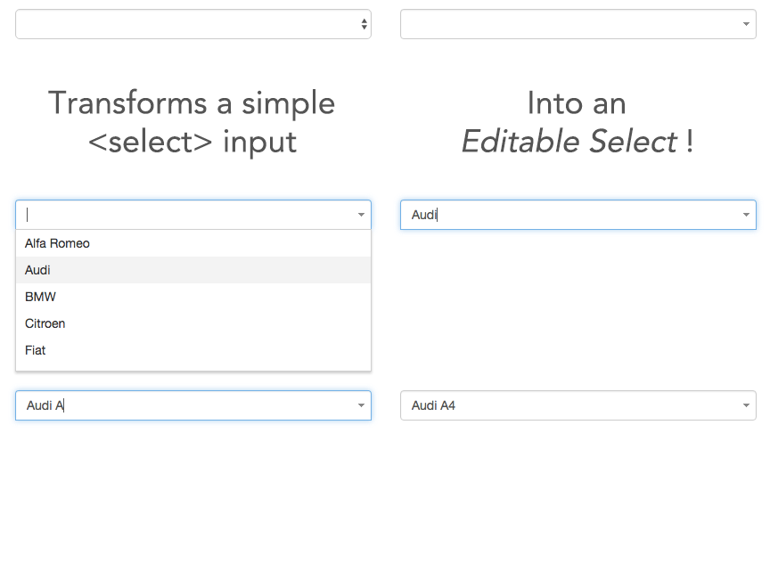
jQuery Editable Select is a jQuery plugin that transforms a select into an input field where single elements are shown in real-time according to the entered characters. It scales down to a real select list when javascript is not available.
See demos here: http://indrimuska.github.io/jquery-editable-select/
Get jQuery Editable Select from npm, bower or git:
  npm install jquery-editable-select
bower install jquery-editable-select
  git clone   https://github.com/indrimuska/jquery-editable-select.git
Include style and script in your page:
<script src="//code.jquery.com/jquery-1.12.4.min.js"></script>
<script src="//rawgithub.com/indrimuska/jquery-editable-select/master/dist/jquery-editable-select.min.js"></script>
<link href="//rawgithub.com/indrimuska/jquery-editable-select/master/dist/jquery-editable-select.min.css" rel="stylesheet"><select id="editable-select">
<option>Alfa Romeo</option>
<option>Audi</option>
<option>BMW</option>
<option>Citroen</option>
</select>$('#editable-select').editableSelect();The default text showed right after the initialization.
<select id="editable-select">
	<option>Alfa Romeo</option>
	<option selected>Audi</option>
	<option>BMW</option>
	<option>Citroen</option>
</select>All HTML tags in each <option> element will be rendered after initialization.
<select id="editable-select">
<option>Alfa Romeo - <small><a href="http://www.alfaromeo.com/">www.alfaromeo.com</a></small></option>
<option>Audi - <small><a href="http://www.audi.com/">www.audi.com</a></small></option>
<option>BMW - <small><a href="http://www.bmw.com/">www.bmw.com</a></small></option>
<option>Citroen - <small><a href="http://www.citroen.com/">www.citroen.com</a></small></option>
</select>If the height of the list rises above 160px, a scrollbar is displayed.
You can change the max-height of the list box by overriding this css rule:
.es-list { max-height: 160px !important; }Options can be passed via data attributes or JavaScript. For data attributes, append the option name to data-, as in data-filter="true".
| Property | Type | Default | Description |
|---|---|---|---|
| filter | Boolean | true |
Filter (or not) items in list while typing. |
| effects | Enum: "default", "slide", "fade" |
"default" |
Easing used for showing and hiding the dropdown list. |
| duration | Integer or Enum: "fast", "slow" |
"fast" |
Duration of the easings (in milliseconds). |
| appendTo | String or jQuery element | select.parent() |
Where to append the dropdown list in the DOM. |
| trigger | Enum: "focus", "manual" |
"focus" |
How dropdown list is triggered. |
$('#editable-select').editableSelect({
	effects: 'slide',
	duration: 200,
	appendTo: 'body'
});You can change the default settings for a plugin by modifying the plugin's Constructor.DEFAULTS object:
$.fn.editableSelect.Constructor.DEFAULTS.effects = 'slide';
// changes default for the plugin's `effects` option to `slide`Transforms the <select> into a typeahead field. Accepts an optional options object.
Manually shows the dropdown list.
Manually hides the dropdown list.
Manually filters the dropdown list according to the value of the text field.
Manually sets the value of the text field to the value of the $element passed as parameter (it must be one of the elements in the dropdown list).
Adds a new option in the dropdown list. You can choose the position where to insert the element (starting from 0) and any attributes (or data-attributes) to be assigned.
Removes an option in the dropdown list at the given index.
Clears all options in the dropdown list.
Destroys the typeahead field and restores the <select> input.
| Event | Description |
|---|---|
| created.editable-select | Fired after initialization. |
| show.editable-select | Fired immediately when the show instance method has been called. |
| shown.editable-select | Fired when the dropdown has been made visible (will wait for CSS transitions to complete). |
| hide.editable-select | Fired immediately when the hide instance method has been called. |
| hidden.editable-select | Fired when the dropdown has finished being hidden (will wait for CSS transitions to complete). |
| select.editable-select | Fired when an option of the list has been selected. The selected $element is available as property of the event. |
$('#editable-select').on('shown.editable-select', function (e) {
	// do something...
});jQuery Editable Select includes support for keyboard navigation:
-
up, down arrow keys
You can navigate through list with keyboard arrows. -
Enter
When the list is visible, by pressing Enter button you'll select the highlighted option and replace the input field value with the option label.
When the list is not visible, Enter will have a normal behavior (submitting the form, etc...) -
Tab
If the dropdown list is visible, it closes the dropdown, otherwise it will be opened. -
Escape
Hides the list.
Copyright (c) 2016 Indri Muska. Licensed under the MIT license.


