Skip to content
New issue

Have a question about this project? Sign up for a free GitHub account to open an issue and contact its maintainers and the community.

By clicking “Sign up for GitHub”, you agree to our terms of service and privacy statement. We’ll occasionally send you account related emails.

Already on GitHub? Sign in to your account

Limit subject height shrinks subjects too much on small screens #6061

Open
1 task done
eatyourgreens opened this issue Apr 26, 2024 · 5 comments
Open
1 task done

Limit subject height shrinks subjects too much on small screens #6061

eatyourgreens opened this issue Apr 26, 2024 · 5 comments
Labels
bug Something isn't working

Comments

@eatyourgreens
Copy link
Contributor

eatyourgreens commented Apr 26, 2024

Package

  • lib-classifier

Describe the bug

Some of the Squirrel Mapper subjects are now very small on mobile, an unintended consequence of the new image sizing styles?

Squirrel Mapper on my phone, with a subject image that's only about half the width of the screen.

To Reproduce

Visit the squirrel workflow on a phone. You might have to refresh a couple of times in order to get a small image.

Expected behavior

Subject images should fill the width of the screen on a phone, in portrait orientation.

Device information

Smartphone (please complete the following information):

  • Device: iPhone Xs
  • OS: iOS 17.4.1
  • Browser: Safari
@eatyourgreens
Copy link
Contributor Author

eatyourgreens commented Sep 27, 2024

Bumping this because it’s still a problem, almost 6 months later.
https://www.zooniverse.org/projects/bcosentino/squirrelmapper/classify/workflow/20578

@eatyourgreens eatyourgreens changed the title Tiny subjects in Squirrel Mapper on mobile Limit subject height shrinks subjects too much on small screens Oct 6, 2024
@eatyourgreens
Copy link
Contributor Author

eatyourgreens commented Oct 6, 2024

Here’s the same bug on Science Scribbler, with a tablet-sized screen. In the single column layout, the subject doesn't expand to fill the available space.

Correct-a-cell on a tablet-sized screen. The layout is a single column, but the subject image only fills about half the width of the screen.

@eatyourgreens
Copy link
Contributor Author

eatyourgreens commented Nov 3, 2024

I just triggered this bug on Squirrel Mapper, but this time I remembered to save the subject ID: 103856571.

This link should reproduce the bug on a small screen:
https://www.zooniverse.org/projects/bcosentino/squirrelmapper/classify/workflow/20808/subject/103856571

Squirrel Mapper on an iPhone. The subject photo is only about half the width of the screen, with large, empty margins on either side.

Here's that same page in desktop Firefox, so this isn't a Safari or iOS bug.
Squirrel Mapper in a narrow window in desktop Firefox. The subject is less than half of the available screen width, in the single column classifier layout.

The subject image is 640px wide, so easily big enough to fill the width of the screen on a phone or small tablet.
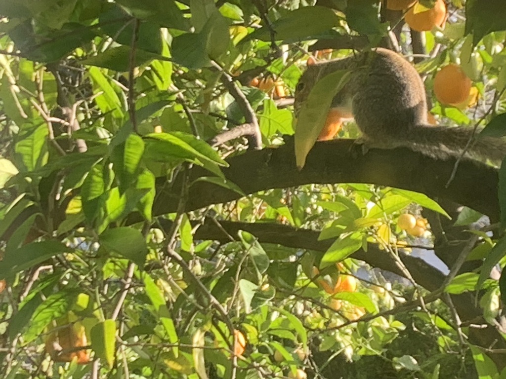
Squirrel Mapper subject 103856571: a squirrel in a tree.

@eatyourgreens
Copy link
Contributor Author

The bug goes away when the subject viewer has a banner.

Squirrel Mapper again, but this time the subject photo has an Already Seen banner. When the banner is present, the subject image fills the available screen width on a small screen.

@eatyourgreens
Copy link
Contributor Author

Here's another example that just came up on Squirrel Mapper, subject 103863673.

https://www.zooniverse.org/projects/bcosentino/squirrelmapper/classify/workflow/20808/subject/103863673

Sign up for free to join this conversation on GitHub. Already have an account? Sign in to comment
Labels
bug Something isn't working
Projects
None yet
Development

No branches or pull requests

1 participant