-
Notifications
You must be signed in to change notification settings - Fork 16
Use Editor
At Builder Assistance, click Edit With Goomento

At Grid or Edit page, click on Editor button

To exit Editor, click this button will close Editor

Goomento provides 04 particular areas for edit and control view

Widget panel: Showing registered widgets, each one can drag and drop to build your Magento store, to toggle click (⌘ + P) or (Ctrl + P)
Drop area: Drag widget from Widget panel to drop here to build your Magento store
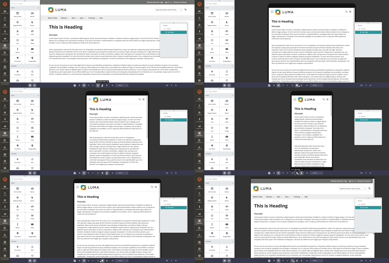
Control bar: Contains buttons and functions that can control the view, such as view in Mobile or Tablet
Navigation: To navigate the current editing widget in among of others, to open click (⌘ + I) or (Ctrl + I)
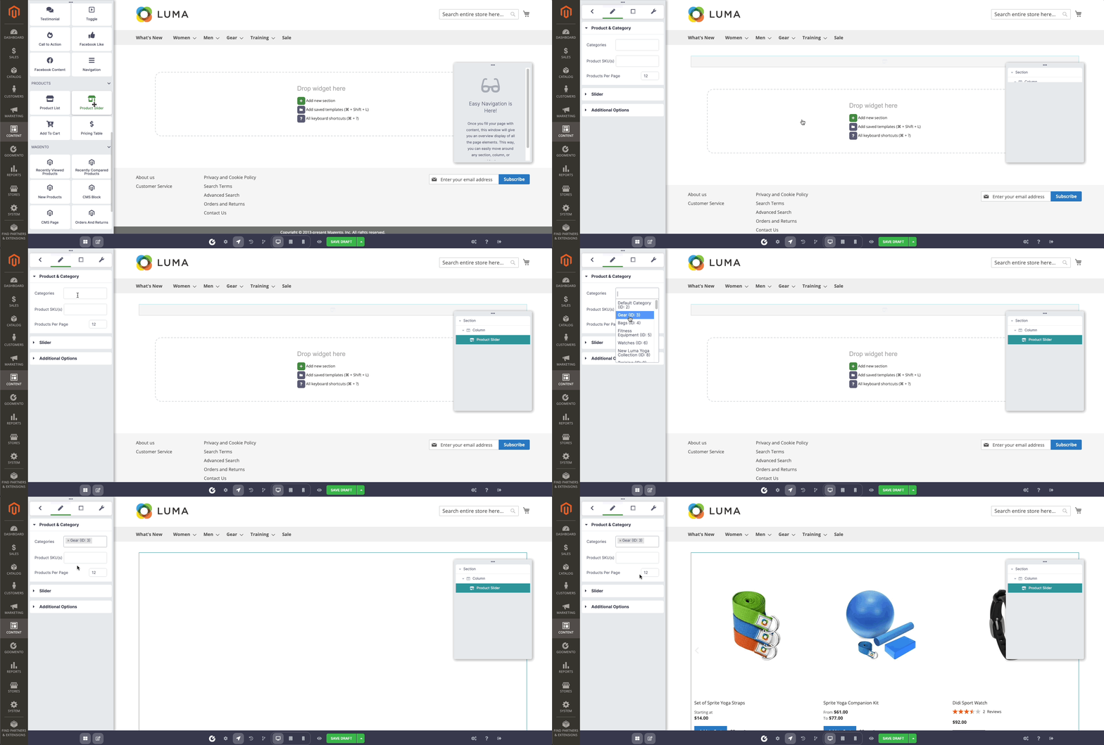
Simply drag an instance of a widget from Widget panel to the Drop area and customize it to your needs.
In general, Goomento is based on a drag-and-drop editor that accommodates sections, columns, and widgets
-
Sections:Containers for columns. -
Columns:Columns that contain widgets. -
Widgets:Individual elements are housed within columns.

You control the sections, columns, and widgets using the green handle. Just right-click the handle to edit follow the menu.

Note: Right-click the navigation item in the right also work as the same result

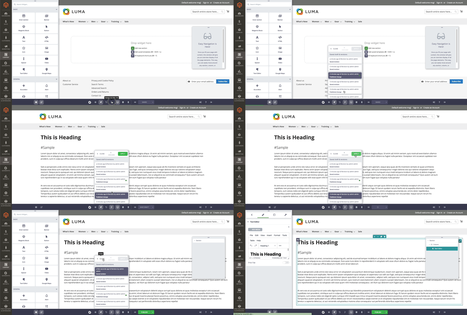
Easy to undo/redo by using the History panel - shortcut (⌘ + Shift + H) or revert the change in the long time ago using Revision panel - shortcut (⌘ + H). Both panels can open by click button in Control bar
When you’re ready to preview your page, click on the eye icon on the bottom Control bar.

Your content will be displayed on three different devices: desktop, tablet, and mobile. You can also change all of the settings for each device by click on the device button - shortcut (⌘ + Shift + M)

Goomento allowed reuse saved template which created before or imported from somewhere, to use it, open the Template panel, click on folder icon in drop area or shortcut (⌘ + Shift + L)

Select the template and click to Insert button


