Wrong spacing with new field analyzer buttons #4230
Comments
|
@bernd I think that was intentional by @lennartkoopmann. At least I read it that way in #4219 (comment)
|
|
@joschi @lennartkoopmann If it was intentional, the "Customize" and "Add to dashboard" buttons should at least be grouped like before.
Now it looks like there is a missing margin. |
|
You are right, the previous implementation looked a little different with regards to the borders of the two buttons. I guess the I’m okay with moving this out of 2.4 if it’s not an easy fix. |
edmundoa
pushed a commit
that referenced
this issue
Oct 24, 2017
bernd
pushed a commit
that referenced
this issue
Oct 24, 2017
* Fix styling of unified analyzer buttons

Fixes #4230

* Open analyzer menus to the left

Dropdown menus on the unified analyzer menus open currently to the right, but
they are very close to the edge of the window and will be cropped. This
commit changes that by opening menus to the left.

(cherry picked from commit f09054a)
Sign up for free
to join this conversation on GitHub.
Already have an account?
Sign in to comment
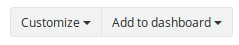
Expected Behavior
There should be consistent spacing between the field analyzer widget buttons.
Current Behavior
After #4219 went it, there is no spacing between the "Add to dashboard" and "Customize" buttons in the field analyzer widgets.
QuickValues:
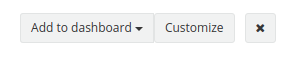
Chart:

Possible Solution
I guess we want to use a
ButtonGroupwrapper component to get consistent spacing.Steps to Reproduce (for bugs)
Your Environment
The text was updated successfully, but these errors were encountered: