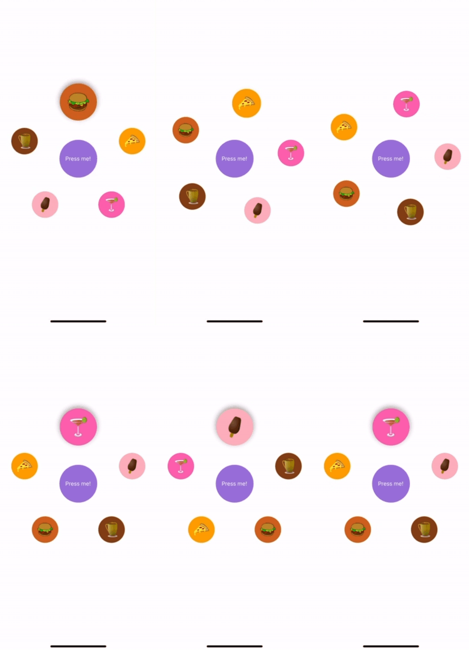
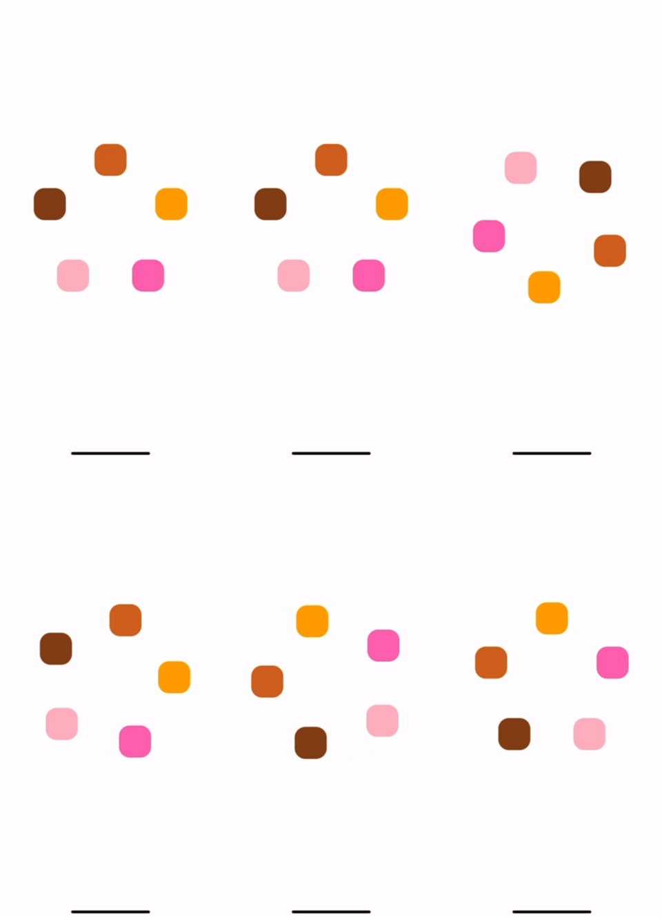
A flexible React Native component that arranges its children in a circular or elliptical layout.
It supports touch gesture rotation, animations, and includes a variety of extra features.
With npm:
npm install @iordanissap/react-native-circular-layout
With yarn:
yarn add @iordanissap/react-native-circular-layout
IMPORTANT: This library uses react-native-gesture-handler. To ensure proper functionality, you need to wrap your app's root component with GestureHandlerRootView.
{
    "react": "18.2.0",
    "react-native": "0.74.3",
    "react-native-gesture-handler": "~2.16.1",
    "react-native-reanimated": "~3.10.1"
}import { SafeAreaView, View } from 'react-native';
import CircularView from 'react-native-circular-layout';
import { GestureHandlerRootView } from 'react-native-gesture-handler';
export default function Example() {
const colors = ['#D2691E', '#FFA500', '#FF69B4', '#FFB6C1', '#8B4513'];
return (
<View style={{flex:1, backgroundColor:'white'}}>
<GestureHandlerRootView>
<SafeAreaView style={{ flex: 1, justifyContent: 'center' }}>
<CircularView
radiusX={120}
radiusY={120}
snappingEnabled={true}
>
{colors.map((color, index) => (
<View key={index} style={{ width: 60, height: 60,
backgroundColor: color, borderRadius:20 }} />
))}
</CircularView>
</SafeAreaView>
</GestureHandlerRootView>
</View >
);
}
| Prop Name | Type | Default | Description |
|---|---|---|---|
children(required) |
React.ReactNode |
- | The children to be displayed in the circular layout |
radiusX(required) |
number | SharedValue<number> |
- | The radius of the ellipse in the x direction. Can be a number or a shared value |
radiusY(required) |
number | SharedValue<number> |
- | The radius of the ellipse in the y direction. Can be a number or a shared value |
centralComponent |
React.ReactNode |
null |
The central component to be displayed in the center of the circle/ellipse |
index |
number |
0 |
The index of the child that is currently snapped to the top |
snappingEnabled |
boolean |
true |
Whether the view should snap to the nearest child |
onSnap |
(index: number) => void |
- | Called when the view snaps to a child. Called when the animation ends. |
onSnapStart |
(index: number) => void |
- | Called when the snapping animation starts |
snapAngle |
SnapAngle | number |
SnapAngle.Top (-Math.PI / 2) |
The angle in radians at which the view should snap to the nearest child |
gesturesEnabled |
boolean |
true |
Whether the user can pan the view / rotate using touch |
onGestureStart |
() => void |
- | Called when the user starts a gesture |
onGestureEnd |
() => void |
- | Called when the user ends a gesture |
rotateCentralComponent |
boolean |
false |
Whether the central component should rotate with the rest of the components |
childContainerStyle |
any |
- | The style of the container for the children |
snapDuration |
number |
600ms |
The duration of the snapping animation in ms |
animationConfig |
DecayConfig |
- | The configuration for the decay animation. Note: deceleration values below 0.9 will cause the animation to stop almost immediately |


