-
-
Notifications
You must be signed in to change notification settings - Fork 2.6k
New issue
Have a question about this project? Sign up for a free GitHub account to open an issue and contact its maintainers and the community.
By clicking “Sign up for GitHub”, you agree to our terms of service and privacy statement. We’ll occasionally send you account related emails.
Already on GitHub? Sign in to your account
[WIP] Fix for issue #7771: Lighten Jabref Icon 32 #7825
Conversation
Replace Jabref icon 32 image with a one with a lighter colour (40% lighrer)
|
Thanks for the work! Looks better now. I also attached the original svg logo file, so we don't loose any quality |
Thank you @Siedlerchr , should I change all the Jabref Icons accordingly or the change of the Icon 32 is enough? Also, the lightened original svg logo looks like this (on png format): |
|
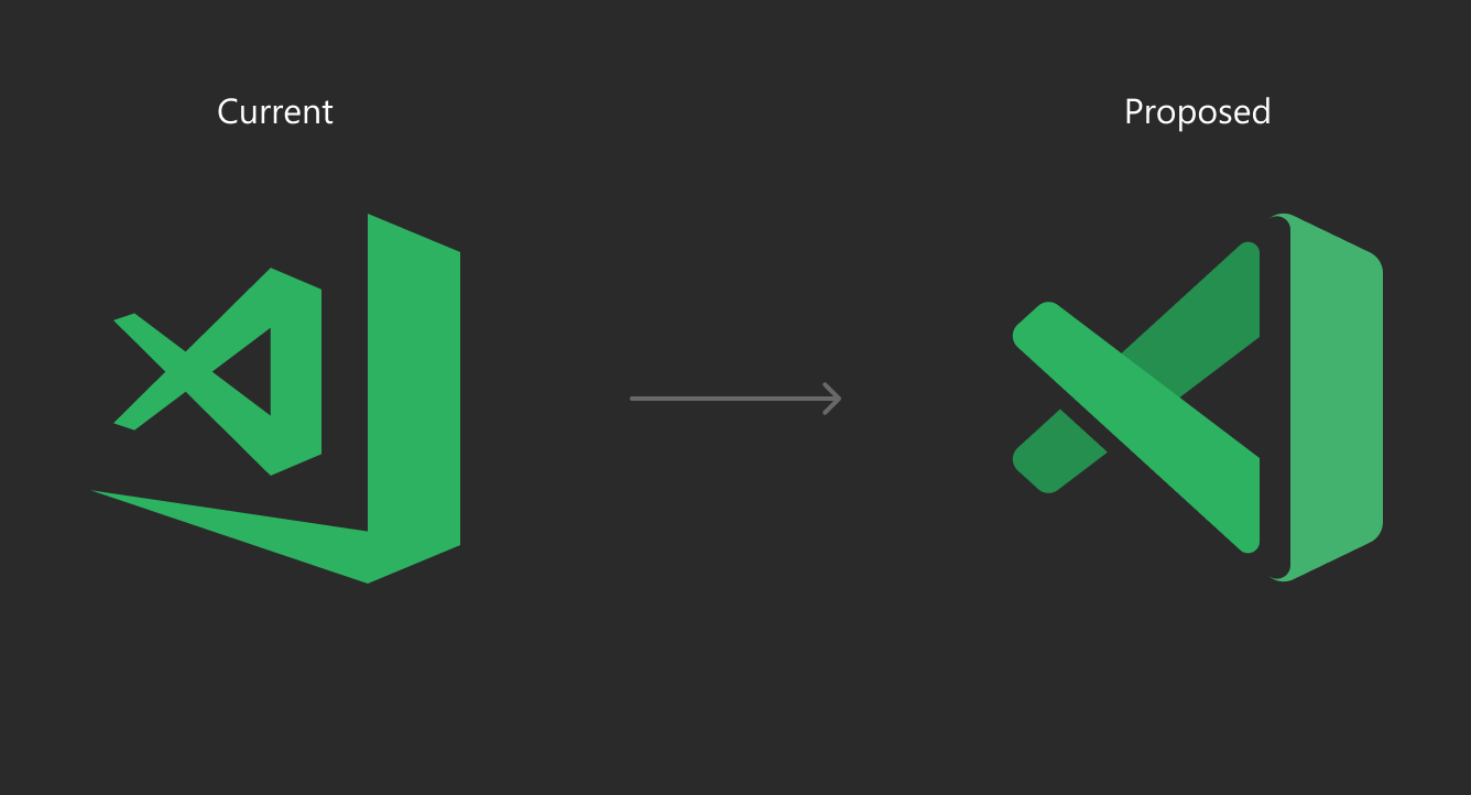
I think for consistency we should then use the new icon everywhere, and change the primary color as well. This amounts more or less to a slight rebranding. I'm absolutely in favor of choosing a better primary color, i.e. a slightly different purple. The current purple is too dark to be displayed on a dark background (which was motivating concern for this PR) and at the same time is too bland to stand out, especially when used as a font color: My proposal would be to generate two lighter versions of the current purple (or a slightly more vibrant version thereof). The darkest one can be used as background for buttons (for buttons), the middle one (maybe a bit more grayish) as font and icon color, and the lightest one as font color on black. There shouldn't be however too much variation in the color. Speaking of VS Code, they also moved from a one-colored icon to one with slightly different colors because this enhances contrast, see discussion here microsoft/vscode#71827. Maybe we can do something similar as well, with one side of the book in a slightly different color. Tagging @JabRef/developers and especially our branding master @stefan-kolb. That's probably something we should discuss on the next devcall. |
|
I like the idea of adjusting the program icons, but I would not change the logo color on our flyers etc |
|
Quite a big change. I'm not against it, but if we move forward here, we should adjust everything consistently. It's probably not easy to find the "right" color here. For dark backgrounds we should have an inverted (white) logo anyway I guess. There's probably no color that works well on light and dark colors or at least this color might not be our favorite one... |
|
@stefan-kolb Do you remember which color you used for the flyers? |
|
|
|
Thank you for the discussions here. We did not find a designer really thinking of the issue. We are going to discuss this on JabCon this year. We will reopen the PR (or open a new one) in case we make progress. |
|
DevCal decision: We just make the color a bit lighter, even if it does not fit with the overall color scheme. |


I lightened the color of the Jabref icon 32 image (40% lighrer ) in order to make it more visible in the Windows Taskbar and address the #7771 issue.


Now, the icon from this color:
results in this more visible one:
CHANGELOG.mddescribed in a way that is understandable for the average user (if applicable)