Fonts & APCA reference alignment #28
-
|
Since font weights scales are relative and there is no standard, is it possible to use APCA with other/custom fonts to increase the accuracy of the results and provide better guidance for contrast, please? |
Beta Was this translation helpful? Give feedback.
Replies: 1 comment 4 replies
-
|
Hi Dan @danhendersonede
YES!Use any reasonable font you would like. Yes, the lack of standardization is definitely a problem. But how serious a problem? It causes less of a bump than you may think, and there is a simple way to find equivalence. The biggest problem relates to the kind of fonts that are needed for blocks of body text to be fluently readable, meaning best speed and comprehension. For the kinds of fonts someone would reasonably use, the variation is not as substantial as, say, for display fonts. But there are still indeed issues. At present the WCAG 3 guidance states (emphasis added): FROM WCAG 3.0 WORKING DRAFTThe following table cross indexes APCA contrast values to the reference font's CSS font-size and CSS font-weight. Reference fonts for comparison include Helvetica Neue, Helvetica, Fira Sans, Kanit, and Arial. Contrast percentage must meet or exceed the value listed, using the absolute value for negative values. A ⊘ indicates that a larger font size (or heavier font weight) must be used. ---TABLE HERE---
• Due to the vast variety of font designs, designers should visually compare an unusual font to a standard font such as Helvetica, using the size and weight of Helvetica that most closely matches the appearance of the tested font as a guide.
Compare to be FairSo at the moment, take your desired font and compare to one of the reference fonts "Helvetica Neue, Helvetica, Fira Sans, Kanit, and Arial." Check the x-height, and visually compare the relative weight. Let's use a 400 normal weight font as an example. Make a webpage with two spans containing a lowercase x, and set the font of one of the spans to Helvetica or Arial (the reference) and set the other span to the font you are testing. Set the font-size to 100px. Then pull this up in a browser and take a screen shot. Load the screenshot into a photo editor and measure the height of both of the x. <!-- Web Page Snippet 1: It's not the size it's how you adjust it -->
<div style="padding: 24px; color: #000; background-color: #ccc; font-size: 100px; font-weight: normal;">
<span style="font-family: Helvetica, cursive;">x</span><span style="font-family: FontyMcFont, cursive;">x</span>
</div>
<!-- the reason the last font in the family fallbacks is cursive is to make it very clear that the desired font did not load as expected -->(NOTE: this was captured on a retina display, so I divide the measurements by 2.)
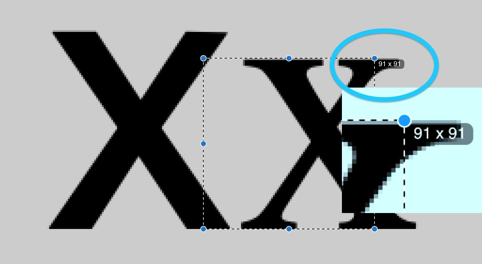
In this case the Helvetica would measure an x-height of about 52px (on retina it was 105). If your font is smaller, you need to determine the difference percentage by dividing the reference by your font (& multiply by 100 for the percentage). If your font is 45px, such as this Times New Roman (half of the 91 shown), then 52/45 = 1.1555 * 100 = 115.5%So to make your font with the x-height of 45 equal to the reference, instead of 100px, set it to 115.5px Of course 100px is too big for a font, but lets say for a pair of colors the APCA lookup indicates a 16px font. Multiply by 1.1556 and you get an 18.5px font. Why Cursive?Make the fallback font after your test and reference fonts something very different such as cursive. This way if the browser is not loading the font properly it is immediately obvious:
My Helvetica reference didn't load due to a path error on my test page. Finally found a good use for that cursive font... LOL. WeightWhile size per x-height is fairly straight forward, weight is not so much. There is active research into possible tools, for the time being a visual reference is needed. In this case, it is usually best to set up a quick test with the fonts near the eventual size. Let's say we want to set our text at 18px (for reference) this would be about 21px for our FontyMcFont. After adjusting for size, we either need to find the weight of Helvetica that matches our font, or font a weight of our font that matched Helvetica (in this case at weight 400). Because Helvetica is available nine weights from 100 to 900, let's find the relevant Helvetica. We'll make a few lines to compare different weights, and one with high contrast, and another set with very low contrast to exacerbate the differences. The test text is Below, a test setup for the RALEWAY Google font: <!DOCTYPE html>
<html>
<head>
<meta charset="utf-8">
<meta name="viewport" content="width=device-width, initial-scale=1">
<title>font test</title>
<link href="/pathToYourReferenceFont/Helvetica.css" rel="stylesheet">
<link href="https://fonts.googleapis.com/css2?family=Raleway:wght@400&display=swap" rel="stylesheet">
</head>
<!-- Web Page Snippet 2: Weighty Decisions -->
<body>
<div style="float:right; padding: 36px 100px 36px 36px; color: #333; background-color: #ddd;">
<h3>Hi Con Compare Lc 78</h3>
<span style="font-size: 18px; font-weight: 200; font-family: HelveticaNeueLT, cursive;">200 & IcyATOMsizedgap Helvetica</span><br>
<span style="font-size: 18px; font-weight: 400; font-family: Raleway, cursive;">400 & IcyATOMsizedgap Raleway</span>
<br><hr><br>
<span style="font-size: 18px; font-weight: 300; font-family: HelveticaNeueLT, cursive;">300 & IcyATOMsizedgap Helvetica</span><br>
<span style="font-size: 18px; font-weight: 400; font-family: Raleway, cursive;">400 & IcyATOMsizedgap Raleway</span>
<br><hr><br>
<span style="font-size: 18px; font-weight: 400; font-family: HelveticaNeueLT, cursive;">400 & IcyATOMsizedgap Helvetica</span><br>
<span style="font-size: 18px; font-weight: 400; font-family: Raleway, cursive;">400 & IcyATOMsizedgap Raleway</span>
<br><hr><br>
<span style="font-size: 18px; font-weight: 500; font-family: HelveticaNeueLT, cursive;">500 & IcyATOMsizedgap Helvetica</span><br>
<span style="font-size: 18px; font-weight: 400; font-family: Raleway, cursive;">400 & IcyATOMsizedgap Raleway</span>
<br><hr><br>
</div>
<div style=" padding: 36px 0 36px 100px; color: #999; background-color: #ccc;">
<h3>Lo Con Compare Lc 25</h3>
<span style="font-size: 18px; font-weight: 200; font-family: HelveticaNeueLT, cursive;">200 & IcyATOMsizedgap Helvetica</span><br>
<span style="font-size: 18px; font-weight: 400; font-family: Raleway, cursive;">400 & IcyATOMsizedgap Raleway</span>
<br><hr><br>
<span style="font-size: 18px; font-weight: 300; font-family: HelveticaNeueLT, cursive;">300 & IcyATOMsizedgap Helvetica</span><br>
<span style="font-size: 18px; font-weight: 400; font-family: Raleway, cursive;">400 & IcyATOMsizedgap Raleway</span>
<br><hr><br>
<span style="font-size: 18px; font-weight: 400; font-family: HelveticaNeueLT, cursive;">400 & IcyATOMsizedgap Helvetica</span><br>
<span style="font-size: 18px; font-weight: 400; font-family: Raleway, cursive;">400 & IcyATOMsizedgap Raleway</span>
<br><hr><br>
<span style="font-size: 18px; font-weight: 500; font-family: HelveticaNeueLT, cursive;">500 & IcyATOMsizedgap Helvetica</span><br>
<span style="font-size: 18px; font-weight: 400; font-family: Raleway, cursive;">400 & IcyATOMsizedgap Raleway</span>
<br><hr><br>
</div>
<!-- find the closest matching weight to the reference font-->
</body>
</html>So here, find the closest visual match in terms of weight. If we look at a screenshot:
We see that Raleway is clearly lighter than Helvetica. The 300 Raleway is perhaps slightly heavier than Helvetica 300, and this is clearly closest in this comparison, so we re-rate Raleway 400 as being 300. Here it is closeup:
A look to the lo con version on the left really highlights the weight differences. TL;DRFollowing a simple procedure, compare your design font to a reference font and determine the offset needed for equivalence. This is an area of ongoing research and development.Thank you, Andy Andrew Somers THE REVOLUTION WILL BE READABLE |


Beta Was this translation helpful? Give feedback.
-
|
Hi, @Myndex I think there might be a simpler way to check for equivalence. I would suggest producing the reference font at the minimum recommended font-size / APCA contrast / font-weight. Then, take the custom font, and produce it using the same CSS parameters. Produce a body paragraph of text for both of these font specifications, either using random combinations of the hundred most common words, or taking standard paragraphs of text from an MNread chart. Then, read both paragraphs in quick succession, and increase the viewing distance until one or other becomes slightly difficult to read. The custom font passes if it's at least as easy to read as the standard font. If the custom font fails, going through this process should make it visually apparent why it failed, which then informs whether it's the font-size or the font-weight (or both) that need to be adjusted in order to get the custom font to pass. This process should work because reading body text is a high spatial frequency task, and artificially increasing the viewing distance gives a perfect horizontal shift to the readers contrast sensitivity function, which is extremely steep for high spatial frequency tasks. Happy to chat further on this topic as convenient. |
Beta Was this translation helpful? Give feedback.
-
|
Okay, though that would be a more complicated way, and would require at least a retina screen or higher density, as at body-text size key metrics like weight are very much subsumed into the anti-aliasing of the rasterizer. Also "slightly difficult to read" means the legibility point, not the readability point, and I'd rather avoid tests that might conflate the two . |
Beta Was this translation helpful? Give feedback.
-
|
Thanks @Myndex for the feedback. By 'slightly difficult to read' I had intended to mean 'slightly slower to read', but I don't think I expressed that very well! Also, it's a good point that screen resolution / anti-aliasing / the persons eyesight may add some noise into the pairwise comparison. This could be solved by making everything bigger, although that makes the interpretation of the pairwise comparison a little bit more abstract. So, I have had another go at rewording the entire text as follows, and included a supplementary additional note to try and account for anti-aliasing etc:
Please let me know if you have any further feedback on this suggestion. |
Beta Was this translation helpful? Give feedback.
-
|
I think MNread is a great tool particularly in clinical or in a research use. I don't think it's a great tool for day-to-day operations use in terms of determining weight of a particular font necessarily. For reasonable validity you need to have a sample size larger than is readily available in most situations. |
Beta Was this translation helpful? Give feedback.
Hi Dan @danhendersonede
YES!
Use any reasonable font you would like. Yes, the lack of standardization is definitely a problem. But how serious a problem? It causes less of a bump than you may think, and there is a simple way to find equivalence.
The biggest problem relates to the kind of fonts that are needed for blocks of body text to be fluently readable, meaning best speed and comprehension. For the kinds of fonts someone would reasonably use, the variation is not as substantial as…