Write a widget to select 3 elements from a certain list (initially set as an array). As test data, 300 elements with sequence numbers will be suitable - ["Element 1", "Element 2", "Element 3... ]
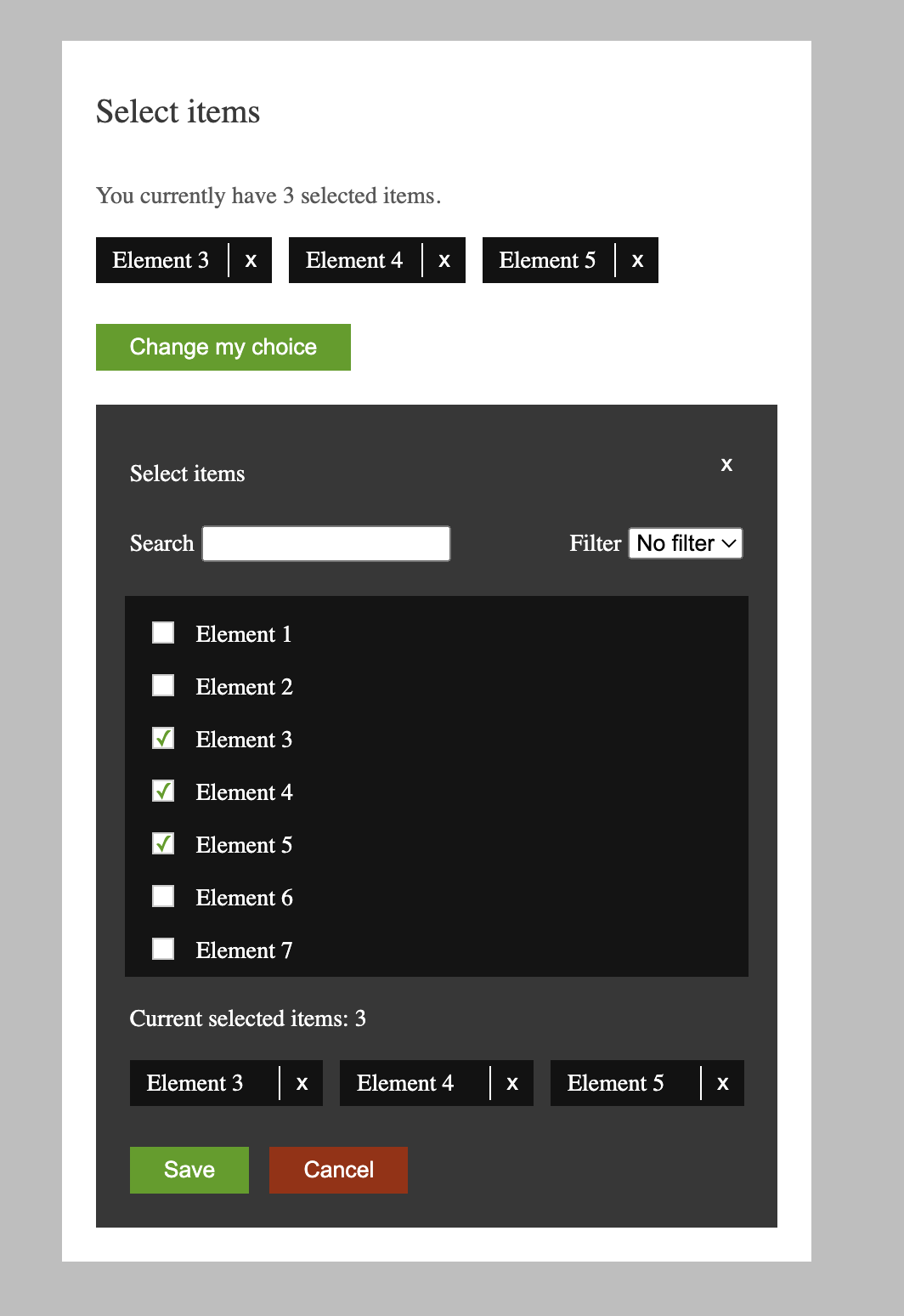
-A list of already selected items is displayed (no more than three).
-By clicking on the "Change my choice" button, a dialog opens with a list of all elements (a scrollable list of fixed height), as well as a search field and filter.
-Checkboxes of already selected items are checked, and the selected items are duplicated as blocks at the bottom of the dialog box.
-Search: as you type characters, the list of elements is filtered (using substring search).
-Additional filter (selectbox) filter by element number (> 10, 50, 100).
-Search and filter complete each other, • You can select no more than three items, in case three items are selected, the remaining checkboxes become disabled.
-The selected items have a link "X" which removes the item from the list of selected items.
-Clicking on the "Save" button closes the dialog box and the list of selected items on the main page is updated from the dialog.
-When you click on the "Cancel" button, the dialog box closes and the list of selected items on the main page remains unchanged.
To complete the task, a widget was created using React.js and TypeScript.
The App.tsx file defines states for controlling the visibility of the dialog and for storing the current selection of elements.
A mock data array of element names was also generated for use in the widget.
The Dialog.tsx component defines states for controlling the visibility of the dialog, filtering, and storing the new selection of elements.
The component also uses custom hooks for handling string search and filtering of elements.
Based on the data obtained from the custom hooks, a filtered list of elements is generated and used for displaying the available elements in the dialog.
To implement the visual styling of the widget, Flexbox was used. The styles folder defines all of the styled components for the elements of the widget. No external UI framework or component library was used in the implementation.
The SelectedElementWidget.tsx component defines the display of selected elements on top of the Widget.
The ElementsList.tsx, SearchAndFilterBar.tsx, and SelectedElementsBoard.tsx components respectively define the list of elements in the dialog.
All textual data is stored in the resources.json file, which allows for easy management of translations and localization of the application.
In addition, the components were implemented with accessibility in mind, with proper aria-labels and role attributes assigned to each element for improved screen reader support.
Overall, the widget allows for convenient selection of three elements from a given list, using search, filtering, and checkboxes. Selected elements can be easily removed from the list, and the selection can be saved or canceled with the corresponding buttons.
In the project directory, you can run:
Install all dependecies
Runs the app in the development mode.
Open http://localhost:3000 to view it in the browser.
The page will reload if you make edits.
You will also see any lint errors in the console.