-
Notifications
You must be signed in to change notification settings - Fork 1
Styles and customization
The widget is styled in style.css. You can create your own stylesheet if you run your own copy of the widget.
If you're using OBS Studio, you can also add custom styles by opening the Properties of the Browser source and using the Custom CSS field to create or override class styles.
Warning: Note History leverages the CSS
maskproperty when coloring the notes using map-provided saber colors. However, due to a known bug in Chrome and other major browsers, this property will not work if the mask is being loaded from a local file. To ensure proper note rendering, if you are running a local copy of Note History, make sure allmasks are be loaded from the web.
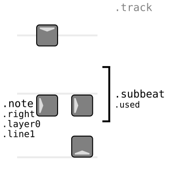
While a map is being played, the track's content is structured like this:

.track
    .subbeat
        ...
            .note
                .sticker
                    ...
            .note
            .note
            ...
    .subbeat
    .subbeat
    ...
New .subbeat containers are appended or prepended when notes are spawned/cut/missed according to scrollDirection, and by addEmptyBeats. The subbeat depends on the time since start of the map; if the current subbeat already has a container, new notes are appended to it.
Notes are discarded in accordance with the max setting. When the player is not in a map, .track is empty.
-
.sabera: The track is tracking the left hand saber. -
.saberb: The track is tracking the right hand saber. -
.saberboth: The track contains information from both sabers.
You can apply color-based styles to the track using var(--sabera-color) and var(--saberb-color).
-
.used: Notes have been added to the container. If this class is missing, the container was added as an empty container. -
Style classes may have been passed from subBeatStyle.
All of these additional classes can appear in note block elements.
-
.notea,.noteband.bomb: The type of note. -
.up,.down,.left,.right,.upleft, etc.: The direction of the note. -
.line0-.line3: The line of the note. Lines are vertical and count from left (0) to right (3). -
.layer0-.layer2: The layer of the note. Layers are horizontal and go from bottom (0) to top (2). -
.badand.good: The quality of the cut (if the note was cut) in accordance withbadScoreMaxandgoodScoreMin. -
.stacking: Added if the note is not the first note in the subbeat.
Stickers are individual block elements optionally layered inside .note > .sticker when warranted.
-
.color: Layer used for colorizing the note (not added to bombs). You can apply color-based styles to notes usingvar(--sabera-color)andvar(--saberb-color). By default a flat colored square, masked with the note picture. -
.missed: Layer added to all notes that were not cut. By default darkens the note. -
.badand.good: Layer added depending on the quality of the cut (if the note was cut) in accordance withbadScoreMaxandgoodScoreMin. -
.slice: Layers added to notes that were cut containing lines representing the cut slice. The lines are animated tovar(--slash-color)if the cut was correct or tovar(--sabera-color)/var(--saberb-color)if it was incorrect. Can be marked with the additional classes.front,.back,.sidea,.sideband.aux(which applies to all lines except.front.) -
.crosshair: Contains the indicator of where the center of the note is. -
.reversed: Layer added to notes that were cut in the wrong direction. Unused by default. -
.wrong: Layer added to notes with an incorrect cut (wrong saber or slicing a bomb). -
.perfect: Layer added to notes with maximum score after the conclusion of the saber swing that cut them.
If the widget is in saber mode, the displayed saber is set up like this:
.saber
    .sticker
        ...
-
.sabera: The saber is tracking the left hand saber. -
.saberb: The saber is tracking the right hand saber.
Like note stickers, these are layered on the saber.
-
.base: Contains the dark parts of the saber. -
.glow: Contains the shiny parts of the saber. A drop shadow is used to simulate glow. -
.color: Layer used for colorizing the saber. You can apply color-based styles to the saber usingvar(--sabera-color)andvar(--saberb-color). By default a flat colored square, masked with the full saber picture.
Note History uses the images of notes, bombs and sabers found in the icon/ folder in PNG format. You can edit them to customize the aspect of notes, bombs and sabers. Make sure you use shades of grey, so the images can be automatically colored with the current map's saber colors.
If you want to resize the icons, you will have to edit the stylesheet to account for the new sizes. The default sizes are fairly large and should render nicely even if you are upscaling the widget, though.
The svg/ folder contains the SVG originals for all the icons. You can use these to produce higher quality PNGs or to make changes. All images were created for this project and are covered under this project's license unless otherwise specified.