


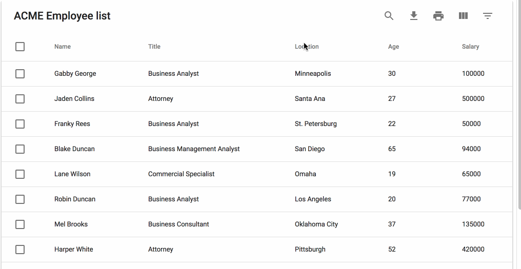
MUI-Datatables is a data tables component built on Material-UI V1. It comes with features like filtering, view/hide columns, search, export to CSV download, printing, selectable rows, pagination, and sorting. On top of the ability to customize styling on most views, there are two responsive modes "stacked" and "scroll" for mobile/tablet devices.
npm install mui-datatables --save

For a simple table:
import MUIDataTable from "mui-datatables";

const columns = ["Name", "Company", "City", "State"];

const data = [
 ["Joe James", "Test Corp", "Yonkers", "NY"],
 ["John Walsh", "Test Corp", "Hartford", "CT"],
 ["Bob Herm", "Test Corp", "Tampa", "FL"],
 ["James Houston", "Test Corp", "Dallas", "TX"],
];

const options = {
  filterType: 'checkbox',
};

<MUIDataTable
  title={"Employee List"}
  data={data}
  columns={columns}
  options={options}
/>
Or customize columns:
import MUIDataTable from "mui-datatables";

const columns = [
 {
  name: "Name",
  options: {
   filter: true,
   sort: true,
  }
 },
 {
  name: "Company",
  options: {
   filter: true,
   sort: false,
  }
 },
 {
  name: "City",
  options: {
   filter: true,
   sort: false,
  }
 },
 {
  name: "State",
  options: {
   filter: true,
   sort: false,
  }
 },
];

const data = [
 ["Joe James", "Test Corp", "Yonkers", "NY"],
 ["John Walsh", "Test Corp", "Hartford", "CT"],
 ["Bob Herm", "Test Corp", "Tampa", "FL"],
 ["James Houston", "Test Corp", "Dallas", "TX"],
];

const options = {
  filterType: 'checkbox',
};

<MUIDataTable
  title={"Employee List"}
  data={data}
  columns={columns}
  options={options}
/>The component accepts the following props:
| Name | Type | Description |
|---|---|---|
title |
array | Title used to caption table |
columns |
array | Columns used to describe table. Must be either an array of simple strings or objects describing a column |
data |
array | Data used to describe table. Must be an array of simple strings |
options |
object | Options used to describe table |
| Name | Type | Default | Description |
|---|---|---|---|
page |
number | User provided starting page for pagination | |
filterList |
array | User provided filter list | |
filterType |
string | 'dropdown' | Choice of filtering view. Options are "checkbox", "dropdown", or "multiselect" |
pagination |
boolean | true | Enable/disable pagination |
selectableRows |
boolean | true | Enable/disable row selection |
caseSensitive |
boolean | false | Enable/disable case sensitivity for search |
responsive |
string | 'stacked' | Enable/disable responsive table views. Options: 'stacked', 'scroll' |
rowsPerPage |
number | 10 | Number of rows allowed per page |
rowsPerPageOptions |
array | [10,15,20] | Options to provide in pagination for number of rows a user can select |
rowHover |
boolean | true | Enable/disable hover style over rows |
sortFilterList |
boolean | true | Enable/disable alphanumeric sorting of filter lists |
sort |
boolean | true | Enable/disable sort on all columns |
filter |
boolean | true | Show/hide filter icon from toolbar |
search |
boolean | true | Show/hide search icon from toolbar |
print |
boolean | true | Show/hide print icon from toolbar |
download |
boolean | true | Show/hide download icon from toolbar |
onRowsSelect |
function | Callback function that triggers when row(s) are selected. function(currentRowsSelected: array, rowsSelected: array) => void |
|
onRowsDelete |
function | Callback function that triggers when row(s) are deleted. function(rowsDeleted: array) => void |
|
onChangePage |
function | Callback function that triggers when a page has changed. function(currentPage: number) => void |
|
onChangeRowsPerPage |
function | Callback function that triggers when the number of rows per page has changed. function(numberOfRows: number) => void |
|
onSearchChange |
function | Callback function that triggers when the search text value has changed. function(searchText: string) => void |
|
onFilterChange |
function | Callback function that triggers when filters have changed. function(changedColumn: string, filterList: array) => void |
|
onColumnSortChange |
function | Callback function that triggers when a column has been sorted. function(changedColumn: string, direction: string) => void |
|
onColumnViewChange |
function | Callback function that triggers when a column view has been changed. function(changedColumn: string, action: string) => void |
On each column object, you have the ability to customize columns to your liking with the 'options' property. Example:
const columns = [
 {
  name: "Name",
  options: {
   filter: true,
   sort: false
  }
 },
 ...
]; | Name | Type | Description |
|---|---|---|
Name |
string | Name of column (This field is required) |
options |
object | Options for customizing column |
| Name | Type | Default | Description |
|---|---|---|---|
display |
boolean | true | Display column in table |
filter |
boolean | true | Display column in filter list |
sort |
boolean | true | Enable/disable sorting on column |
customRender |
function | Function that returns a string or React component. Used as display data within all table cells of a given column. `function(index: number, value: any, updateValue: function) => string |
Using Material-UI theme overrides will allow you to customize styling to your liking. First, determine which component you would want to target and then lookup the override classname. Let's start with a simple example where we will change the background color of a body cell to be red:
import React from "react";
import MUIDataTable from "mui-datatables";
import { createMuiTheme, MuiThemeProvider } from 'material-ui/styles';

class BodyCellExample extends React.Component {

  getMuiTheme = () => createMuiTheme({
    overrides: {
      MUIDataTableBodyCell: {
        root: {
          backgroundColor: "#FF0000"
        }
      }
    }
  })

  render() {

    return (
      <MuiThemeProvider theme={this.getMuiTheme()}>
        <MUIDataTable title={"ACME Employee list"} data={data} columns={columns} options={options} />
      </MuiThemeProvider>
    );

  }
}The files included in this repository are licensed under the MIT license.