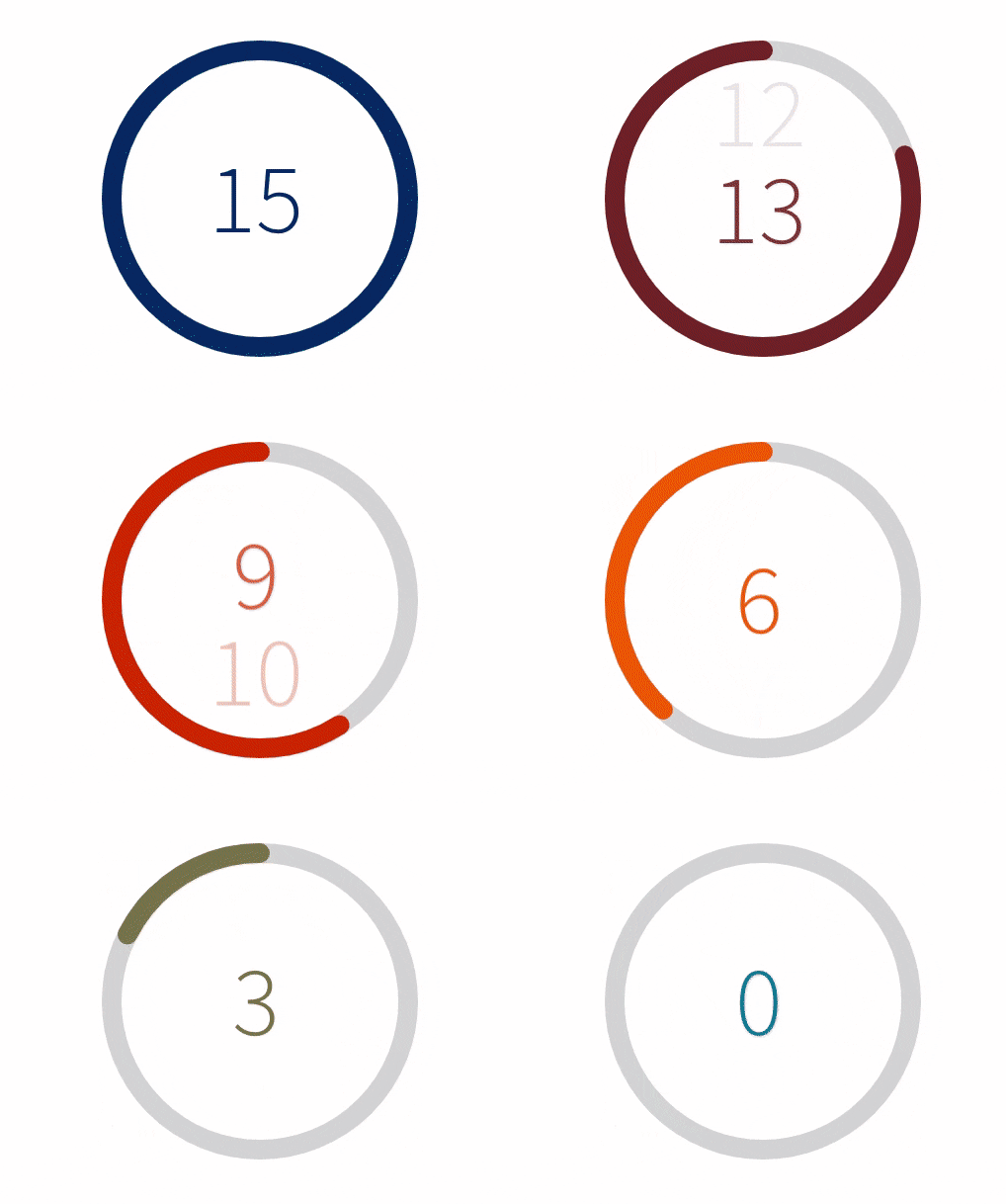
React countdown timer component in a circle shape with color and progress animation to urge with pleasure your users.
- Lightweight only 9.9kB
- Performance optimized with single
requestAnimationFrameloop to animate color and progress (nosetIntervalused) - Transition between colors during the countdown
- Support for linear gradient
- Fully customizable content in the center of the circle
a11ysupport
yarn add react-countdown-circle-timer
or
npm install react-countdown-circle-timer
Check the demo on CodeSandbox to get started
import { CountdownCircleTimer } from 'react-countdown-circle-timer';

const UrgeWithPleasureComponent = () => (
    <CountdownCircleTimer
        isPlaying
        durationSeconds={10}
        colors={[
            ['#004777', .33],
            ['#F7B801', .33],
            ['#A30000']
        ]}
    />
);| Prop Name | Type | Default | Description |
|---|---|---|---|
| durationSeconds | number | required | Countdown duration in seconds |
| colors | Array<[color HEX: string, transition duration: float number between 0 and 1]> | required | Array of tuples: 1st param - color in HEX format; 2nd param - time to transition to next color represented as a fraction of the total duration |
| size | number | 180 | Width and height of the SVG element |
| strokeWidth | number | 12 | Path stroke width |
| strokeLinecap | Enum{ 'round', 'square' } | round | Path stroke line cap |
| trailColor | string | #d9d9d9 | Circle trail color - takes any valid color format (HEX, rgb, rgba, etc.) |
| isPlaying | boolean | false | Play and pause animation |
| * isLinearGradient | boolean | false | * Apples linear gradient on top of the circle. The gradient doesn't follow the circle path. Works best with two colors. |
| gradientUniqueKey | string | - | Unique ID for the linearGradient element. It takes random ID if it's not provided. |
| renderTime | function(remainingTime: number, elapsedTime: number, isPlaying: boolean): number|string|ReactNode | - | Render prop function to customize the content in the center of the circle. The content is centered using flexbox. |
| onComplete | function(): undefined | [shouldRepeat: boolean, delay: number] | - | On complete handler. It can be used to repeat the countdown by returning an array where the first element shouldRepeat indicates if the loop should start over and second element delay specifies the delay before looping again in milliseconds. |
| ariaLabel | string | Countdown timer | Aria label for the whole component |
| renderAriaTime | function(remainingTime: number, elapsedTime: number, isPlaying: boolean): string | - | Render prop function to customize the text message that will be read by the screen reader during the countdown. |
Pass a key prop to CountdownCircleTimer and change the key when the timer should be restarted.
Return an array from onComplete handler, which indicates if the animation should be repeated. Example:
const UrgeWithPleasureComponent = () => (
    <CountdownCircleTimer
        onComplete={() => {
            // do your stuff here
            return [true, 1500]; // repeat animation in 1.5 seconds
        }}
        isPlaying
        durationSeconds={10}
        colors={[['#A30000']]}
    />
);- Test coverage


