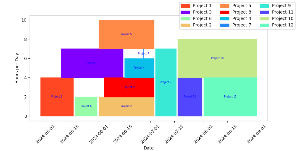
Compressed Gantt For Project Management
Purpose:
The purpose of this script is to help you plan your projects for the year by expanding the idea of the Gantt chart such that projects are “nested” and “tiled”, i.e. not all on separate lines so that you can see how much demand you will have at a given time
Input:
To accomplish this, the input sheet should have projects described by the following fields:
- “task”
- This is really the project
- Given level of effort below, you may want to break up projects that have different segments with different levels of effort at different times, but keeping in mind that this is a generalization
- start_date
- must be in YYYY-MM-DD in text format
- end_date
- must be in YYYY-MM-DD in text format
- level_of_effort
- level of effort at a given time, roughly corresponding to hours per day
- this is an estimate and average
Method:
To use this script first install the requirements using the following line
python3 -m pip install -r requirements.txt
Then you can run the program with python3 continuousGantt.py
Output:
it opens a matplotlib interactive window with this broken bar chart. You can save and export from here.
A use of this would then be to go back to your input spreadsheet and adjust dates so there isn’t too much demand at one time or overlap
animate.py The code works by creating essentially boolean values in a master sheet that represents the total possible area a result continuous Gannt chart could occupy, that is a run of the earliest start date to the latest end date, and a rise of the all the level of effort values added together, as if all of the projects had to be done at the same time. Columns and rows (indices ) are reversed in this actual processing, but the effect is the same
Then it loops through each of the projects, with its own start and end date, and level of effort, which defines a sub dataframe that has to "fit" somwhere in the larger dataframe. Start and end dates are fixed, at least in the operation of the script, but where on the y axis the project block will be located will depend on there not being other projects that intersect with that, assuming you can't do two things at the same time on the same day.
Animate.py shows how this happens, and where the blocks are moved in the course of evaluating them.
Notes The generalizations you create with this tool probably won't represent exactly how much effort (hours) you will spend on each project in a given time period, but is meant to help you plan out projects that you have to complete in a certain time period, e.g. fiscal year. It helps the author, e.g. realize that I may "frontload" projects too readily and have to spread them out where there are breaks in the Gannt "curve" to create a smoother application of effort.
Thus you may modify the start and end dates of projects depending on what you find when you plot them, possibly still having the same area (l x w) but over a longer period of starting and end at a different time.
