-
Notifications
You must be signed in to change notification settings - Fork 4.2k
New issue
Have a question about this project? Sign up for a free GitHub account to open an issue and contact its maintainers and the community.
By clicking “Sign up for GitHub”, you agree to our terms of service and privacy statement. We’ll occasionally send you account related emails.
Already on GitHub? Sign in to your account
Add float clearing functionality to blocks #4127
Comments
|
As a workaround, if the theme implements some form of Alternatively, a |
|
I think this is quite an advanced feature for people to understand clearing. Do nested blocks solve this (maybe more in future)? |
|
And herein lies the rub with calling these content fragments, "blocks." This is one of the ways in which they simply do not act like blocks, in the sense that the alignment makes them open-ended and not closed. Whole-heartedly agree with OP that Gutenberg is an excellent opportunity to address this pre-existing issue. Also agree that "Clearing" should not be the user-facing verbiage for this feature. People understand the concept of "I want my next 'block' of content below this block, not next to it" even if they don't understand what 'clearing the float' and 'floats' are. Ideas:
|
|
Hm as the Spacer uses a fixed height in pixels, it probably won't work well in a responsive layout where the text reflows and also the image can be responsive. |
|
Just my 2c here: Though we've been using floats & clearfixes for more than a decade, they are no longer necessary and should be avoided if possible. clearfixes are more of a hack than a best practice. |
|
Could we add a "clear left & right aligned items" toggle to the Spacer block and the Separator block? Or perhaps just make those two clear floats by default? We all know HTML. We all know this is intentional behavior in the spec, and we all know the workarounds and how to fix it. It's quite exotic behavior, and if we are to build a feature into Gutenberg that makes it easy for anyone to address the issue presented, we have to think like a user that perhaps doesn't care about webdesign at all. If you had the issue present in this ticket, what would you do? The answer is probably insert linebreaks. Yes, this is completely anecdotal speculation, but I doubt any advanced "clear blocks" feature will be discoverable to anyone but those who already know how to address this behavior. |
|
I'm going to close this as we haven't reached a good proposal. Let's reopen when / if a design implementation becomes a bit more tangible. |

Noticed during WordCamp Rome contributor day users testing session. /cc @johnbillion
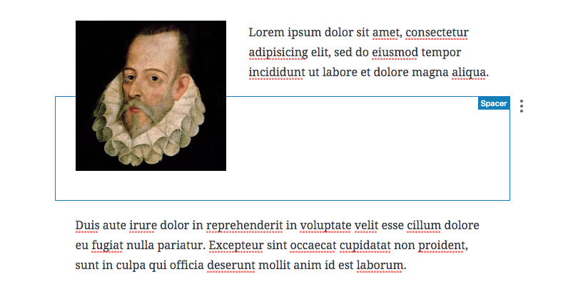
Gutenberg gives users the ability to easily float some block types (e.g. images, pull quotes) to the left or right and have the following blocks content wrap around the floated one:
This may or may not be the desired layout. What if I want to clear the following block to make it not wrap the image? For example:
The only way I've found so far is to add new empty lines to push down the following block. Worth noting this is not new to Gutenberg, I think users do this also in the classic editor but it's an ugly practice, it produces lots of unsemantic, empty, paragraphs, it's not responsive, etc.
Gutenberg is an excellent opportunity to offer users a better option 🙂 I'd propose to introduce a simple, effective, way to "clear" a block. It should be something very intuitive, something users can understand ("clear" is too technical), and something that aims to produce better, cleaner, more semantic markup.
The text was updated successfully, but these errors were encountered: