Simplify keyboard navigation through blocks #5694
Comments
 afercia
added
the
[Focus] Accessibility (a11y)
afercia
added
the
[Focus] Accessibility (a11y)
|
I highly endorse this approach in combination with a solid user guide. |
 karmatosed
added
the
[Priority] High
karmatosed
added
the
[Priority] High
|
Some notes from the a11y team Slack: I think the UI complexity is universal to both pointed device users AND keyboard users. This is a challenge with the fundamental concept of blocks (or, at least, how they articulate themselves in Gutenberg). Consider this: if you have 20 paragraph blocks, that means you are reproducing the same UI 20 times. 20 consecutive paragraph blocks, though, should be treated as one cohesive piece of content. This is a common pattern between document editors, Medium, virtually everything. If that’s extended to other basic content-like items (headings, lists, and similar non-blocking elements), I think it reduces the amount of cognitive load while reducing the amount of meta information that needs to be relayed to an assistive device. Instead, it’s relaying the content itself, not the interface. I think blocks become more important as the layouts become more complex, but perhaps we can lessen the load for the user by treating consecutive pieces of text-based content as single blocks. They can still register in React as individual blocks, but at the very least, they should be presented in the editor as a single cohesive block. Also, because this is a common approach to this type of content, I think we have some information, patterns, and expectations on how to present this UI to assistive technologies, which should help inform how to address this moving forward. Here's a quick mockup I did to explain the above.
|

Blocks - keyboard interaction (Tab, Shift+Tab)/* Updated for Gutenberg 2.7 */ Paragraph blockTab: Initial focus: cursor in to add text
Shift + Tab:
Paragraph block, content addedInitial focus: on paragraph block Tab:
Shift + Tab:
Paragraph block, content addedInitial focus: in text area, cursor at end Tab:
Shift + Tab:
Image BlockInitial focus: on image block Tab:
Shift + Tab:
Image Block, image just addedInitial focus: on image Tab:
Shift + Tab:
Image Block, image addedInitial focus: on image block Tab:
Shift+Tab:
Image Block, image addedInitial focus: on caption field Tab:
Shift + Tab:
Heading BlockInitial focus: cursor in to add heading Tab:
Shift + Tab:
Heading block with Heading addedInitial focus: on Heading block Tab:
Shift + Tab:
Heading block with Heading addedInitial focus: cursor in Heading text area Tab:
Shift+Tab:
Gallery BlockInitial focus: on gallery block Tab:
Shift + Tab:
Gallery Block, after images addedInitial focus: unclear Tab:
Shift + Tab:
Can’t tab to Write caption, Remove image (available on mouse click) Gallery Block, after images addedInitial focus: on gallery block Tab:
Shift + Tab:
List blockInitial focus: cursor in unordered list, ready for item 1 Tab:
Shift + Tab:
List: after items addedInitial focus: on list block Tab:
Shift + Tab:
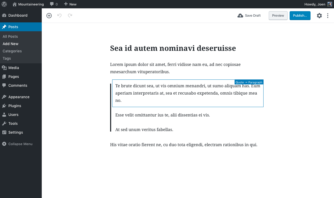
QuoteInitial focus: cursor in Write quote box Tab:
Shift + Tab:
Quote, content addedInitial focus: on quote block Tab:
Shift + Tab:
Audio blockInitial focus: Enter URL of audio file here… Tab:
Initial focus: Enter URL of audio file here… Shift + Tab::
Audio block, content addedInitial focus: unclear Tab:
Shift + Tab:
Audio block, content addedInitial focus:: whole block Tab:
Shift+Tab:
Cover ImageInitial focus: on whole block Tab:
Shift+Tab:
Cover image, with content addedInitial focus: on image Tab:
Shift + Tab:
Cover image, with content addedInitial focus: on block Tab:
Shift + Tab:
SubheadInitial focus: in text box Tab:
Shift + Tab:
Subhead, with contentInitial focus: text box, at end of text Tab:
Shift + Tab:
Video blockYouTube URLs don’t seem to work!! (YouTube is a separate block) Initial focus: Enter URL of video file here… Tab:
Shift + Tab:
Video block, content addedInitial focus: unclear Tab:
Initial focus: whole block Shift + Tab:
|
|
@abrightclearweb thanks Claire! |
|
Thanks @abrightclearweb! Can you write short summary what was good and bad about those keyboard interactions? Are we still after the original "navigation" and "edit" mode as mention in the first comment? Here is my short summary of keyboard interaction from block to block and inside a block:
|
|
Some of the annoyances about keyboard interactions:
|

|
@abrightclearweb 👋 thanks so much for your testing and feedback. I'd absolutely agree the Tab order doesn't make much sense in some cases, some focus styles are too light (especially for my poor eyesight), etc. Some of these points have specific issues:
This is fixed on master :)
Yeah, this was reported by many, see #6009 and hope to see some progress there /Cc @karamtosed please
😬Yeah... this is because, actually, the panel is at the bottom of the DOM (I've explained this to the dev team many times but they have technical reasons to keep it there). However, then it should be treated like a modal see #5242
@youknowriad worked on a PR and implemented it, see #5709 but... there's a problem: keyboard events on a DIV element don't work with screen readers when in "browse mode", which defeats the purpose of that change. It works only in VoiceOver because VO doesn't use browse/forms mode. Any idea and testing regarding that PR would be greatly appreciated! |
|
Re: the tab order, there's also #1934. I'd like to add an animated GIF to visually illustrate the order the UI controls in a block (a paragraph) are navigated when tabbing with the keyboard. Two considerations:
|

|
Feedback from @conlaccento on make/accessibility gutenberg testing:
|
|
@aardrian, can you have an opinion about @afercia's solution in |
|
@rianrietveld I am struggling because I see this is a long comment thread and I don't know where I need to start to get sufficient context. That said, the first thing I did was look at the animated GIF (because it was moving) and my first reaction is that I would flag that tab order in an audit (1.3.2 Meaningful Sequence and 2.4.3 Focus Order). I don't know if they are failures, but my gut tells me to look under the hood because they may be. Further, the icons not appearing until focus is a big usability issue in my opinion (and experience) because there is no cue to a sighted user that there are controls that may receive focus. When I think of a user with a screen magnifier when the focus leaves the magnified area, that user may not think to look right or left because that user saw no controls there previously. Training can mitigate this, but it is not a good first interaction. Plus I have an issue with hiding controls in the interest of 'simplifying' user interfaces. That often does the opposite. It appeals to a design aesthetic, but in testing with users hidden controls can/do increase cognitive load and require interaction to identify all the options. Now, to @afercia's bullets:
|
|
Thanks @aardrian
FWIW I have the same issue 🙂 Re: the toolbar, we've discussed it during today's a11y meeting and agreed to try the ARIA interaction model. But then it should be A/B tested. |
|
Out of curiosity, I've checked the order of the block controls in the "responsive" view, and seems to me it makes more sense (except the "horizontal line" a.k.a. "sibling inserter" is almost completely hidden by the top toolbar). A "mobile" toolbar appears after the block and groups the "Add block" button, the movers, ellipsis menu and remove:
Of course, the bottom toolbar could be an issue with very long blocks. |

|
With regards to the experimental switch between "navigation" and "edit" mode tried in #5709 worth considering there are also alternate approaches to evaluate. See last comment on #5709 (comment) |
 mtias
removed
the
[Priority] High
mtias
removed
the
[Priority] High
|
Let's try and unstick this and make some decisions on how to move forward. Based on discussion in #5709, here are mockups for an approach I feel is clear, simple, unintrusive, and inspired by how notion.so does it, so you can test it there as a prototype. Here's our content — for this exercise, imagine the Quote being a container for nested paragraphs. Note how no block is yet selected, but the editing canvas has focus:
Now press Tab, and you get this:
Press Tab again, to get this:
Press Tab once more, to get this:
Now press Enter, and you're now editing the first paragraph of the quote:
Now we press Escape, and we're back here:
Some notes:
The benefit to the above is that to the user, this isn't really additional cognitive weight. It is visually almost indistinguishable from what we have today, but it accomplishes the goal of allowing you to press tab three times to get to the third block. In other words, if you never learn about navigation mode, it does not get in your way. This approach is inspired by what notion.so does — only they use arrow keys instead of Tab to jump between blocks. But regardless, you can try notion to experiment with this approach as a prototype. Here's a GIF as well:
What are next steps? Can we make a decision to move forward with this? |


 tofumatt
changed the title
tofumatt
changed the title
My greatest apologies in not seeing this sooner. We should do (almost) exactly what you suggest, @jasmussen. I would be okay with keyboard arrows being a way we move through blocks in navigation mode but I suppose My one question is around |
tofumatt
removed
the
Needs Decision
|
(Optimistically adding to the milestone as a priority marker; not really a blocker but it's the nicest-nice-to-have I can think of.) |
|
This approach was already tried in #5709 and doesn't work when a screen reader is running. I'd recommend to re-read what's in #5709 and familiarize with the concept of "browse mode / focus mode" used by screen readers on Windows before spending time on an implementation that would be not effective. VoiceOver is really an exception to this model, I'd strongly recommend everyone to familiarize with screen readers on Windows. In short, in the default "browse mode", screen readers intercept keystrokes and pressing Enter on a div doesn't do anything. This was already discussed with @aduth, who also took some time to have a look at the NVDA source code to get an idea of how screen reader modes work 🙂and I guess he could provide some in-depth feedback if necessary. As mentioned in #5709, there's the need of a button element to switch from a block "navigation mode" to "edit mode". |
|
Consolidating with #4382 |
|
In my opinion, this issue is probably the single biggest accessibility concern with Gutenberg right now. The sheer cognitive load of figuring out which direction you need to go to find a control at any given time and the number of controls required to navigate through the page transform a set of accessible micro-interactions into an unusable macro environment. For any user of assistive technology, this is a massive usability challenge. For a sighted keyboard user, there's at least some visual affordance giving you navigational clues, but for non-sighted users, it's incredibly difficult. Solving this is a must-have, not a nice-to-have. |
|
We're working on it right now in #10545. 😄 I'm making some accessibility suggestions based on screenreader testing. It should be posted within ten minutes. |
I would like to note that the PR has been labeled with "Need Accessibility Feedback" |
|
I would also like to remind people to drop the "lesson giving" tone as a method of communication as it just creates frustraction and doesn't help things moving forward. |
Thanks, I've noticed it. The two labels have a quite different use, as "need feedback" gets removed (and it was removed) as soon as feedback has been given. Instead the general "Accessibility" label stays so contributors can still search based on that label. I'd say it's a pretty significant difference. A proper label handling is important also for mutual professional respect. The accessibility team has kindly asked to be pinged for feedback, labels are an important part of that. I'm sorry if the tone sounder not proper, I was just in a rush because I was reviewing that PR. On a side note, I've re-added also "Need Accessibility Feedback" as I think the previous feedback was incomplete (see comment on the PR) and likely there will be the need for more feedback with future iterations. Thank you. |
|
I think this is addressed by #10545. 🙂 It allows navigation throughout the blocks, including with Firefox + NVDA in my testing. A keyboard shortcut is provided that allows easy access, even when the user is in a block that may present issues when trying to navigate out of using only the keyboard (a few of these, I think, do exist). Please let me know if I'm off on this or there are bugs with #10545 in follow-up issues we can address. |
Worth noting with VoiceOver the Blocks navigation menu shortcut |
|
Discussed this issue during today's accessibility bug-scrub and the team agreed the “Blocks navigation menu” implemented in #10545 is a nice-to-have and may help in some workflows but doesn’t fully address the issue. The fundamental problem still stands, not going to reopen this issue because there's now #11581 with a detailed proposal to improve keyboard accessibility. |
Follow up to #2031. The accessibility team has identified a list of 10 high priority issues for version 1 and agreed with the Gutenberg team to mark them with the "merge proposal" milestone.
For keyboard and screen reader users, keyboard navigation through the blocks needs to be greatly simplified. Feedback received from accessibility testers so far has always reported that navigation through the UI is confusing and terribly complicated: there are just too many tab stops, too many controls, formatting toolbars, block movers, ellipsis buttons, and the like. As long as the amount of blocks in a post increases, the UI controls increase exponentially, adding several tab stops for each block.
This issue was discussed at length in #2031 and one of the identified solutions was trying to implement two keyboard interaction modes: "navigation mode", and "edit mode". There's an initial PR that started experimenting with this, see #3195.
Trying to summarize the basic idea;
The accessibility team agreed this could be a very interesting idea (VIM users might like it ;) ) and probably one of the few options to guarantee a decent level of keyboard accessibility at this point of the project. Open to other suggestions, but we'd like to strongly recommend the interaction model described above.
Of course, once implemented, this should be clearly documented and made available in a User Guide, see #5420.
The text was updated successfully, but these errors were encountered: