Enhancement: images handling #6177
Comments
 azaozz
added
the
[Feature] Media
azaozz
added
the
[Feature] Media
|
Pinging @noisysocks and @iseulde for the editor changes. I can add the core changes. For the editor the changes (as I see them) would be:
TODO: consider what would be the best way to pass percentage width to the front-end. |
|
Thanks for writing this up, @azaozz! Happy to help with the necessary editor changes. They sound good to me.
My hesitation with this is that if a third party (e.g. plugin, RSS reader, API consumer) uses the Thinking out loud: could we use Gutenberg metadata to accomplish some of this, e.g. to store the attachment ID and percentage width? <!-- wp:image {"attachmentId":123,"horizontalScale":0.25} -->
<img src="https://example.com/image.jpg" width="600" height="500" />
<!-- /wp:image --> |
|
Yeah, images are "dynamic blocks" (that's how they are treated in the classic editor too). They are the best kind of dynamic blocks as they have the "fallback markup" right in there, and are processed on the Having that fallback markup makes images work "everywhere" even when the "display filters" haven't been run (this would actually leave the content without paragraphs, so don't think any plugin would do it). We can certainly add the data we need to pass to the front-end to the blocks meta, however thinking we will need the same data in the At the end this boils down to:
Imho we should use both the block meta and the img tag attributes, then (one day) we will be able to choose which to use when parsing the content on display. |
|
@azaozz This is a well thought out proposal. I am not fully grasping why we don't use existing theme-declared image sizes though. Is there a prior discussion around this? Currently a percentage field is exposed but I wasn't able to determine whether this does anything at present on the frontend. https://github.com/WordPress/gutenberg/blob/master/blocks/library/image/block.js#L266 The percentage approach is nice but it breaks backwards compatibility with the theme API. |
We do :) We use all available sizes (that have the same w / h ratio) when adding the |
|
@azaozz I believe that would function a bit differently than current behavior. Image sizes can also be used to deliver styles, not just the image crop to use. I also think that existing lazy load plugins expect the Edit: This would be the |
|
@davisshaver I've gone through several lazy load plugins in the past week. Many of them look for existing |
|
There are several issues related to responsive images that will have overlapping solutions. I propose we consolidate everything into this issue to avoid further fracturing of the discussion. Here's an incomplete list: Related issues:
Core tickets: |
|
Regarding this, in @azaozz proposal:
Has there been consideration of bumping up the current default pixel sizes of "thumbnail", "medium", and "large", which were originally defined in 2008? Maybe with Gutenberg it's the perfect moment of increasing them x2. Otherwise, the terms "medium" and "large" will lose their semantic meaning. |
|
Also related: #5650 Same core issue cause: new content width paradigm makes things that used to be standard not work as expected and introduces need for rethink of how core works. |
|
/update/image-block is a "work in progress" :) Please test. Changes:
TODO:
|
|
@azaozz this is looking really great so far. Nice work! A few things I've noticed while testing this out: First, editor width is probably not going to match the intended display width on the front end, so saving the The latter would be my suggestion. Here we can now take advantage of the block parser in WordPress to implement a much better responsive image solution, rather than a filter on I 💖 the changes to the size dropdown here. I'm curious if you've thought about how this could be extended to allow for custom crop sizes, i.e. A bug that I ran into was inserting an image, setting the source type to thumbnail, saving a draft, and then refreshing the page. In that case, the block parser responds with the classic "This block appears to have been modified externally" error. Seems it's expecting only There's still some weirdness with right/left aligned images. I wonder if in these cases we should explicitly resize to a percentage of the editor width and update the sizes attribute to match? I was surprised by the choice to add a specific I'm going to leave this for now and continue testing. Bravo, sir. |
|
@joemcgill thanks for having a look!
Right. This is the reason to add the
Yep, it is intended to be overridden on the front. Was thinking if we should keep it in the image tag as a "fallback" in case something goes wrong. However thinking to leave the
Possibly but that is going to be pretty slow. For now running the block parser on the front-end is not something we can do.
That's how block properties work. Alternatively we can "extract" the image blocks with some regex and parse the HTML in them looking for the image tag. Still... parsing even a bit of HTML with regex seems like something we should avoid. So for now thinking to add all needed context from the editor in the actual img tag.
This should work at present. Only sizes that match the original image ratio are removed from the drop-down, the rest (plus the thumbnail) are shown. So all custom crops added by themes and plugins are in it.
Uh, will check that again. Thought I caught all of these.. This also prompted me to look at block validation, and why blocks fail so often (for example after the user adds another attribute). Thinking we will need some more general fixes there too, but that's for another issue.
Yeah, thinking the previous behaviour was better there. We should probably go back to setting right/left aligned images to 50% width. Can also change
Tested several approaches there but this seems to work best. At the point when adding the
Yeah, once Gutenberg is merged, this should go to the proper functions.
Hmm, we should probably open a core trac ticket for that. It should always be present. I'm going to look into adding the front-end code that uses the new attributes next. Then we will have a good start to tweaking all this :) |
|
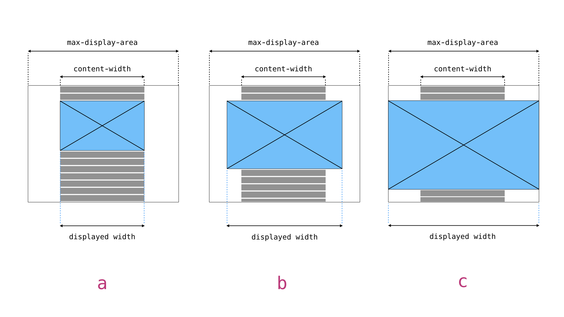
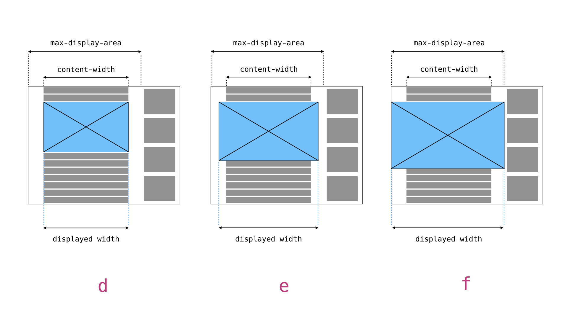
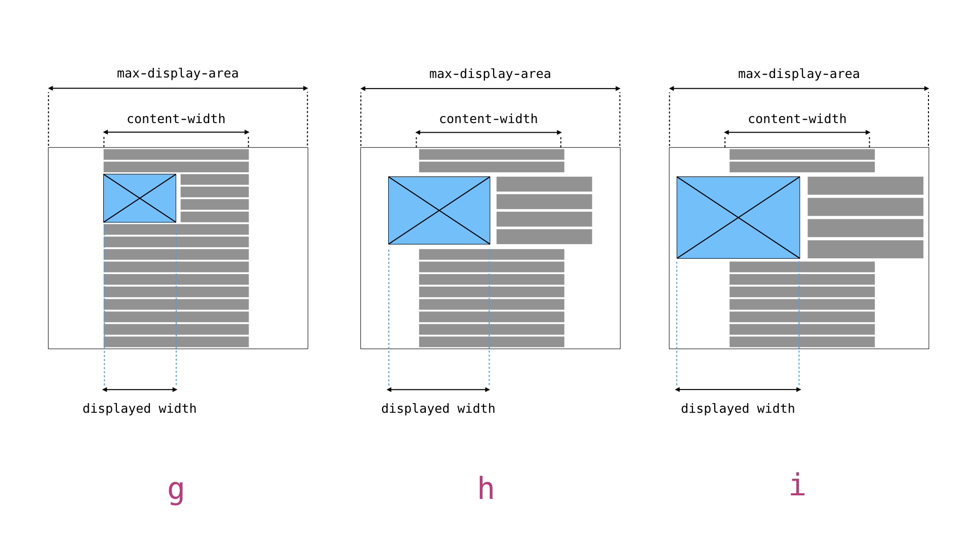
I had a chat with @azaozz at WCEU contributor day and want to share my thoughts with everyone in an effort to move this forward. Context: Front-end (theme / plugin territory) ProposalThe challenge I'm interested in, as I've stipulated before (#6131), is how theme and plugin developers can control the Consider the following scenarios, a through i: Historically, we've known two things about any image displayed: The physical width of the image file, and the Gutenberg introduces not only the These examples show there are two constants which can be easily defined by the theme developer (and by extension plugin developers):
There is also one third assumption we can make:
In other words, if WordPress knows the Practical applicationThe theme developer defines two values:
Both these values will be variable depending on conditions so neither can be a global the way For images displayed without For images displayed in an So for the examples above a theme would declare something like: // In this theme there is a fixed maximum content width of 720px.
$content_width = 720px;
if ( is_active_sidebar( 'sidebar-1' ) {
$max_display_area = [
'min-width: 48em' => 'calc( 100vw - 30em), // sidebar is 30em wide.
'fallback' => '100vw',
];
} else {
$max_display_area = [
'fallback' => '100vw',
];
}Assuming for d, e, and f, the breakpoint where the sidebar appears is at 48em and for g, h, and i, the /**
* a: Image width is equal to $content_width area.
*/
sizes="(min-width: $content_width) $content_width, fallback"
sizes="(min-width: 720px) 720px, 100vw"
/**
* b: Image width is 50% of the available space between $content_width and $max_display_area.
*/
sizes="(min-width: $content_width) calc(($max_display_area - $content_width) / 2), fallback"
sizes="(min-width: 720px) calc((100vw - 720px) / 2), 100vw"
/**
* c: Image width is equal to fallback.
*/
sizes="fallback"
sizes="100vw"
/**
* d: Image widths is equal to $content_width area.
*/
sizes="(min-width: $content_width) $content_width, fallback"
sizes="(min-width: 720px) 720px, 100vw"
/**
*e: Image width is $content_width plus 50% of the available space between $content_width and $max_display_area.
*/
sizes="(min-width: $content_width) calc(($max_display_area - $content_width) / 2), fallback"
sizes="(min-width: 720px) calc((100vw - 30em) - 720px) / 2, 100vw"
/**
* f: Image width is equal to $max_display_area.
*/
sizes="$max_display_area, fallback"
sizes="(min-width: 48em) calc(100vw - 30em), 100vw"
/**
* g: Image width is 50% of $content_width.
*/
sizes="(min-width: $content_width) calc($max_display_area * (data-wp-percent-width / 100)), calc(fallback * (data-image-width / 100))"
sizes="(min-width: 720px) calc(720px * .5), calc(100vw * .5)"
/**
* h: Image width is 50% of $content_width plus 50% of the available space between $content_width and $max_display_area.
*/
sizes="(min-width: $content_width) calc((($max_display_area - $content_width) / 2) * (data-wp-percent-width / 100)), calc( fallback * (data-image-width / 100))"
sizes="(min-width: 720px) calc(((100vw - 720px) / 2) * .5), calc(100vw * .5)"
/**
* i: Image width is equal to 50% of fallback.
*/
sizes="calc(fallback * (data-wp-percent-width / 100))"
sizes="calc(100vw * .5)" |
|
Thanks @mor10, very nicely put :) Yes, to properly process and display images on the front-end we need couple of bits of data: some context from the editor on how the image was used exactly, and some data from the theme on how the image will be displayed. I have couple of small suggestions/clarifications.
I'm (still) thinking we should let the theme (be able to) specify all three widths: content/main column, wide and full. That way we won't be forcing anything on the themes. Some may want a bit wider or narrower So these should be something like:
(Technically they can also be in an associative array so we don't "litter" the globals space too much. Having that array will also signal that the theme supports this.) Another important distinction is that we will expect these new widths to be "contextual". I.e. they should be set by the current template before it starts to output the HTML, (and perhaps reset at the end). This is critical for generating more precise
Don't think we need to be concerned about that re: images. If a block is set to |
|
Having all three widths specified makes sense, and the associative array would indeed make it cleaner. The only question is how to modify that with conditions... I guess the theme dev would just modify the array?
If you look at the examples in my comment you'll see we have to account for these. If someone has a very large screen and a block is set to |
|
Hello @mor10, in your example, shouldn't the sizes for 'b' be: sizes="(min-width: $content_width) calc($content_width + ($max_display_area - $content_width) / 2), fallback" ? |
|
@alialaa The math might well be wonky. It was provides as a prototypical example only. |
|
@azaozz Where are we with this? I just tested Gutenberg 3.3 with the official Gutenberg Starter Theme and as far as I can tell the current blocks are all using the full image size for everything. This causes a significant performance hit when the plugin is activated. |
|
@mor10 I'm trying to implement something that's very similar to the code provided by you (the
What I managed to implement already is some PHP logic that accepts a set of parameters and outputs an array of sizes, with width descriptors and media queries. My goal is to cover the most common bootstrap layouts, they are super widely used For the context, here are the breakpoints (with slightly modified media queries) that are used to generate these numbers. The valid parameters for the thing are:
Here are some test cases that actually pass, in JSON format (each entry is a test case, first object is the input to my logic, and the second is the output): [
[
{"bootstrap_class": "col-md-12", "gutters": true, "fluid": true},
[{"media_query": false, "image_size": "calc(100vw - 30px)"}]
],
[
{"bootstrap_class": "col-sm-12", "gutters": true, "fluid": true},
[{"media_query": false, "image_size": "calc(100vw - 30px)"}]
],
[
{"bootstrap_class": "col-xs-6", "gutters": true, "fluid": true},
[{"media_query": false, "image_size": "calc(50vw - 30px)"}]
],
[
{"bootstrap_class": "col-xs-8", "gutters": true, "fluid": true},
[{"media_query": false, "image_size": "calc(66.6667vw - 30px)"}]
],
[
{"bootstrap_class": "col-xs-5", "gutters": true, "fluid": true},
[{"media_query": false, "image_size": "calc(41.6667vw - 30px)"}]
],
[
{"bootstrap_class": "col-xs-9", "gutters": true, "fluid": true},
[{"media_query": false, "image_size": "calc(75vw - 30px)"}]
],
[
{
"bootstrap_class": "col-xs-10 col-sm-3 col-md-7 col-lg-11 col-xl-5",
"gutters": true,
"fluid": true
},
[
{"media_query": "1300px", "image_size": "calc(41.6667vw - 30px)"},
{"media_query": "1000px", "image_size": "calc(91.6667vw - 30px)"},
{"media_query": "690px", "image_size": "calc(58.3333vw - 30px)"},
{"media_query": "480px", "image_size": "calc(25vw - 30px)"},
{"media_query": false, "image_size": "calc(83.3333vw - 30px)"}
]
]
]After getting the output, it can be assembled easily into a proper For example, here's what the output should be for a very complicated [
{
"bootstrap_class": "col-xs-10 col-sm-3 col-md-7 col-lg-11 col-xl-5",
"gutters": true,
"fluid": true
},
[
{"media_query": "1300px", "image_size": "calc(41.6667vw - 30px)"},
{"media_query": "1000px", "image_size": "calc(91.6667vw - 30px)"},
{"media_query": "690px", "image_size": "calc(58.3333vw - 30px)"},
{"media_query": "480px", "image_size": "calc(25vw - 30px)"},
{"media_query": false, "image_size": "calc(83.3333vw - 30px)"}
]
],Which in final assembled HTML would look like that: <div class="container-fluid">
<div class="row">
<div class="col-xs-10 col-sm-3 col-md-7 col-lg-11 col-xl-5">
<img
srcset="..."
sizes="
(min-width: 1300px) calc(41.6667vw - 30px),
(min-width: 1000px) calc(91.6667vw - 30px),
(min-width: 690px) calc(58.3333vw - 30px),
(min-width: 480px) calc(25vw - 30px),
calc(83.3333vw - 30px),
"
>
</div>
</div>
</div>Now test cases for the non fluid layouts are much more complicated and harder to follow. Also, sometimes the If interested, I can hop into a more detailed chat somewhere else about this thing, I'm really interested into moving it forward properly, there are still lots of problems that I face 🙂 |
 jorgefilipecosta
removed
the
[Priority] High
jorgefilipecosta
removed
the
[Priority] High
|
If FLIF or JPEG-XR could be widely enough supported already... 🐱 Currently the cover image is placed as CSS background image in its full, original size, no resizing, no server-side compression or optimizations whatsoever. This is very bad for the load times for UX, when a separate, scaled-down variant has to be uploaded and used for the cover block instead. |
|
Is there already an update for this? |
|
Hello @azaozz and others. It seems there is a lot of things going on in this issue. It is important to break it part into smaller issues that are easier to handle. Thanks. |
|
Is there any way to fix the gallery problem? I mean linking to the media file? Currently some of my images have valid links to full width, but most of them linking to large format (1024x). |
|
Hey @Cnk001 See if you are able to locate an issue that is related. I did a search for media label issues:
[Feature] Media
|
|
I just had a support request for a user needing more advanced image handling. |
|
After one of the last Wordpress Autoupdates my solution went down the drain like ... Did anyone find a solution to the problem that galleries do not show thumbnails but full size images? |
|
Hey @ararename Gallery is being reworked to use inner blocks. For more information check out this Pull Request. |
|
@paaljoachim Thank you for the quick reply! Gonna check :-) |
|
@ararename you can use the PhotoPress plug-in in the meantime. It has a core gallery transform. |
|
Thanks @padams for another option. I thought i will get to it today but it will take me some days to return to this topic. Will report back how it went. |
|
This issue is very huge and hopefully actionable issues have been created. |
|
Could you actually reference all the actionable issues here as a last comment? |
I've just found out that the issue is with the select form. You can't choose thumbnail because it's the top option, and the form keep showing that as selected no matter which size you click. As a workaround just add new custom size ( add_image_size ) and register it ( image_size_names_choose ) so that you can use the new size instead. |
 skorasaurus
removed
the
[Status] In Progress
skorasaurus
removed
the
[Status] In Progress
After going through this issue, I summarized the issue(s) that remain at https://gist.github.com/skorasaurus/a01249d4302226bf12c80dd979322303 I brought up the issue in today's core-media meeting and it's proposed the first step is https://core.trac.wordpress.org/ticket/45407 |
 skorasaurus
added
[Block] Image
skorasaurus
added
[Block] Image
|
This is one of the biggest problem. The Drupal builds its responsive images with For instance I am adding 9 image sizes with
|
 and others
This is a "mini-proposal" on how to handle images in the editor and the front-end (follow-up from #4914).
Currently:
srcsetattribute, but thesizesattribute is pretty useless as it only refers to the full size image file:sizes="(max-width: 6000px) 100vw, 6000px".To fix this in the editor:
srcsetattribute that will also list 2x large size (so images are retina ready). This is a new size and will have to be added to the default WP sizes, see below.srcsetandsizes attributes a bit differently. Ideally that should have the attachment ID, something likedata-wp-attachment-id="1234". Then perhaps we will be able to drop the "old" way of passing the ID,class="wp-image-1234".To fix this for the front-end:
<img>tags and addingsrcset, etc. that will produce usablesizesattribute. It will depend on the new data-* attribute and take into account theme's width when calculating sizes. If we are going to recalculate hard-coded width attributes (see above), this can be done here and the values used in both attributes. Alternatively we can set the width in percentage (HTML 4.0 style) in the editor, then replace them with pixels at this point.Implementing all of the above will ensure all images are always "retina ready" both in the editor and on the site. It will also improve handling on the front-end and optimize image loading there.
This will also affect other enhancements, mostly #4914. Also, as described in #6131 the themes will be able to add more precise
sizesattributes for the different images.The text was updated successfully, but these errors were encountered: