-
Notifications
You must be signed in to change notification settings - Fork 4.2k
New issue
Have a question about this project? Sign up for a free GitHub account to open an issue and contact its maintainers and the community.
By clicking “Sign up for GitHub”, you agree to our terms of service and privacy statement. We’ll occasionally send you account related emails.
Already on GitHub? Sign in to your account
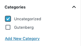
Add left padding to the categories list inside of the categories panel #15075
Merged
Conversation
This file contains bidirectional Unicode text that may be interpreted or compiled differently than what appears below. To review, open the file in an editor that reveals hidden Unicode characters.
Learn more about bidirectional Unicode characters
Prevents the focus state for checkboxes from being trimmed off.
jasmussen
approved these changes
Apr 26, 2019
There was a problem hiding this comment.
Choose a reason for hiding this comment
The reason will be displayed to describe this comment to others. Learn more.
Yep! Nice bit of tightening up!
This was referenced Apr 29, 2019
This was referenced Sep 11, 2024
[Snyk] Upgrade @wordpress/postcss-plugins-preset from 1.6.0 to 5.6.0
WontonSam/woocommerce-admin#263
Open
This was referenced Sep 14, 2024
This was referenced Sep 19, 2024
Sign up for free
to join this conversation on GitHub.
Already have an account?
Sign in to comment
Labels
Needs Design Feedback
Needs general design feedback.
[Type] Bug
An existing feature does not function as intended
Add this suggestion to a batch that can be applied as a single commit.
This suggestion is invalid because no changes were made to the code.
Suggestions cannot be applied while the pull request is closed.
Suggestions cannot be applied while viewing a subset of changes.
Only one suggestion per line can be applied in a batch.
Add this suggestion to a batch that can be applied as a single commit.
Applying suggestions on deleted lines is not supported.
You must change the existing code in this line in order to create a valid suggestion.
Outdated suggestions cannot be applied.
This suggestion has been applied or marked resolved.
Suggestions cannot be applied from pending reviews.
Suggestions cannot be applied on multi-line comments.
Suggestions cannot be applied while the pull request is queued to merge.
Suggestion cannot be applied right now. Please check back later.
Fixes #15045. This extra padding prevents the focus state for checkboxes from being trimmed off.
Before:

After:
