-
Notifications
You must be signed in to change notification settings - Fork 4.2k
New issue
Have a question about this project? Sign up for a free GitHub account to open an issue and contact its maintainers and the community.
By clicking “Sign up for GitHub”, you agree to our terms of service and privacy statement. We’ll occasionally send you account related emails.
Already on GitHub? Sign in to your account
Fix checkbox alignment issues in options and block manager modals (#16860) #16863
Conversation
|
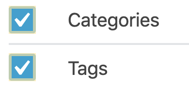
Thanks for the quick fix, @jffng. Just a small nitpicky note: I'm seeing a little bit of spacing inconsistency, and I can't figure out where it's coming from. Check out these two adjacent list items in the Options panel for example: Notice that the first checkmark is appearing higher than the one below it. Those should theoretically have the exact same styles, so I'm not sure what's causing the inconsistency. Any ideas? |
|
@kjellr it looks like the actual inputs are being rendered in ever so slightly different positions, thus throwing off the position of the checkmark relative to the box: The issue goes away when the width + height of the input is greater than some threshold, e.g. 19 x 19px: |
packages/edit-post/src/components/manage-blocks-modal/style.scss
Outdated
Show resolved
Hide resolved
That is truly bizarre. 🤔 In any case, I don't think it should hold up this PR. I posted a tiny comment about the |
Use z-index mixin
|
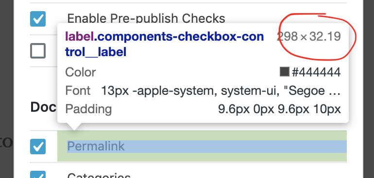
@kjellr I think I came up with a fix. The height of the labels was fractionally different in some places due to a Manually setting the height of the label seems to have done the trick. Mind giving it one more spin to see if passes the eye test? |
|
It's a bit concerning that the height of the label affects the checkbox, I was expecting that the checkbox component would work properly no matter the context it's being used in? Does this mean any developer using the component would have to adjust the height of the labels somehow? |
|
@youknowriad this is a valid concern. I pushed an update that should address it, let me know if it's okay. Previously I wanted to avoid adding any additional markup to the component, but looking at other checkbox implementations, I think it's reasonable to add a span that wraps the input and svg elements in a single inline container. |
| @@ -1,3 +1,6 @@ | |||
| $input-size: 16px; | |||
There was a problem hiding this comment.
Choose a reason for hiding this comment
The reason will be displayed to describe this comment to others. Learn more.
Should these be declared somewhere more global (ie. _variables.scss)?
| @@ -54,6 +54,7 @@ | |||
| top: 0; | |||
| padding: $panel-padding 0; | |||
| background-color: $white; | |||
| z-index: z-index(".edit-post-manage-blocks-modal__category-title"); | |||
There was a problem hiding this comment.
Choose a reason for hiding this comment
The reason will be displayed to describe this comment to others. Learn more.
How is this change related?
There was a problem hiding this comment.
Choose a reason for hiding this comment
The reason will be displayed to describe this comment to others. Learn more.
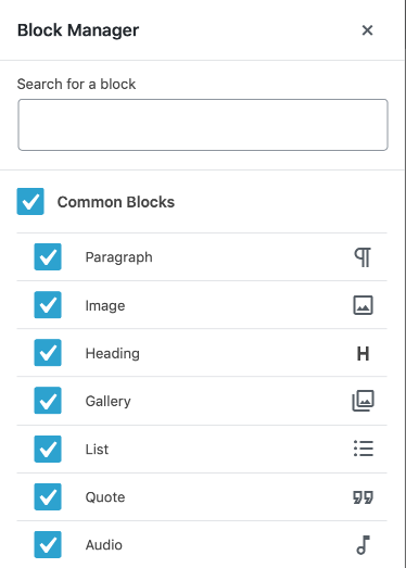
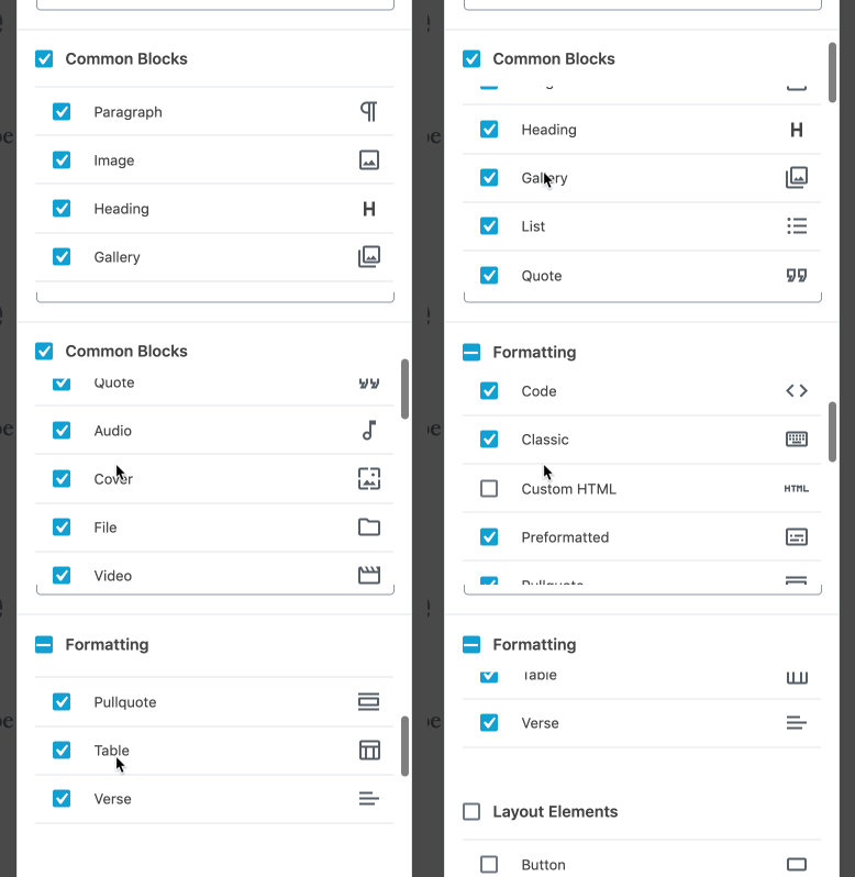
The headings for the block manager modal use position: sticky, creating a "sticky container" parent. Using a position: relative element (the wrapper for the input to position the checkbox) within the same sticky parent container, the browser treats them as in the same stacking context:
Adding a z-index to the header makes the sticky header remain on top:
|
The approach seems good to me. I'm wondering why do we need changes outside the component itself? |
|
(Sorry, clicked the wrong button) |
assets/stylesheets/_variables.scss
Outdated
| @@ -65,3 +65,5 @@ $block-bg-padding--h: $block-side-ui-width + $block-side-ui-clearance; // paddin | |||
| // Buttons & UI Widgets | |||
| $radius-round-rectangle: 4px; | |||
| $radius-round: 50%; | |||
| $input-size: 16px; | |||
There was a problem hiding this comment.
Choose a reason for hiding this comment
The reason will be displayed to describe this comment to others. Learn more.
To be honest, I'm not certain about these variables being global here. I think it only make sense if we use them consistently in all "inputs" otherwise it's going to create confusion. For example, why the size of the TextControl component doesn't use it?...
Thoughts @kjellr maybe we can leave them in the component for now, and maybe rename them to make it clear that it's just about the checkbox?
There was a problem hiding this comment.
Choose a reason for hiding this comment
The reason will be displayed to describe this comment to others. Learn more.
Yeah, I just conferred with @jasmussen about this, and while we haven't usually declared variables within components in the past, we can see how it would make sense to allow them.
Feel free to move these back, @jffng (and sorry for the back and forth!). Might also want to make the names just a little more specific too, as Riad noted.
Thanks!
|
Looks like there are some failing unit tests preventing us from merging this branch. Is this something you can take care of or need help with? |
|
Thanks @youknowriad, this link helped me out for updating the snapshots: |
There was a problem hiding this comment.
Choose a reason for hiding this comment
The reason will be displayed to describe this comment to others. Learn more.
Thanks for the updates. LGTM 👍
|
🎉 Thanks for sorting this out, @jffng! |


Description
Checkboxes are misaligned in the options + block manager modals due to an attempt to replace them with SVG (#16551).
This PR introduces editor specific css to address those alignment issues.
How has this been tested?
Tested MacOS on latest Chrome, Firefox, and Safari.
Screenshots
Types of changes
Fixes #16860
Checklist:
cc @kjellr