test: add accessibility testing where applicable #719
Conversation
| <img | ||
| src="${this.hero}" | ||
| slot="hero" | ||
| aria-hidden="true" |
There was a problem hiding this comment.
This is cheating! Currently, Spectrum CSS uses a background image for this, which is very close to the same level of cheating, so I wasn't sure what to do about applying an alt tag here. Should we use aria-hidden? Should we reapply the headline text? Should we surface an additional attribute? Should we move to a background image? I'm not sure the right path for both functionality and accessibility here...
There was a problem hiding this comment.
Alternates...
<sp-dialog-wrapper headline="Text" />
...
<img
 src="${this.hero}"
 slot="hero"
 alt="${this.headline}"
/>
<sp-dialog-wrapper hero-label="Text" />
...
<img
 src="${this.hero}"
 slot="hero"
 alt="${this.heroLabel}"
/>
<sp-dialog-wrapper />
...
<img
 src="${this.hero}"
 slot="hero"
 alt="Hero"
/>
There was a problem hiding this comment.
As discussed offline, the second alternate that leverages the hero-label attribute makes the most sense to me.
Both the headline and hero-label alternatives align with how we're handling the alt tag of shadowDOM images in other components, such as Avatar. I prefer the hero-label implementation, since the headline of the dialogWrapper doesn't always align with the contents of the hero image
There was a problem hiding this comment.
I've updated sp-dialog-wrapper to include hero-label attribute which applies to the alt attribute to the <img /> when available. When unavailable, the aria-hidden="true" practice is maintained.
| : html``} | ||
| </div> | ||
| <div class="content"> | ||
| <div class="content" tabindex="0"> |
There was a problem hiding this comment.
@jnurthen would love some additional insight here. This is based on the feedback in https://dequeuniversity.com/rules/axe/3.4/scrollable-region-focusable?application=axeAPI. However, this element won't always be "scrollable" even though it has overflow: auto, due to content size. Do we need to dynamically cover for that? Or, is it OK to make it focusable even when the content doesn't require scroll?
There was a problem hiding this comment.
We should also have a visible reaction to focusable elements, right? If this makes sense to move forward with, I'll need to submit an issue to Spectrum CSS generally for the absence of such styles. Maybe @lazd would have some thoughts on that?
There was a problem hiding this comment.
@andrewhatran I've thought about this some more, and while it seems sub-optimal to have or not have the tabindex 100% of the time like this, it seems slightly less so to have it 100% of the time AND any updates we make to when it is available in the future would essentially be within the private API scope of the element, so there is no need to block on them now. I've created #723 to track the additional functionality and design application that will likely be needed. Without directly addressing this question now, I think we should be OK moving forward on a more complete review of this PR when you have some time! Thanks.
There was a problem hiding this comment.
This totally makes sense to me. If we're planning on updating this component in the future to make the tabindex responsive to the scrollability of the element, then I feel comfortable with moving forward with this workaround 👍
I'll continue with a more thorough/complete review as soon as I have time!
|
FYI: CI fails because of an expected change in the screenshot testing. Want to make sure we work through any alterations of the actual code in this PR before I bump the golden image cache. |
 Westbrook
force-pushed
the
westbrook/switch
branch
2 times, most recently
from
Westbrook
force-pushed
the
westbrook/switch
branch
2 times, most recently
from
ed86dc7 to
4fc47a8
Compare
| this.inputElement.setAttribute( | ||
| 'aria-checked', | ||
| this.checked ? 'true' : 'false' | ||
| ); |
There was a problem hiding this comment.
@jnurthen The testing pointed out that switches with role="switch" require aria-checked where as checkboxes (the base of this component) don't. Does that checkout appropriately on your end?
 Westbrook
force-pushed
the
westbrook/switch
branch
from
Westbrook
force-pushed
the
westbrook/switch
branch
from
4fc47a8 to
04aa5bb
Compare
 Westbrook
force-pushed
the
westbrook/switch
branch
from
Westbrook
force-pushed
the
westbrook/switch
branch
from
1278854 to
bda029b
Compare
Westbrook
force-pushed
the
westbrook/switch
branch
from
bda029b to
e53af9b
Compare
| <sp-actionbar open> | ||
| <sp-checkbox indeterminate>228 Selected</sp-checkbox> | ||
| <div class="spectrum-ButtonGroup"> | ||
| <sp-button-group> |
| @property() | ||
| public hero = ''; | ||
|
|
||
| @property({ attribute: 'hero-label' }) |
 andrewhatran
left a comment
andrewhatran
left a comment
andrewhatran
left a comment
There was a problem hiding this comment.
Looks good to me, nice job 🎉
Description
Expand the testing suite to rely on
await expect(el).to.be.accessible();more liberally, and correct prior use of this command that omitted theawaitsignifier..to.equalSnapshot();tests for this approach as the DOM internal to our components is private API and doesn't need to be guaranteed across functional changes whereas the accessibility of our components does.Motivation and Context
How Has This Been Tested?
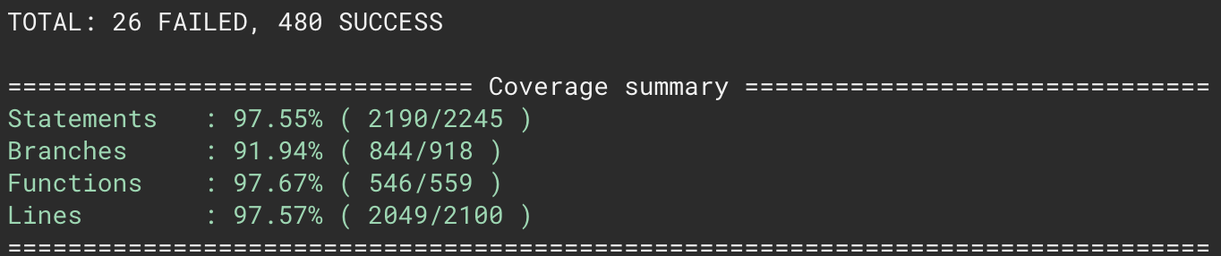
Screenshots (if appropriate):
Before:
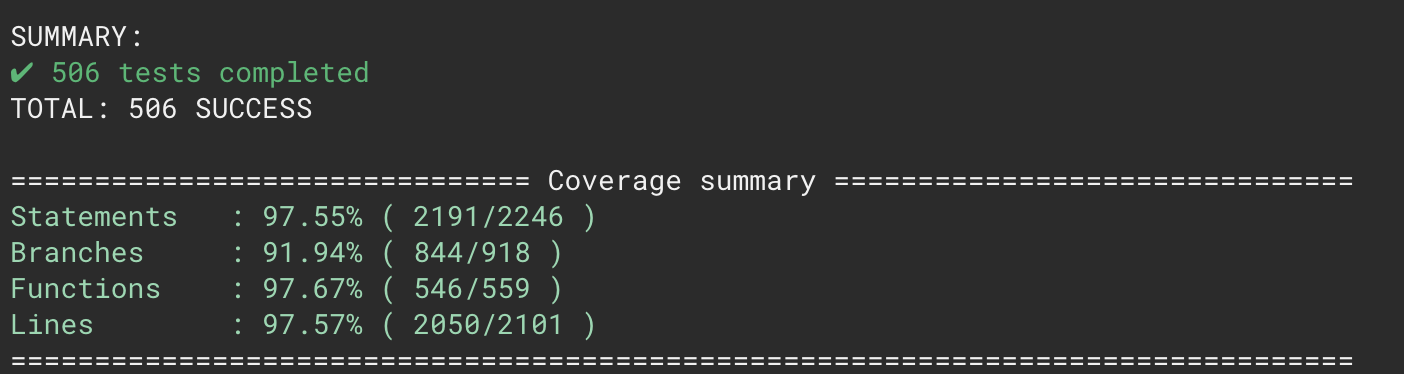
After:
Types of changes
Checklist: