A lightweight and customizable alert dialog package for Flutter. Easily display success, error, warning, and info dialogs with various styles and themes.
- Supports different alert types: Success, Error, Warning, Info
- Customizable UI with
QuickAlertTheme - Multiple dialog styles: Normal, Confirm, Loading
- Options for close and cancel buttons
- Configurable dismiss behavior
- Built-in support for multiple languages
- Easy-to-use extensions for
BuildContext
Add the package to your pubspec.yaml:
dependencies:
  flutter_quickalert: latest_version
Then, run:
flutter pub getimport 'package:flutter/material.dart';
import 'package:flutter_quickalert/flutter_quickalert.dart';
void showAlert(BuildContext context) {
QuickAlert.show(
context: context,
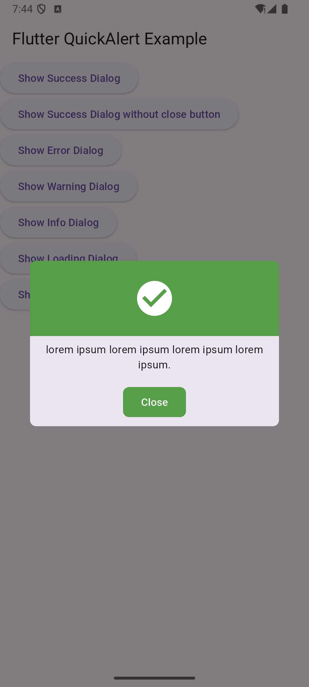
message: 'Operation Successful!',
type: QuickAlertTypes.success,
);
}QuickAlert.show(
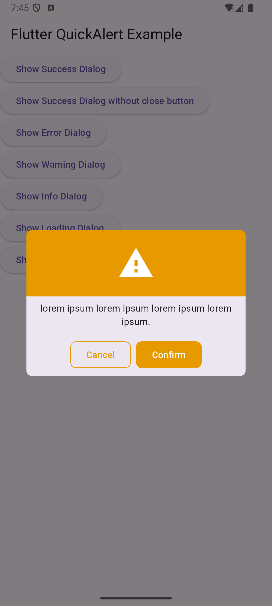
context: context,
message: 'Are you sure you want to proceed?',
type: QuickAlertTypes.warning,
dialogType: QuickAlertDialogTypes.confirm,
showCancelButton: true,
barrierDismissible: false,
);Customize the alert appearance by applying QuickAlertTheme to your app's theme:
ThemeData(
  // your custom theme data
    extensions: <ThemeExtension<dynamic>>{
      QuickAlertTheme(
        // background,
        // onBackground,
        success: const Color(0xFF569F49),
        onSuccess: Colors.white,
        error: const Color(0xFFAA4444),
        onError: Colors.white,
        warning: const Color(0xFFE69A00),
        onWarning: Colors.white,
        info: const Color(0xFF258EA6),
        onInfo: Colors.white,
        radius: 8,
        headerHeight: 100,
      ),
    },
);import 'package:flutter/material.dart';
import 'package:flutter_quickalert/flutter_quickalert.dart';
void showAlerts(BuildContext context) {
context.showAlert(
message: 'This is an info alert!',
type: QuickAlertTypes.info,
);
context.showLoadingAlert(
message: 'Loading...',
type: QuickAlertTypes.loading,
onCanceled: (context) {
print('Loading canceled');
},
);
context.showConfirmAlert(
message: 'Do you confirm this action?',
type: QuickAlertTypes.confirm,
);
}enum QuickAlertTypes {
success,
error,
warning,
info,
}enum QuickAlertDialogTypes {
normal,
confirm,
loading,
}


Contributions are welcome! Feel free to open issues and submit pull requests.
This package is available under the MIT License.