Link hover states are not clear #1417
Comments
 NickColley
added
accessibility
audit may 2019
NickColley
added
accessibility
audit may 2019
 kellylee-gds
added
🕔 hours
kellylee-gds
added
🕔 hours
|
I think it'd good to think about #1205 as well if we did this. |
|
Hover states in general could do with a review for example:
do not have hover states (perhaps more components too). |
 timpaul
changed the title
timpaul
changed the title
|
Noticed the NHS seem to have responded to this challenge too (perhaps by DAC as well!). Main NHS.UK websiteNo interaction
Hover with a mouse
Focus with a keyboard
I think this approach could potentially be problematic because the hover and the focus style are so similar a user could be confused what they're focused on and accidentally interact with wrong element.
Beta NHS.UK Service ManualLink with no interaction
Link when hovered
Link when focused
This approach seems to be: 'if there is an underline, remove it. If there is no underline, show one'. |


|
Dave Hunter has shared some of the working notes for this iteration:
Full document: https://docs.google.com/document/d/11AjdOgWC7ue1bit5AFyaneNwJYiudgLhf8nOxCWbn9M/edit# A note on how they recruited participants:
|


|
Related PR raised |
|
Browser support for It looks like that issue should be fixed in Chrome 90, which becomes stable in April. As Edge and Opera are both built on top of Chromium, I'd expect both of those browsers to be updated with the same fix not long after. Using text-decoration-thickness would allow us to do something like this, if we wanted: Screen.Recording.2021-01-27.at.09.23.41.movIt would need to be considered an enhancement as it would not work in IE11, Edge < 90 Early 2021), Chrome < 90 (April 2021), Safari < 12.1 (March 2019), Firefox < 70 (October 2019) – unless we also set the color or offset. |
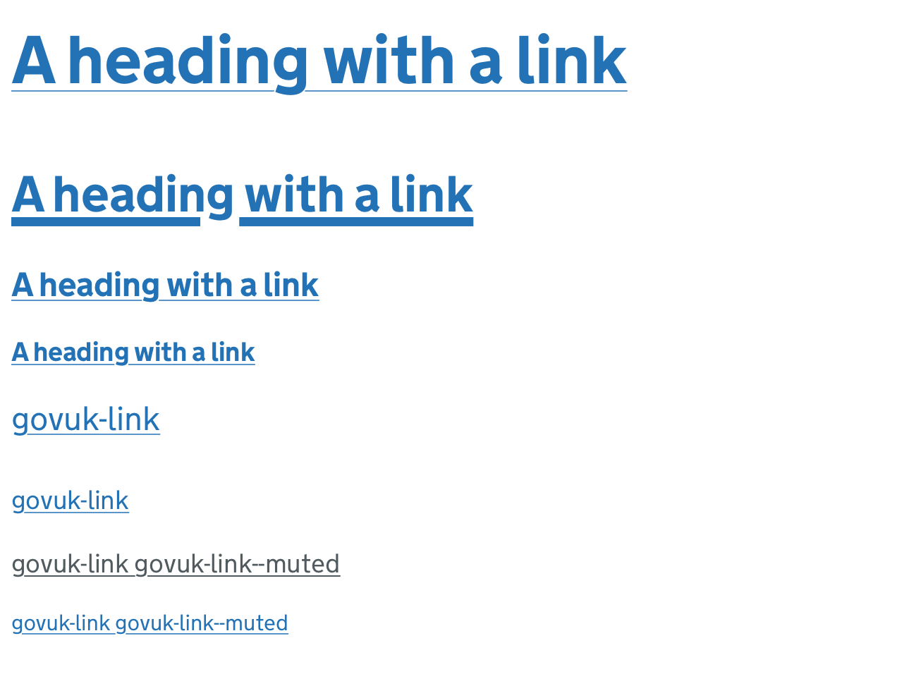
New link styles and hover statesI've been doing some more work on links, building on Ollie's work above. I'm trying to solve two problems here:
The increasing support for a few CSS properties means we can now control more about how links look. I've had a go at making links that:
It's worth reiterating that these changes should be seen as an enhancement. For browsers that don't support some or all of these properties, the normal underline will still work. Proposed designLook at the work in Frontend at #2089. Still some details to iron out, but something like this. Before:
After:
I've added the following CSS to links: It makes all link underlines 1px thick, sits them a bit further below the baseline of the text, and uses a lighter shade of blue to make the line a bit visually lighter. For the hover state, I made the line thicker and brought back the original link colour to make it stronger:
Here's how that scales for different sized text: Hover: ConsiderationsDifferent coloured links and backgroundsThe use of I think we'd want to be fairly confident that any underline colour has at least 3:1 contrast with the background to pass 1.4.11 Non-text Contrast. If something like that's not possible, we could either:
Distance from the baselineFor some reason, every browser's implementation of On all browsers, the combination of Another thing we could look at doing is making the underline offset on hover the same distance from the baseline as our focus state border. Again, I don't think there are huge gains here but it might look a bit more elegant or less jumpy. Testing across browsers and versionsI've done a bit of this but it would be good to test a bit more thoroughly on different versions and devices. |


|
We sent the revised implementation of link styles and hover states to the working group in March 2021. The group approved the changes, with the following main feedback:
We'll need to do a little bit more exploration to address these, covered in alphagov/govuk-design-system#1578 |
 36degrees
added
epic
36degrees
added
epic
We have a long-standing issue (#1417) [1] from an audit in May 2019 about the link hover state not being clear:

> The colour change when a user hovers over a link is not clear and this was especially difficult for low vision users to determine.
>
> Ensuring that the state change is distinctive would benefit low vision users in particular, while benefiting all mouse users in general.

This was raised as a usability issue rather than a WCAG failure.

We’ve been keeping an eye on browser support for the `text-decoration-thickness` property, and its introduction into Chrome 87 means that all evergreen browsers now support it. We can therefore use `text-decoration-thickess` as a way to differentiate the link on hover.

Some of the rationale for this is included in a comment around the time of the previous working group review [2]. The broad intention is that the thicker underline is a state change that can work across any combination of text colour and background colour, as long as the link has enough contrast in its default state.

We set the underline to a minimum width to 3px with a max to 0.12em. The aim is to make the state change clear whilst avoiding the underline crashing into the text below at larger sizes. A minimum 3px width ensures at least a 2px change from the default 1px thickness. It’s a bit close with 16px body-s text, but if you set the minimum width too low, the hover thickness at 19px stays too thin. [3]

We're retaining the existing colour change on hover, as without the colour change there would be no state change in browsers that don't support `text-decoration-thickness`, including IE11. We can revisit this decision as and when our browser support requirements change. [4]

[1]: #1417
[2]: #1417 (comment)
[3]: alphagov/govuk-design-system#1578 (comment)
[4]: alphagov/govuk-design-system#1578 (comment)

Co-authored-by: Chris Thomas <christopher.thomas@digital.cabinet-office.gov.uk>
Co-authored-by: Charlotte Downs <charlotte.downs@digital.cabinet-office.gov.uk>
36degrees
removed
the
epic
We have a long-standing issue (#1417) [1] from an audit in May 2019 about the link hover state not being clear:

> The colour change when a user hovers over a link is not clear and this was especially difficult for low vision users to determine.
>
> Ensuring that the state change is distinctive would benefit low vision users in particular, while benefiting all mouse users in general.

This was raised as a usability issue rather than a WCAG failure.

We’ve been keeping an eye on browser support for the `text-decoration-thickness` property, and its introduction into Chrome 87 means that all evergreen browsers now support it. We can therefore use `text-decoration-thickess` as a way to differentiate the link on hover.

Some of the rationale for this is included in a comment around the time of the previous working group review [2]. The broad intention is that the thicker underline is a state change that can work across any combination of text colour and background colour, as long as the link has enough contrast in its default state.

We set the underline to a minimum width to 3px with a max to 0.12em. The aim is to make the state change clear whilst avoiding the underline crashing into the text below at larger sizes. A minimum 3px width ensures at least a 2px change from the default 1px thickness. It’s a bit close with 16px body-s text, but if you set the minimum width too low, the hover thickness at 19px stays too thin. [3]

We're retaining the existing colour change on hover, as without the colour change there would be no state change in browsers that don't support `text-decoration-thickness`, including IE11. We can revisit this decision as and when our browser support requirements change. [4]

[1]: #1417
[2]: #1417 (comment)
[3]: alphagov/govuk-design-system#1578 (comment)
[4]: alphagov/govuk-design-system#1578 (comment)

Co-authored-by: Chris Thomas <christopher.thomas@digital.cabinet-office.gov.uk>
Co-authored-by: Charlotte Downs <charlotte.downs@digital.cabinet-office.gov.uk>
This issue is from a May 2019 external accessibility audit report.
WCAG Reference: Usability feedback only, there is no WCAG related guidelines.
Issue ID: DAC_Issue33
URL: Throughout
Screen Shot
Before hover
On hover
The colour change when a user hovers over a link is not clear and this was especially difficult for low vision users to determine.
Ensuring that the state change is distinctive would benefit low vision users in particular, while benefiting all mouse users in general.
Current Code Ref(s)
$govuk-link-colour #005ea5 $govuk-link-hover-colour #2b8cc4Low vision user comments
Solution
Offer a clearer colour change i.e. similar to that of the keyboard focus, or add/remove an underline when users hover over the links/buttons.
The text was updated successfully, but these errors were encountered: