Open
Description
Bug, feature request, or proposal:
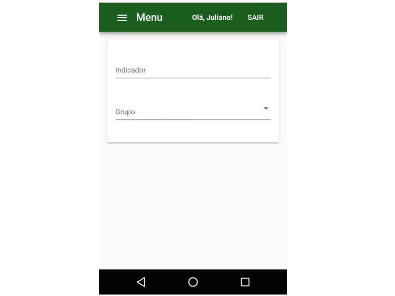
Bug: the overlay panel position is bugged in small devices, when pushed up by the virtual keyboard on mobile devices.
What is the expected behavior?
If there's no space to show the autocomplete neither above, nor bellow the associated input, maybe it's better to do nothing, just leaving the panel where it was initially opened (or maybe it's better to push it downwards).
What is the current behavior?
Notice how the panel just goes off the screen
What are the steps to reproduce?
There's no special steps to reproduce it. Just open an autocomplete panel in a small screen.
What is the use-case or motivation for changing an existing behavior?
UX in small devices
Which versions of Angular, Material, OS, TypeScript, browsers are affected?
Angular CLI: 6.0.8
Node: 8.11.2
OS: win32 x64
Angular: 6.0.5
... animations, common, compiler, compiler-cli, core, forms
... http, platform-browser, platform-browser-dynamic
... platform-server, router

Package                            Version
------------------------------------------------------------
@angular-devkit/architect          0.6.8
@angular-devkit/build-angular      0.6.8
@angular-devkit/build-optimizer    0.6.8
@angular-devkit/core               0.6.8
@angular-devkit/schematics         0.6.8
@angular/cdk                       6.3.0
@angular/cli                       6.0.8
@angular/flex-layout               6.0.0-beta.16
@angular/material                  6.3.0
@angular/material-moment-adapter   6.3.0
@ngtools/webpack                   6.0.8
@schematics/angular                0.6.8
@schematics/update                 0.6.8
rxjs                               6.2.1
typescript                         2.7.2
webpack                            4.8.3
Is there anything else we should know?
Maybe related to #6965
cc: @crisbeto