This repository was deprecated as new versions of storybook have this feature out of the box
This is an addon to render your Stories as full-featured markdown documentation with a storybook. Allows to render source template near the live example.
Addon was tested with version 4.0.0 of a storybook.
npm install storybook-any-info --save-dev- That addon modifies your story output.
- Currently only
template-stories supported. - Addon is not covered with tests yet, use it wisely :)
There are tasks to fix some issues. Soon TODO list will be moved to GitHub issues.
-
Write markdown file near your story.
-
Import
*.mdfile to your story, check if build will not fail. (Find Angular workaround in the bottom of the docs) -
Add decorator and parameters.
.addDecorator(withAnyInfo)
.addParameters({
    anyinfo: {
        customStyles: "div {background: #0f0;}",
        markdown: "## Custom markdown header",
    }
})
Here are options for anyinfo parameter:
| name | type | required |
|---|---|---|
| customStyles | string | No |
| markdown | string | No |
This is a final example with Angular:
import { withAnyInfo } from "storybook-any-info";
import * as markdown from "./README.md"; // Related docs file
import { Button } from "@storybook/angular/demo"; // Do not forget to replace with your component
storiesOf("Button", module)
.addDecorator(withAnyInfo)
.addParameters({
anyinfo: {
customStyles: "div {background: #0f0;}",
markdown: "## Custom markdown header"
}
})
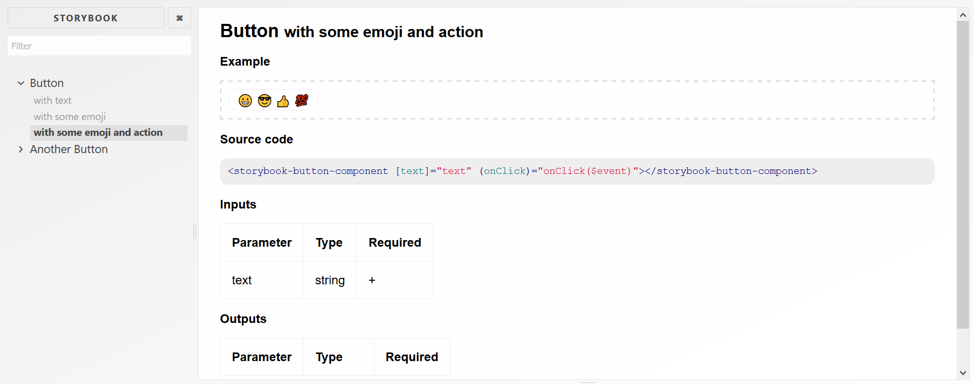
.add("with text", () => ({
moduleMetadata: {
declarations: [Button]
},
template: `<storybook-button-component [text]="text"></storybook-button-component>`,
props: {
text: "Hello Button"
}
}));You can setup your own styling, or use predefined one from exported variable storyStyles.
Add types.d.ts with next content to .storybook directory:
declare module "*.md" {
  const value: string;
  export default value;
}
And add it to your .storybook/tsconfig.json:
{
  // ...
  "include": [
    "./types.d.ts"
    // ...
  ]
}