-
-
Notifications
You must be signed in to change notification settings - Fork 74
Customising the Icon
- Basic Use
- Slightly More Advanced Use
- Built in Icons
- Using SF Symbols
- Icon Overlays
- Icon Size
- Hiding the Icon
- Setting Light or Dark mode icons
Use the -i or --icon command line option to specify what icon or image you would like in the Icon title area.
--icon <file | url | text= >
swiftDialog accepts images in png and jpg formats and displays the specified image in the icon display area.
Images will be resized to fit the image display area which is 170pt wide by 260pt high.
png is preferred however if jpg is specified the images will be presented with slightly rounded corners for a less harsh look.

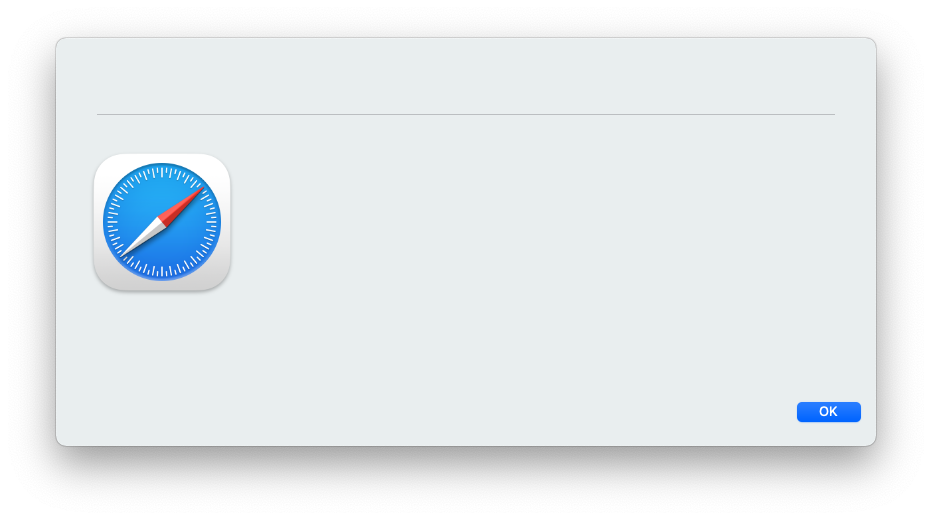
swiftDialog will accept an Application path and will use the applications icon as the image.
e.g. --icon /Applications/Safari.app

swiftDialog will also accept a URL to an image resource.
e.g. --icon "https://user-images.githubusercontent.com/3598965/111854068-84f6ab00-8971-11eb-935b-487f1a15b91f.png"

Use --iconalpha to set a transparancy value.
The range is from 0.0 (fully transparant) to 1.0 (fully opaque)
Use :dark= and specify an alternate icon or path to be used if the user's appearance is in dark mode
e.g. --icon /path/to/light.png:dark=/path/to/dark.png
swiftDialog has several built in icons that can be used with the --icon option
--icon info

--icon caution

--icon warning

--icon computer

You can also use the text= prefix to display text in the icon area. This is useful for displaying a single character or emoji.
e.g. --icon text=👍

swiftDialog can also display any SF Symbol iconography https://developer.apple.com/sf-symbols/
When Specifying SF Symbols for icon or overlay icon, additional parameters for colour and weight are available:
"SF=sf.symbol.name,colour=<text><hex>,weight=<text>"
color,colour=<text><hex> specified in hex format, e.g. #00A4C7
Also accepts any of the standard Apple colours
black, blue, gray, green, orange, pink, purple, red, white, yellow
default if option is invalid is system primary colour
Special colour "auto".
When used with a multicolor SF Symbol, the symbols default colour scheme will be used. If used with a monochrome SF Symbol it will default to black and will not respect dark mode.
e.g. dialog -s -i SF=airplane.circle.fill,colour=auto

Colour gradients can be set by adding the additional colour2 or color2 argument e.g. SF=applelogo,colour=pink,colour2=purple

Multicolor SF Symbols can colourised using the palette argument, e.g. SF=person.3.sequence.fill,palette=red,green,blue

SF Symbol Weight can be set with the weight argument
weight=<text> accepts any of the following values:
- thin (default)
- light
- regular
- medium
- heavy
- bold
Support for animated SF symbols is availabe on macOS 14 or newer.
Example usage:
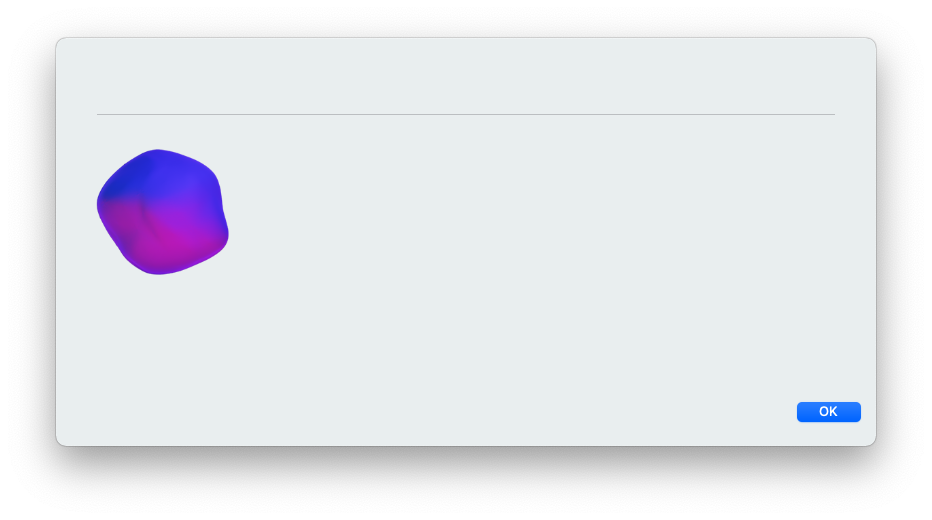
--icon sf=rainbow,colour=auto,animation=variable
Limited support at this time using the following animation types:
- "variable":
- "variable.reversing"
- "variable.iterative"
- "variable.iterative.reversing"
- "variable.cumulative"
- "pulse"
- "pulse.bylayer"
Use the -y or --overlayicon command line option to specify what icon or image you would like as an overlay to the main icon.
Overlays are displayed at half the normal resolution and shifted to the bottom right of the main icon display area. Using this option you can combine images to display
Overlay icons take all the same image types and locations as the --icon parameter including built-ins and SF Symbols
Example:
--icon caution --overlayicon /Applications/Safari.app
-i caution -y /Applications/Safari.app

Example 2:
--icon /Applications/Google\ Chrome.app --overlayicon warning
-i /Applications/Google\ Chrome.app -y warning

When using SF Symbols, a semi-transparant squircle is added to make the symbol stand out over the main icon as many symbols contain elements that don't work well as an overlay.

The background appearance can be adjusted with a bgcolor= modifier and uses the same syntax wherever color can be set. You can also specify the special colour bgcolor=none if the overlay background is not desired.

--iconsize <float> Will re-size the icon to the specified width. The default width is 170
Example 1:
--icon caution --overlayicon /Applications/Safari.app --iconsize 300

Example 2:
--icon /Applications/Firefox.app --iconsize 100 -s

--centreicon or --centericon
Changes the icon position to be centred

Can also be changed using the command file while swiftDialog is running
echo "icon: centre" >> /var/tmp/dialog.log
The icon can be removed entirely with either one of the following commands:
--hideicon
or
--icon none
Except for some SF Symbols, swiftDialog doesn't have any built in functionality for switching between dark and light mode icons.
Setting icon based on UI settings though can be achieved in the calling script:
zsh / bash (thanks to mm2270)
#!/bin/zsh

icon_path_dark="/path/to/icondark.png"
icon_path_lite="/path/to/iconlite.png"

logged_in_user=$(/usr/sbin/scutil <<< "show State:/Users/ConsoleUser" | /usr/bin/awk '/Name :/ && ! /loginwindow/ {print $3}')

os_color_mode=$(/usr/bin/defaults read /Users/$logged_in_user/Library/Preferences/.GlobalPreferences.plist AppleInterfaceStyle)

if [ "$os_color_mode" = "Dark" ]; then
	icon_path=$icon_path_dark
else
	icon_path=$icon_path_lite
fi
or in python (thanks to joncrain)
from Foundation import NSBundle

def is_dark_mode():
    appearanceBundle = NSBundle.bundleWithPath_(
        "/System/Library/PreferencePanes/Appearance.prefPane"
    )
    appearanceShared = appearanceBundle.classNamed_("AppearanceShared")
    app = appearanceShared.sharedAppearanceAccess()
    if app.theme() == 1:
        return False
    else:
        return True

if is_dark_mode():
    content["icon"] = "dark_icon.png"
else:
    content["icon"] = "light_icon.png"