-
Notifications
You must be signed in to change notification settings - Fork 79
New issue
Have a question about this project? Sign up for a free GitHub account to open an issue and contact its maintainers and the community.
By clicking “Sign up for GitHub”, you agree to our terms of service and privacy statement. We’ll occasionally send you account related emails.
Already on GitHub? Sign in to your account
Add stats page #156
Add stats page #156
Conversation
Also collapse blog, docs, and community links to separate menu to save
space (main nav was getting too crowded).
|
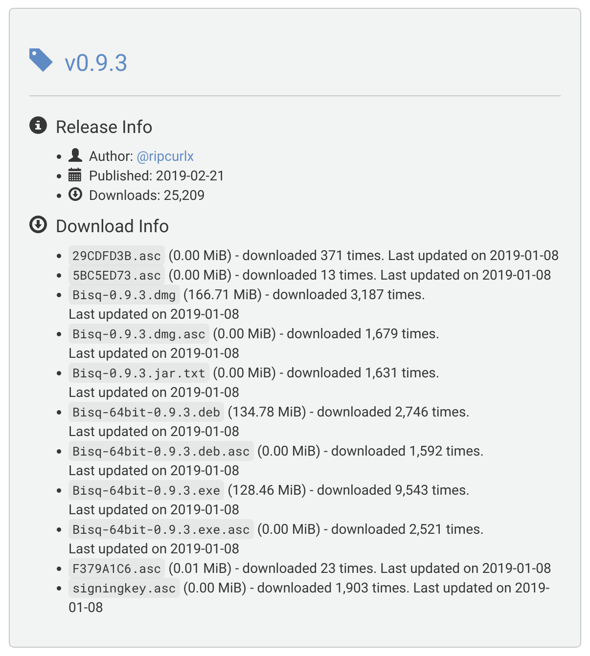
Date of downloads is wrong: Released Aug 22nd, 2018 |
|
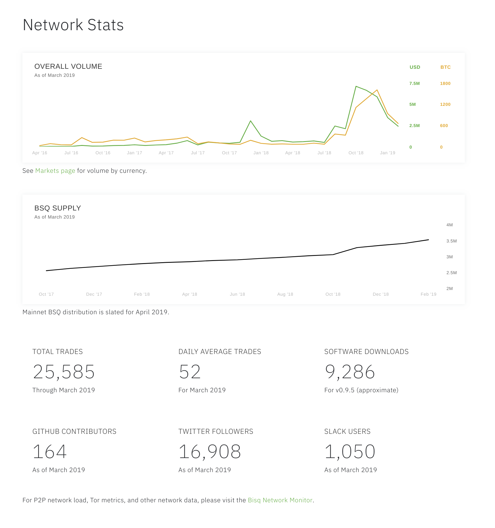
Not sure if a more graphical approach would be better? @pedromvpg would you have time to make a suggestion? |
|
@ManfredKarrer I used 0.9.3 because it had the best numbers...took numbers from here and added up only .dmg .exe .deb numbers: We could use a more recent version but numbers are much lower. Yes automating these figures will be great, was thinking we could do it all at once, when we automate the Bisq stats. |
|
Is this the right list of data to be displayed? If not is there a consolidated list I can reference? |
|
That looks good to me. Generally I think we want to include as much as we can from the analytics infographic and whatever else makes sense (e.g., link to the network monitor). |
|
@pedromvpg figma crashes often my firefox tabs.... the adobe page was working better |
|
I like the design 👍 . Regarding KPIs, graphs and naming I would suggest following:
I think for a first version this information should be sufficient to spark interest. |
|
I like @ripcurlx's suggestions...very well thought-out. Only thing I would mention is that it makes more sense to me to keep BSQ supply and created/burned on the same graph. Maybe the line indicates the net supply over time, and double-bars at each time interval indicate issuance and burning (not sure of the exact graph details; we can figure them out when we actually have the data to make the complete graph). |
Was 'network stats'.
Not sure why I need to do this...
|
I applied Pedro's design and Christoph's KPIs suggestions. I kept the order of items the same as Pedro's design, as alternating between graphs and KPIs looks a little strange, I think, especially on smaller screens where everything becomes a single column. Also -- I stuck with v0.9.5 for downloads because v0.9 didn't have too many (which is what I assume ripcurlx meant by major release - 0.8, 0.9, 1.0, etc). I think we just need to play this by ear and use the version that makes most sense. If there are no further suggestions, this should be ready to go. |


To address #147.
Notes:
Also looks like there are some merge conflicts at the moment (will fix).
But please review for substance.
Preview is broken, so here are screenshots.