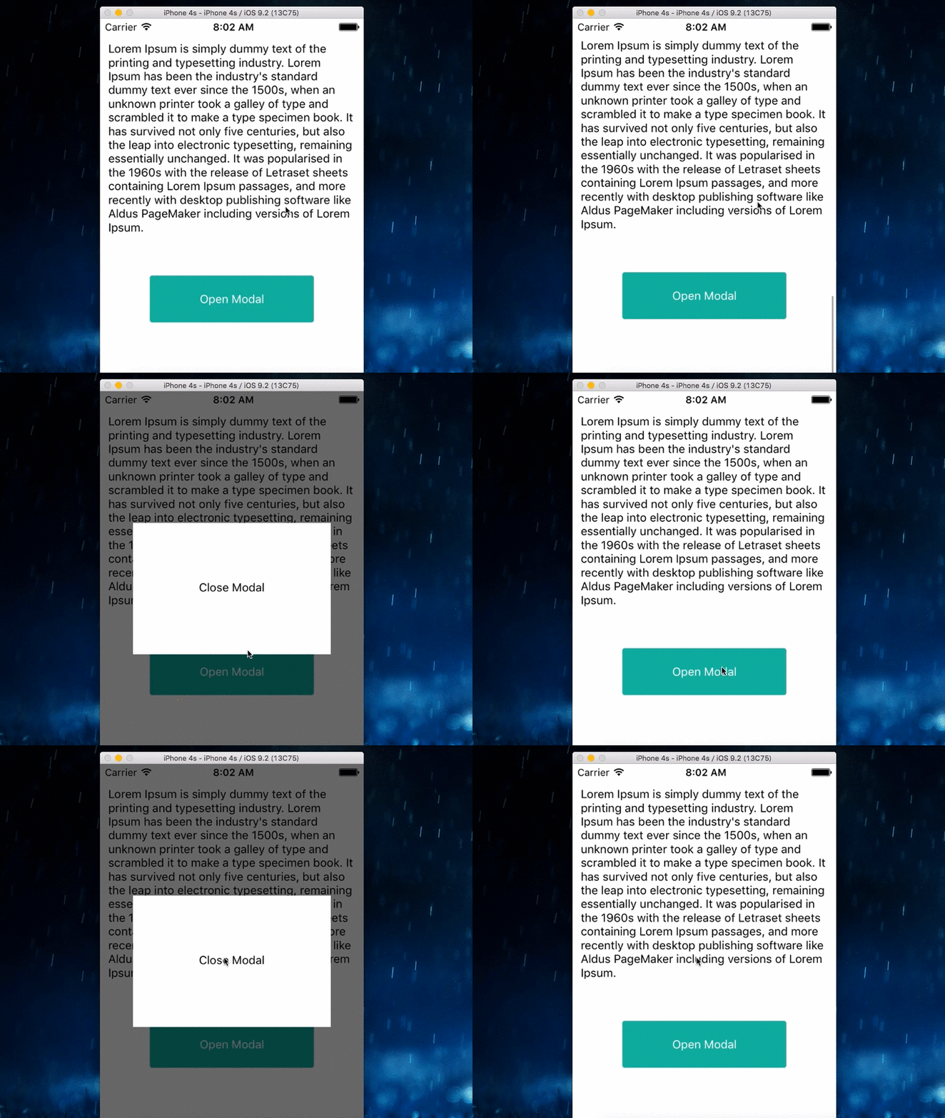
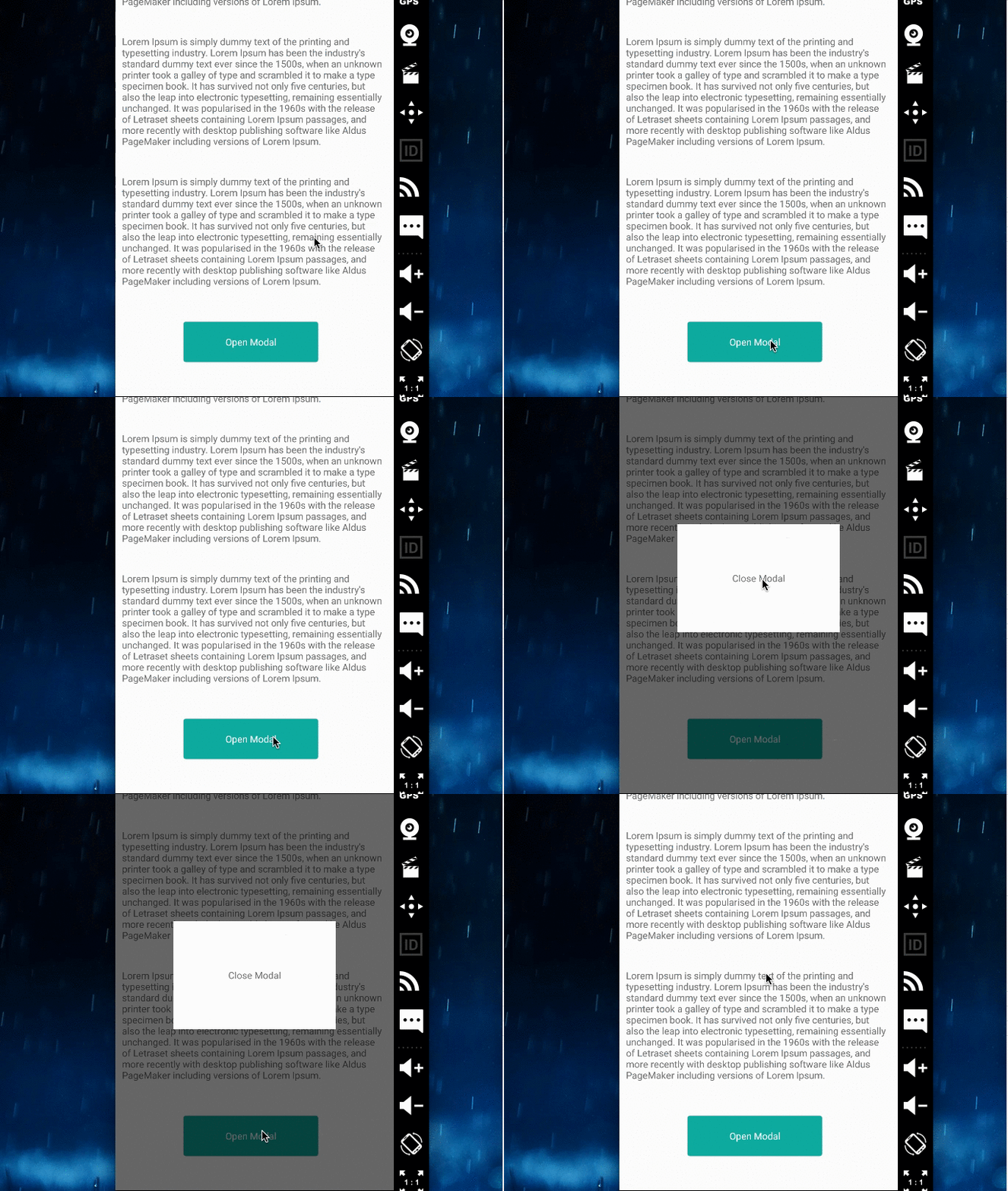
Universal simple modal component for React Native
- iOS
- Android
This repository is heavily under development and unstable.
npm i react-native-universal-modal- example
<Modal isOpen={this.state.isOpen}
       styles={modalStyles}>
  <TouchableOpacity
     onPress={() => this.setState{isOpen: false}}>
    <View style={styles.modalInner}>
      <Text>Close Modal</Text>
    </View>
  </TouchableOpacity>
</Modal>The style of modal and overlay.
See example.
- example
const modalStyles = {
  modal : {
    width: 240,
    height: 160,
    backgroundColor: '#FFF'
  },
  overlay : {
    backgroundColor: 'rgba(0,0,0,0.6)'
  }
};
If set true, modal is open.
The MIT License (MIT)
Copyright (c) 2015 @Bokuweb
Permission is hereby granted, free of charge, to any person obtaining a copy of this software and associated documentation files (the "Software"), to deal in the Software without restriction, including without limitation the rights to use, copy, modify, merge, publish, distribute, sublicense, and/or sell copies of the Software, and to permit persons to whom the Software is furnished to do so, subject to the following conditions:
The above copyright notice and this permission notice shall be included in all copies or substantial portions of the Software.

