Skip to content
New issue

Have a question about this project? Sign up for a free GitHub account to open an issue and contact its maintainers and the community.

By clicking “Sign up for GitHub”, you agree to our terms of service and privacy statement. We’ll occasionally send you account related emails.

Already on GitHub? Sign in to your account

[Lightbox media viewer] Web Component & React: Include the layout updates #6386

Closed
11 tasks
RobertaJHahn opened this issue Jun 16, 2021 · 2 comments
Closed
11 tasks
Assignees
Labels
adopter: AEM used when component or pattern will be used by this adopter adopter support dev Needs some dev work Feature request A new adopter requested feature Needs design approval PRs on feature requests and new components have to get design approval before merge. package: react Work necessary for the Carbon for IBM.com react components package package: web components Work necessary for the IBM.com Library web components package priority: medium
Milestone

Comments

@RobertaJHahn
Copy link

RobertaJHahn commented Jun 16, 2021

User Story

As a [user role below]:
Carbon for ibm.com developer

I need to:
create/change the Lightbox media viewer

so that I can:
provide the ibm.com adopter developers components they can use to build ibm.com web pages

Additional information


Design specs for the proposed solution can be found here:

PDF
Sketch file

Preview of specs for Lightbox media viewer

image
image

Acceptance criteria

  • Include README for the web component and corresponding styles
  • Create Web Components styles in styles package
  • Do not create knobs in Storybook that include JSON objects
  • Break out Storybook stories into multiple variation stories, if applicable
  • Create codesandbox example under /packages/web-components/examples/codesandbox and include in README
  • Minimum 80% unit test coverage
  • Update the Carbon for ibm.com website component data file to be sure the web site Component Status and Storybook links are correct
  • Use the Visual QA checklist to verify design quality
  • Include the DDS design consultant in the Pull Request for the Visual QA
  • Provide a direct link to the deploy preview for the designer in the Pull Request description
  • A comment is posted in the Prod QA issue, tagging Praveen when development is finished
@RobertaJHahn RobertaJHahn added adopter support adopter: AEM used when component or pattern will be used by this adopter dev Needs some dev work package: web components Work necessary for the IBM.com Library web components package priority: high Needs func specs labels Jun 16, 2021
@RobertaJHahn RobertaJHahn added the Feature request A new adopter requested feature label Jun 17, 2021
@jeffchew jeffchew changed the title [Lightbox media viewer] Web Component: Include the layout updates [Lightbox media viewer] Web Component & React: Include the layout updates Jul 19, 2021
@jeffchew jeffchew added the package: react Work necessary for the Carbon for IBM.com react components package label Jul 19, 2021
@jeffchew
Copy link
Member

Team has discussed and will do both Web Components and React at the same time. Will close the React story.

@jeffchew jeffchew added this to the Sprint 21-16 milestone Jul 22, 2021
@shixiedesign
Copy link
Contributor

Func spec done.
@RobertaJHahn this is ready for Monday's engineering refinement. Looks like James is not feeling well the past few days, so I can present the specs.

@shixiedesign shixiedesign added the Needs design approval PRs on feature requests and new components have to get design approval before merge. label Jul 23, 2021
@ariellalgilmore ariellalgilmore self-assigned this Aug 2, 2021
kodiakhq bot pushed a commit that referenced this issue Aug 13, 2021
### Related Ticket(s)

#6386 #6842
### Description

Multiple style update to the lightbox-media-viewer. 
![image](https://user-images.githubusercontent.com/20210594/129277247-0887df78-2317-4b0b-8dc1-7f757341e95b.png)
![image](https://user-images.githubusercontent.com/20210594/129277251-5b06e1bd-6f98-4563-828e-ee369f4326e9.png)


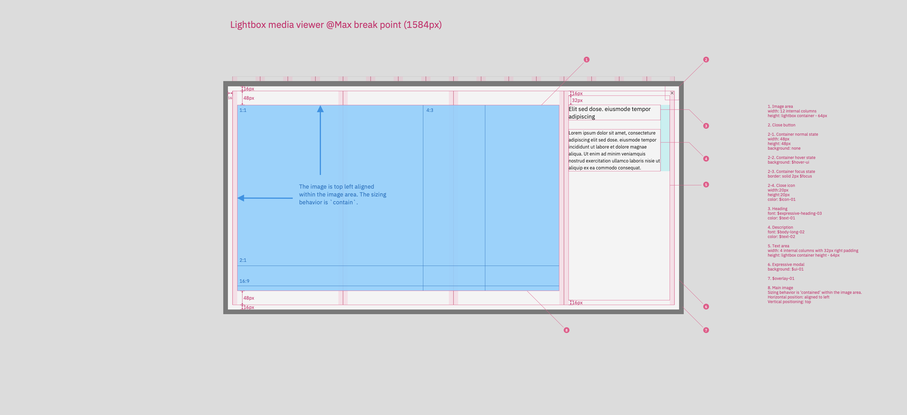
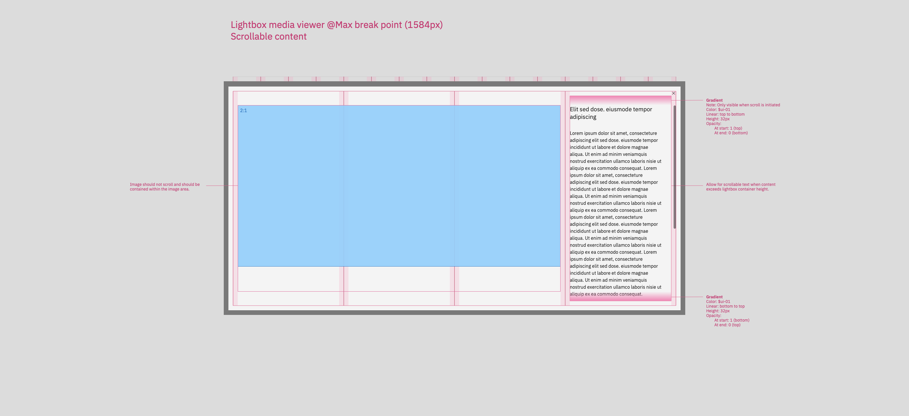
### Changelog

**New**

- max-width introduced to expressive modal
- lightbox mode property to expressive modal in wc for styling
- top and bottom gradient when scrollilng above small breakpoint
- fixed media, so only text is scrollable above md breakpoint

**Changed**

- many style updates and changes

**Removed**

- {{removed thing}}

<!-- React and Web Component deploy previews are enabled by default. -->
<!-- To enable additional available deploy previews, apply the following -->
<!-- labels for the corresponding package: -->
<!-- *** "package: services": Services -->
<!-- *** "package: utilities": Utilities -->
<!-- *** "package: styles": Carbon Expressive -->
<!-- *** "RTL": React / Web Components (RTL) -->
<!-- *** "feature flag": React / Web Components (experimental) -->
Sign up for free to join this conversation on GitHub. Already have an account? Sign in to comment
Labels
adopter: AEM used when component or pattern will be used by this adopter adopter support dev Needs some dev work Feature request A new adopter requested feature Needs design approval PRs on feature requests and new components have to get design approval before merge. package: react Work necessary for the Carbon for IBM.com react components package package: web components Work necessary for the IBM.com Library web components package priority: medium
Projects
None yet
Development

No branches or pull requests

4 participants