Effortlessly keep BreakJS responsive breakpoints and Vuex Store in sync.
# for vue >= 2.0:
npm install vuex-breakjs-sync
import { sync } from 'vuex-breakjs-sync' // `sync` init method
import store from './vuex/store' // Vuex store instance
import breakjs from 'breakjs' // BreakJS init method
sync(store, breakjs) // done.
// bootstrap your app...# run the demo from source
git clone https://github.com/chrisbraddock/vuex-breakjs-sync
cd vuex-breakjs-sync/demo
npm install
npm run dev- It adds a
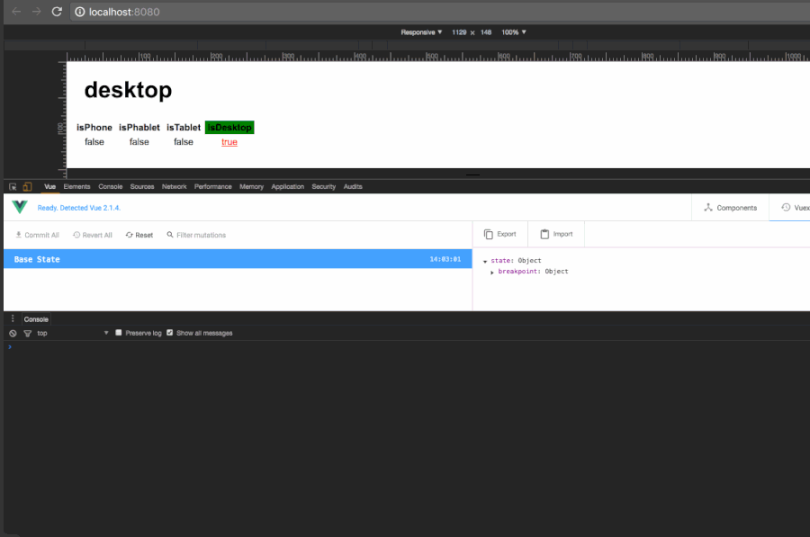
breakpointmodule into the store, which contains the state representing the current breakpoint.
store.state.breakpoint.current // string current breakpoint e.g. 'tablet'- When BreakJS runs callbacks on breakpoint change, the store's state is updated.
vuex-breakjs-sync breaks defaults to:
{
    phone: '320px',
    tablet: '768px',
    desktop: '1024px'
}
* borrowed from include-media
The defaults can be overridden by passing a valid BreakJS layout
object as a parameter
to sync .e.g.
var myBreaks = { ... }
sync(store, breakjs, myBreaks)
The default breaks object is available as a convenience export from
vuex-breakjs-sync:
import { sync, breaks } from 'vuex-breakjs-sync'
import store from './vuex/store'
import breakjs from 'breakjs'

breaks['phablet'] = 550

sync(store, breakjs, breaks)only minor adaptation to vue-router-sync was needed for this project